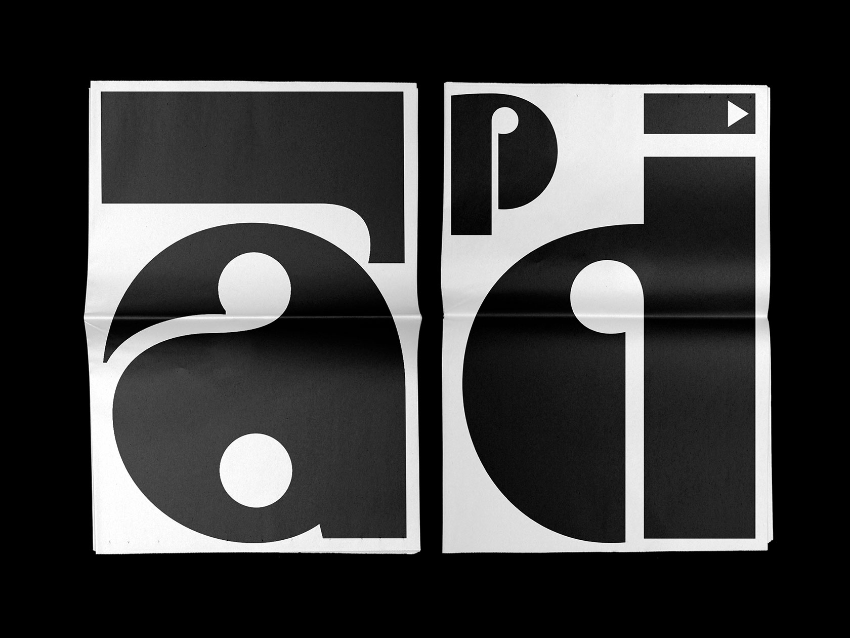
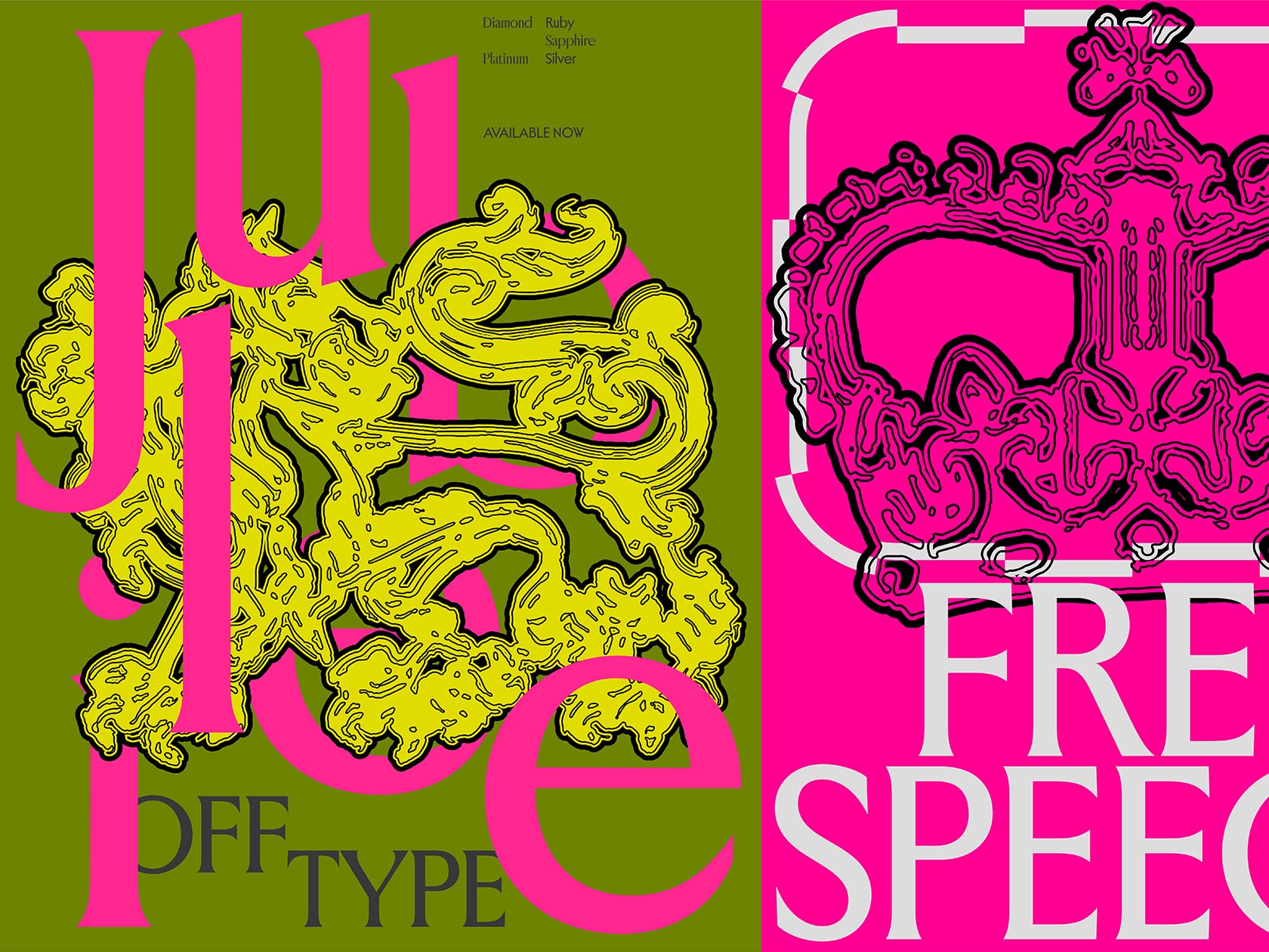
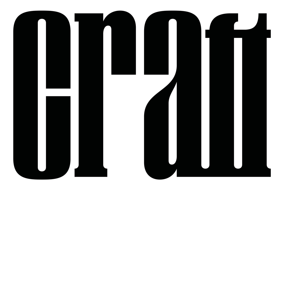
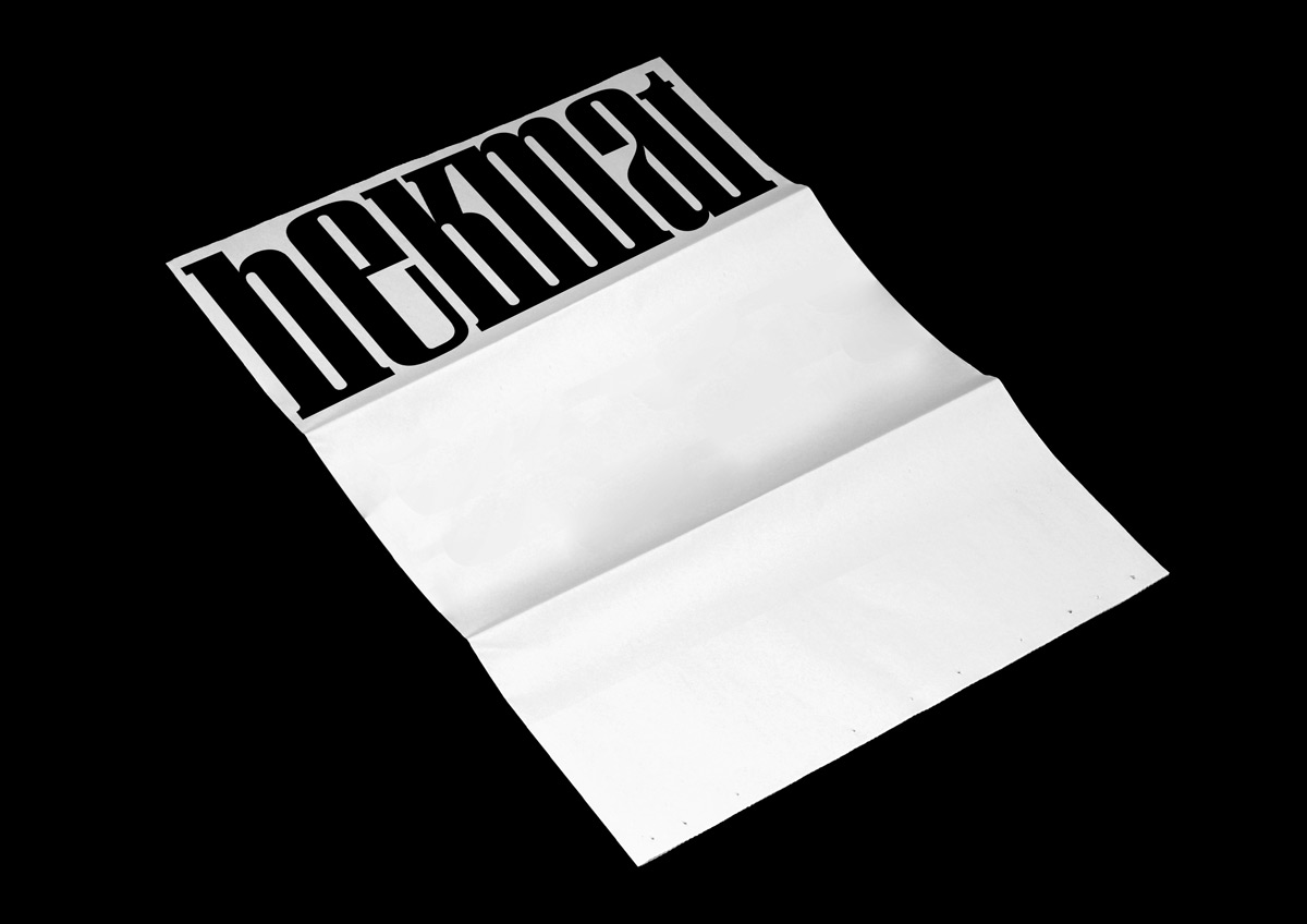
Inspired by the masters of the Swiss Style, like Wolfgang Weingart, and by the geometry of the industrial graphic culture, Benoit Brun and Raphaël de La Morinerie pursued their own contemporary approach last year and released two display typefaces together, called “Craft” and “Rapid”. Despite following a completely different set of rules, both types have playful and expressive characteristics. They were created during their last semester at ECAL in Lausanne. “We are studying in the same class and we became close friends, so our collaboration started very naturally – also because we share a lot of references”, the duo tells us.
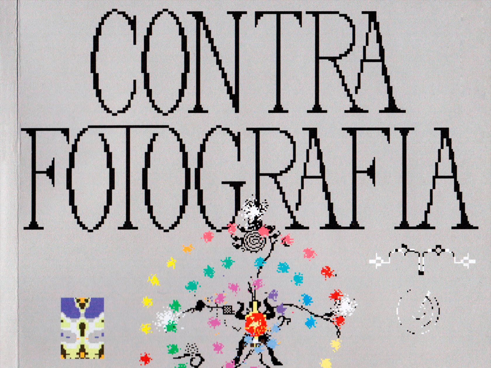
After a tutor invited an artist to present her work at ECAL as part of a school project, “Craft” came into being. Based on the challenge to design a typeface to raise up the visual identity of this artist, the duo decided to team up and start their research. “She send us a moodboard with some vintage graphic design references: wood type, goofy old magazines like Harakiri, etc. So the first step was to look for typographic references that are close to her graphic tastes and that we also like”, Benoit and Raphaël explain the process, “We were really interested in drawing something unconventional with a vintage flavor. So the starting point was the quirkiness of French wood type. To translate these quirkiness feeling we decided to remove the ascender and the descender and to play with the proportion to have condensed lettershape. We wanted a typeface with a very regular rhythm with a dense grey of text.” During this project, the two of them discovered their shared influences and their common interest in experimental and unusual typefaces. “We would search for forms where we complement each other. So the best thing to come out of this collaboration was to know that we could make new ones.”
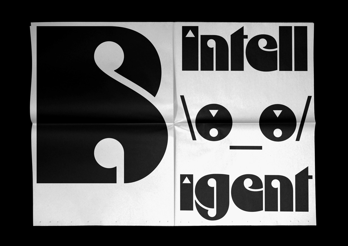
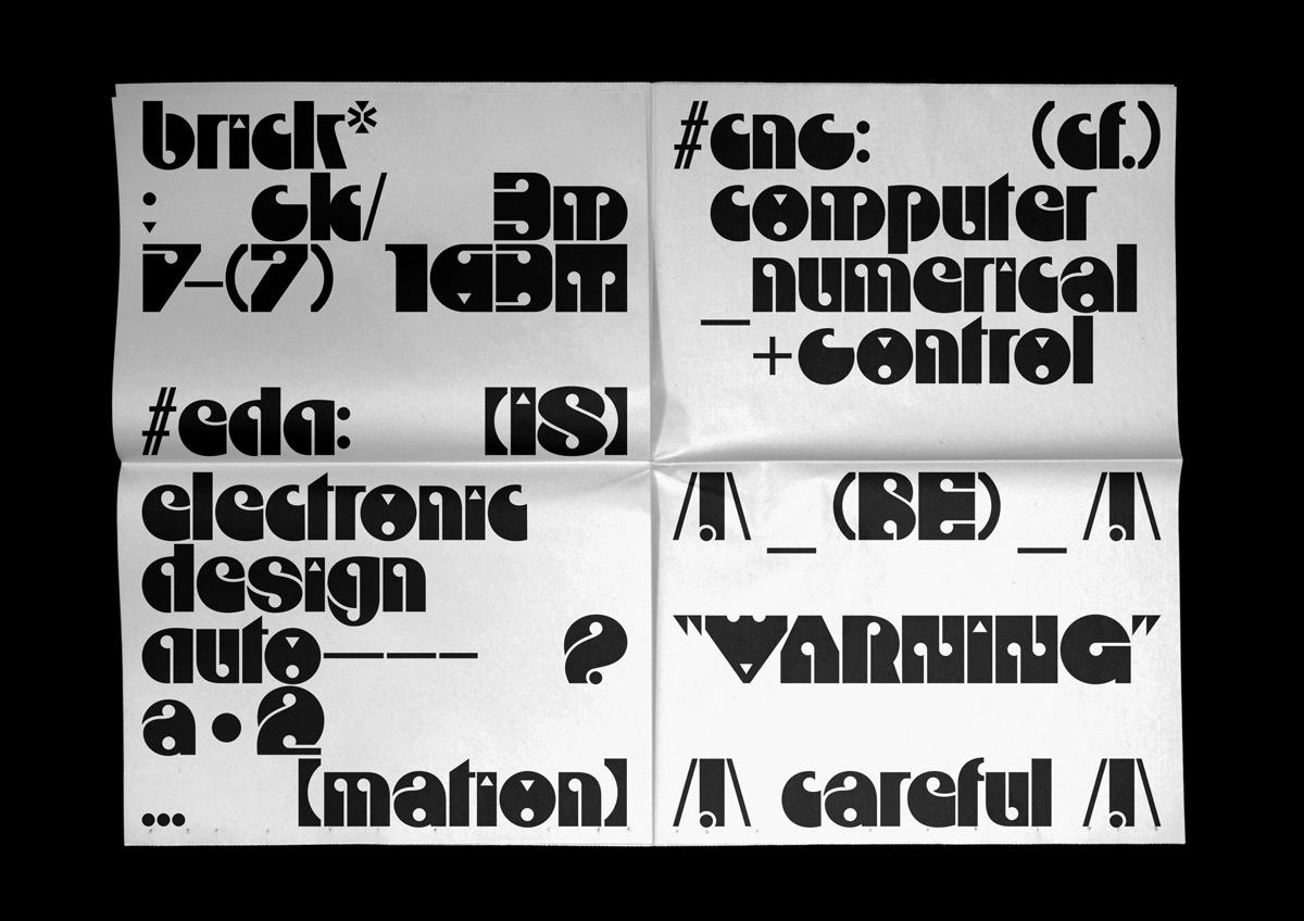
Their second typeface “Rapid” was based on a logo found on an industrial machine. With its playful and ornamental look, it can be seen as a contemporary tribute to the German Art Nouveau.
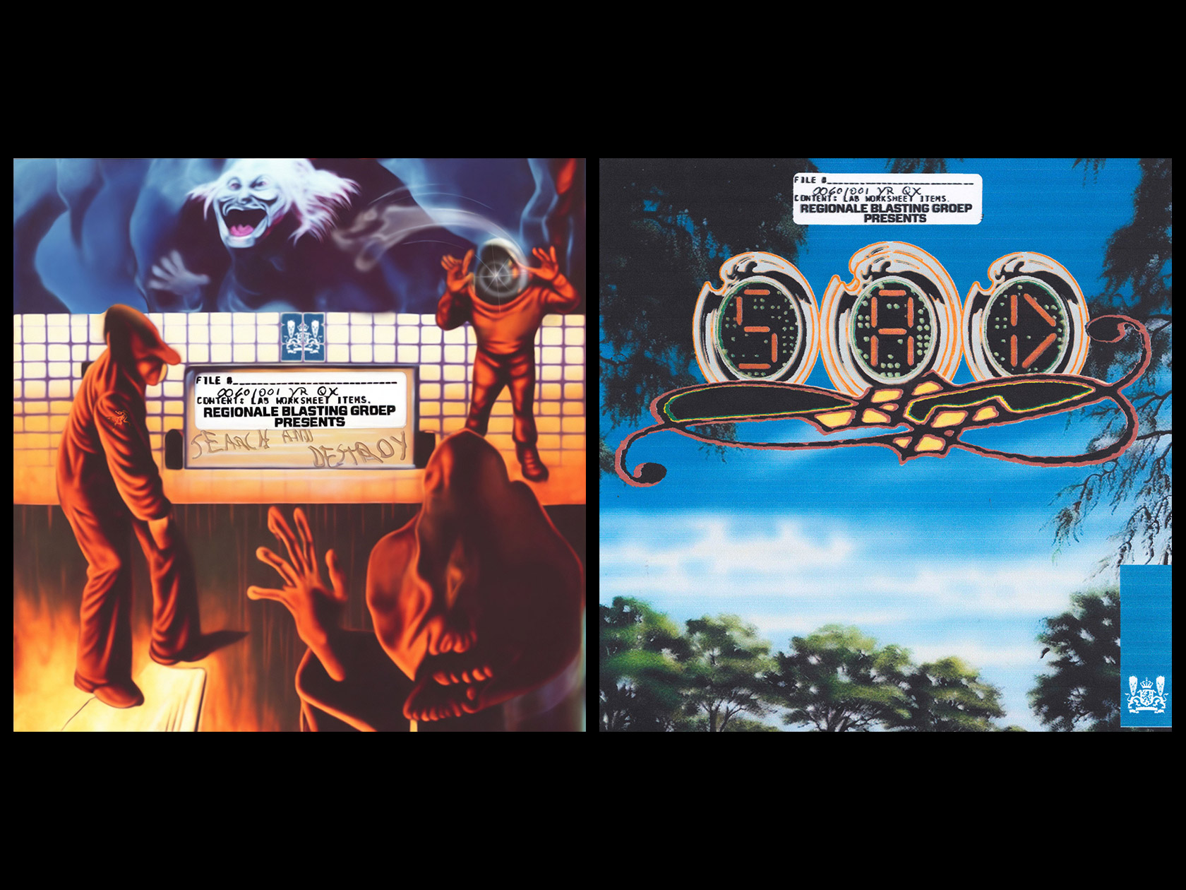
Before finding his way into the design scene, Benoit were interested in physics and chemistry. Therefore he moved from his hometown Sanary in the South of France to Toulon, to get a degree in space design. “I was more interested in the communication around my projects, which led me to graphic design”, he remembers. Ending up at the ECAL in Lausanne to begin his studies in graphic design, he was straight-away surrounded by the influence of the Swiss graphic design and its rigorous and functional approach. “My teachers really drew my attention to the importance of the grid, the proportions, balance and contrast. For me, these questions are the basis of typography and editorial design.”, he describes his own design aesthetics, “Also having an interest in illustration I am always looking for expressive and surprising forms in my design. I will summarize my style by saying that my approach is first of all very rigorous before I can detach myself from the established rules and look for something spontaneous and lively.” After his internships at Hubertus Design and Offshore Studio in Zurich, he came back to ECAL to start his master in type design. Besides working on various projects, like the visual identity for the Roman Swiss Orchestra, he is known for the radical and dynamic typeface “Shakotan”.
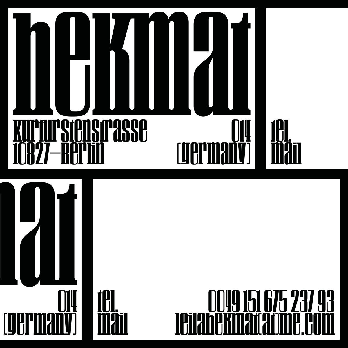
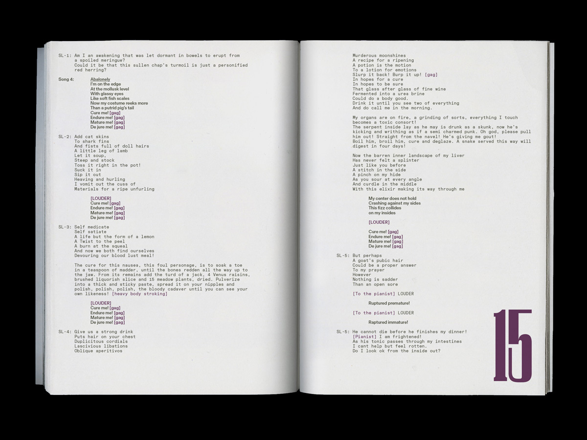
Raphaël also first chose a completely different direction and studied Political Sciences for one year at university in his hometown Paris, before moving to Brussels for its bachelor in graphic design and typography at ENSAV La Cambre for the next three years. After that, he did an internship at a Paris based design agency, called Atelier les Graphiquants, before starting his master in type design at ECAL. “At La Cambre I was trained in publishing and printed matter. I have an attraction for books and all the visual culture that goes with them”, he tells us, “I would say that I am attracted to pure forms for their elegance and striking impact. I often seek to update historical forms and see their contemporary resonance.” Inspired by “wherever there are letters”, his work is often based on typographical research. Besides projects, like the book “The Politique du Geste”, he also has created several typefaces, like the variable font “Serpe”.
Their fascination for typography and the creating of custom fonts is clearly rooted in the early beginnings of their studies. “Basically we both did a Bachelor’s degree in graphic design with an emphasis on publishing. So we’ve always had a strong connection to typography. Our visual environment influences us creatively in a conscious and unconscious way in our daily life, for example in Paris we see art nouveau typography and in Lausanne a lot of sans serif!”, they tell us, “Drawing typefaces attracted us very quickly to give more singularity and personality to our projects. A custom font is a personal writing, it’s a strong visual reference that allows the person who uses it to affirm his own graphic language. It’s always a plus in a visual identity project when it’s not the basis!”
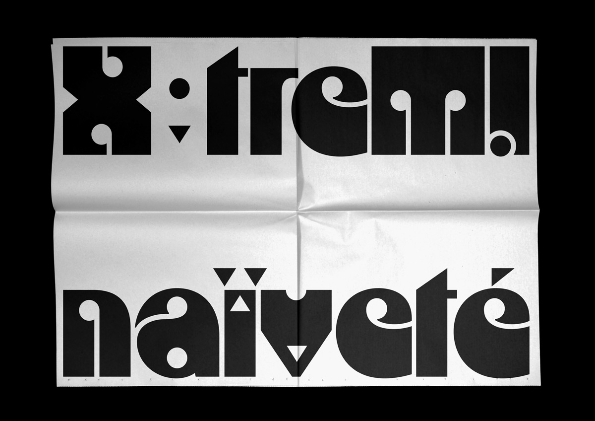
To them, typography as the smallest unit of graphic design is always the beginning of each and every project. “On a more global scale drawing typefaces allows us to understand much better how to layout text, how to use typography.” In the last couple of years, they have noticed a change in the perception of graphic design. “In every country the specialized press has noted a strong revival of interest in type design and graphic design courses have largely developed typography courses. Everything is connected and easier to access and the knowledge is more widely shared. I think this is due to the simplification of software and the return of a vintage aesthetic, a taste for visuals that are connected to our close history.”
As far as future collaborations, Benoit names the still life photographer, Julien Deceroi. “I would find it interesting to combine two different areas of expertise and create a common work. Photography is a field of research of light, contrast and composition in the same way as typography. I would like to explore this text/image relationship, an abstract composition at the limit of legibility in a pictorial space attached to pixels (and no longer vectorial)”, he explains us.
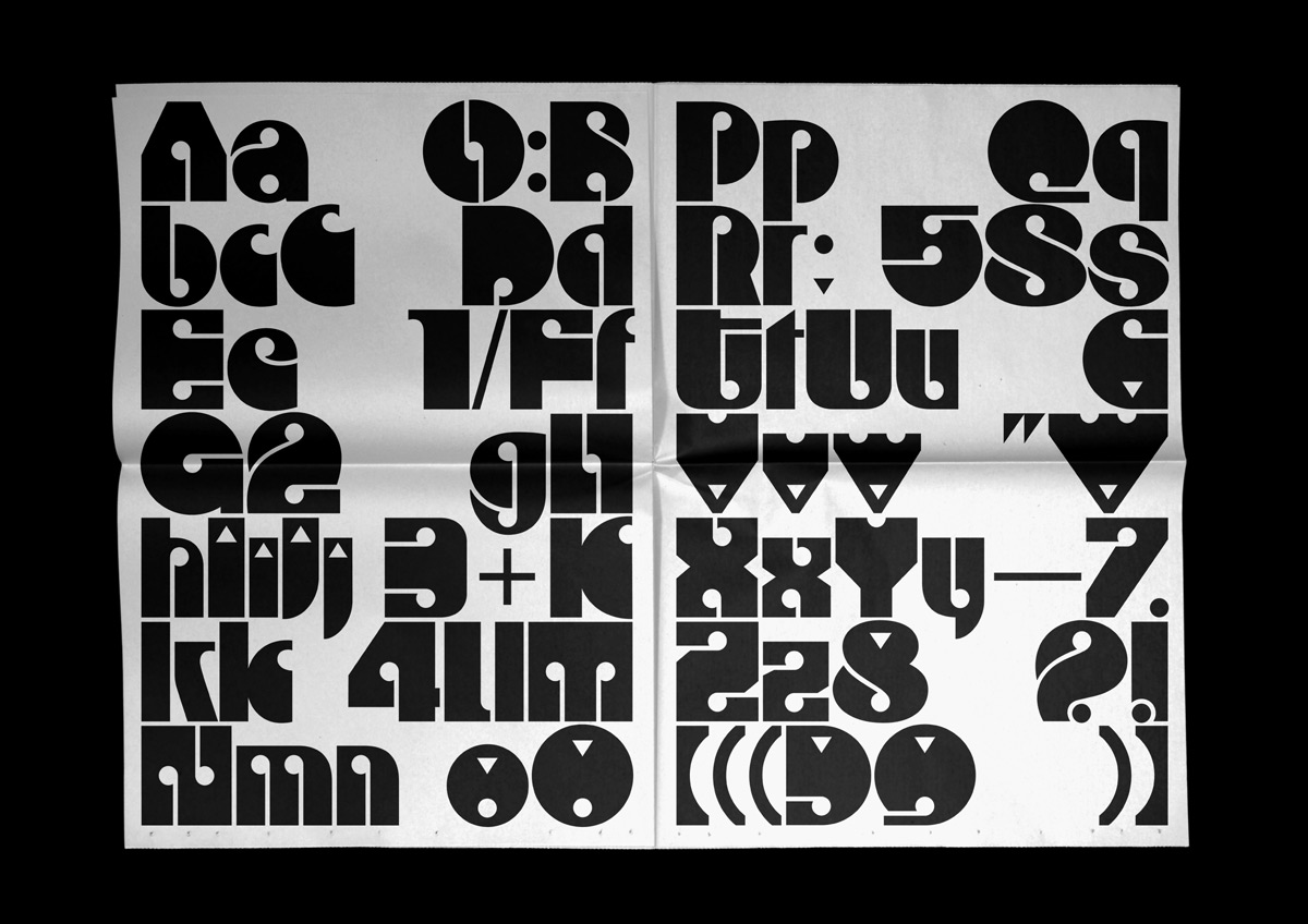
Seeing collaborations as a way to push the limits of their graphic design practice and opening up to different approaches, it is important to them to be surrounded and to work with other creatives. “A collaboration is mixing two different and complementary approaches to develop ideas that we wouldn’t have thought of alone. It is to develop a common artistic sensibility that goes beyond a personal thought”, they tell us, “Then, it is also to know how to develop working rules, to select good ideas by making compromises and to trust each other. We think it is better to be an expert in your field than to pretend to master all the disciplines of visual communication.”

