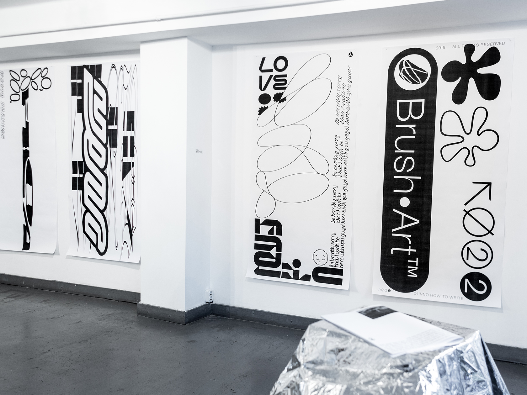
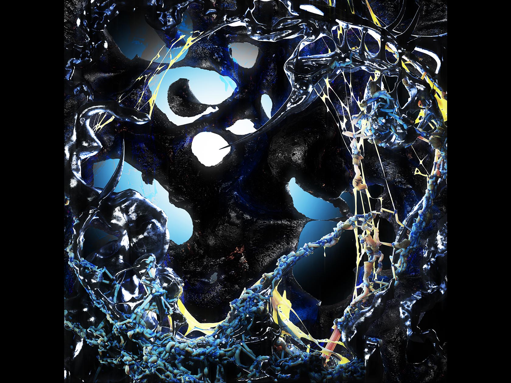
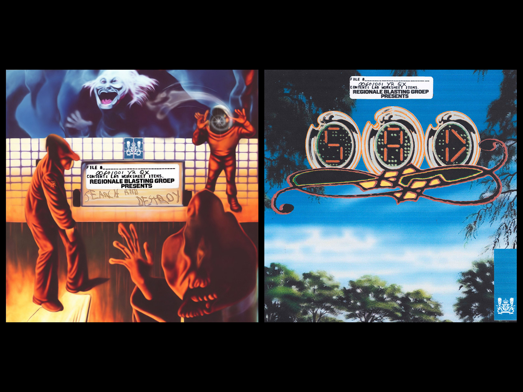
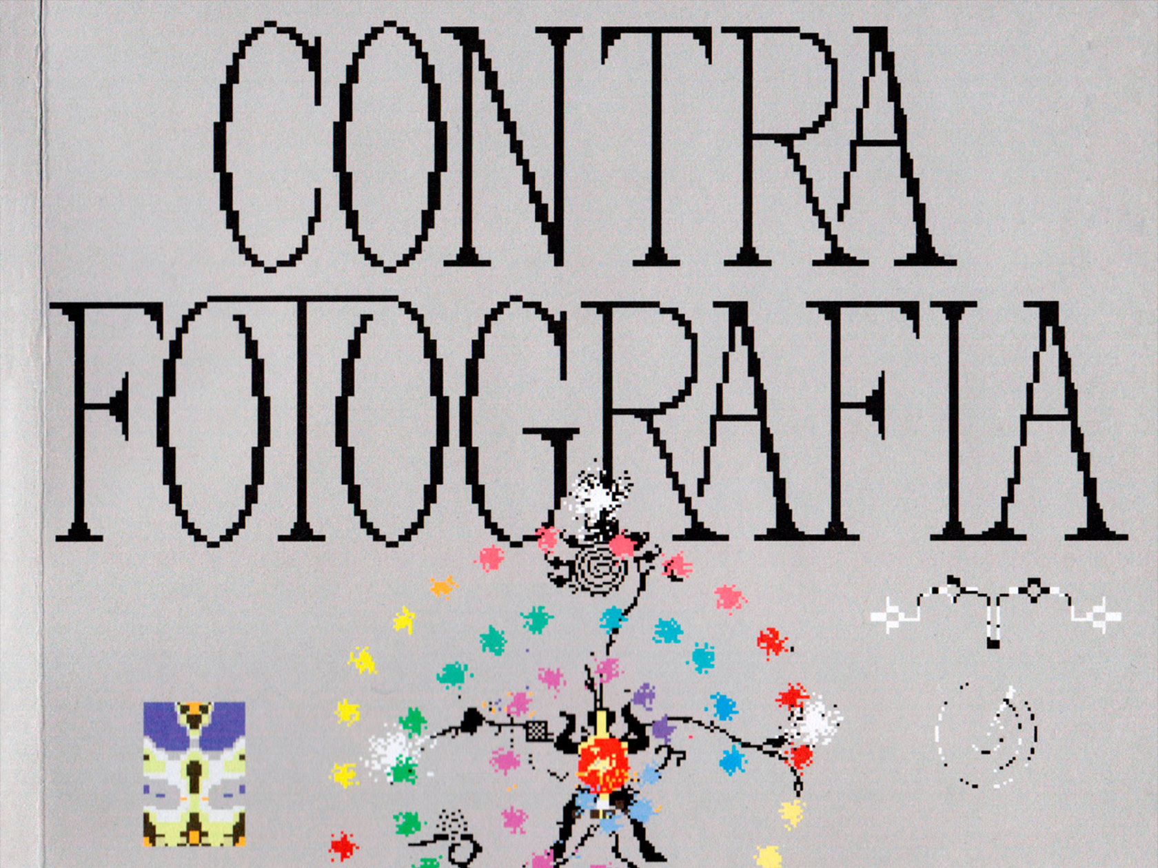
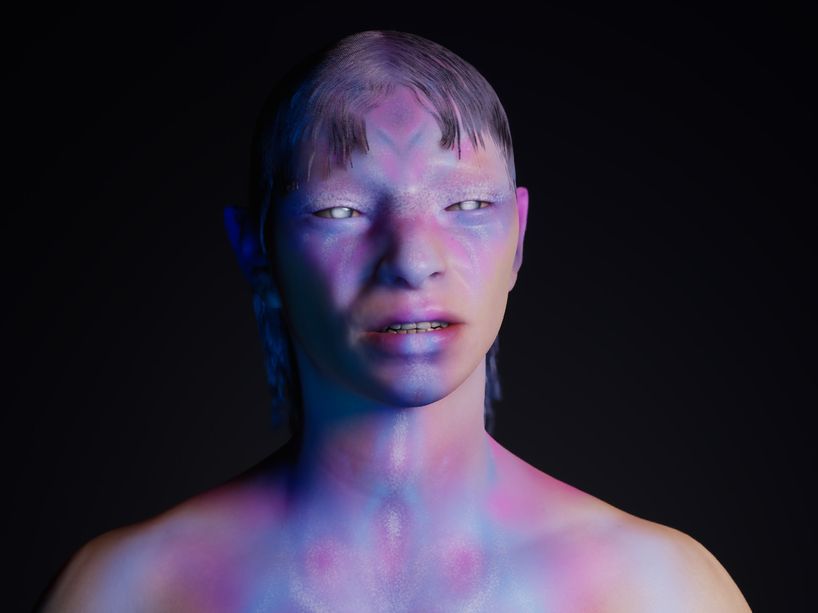
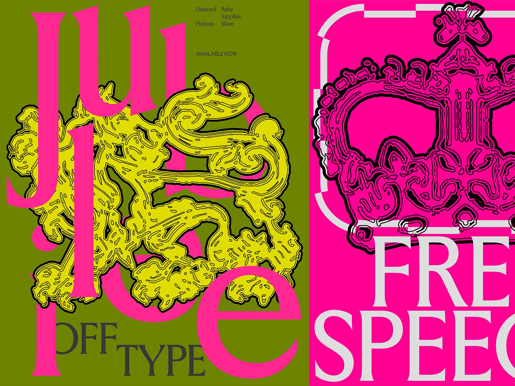
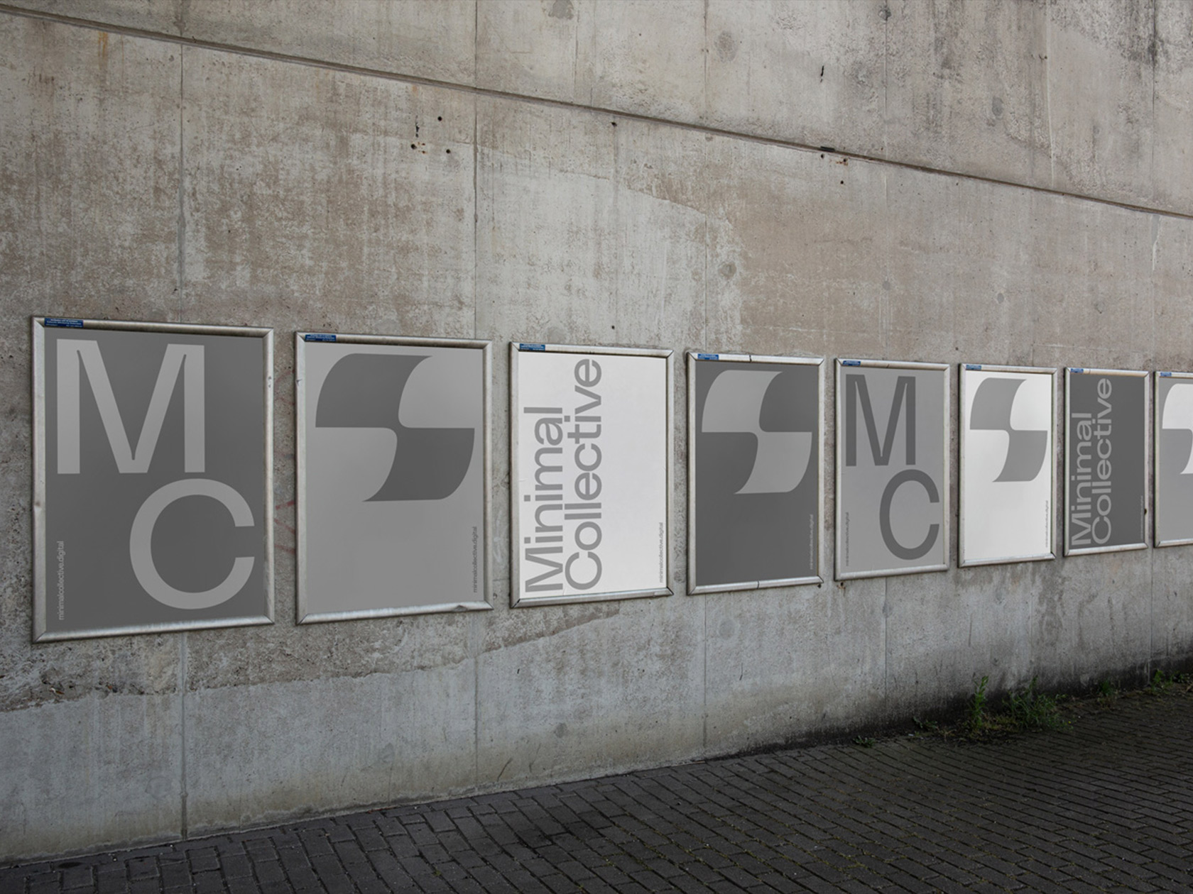
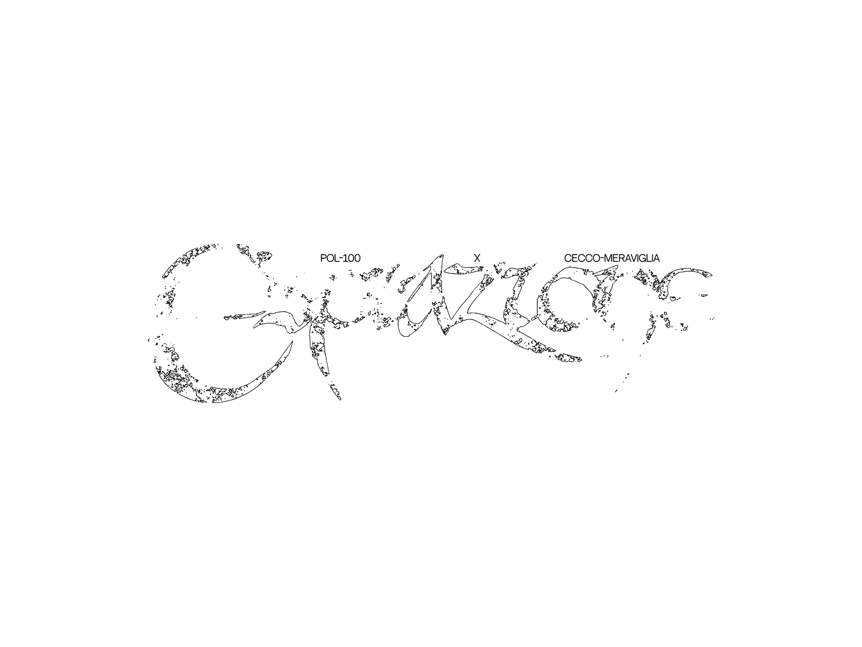
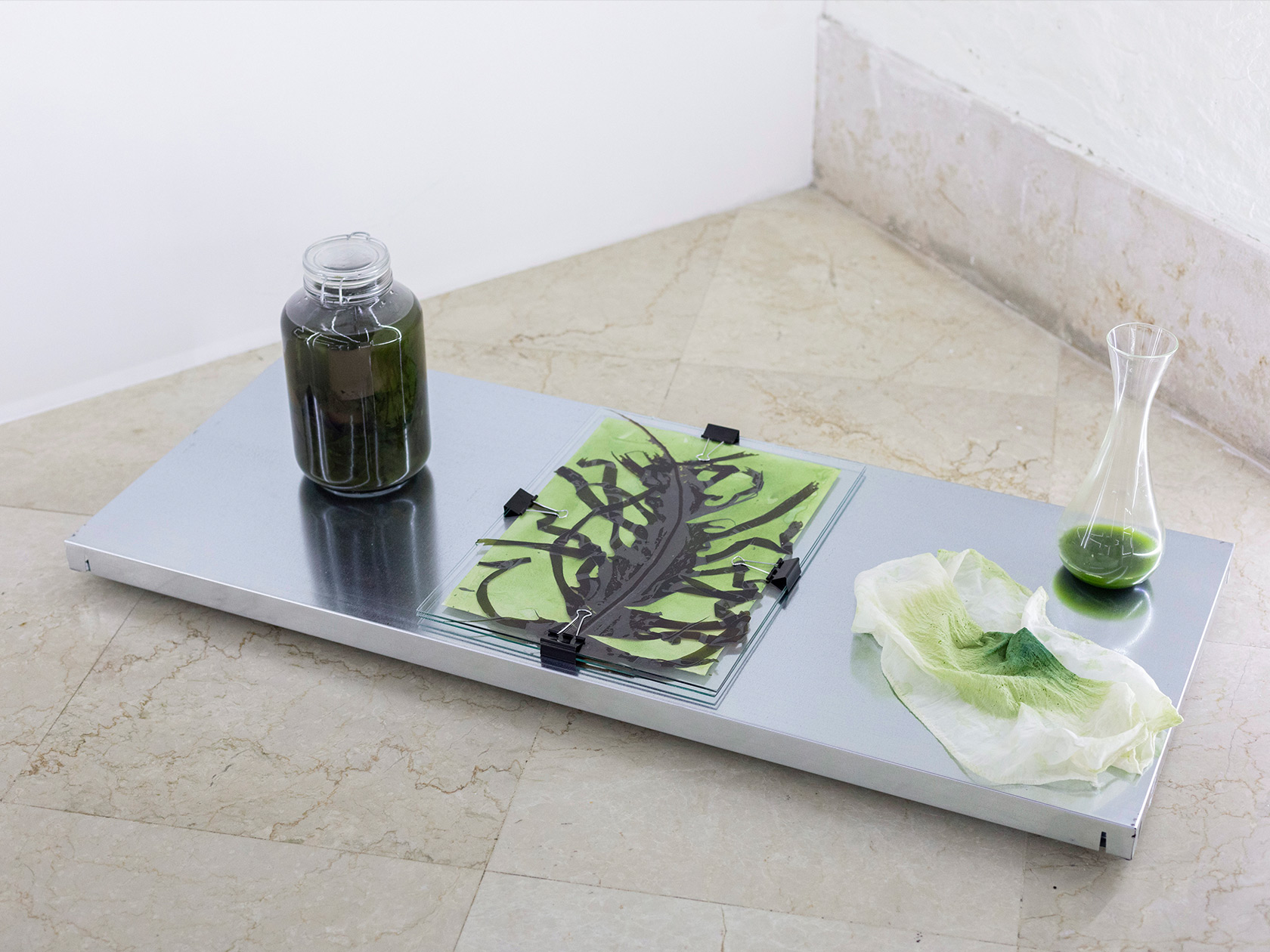
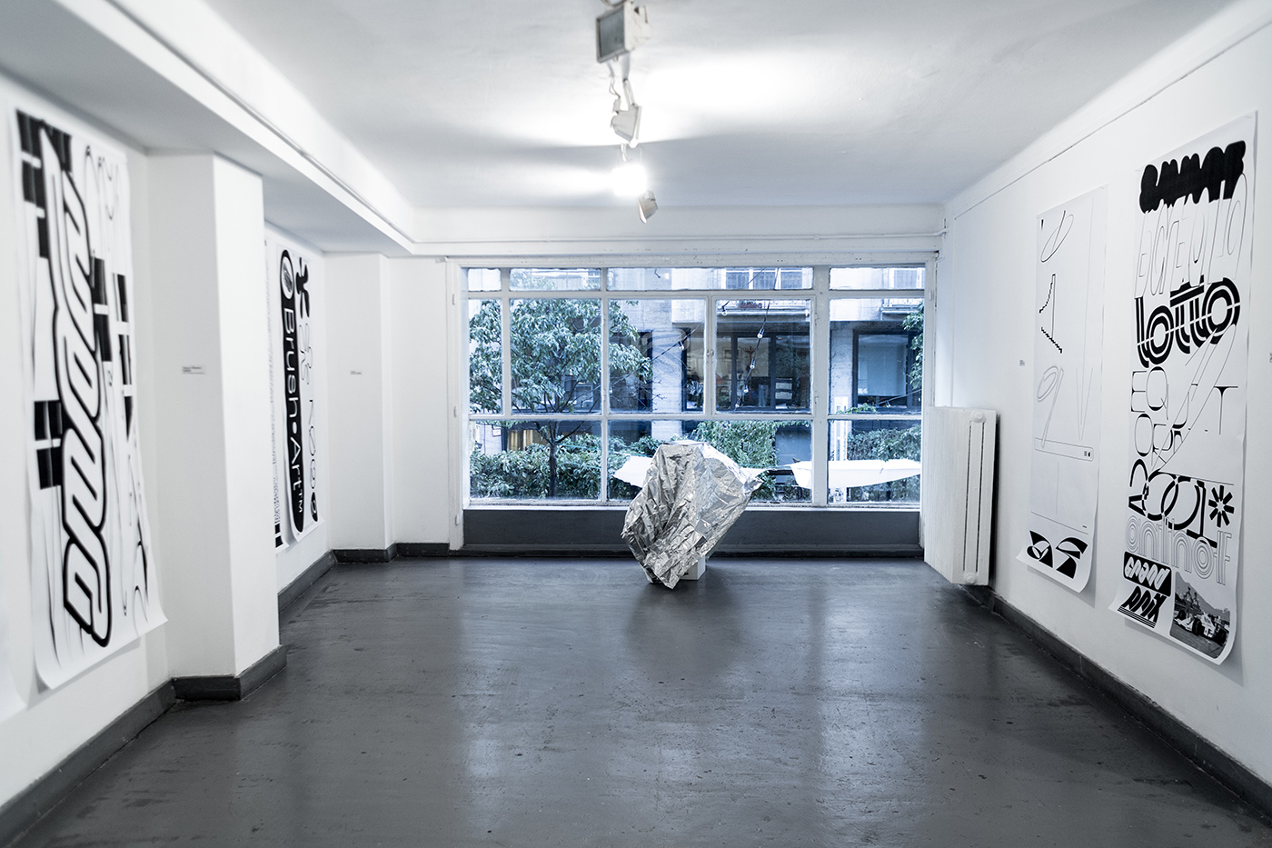
“I had the idea of starting this kind of collaboration a while ago. So I just wrote my friends like ‘Hey, wanna make some lit sh!t together?’ In the end, they said ‘yes’ and I found myself in the situation that I have to organize an exhibition for the first time in my life”, János Hunor Vári says about the beginning of his project “Dunno How to Write”, a publication and exhibition about contemporary graphic and type design. The project is meant to be a periodical practice of typographers and graphic designers to stay in constant exchange and share their sketches, ideas and experiments. For the release of the first issue, János organized an exhibition at Telep Gallery in order to offer a broader showcase to the artists involved. Together with six friends and fellow designers including Ádám Asztalos, Bendegúz Batke, Adrienn Csázsár, Laura Csocsán, Bálint Jákob and Boldizsár Tóth, he worked on several playful artworks, celebrating the errors, mistakes and imperfections along the way.
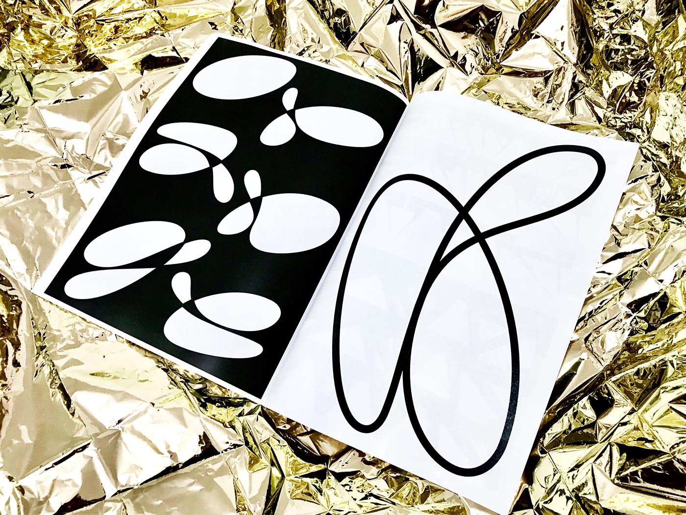
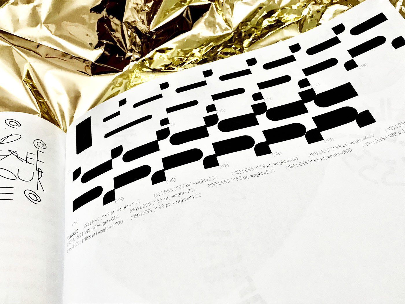
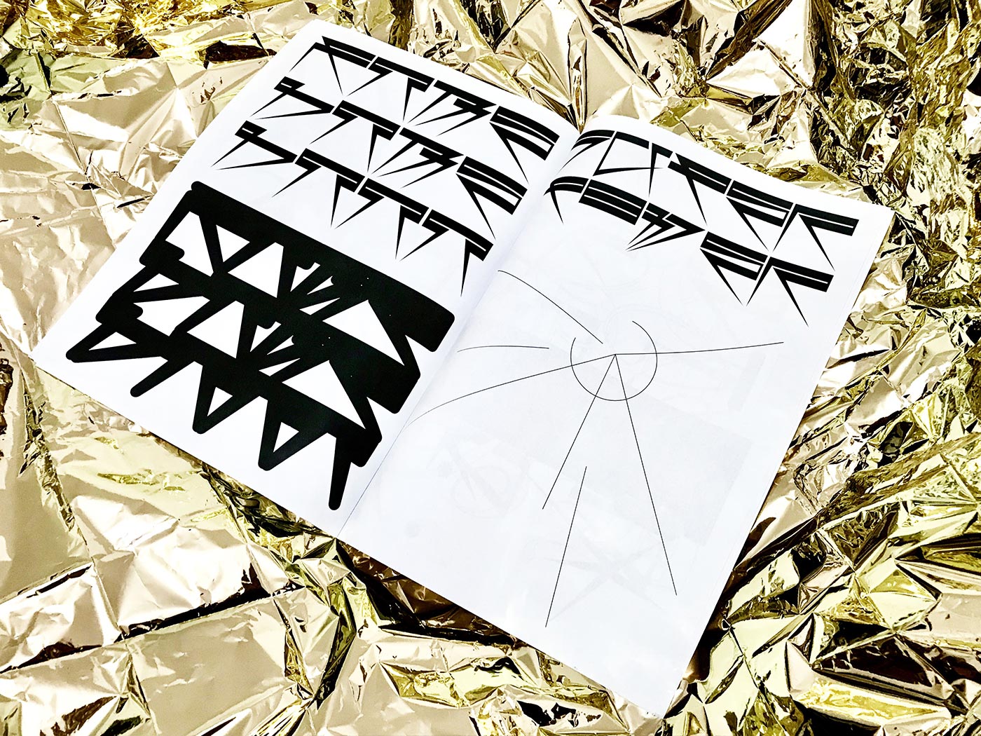
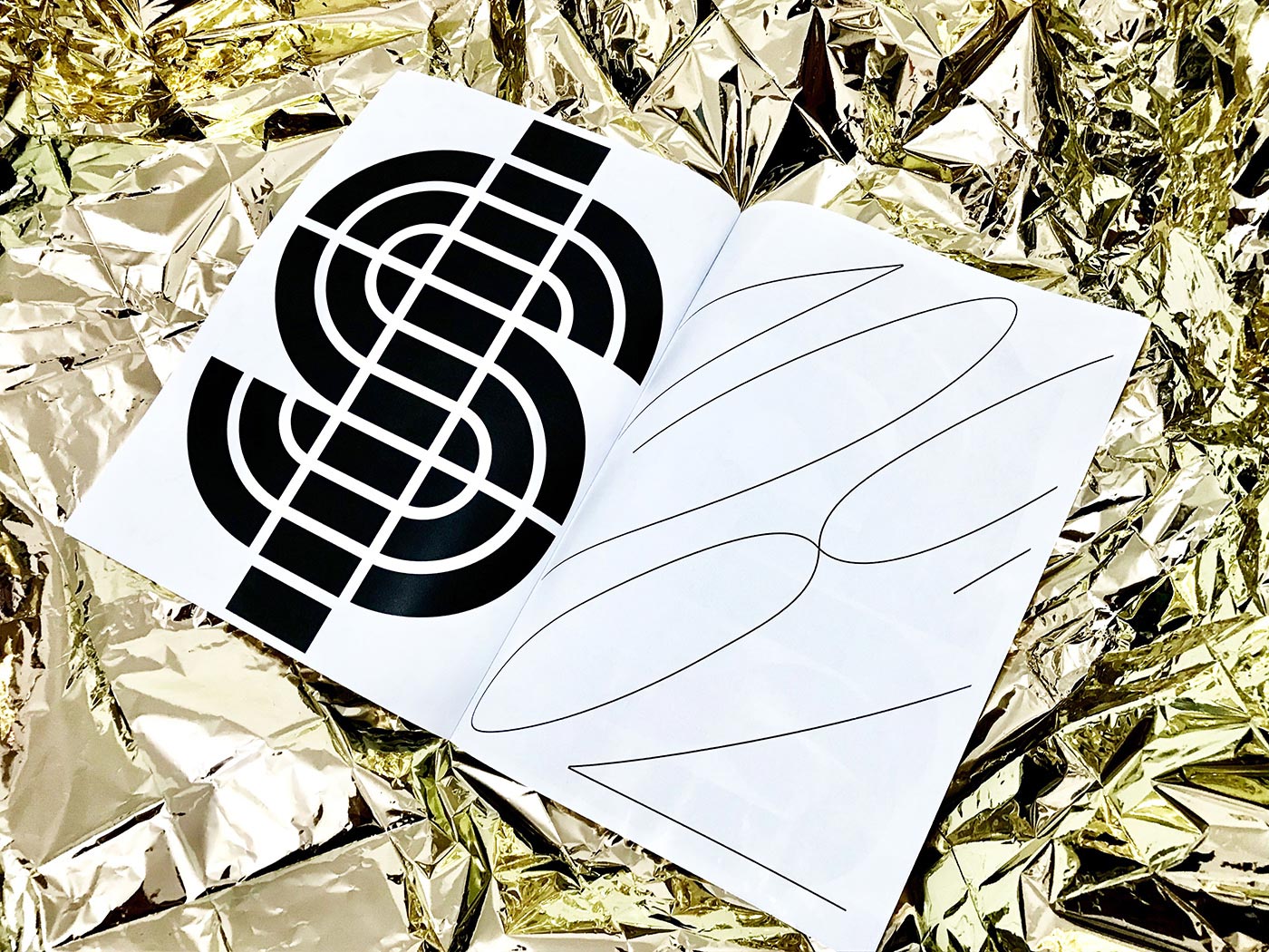
In contrast to the playful concept of the project which leaves enough room for experimentation, the designers only worked with black and white colors, exploring the balance of designing in monochrome. “The main idea of the concept is simplicity. Black ink and white paper should be enough for a designer”, János explains, describing the final outcome of the project as “simple and raw”. Apart from that, the designers could completely immerse themselves in in experimentation without having to follow any other restrictions. “I’ve seen so many things falling off from the art boards, disappearing, just because they didn’t meet the requirement of the current project. And I love errors, mistakes, they always bring up a lot of possibilities. So I told my friends: ‘Gimme your sketches, the things you have never finished, the ideas you haven’t used yet and lemme save ’em for you’.” While the project was meant to focus only on Hungarian type designers in the beginning, János plans to include artists from all around the world in the upcoming issue.
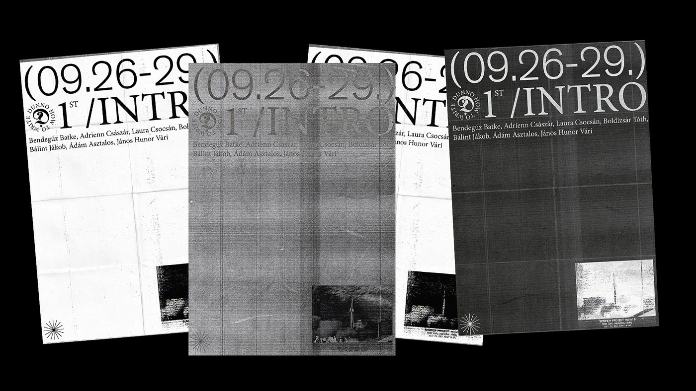
Like many other artists, János path to working in the creative industry began with graffiti which also served as a source of inspiration for the title of the project. “I was really into graffiti writing as a teenager. When they see some wild styles on the wall, a lot of people say ‘I can’t read it, I don’t know how to read’. The same thing happens regarding experimental typography sometimes”, Janor tells us, throwing a bridge between graffiti and contemporary type design. “As the outcome of the experiment stays unpredictable for the you until the end, you basically ‘dunno’ what you are doing. And for people who aren’t familiar with experimental typography, it might seem like you ‘dunno know how to write’ the letters in a proper way.”
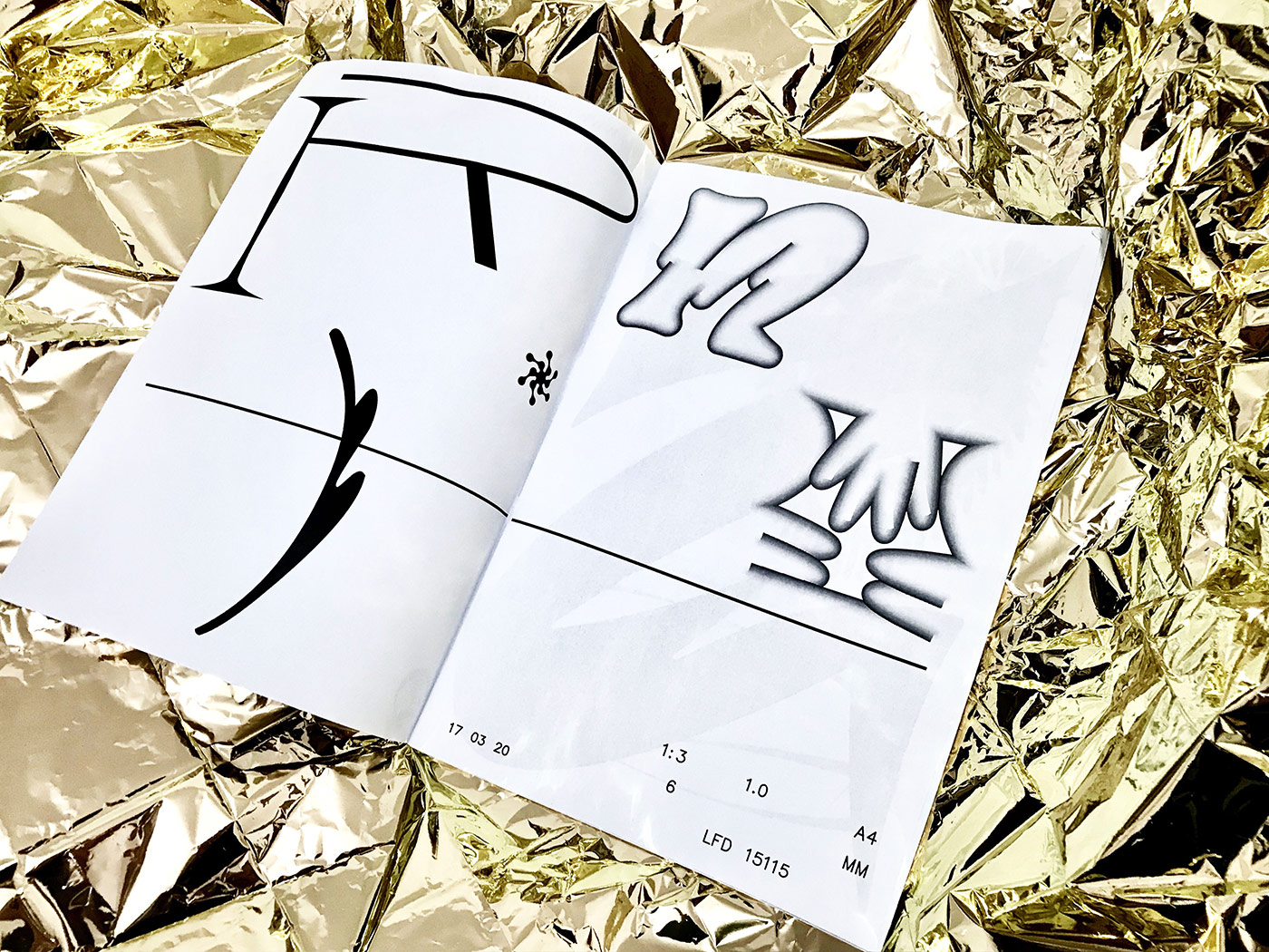
As this was the first time János organized an exhibition by himself, he had to slip into the role of a curator and learn about managing a project. “At first, I wanted to handle it in a ‚democratic’ way, but I soon had to realize that I will never even finish the first issue, if I discuss every little detail with all of the contributors”, János jokes, “I have learned a lot of important thing about organizing, making deadlines and controlling projects. It’s important to mention that I got so much help from my friends, and from Telep Gallery, they made it so easy for me to make it happen.” Although he also took responsibility for the art direction of the publication and exhibition, he made sure to leave enough room for the presented artworks. “I didn‘t want to manipulate the work of the contributors. they have been invited because I trust them and appreciate their style. In case I’d see something that doesn’t fit to the project I’d tell them, but I have never even thought that it’ll be necessary – and it wasn’t. Since I’m a bit absentminded sometimes, it was quite challenging for me to organize everything, but I got so much help which I’m really thankful for.”
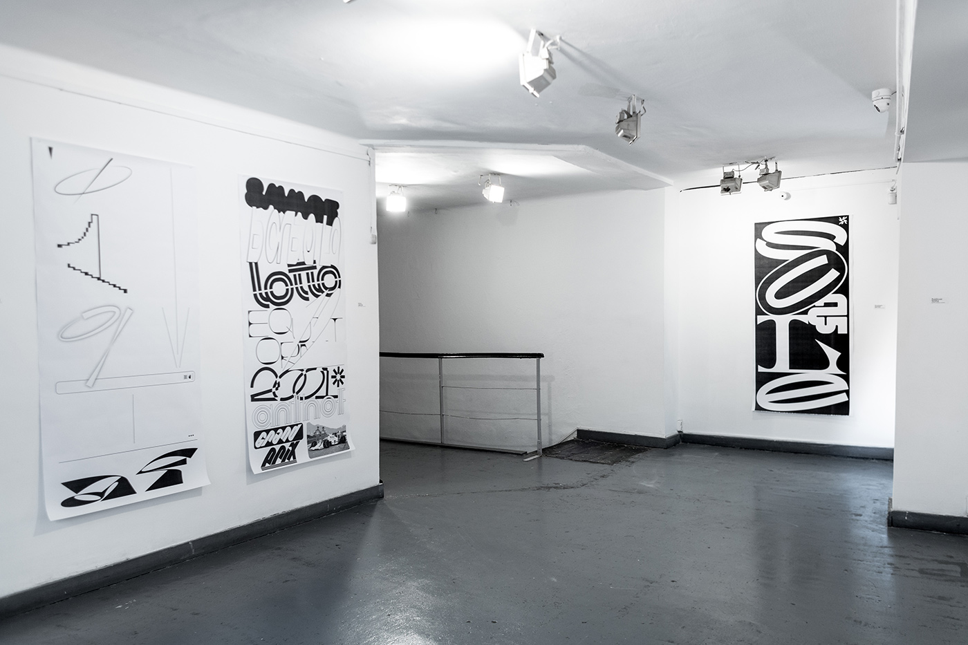
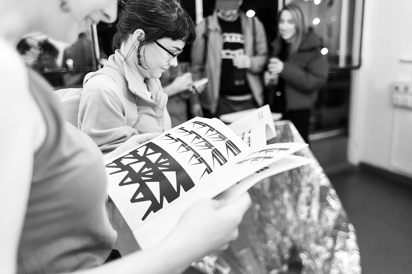
Since finishing his studies in graphic design at MOME in Budapest where he met all of the other designers involved in this project, János has begun to work on more type-related projects, pursuing his passion from his early childhood. “As a kid I used to redraw the titles of my favorite tv shows such as Dragon Ball Z and Superman, later I did the same with band logos”, he reflects, “So I don’t have an exact memory when it all started. I just love the idea of letters, these abstract shapes that bear so much information, complexity and symbolism. Apart from that, I’m a huge fan of languages in general, expressing complex thoughts via texts. I also publish poetry in literature journals, which has a lot to do with my fascination for type design, I think.” Immersing himself in experimentation and eclecticism, the János has tried the ways of working that best suit him. This playful design approach seems to be at the core of his practice and person. “I always want to see something I’ve never seen before, because I get bored with things I have already done. It’s quite challenging. I love that here in Budapest, you can always find something unexpected. I use to take different routes to get home and there’s always something new at some corner. Also the city has no consequent visual identity, so it’s really eclectic.”
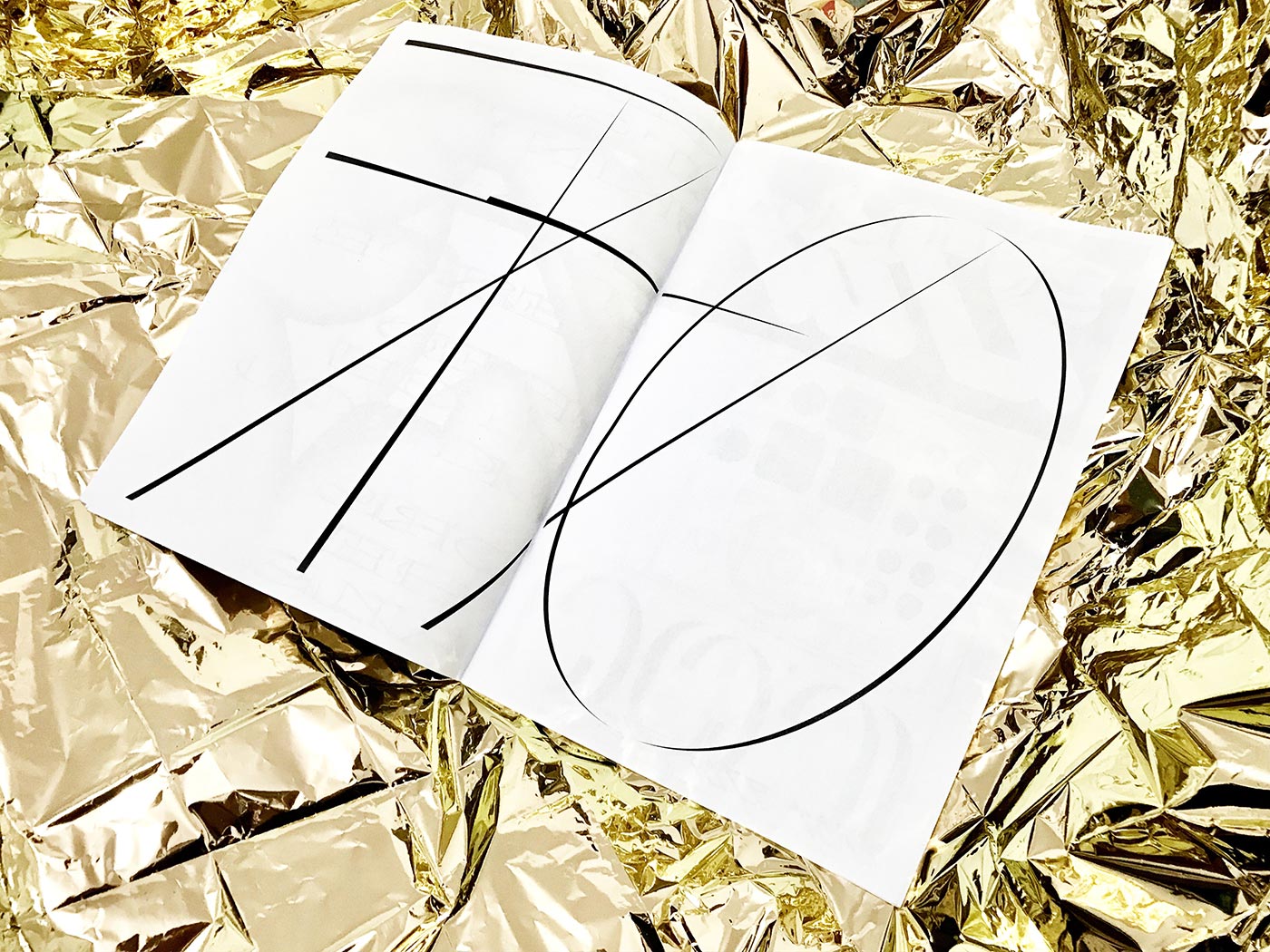
In the future, János hopes to build upon the concept of the project by founding a platform that collects and distributes experimental typefaces. “One goal is to get some publicity for Hungarian designers. There are so many talented people here but Hungarian language can be a really huge gap for them”, János explains, “Luckily letters themselves have no clear language, they can be adapted to several languages.”

