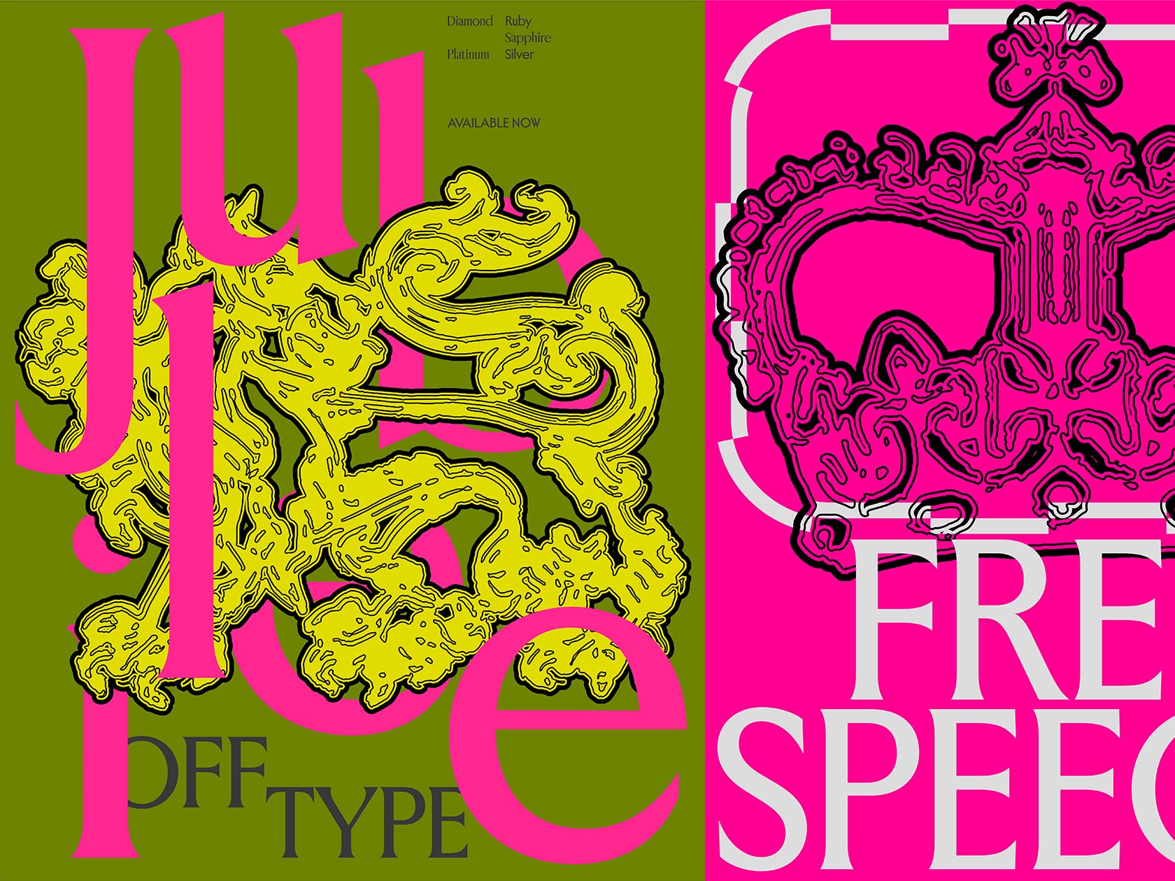
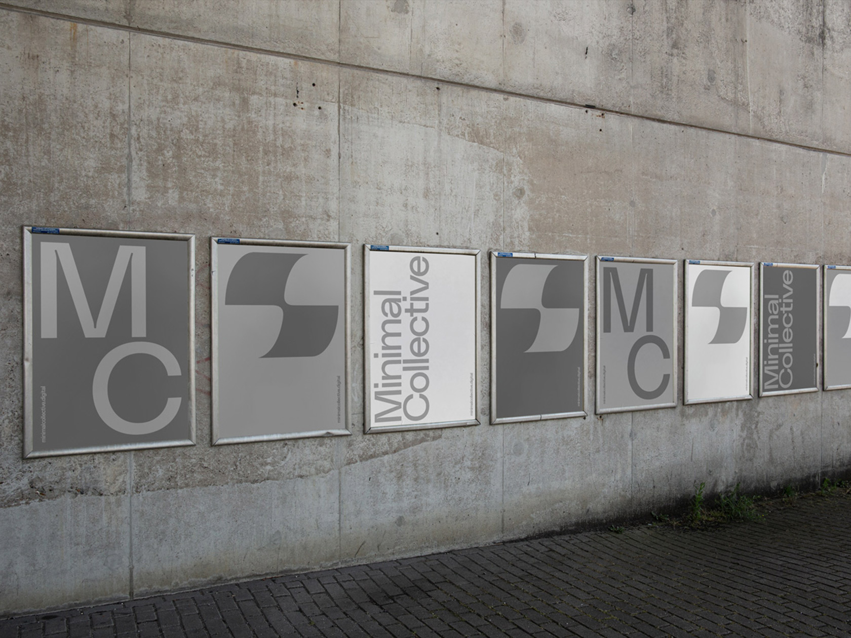
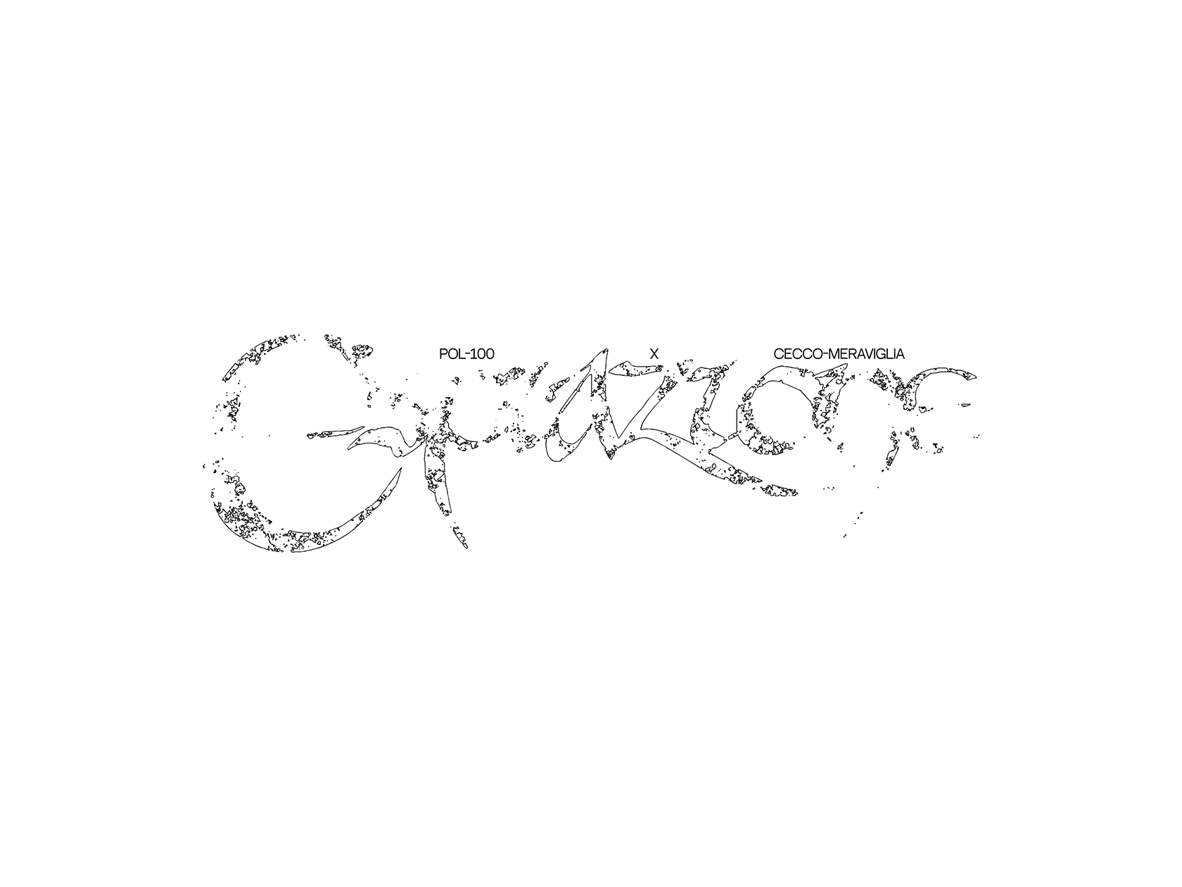
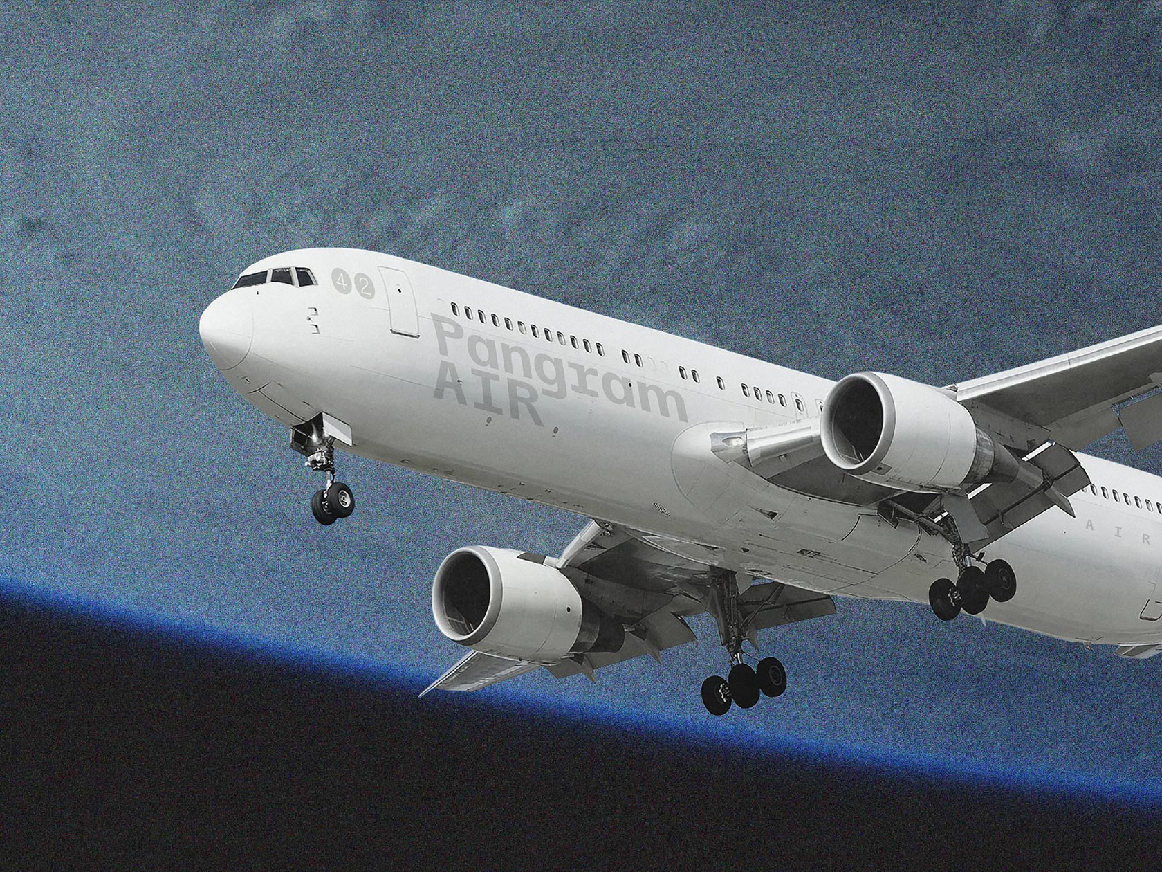
“Typography is an important part in design. I believe both are inseparable, functional aspect needs graphic aspect and vice versa”, explains Floriane Rousselot, founder and curator of the TypeLab.fr – a platform for young type designers and a digital space dedicated to the experimentation with typography. Even if the project has just launched about a year ago, it is already well known amongst graphic designers and type lovers. With a strong focus on display fonts and ornamental types, the platform pushes the boundaries of readability and challenges conventional typographic rules.
The founder of the platform, Floriane Rousselot, is a french graphic designer with a strong specialization in type design. Being based in Aix-en-Provence in the South of France, the graphic designer already took her degree in art direction and graphic design. “I would say my style is always an hybrid between different influences, usually very contrasted and resulting from graphic mistakes.I am trying to find a balance between experimentation and legibility – I try to find where the boundaries are and play with them.” During a workshop hosted by Colophon foundries at her university, her interest in type design started to grow. “The project was to create a typeface which could represent an institution, a place, a building in the city. My team and I decided to focus on churches, so analyze every church in town, every typeface we could find there and create a hybrid,” Floriane explains the origin of her lasting fascination, “At this point I realized how a typeface can represent an idea, an influence, an emotion or a culture. Since now I am interested in how typography is a strong visual aspect and what I can transmit through it.” She started specializing more and more in this subject – and soon after the idea for typelab.fr was born.
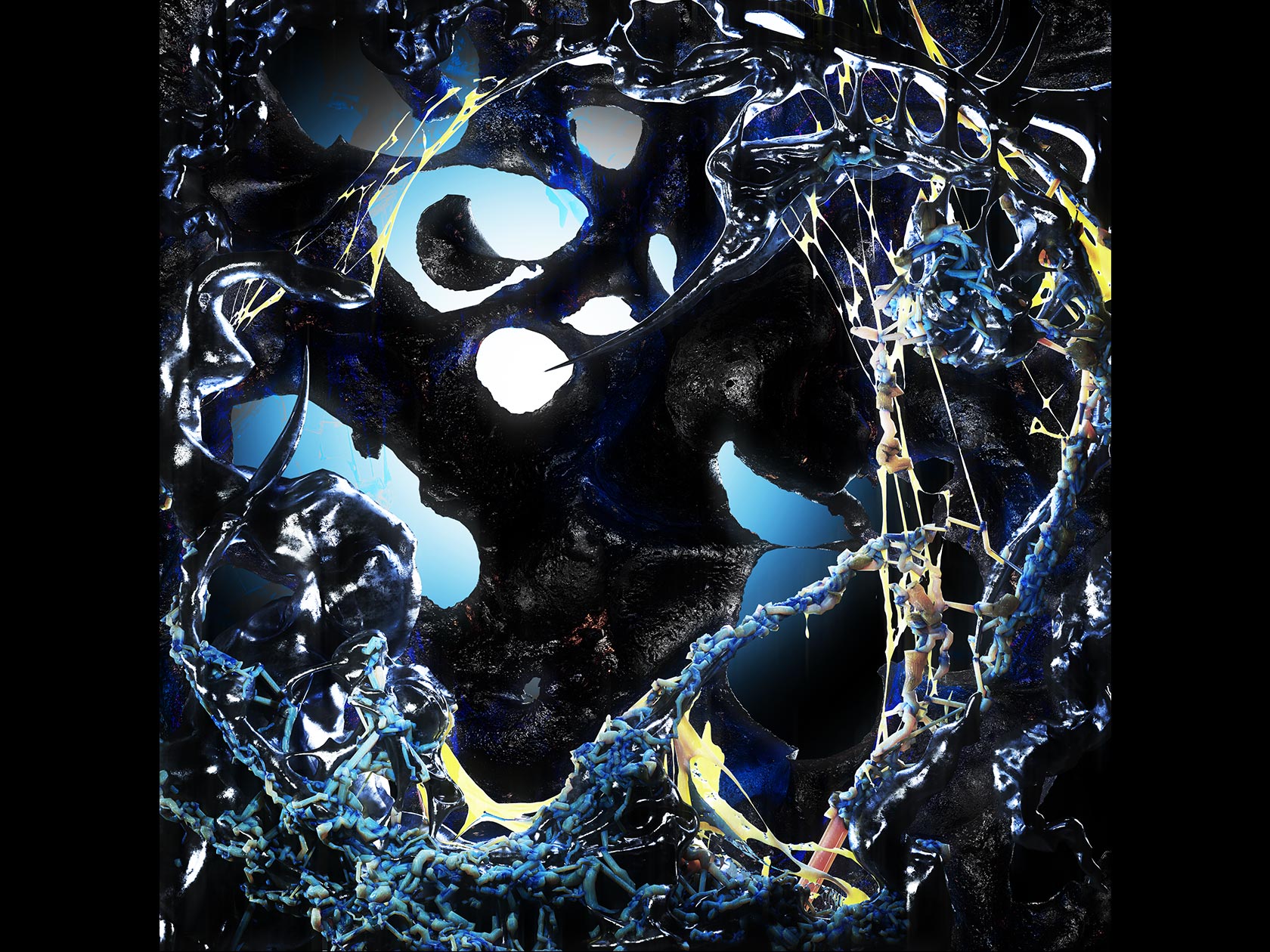
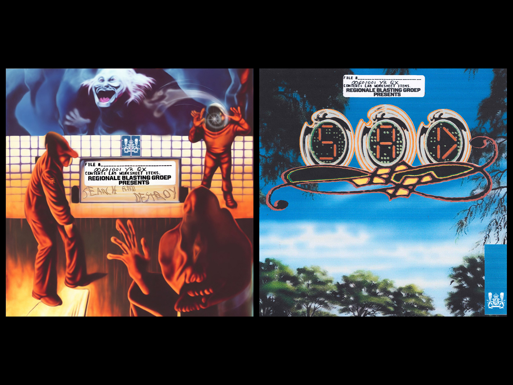
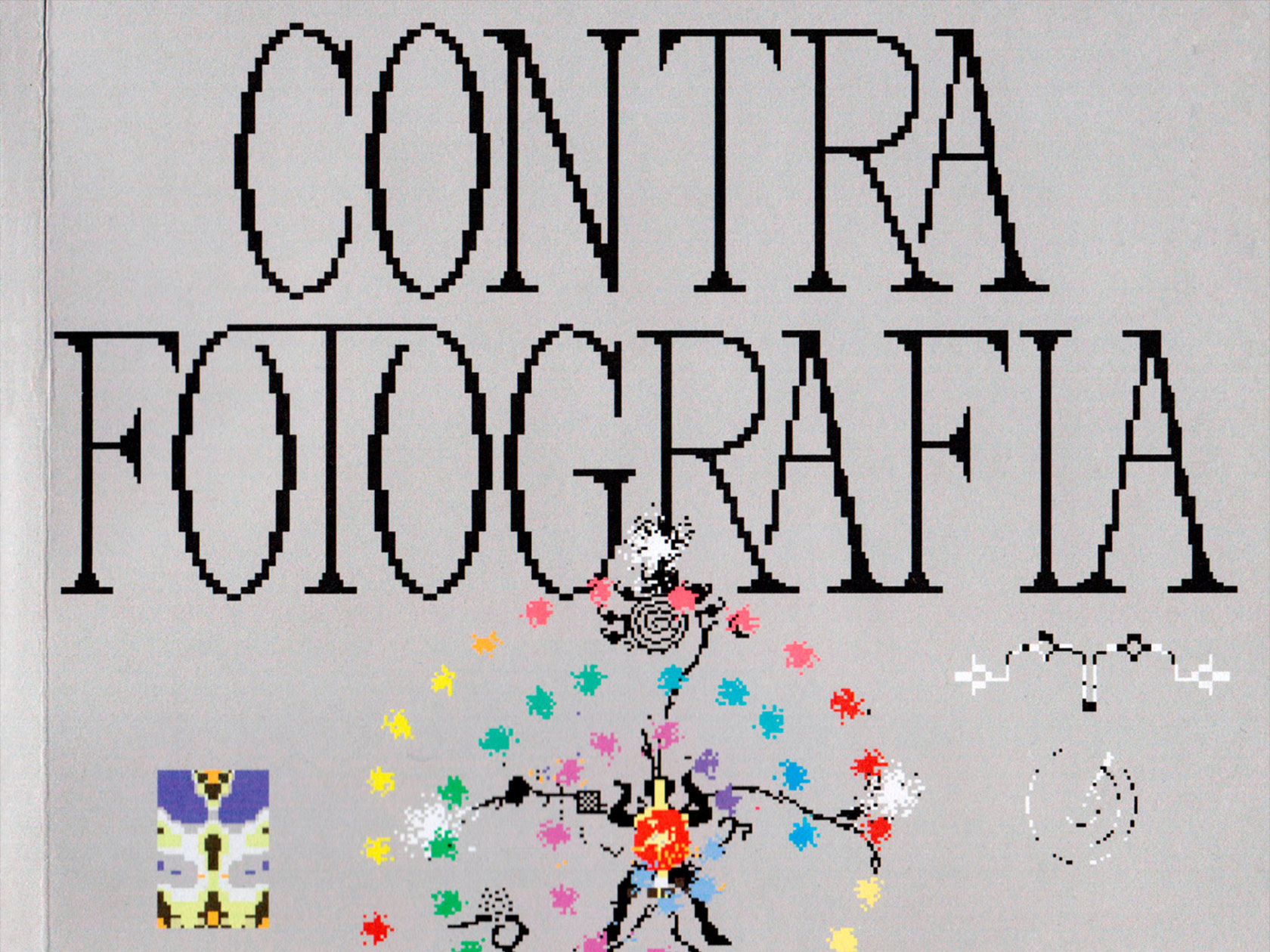
“The idea merged one year ago as a part of my diploma project. Some friends and I wanted to communicate on our type design projects, but it was mostly WIP display fonts, and they couldn’t fit with Foundries’s catalogues”, Floriane tells. “That’s why I decided to create a digital platform which could help firstly my friends and then young designers to showcase their fonts, communicate on their practice. The basic but difficult goal is to help young designers to be highlighted, help them find clients and/or collaborators. Help them acquire more visibility.” What was meant to be a showcase for the work of her friends, soon turned into be a bigger platform now featuring about 30 different typefaces from 24 young type designers including “Tundra” by Ciaran Birch (2018), “Zorn” by Laura Csocsan (2019) and “RED” by Frédéric Jaman and Vrints Kolsteren (2018).
The typefaces are subdivided into four different collections: the WWW Collection, the Gadji Collection, the Future Collection and the Territory Collection. “Mainly I am trying to find the good match between some typefaces I chosen. I try to keep the display and experimental aspect in every collection. But the selection is always subjective, what’s shining to my eyes!”, Floriane explains the concept behind the unusual titles of the collections. While Territory incorporates the idea of bringing type designers from all over the world together and therefore creating one digital territory, Future is more about the visuality of the typefaces in said collection. The typefaces “Bogoni” by Colin Doerffler, “Sword” by Kazuhiro Aihara and “Kraft” by Jacob Wise all had something in common: their expressive and futuristic looks. The name of the third collection, Gadji, was inspired by a french slang word from Marseille, meaning “girl” or “woman”. Therefore the collection concentrates solely on the work of female designers and highlights the relevance and importance of women in the field of type design. The fourth and last collection, “WWW”, incorporates the spirit of the world wide web as a positive medium that connects designers from all over the world and also symbolizes the internationality of the platform.
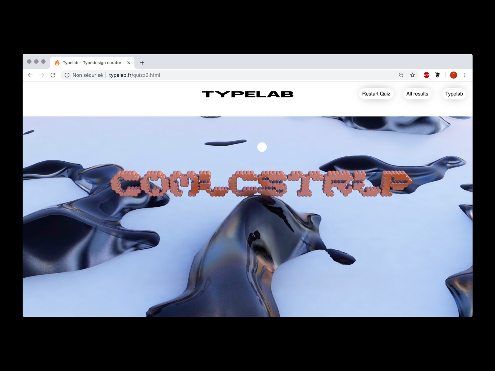
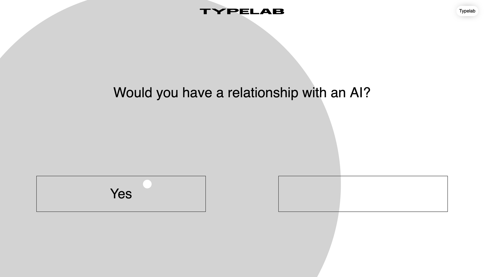
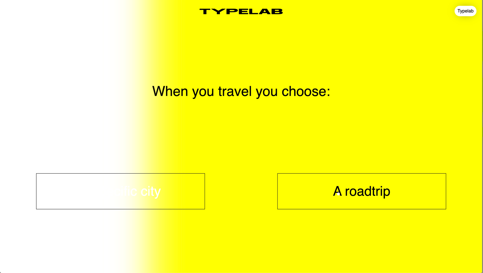
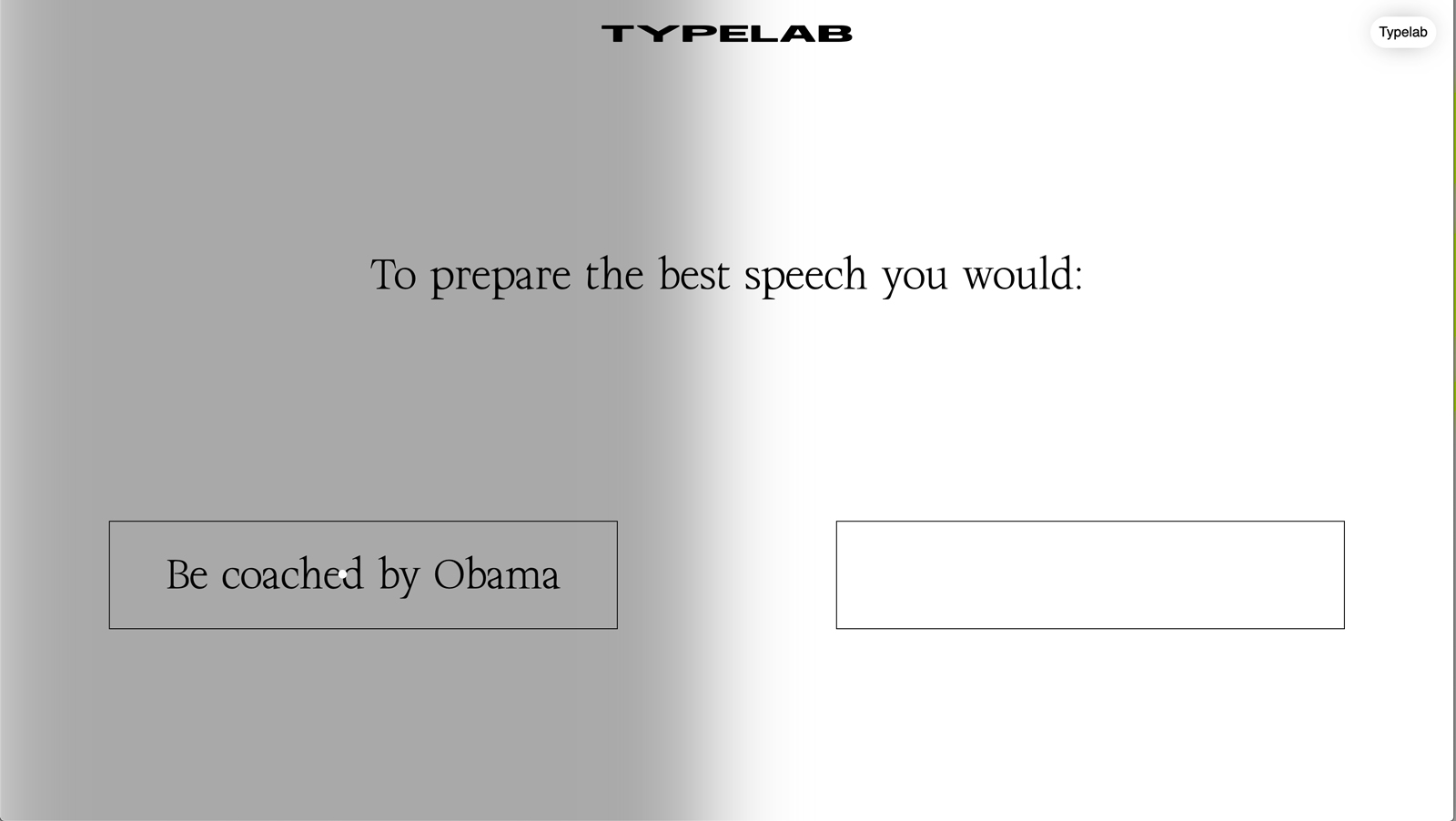
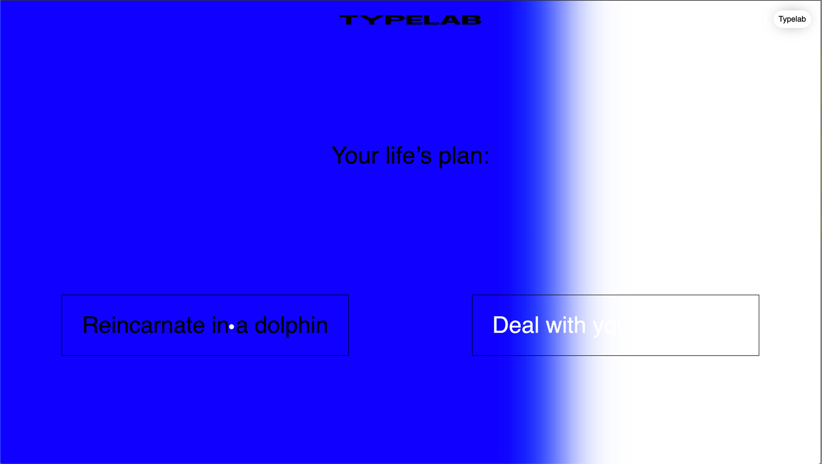
But not only the typefaces have an expressive and futuristic visuality, the design of the platform is pretty impressive itself. After Vanille and Julien, the two founders of the french web agency Twistudio, already supported Floriane during her diploma project, they also decided to support her in designing the platform. “We’ve talked about 2 or 3 different designs, but I wanted something very efficient, brutalist, refined in order to highlight typefaces. This is exactly the vision of Twistudio, we quickly agreed on the visual direction and final aspect”, Floriane tells us about the collaboration with Vanille and Julien. “So it has been really Fast&Furious. They are always following the evolution of the website with relevant advices and surprising ideas! It is an easy collaboration where we mutually know what we want and we share the same vision on this project.” Together they camp up with the idea of the WWW quiz, a fun gadget which can be found on the website. The quiz is based on the first personality test created by Carl Gustav Jung, using three different criteria: Extraversion – Introversion, Sensing – Intuition, Thinking – Feeling. Asking you fifteen personal questions, the end result of the quiz matches you with one of the typefaces of the showcase which personality is meant to fit yours.
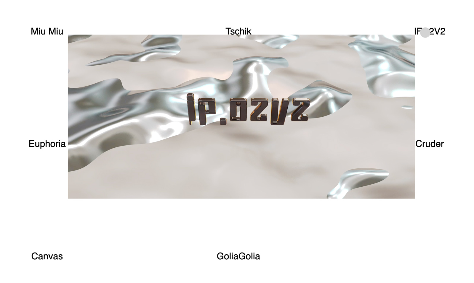
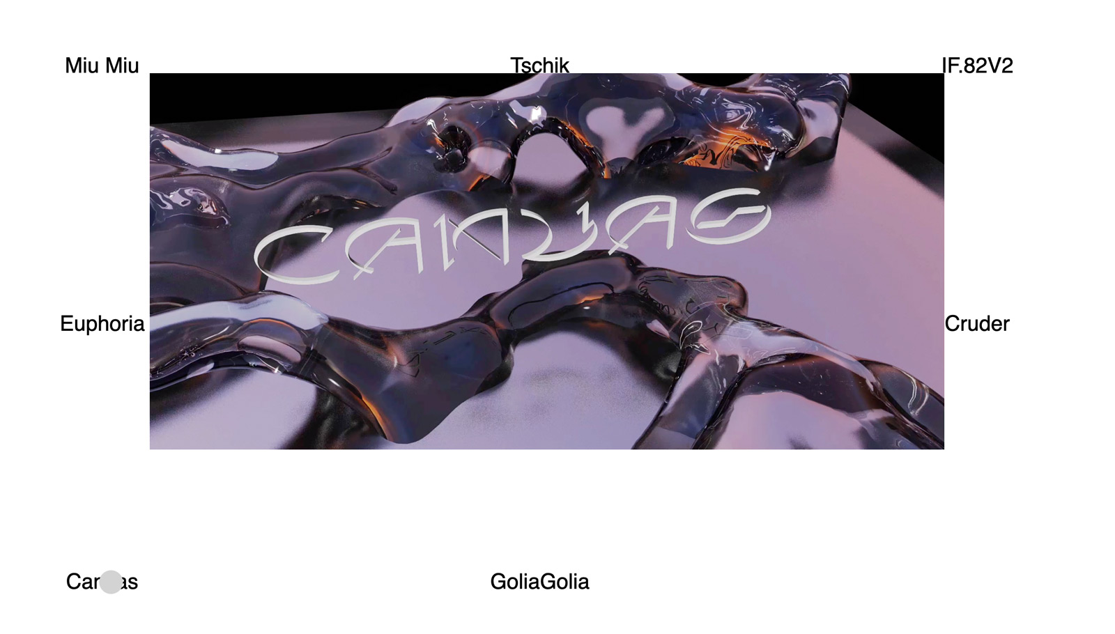
“I mainly find typefaces and type designers on instagram. I am choosing typefaces which grab my attention, this is always subjective but always focusing on experimentation or hybridization. Typeface which are based on interesting and surprising shapes or concept”, Florian tells us about curating the platform. Bringing young designers together and creating some sort of community is of great importance to her. “I am often in contact with some of designers featured on Typelab, to get some news, and I am sure some of them are in contact as well!” Connecting with other designers and collaborating on mutual projects, is “the most interesting part of our design practice. Sharing and learning from each other seems to be the best way to evolve so I hope it’s gonna continue. This is the moment you are faced with new ideas, new approaches you are not always familiar with. So you need to deal with it but at the same time it helps to bring surprising ideas, create new combination of visual tools, bounced on aspects you might not think about by your own. The moment you are experimenting and you are outside of your comfort zone is when you are able to create new things. Collaboration is this moment, so go for it!”


