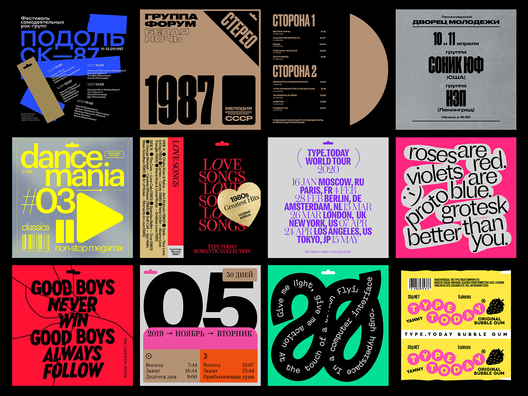
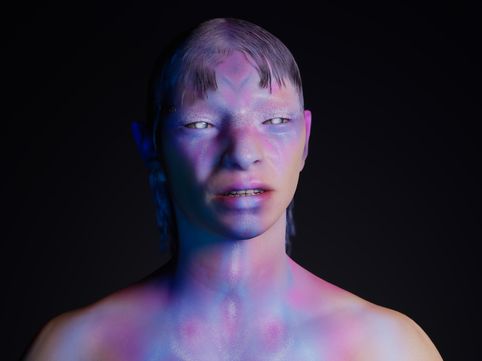
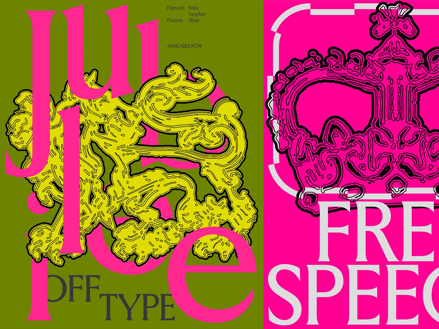
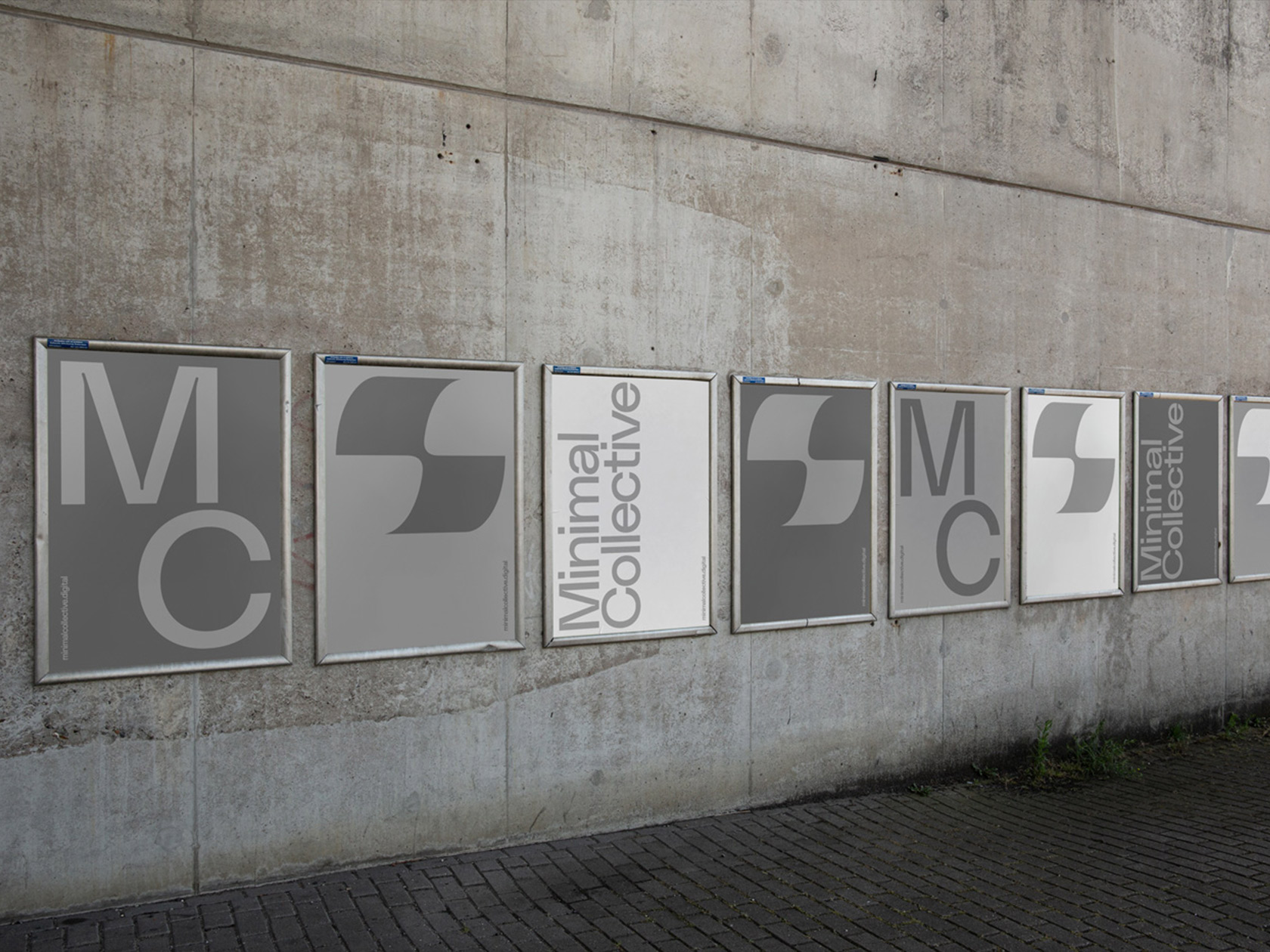
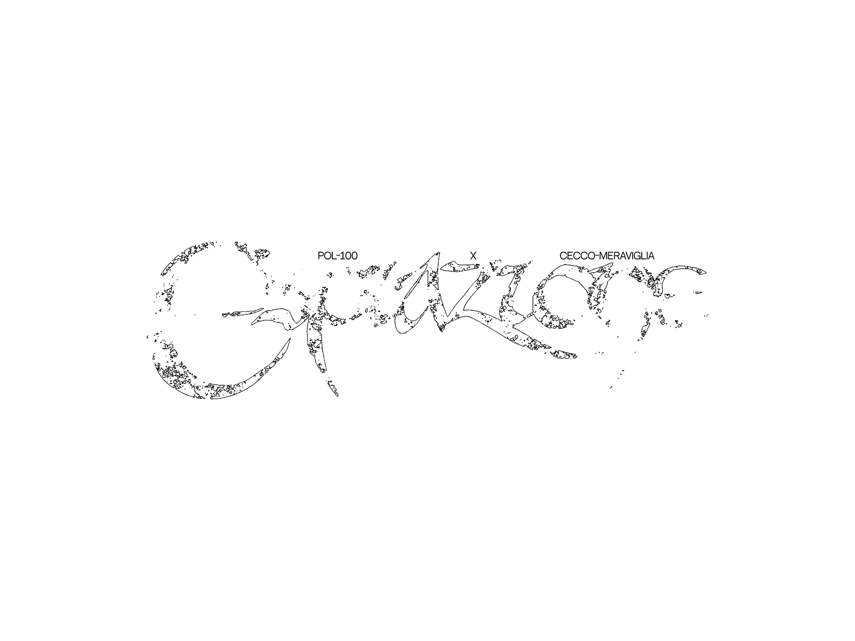
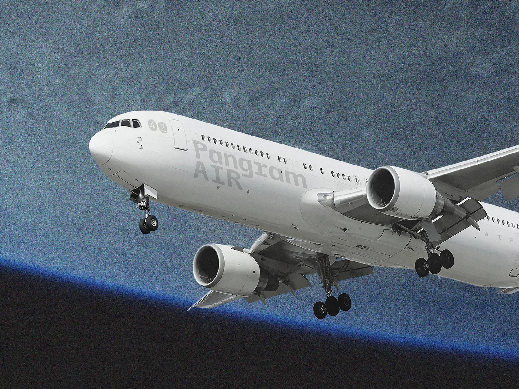
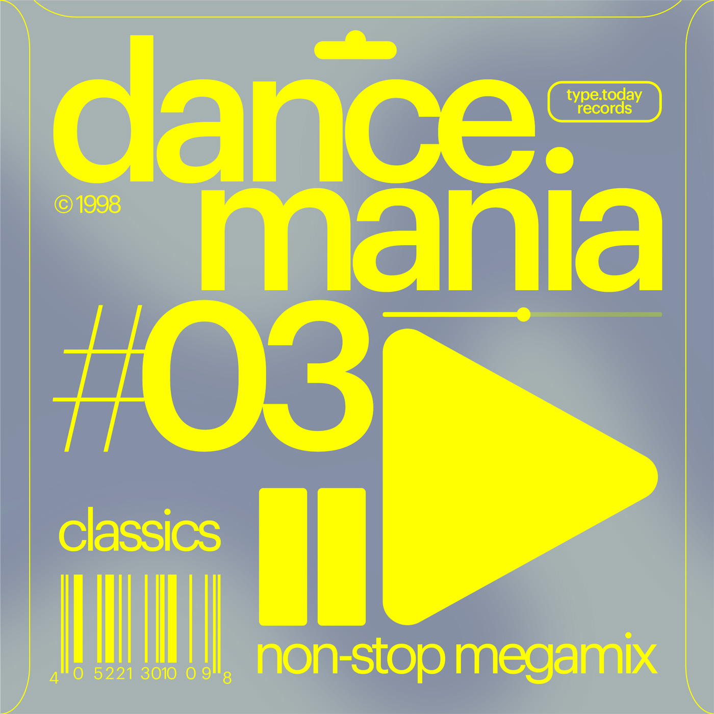
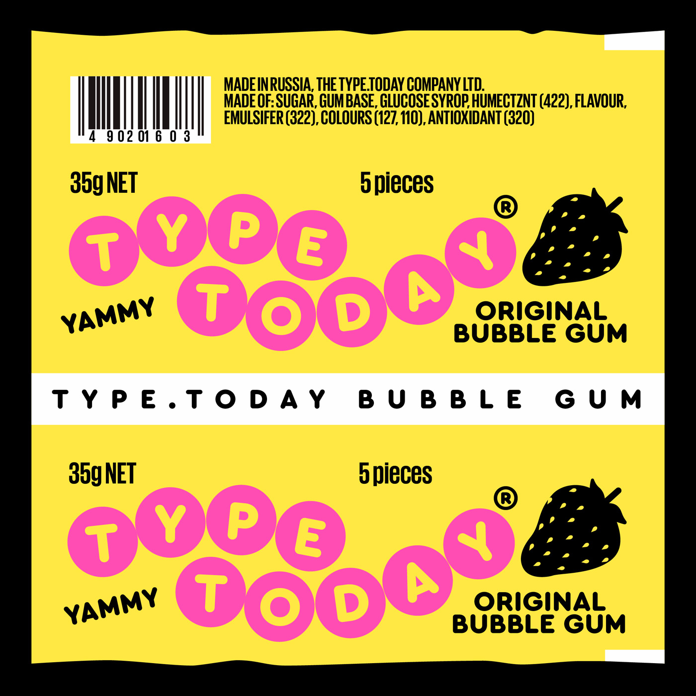
If a fontshop offers you to experiment with their collection of typefaces for free, you usually don’t decline. Each month, type.today invite different graphic designers to take over their instagram account, filling it with artworks and designs they created with their typefaces. When Karina Yazylyan heard about this kind of concept, she took the initiative and got in contact with them. “I saw that some of my friends have already worked with type.today, so I just texted them and they invited me to be part of it. They provided me with their fonts and the whole month, I could do and create whatever I wanted”, the Moscow based graphic designer tells Collide24, “I think their system is beneficial for both sides involved, because they get different content for their instagram each month and the designer gets to promote himself and his work.” At the end of the month, Karina has created twenty-four individual artworks, inspired by 80s and 90s music, album covers, labels, door signs and packages.
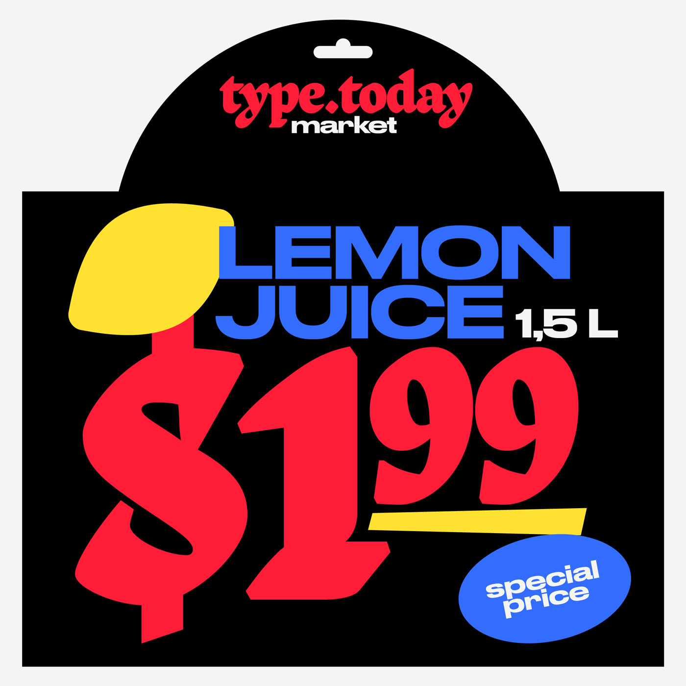
With so many typefaces at hand, Karina was clearly spoilt for choice. “It was quite difficult, because I became obsessed with fonts like Druk or Austin and I wanted to do everything only with them, but the main condition was to show as many fonts from the collection as possible, especially to use Cyrillic fonts. Even if I had creative freedom and could express myself as a designer, it was quite a hard challenge at the same time“, she concludes. Apart from the request to use more of the Cyrillic typefaces and to give an overview over the whole collection, type.today gave free rein to Karina’s imagination. After getting familiar with the characteristics of the various typefaces, Karina began by playing around with some artboards and setting up her instagram guidelines.

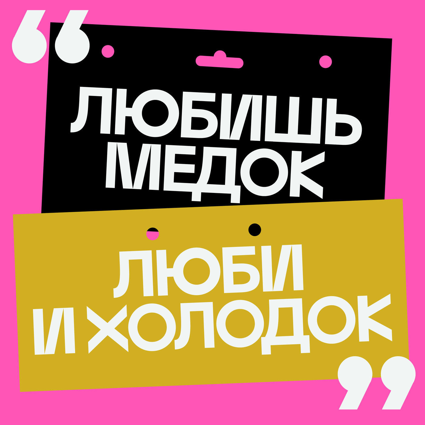
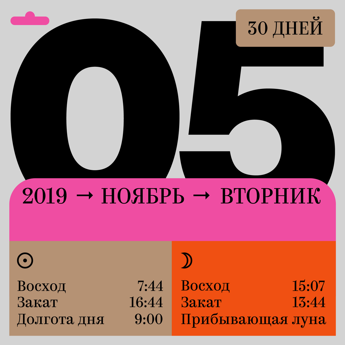
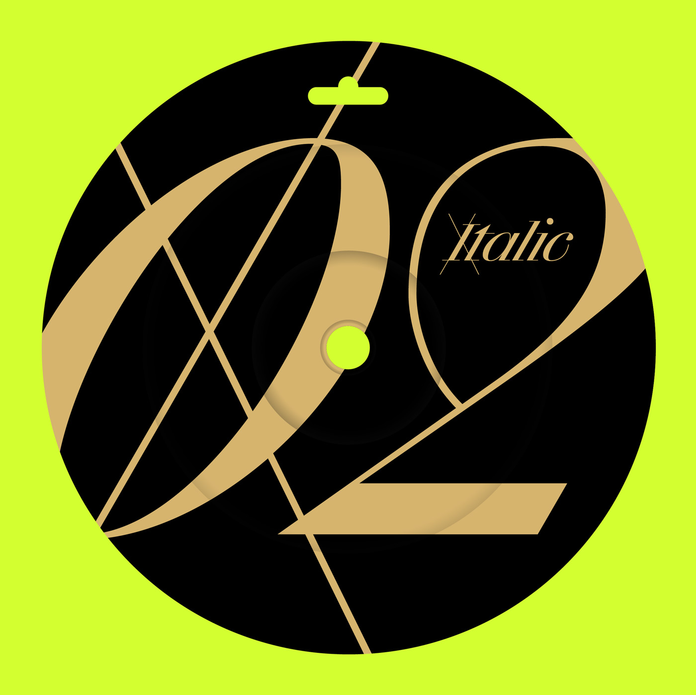
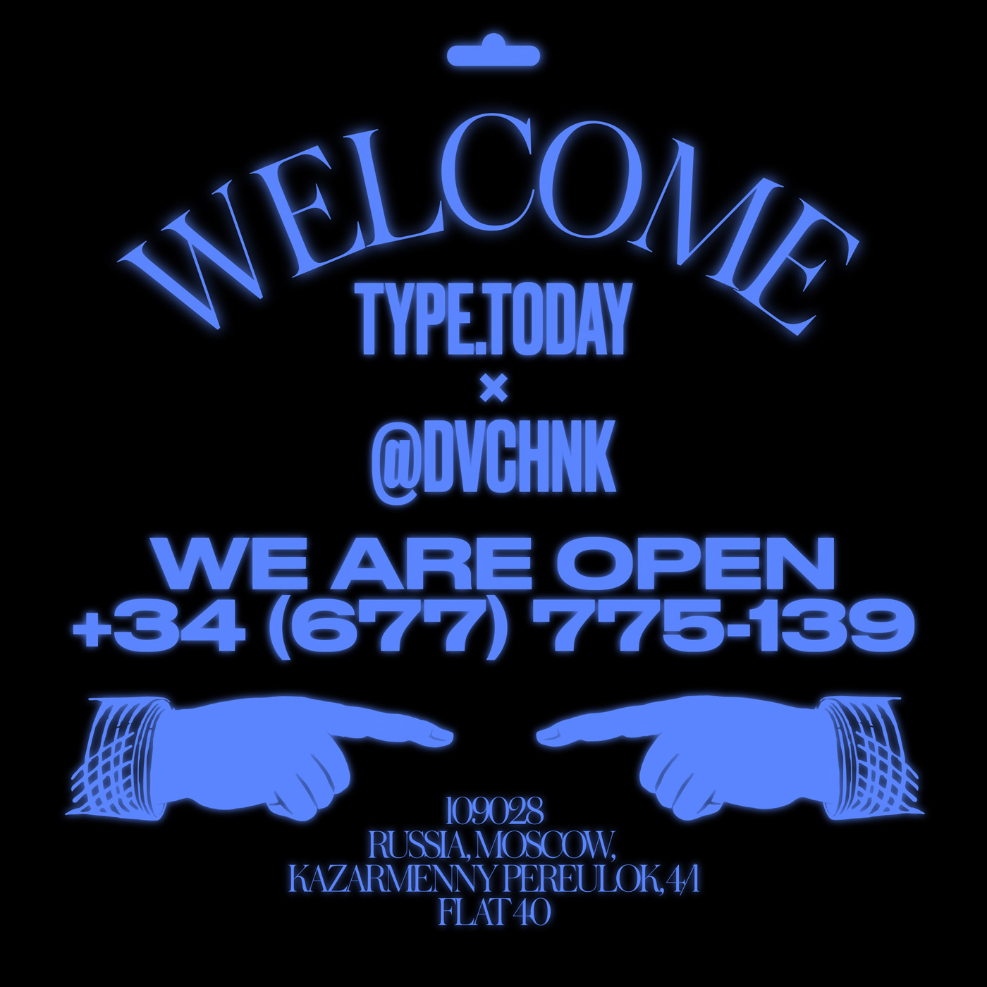
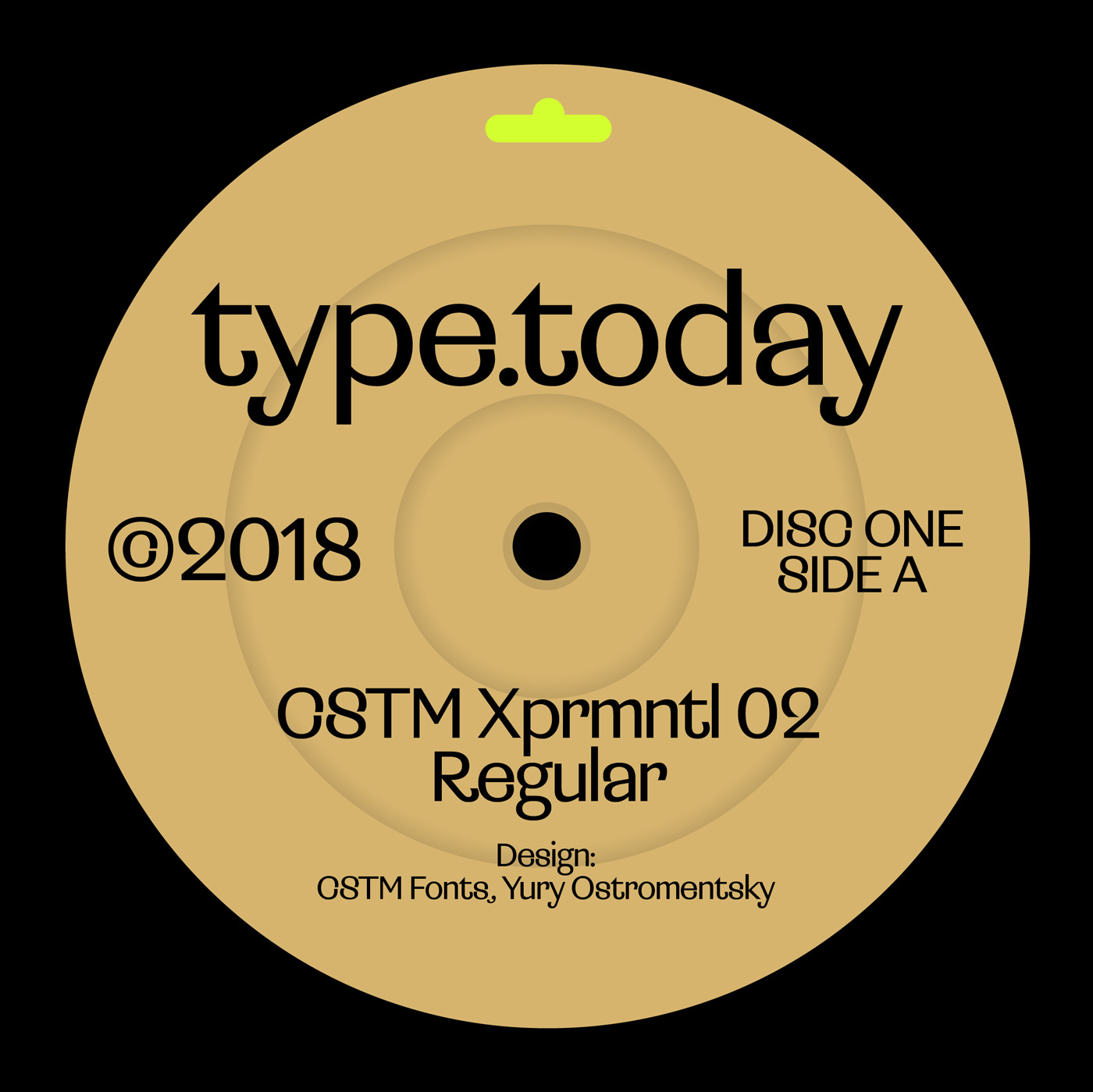
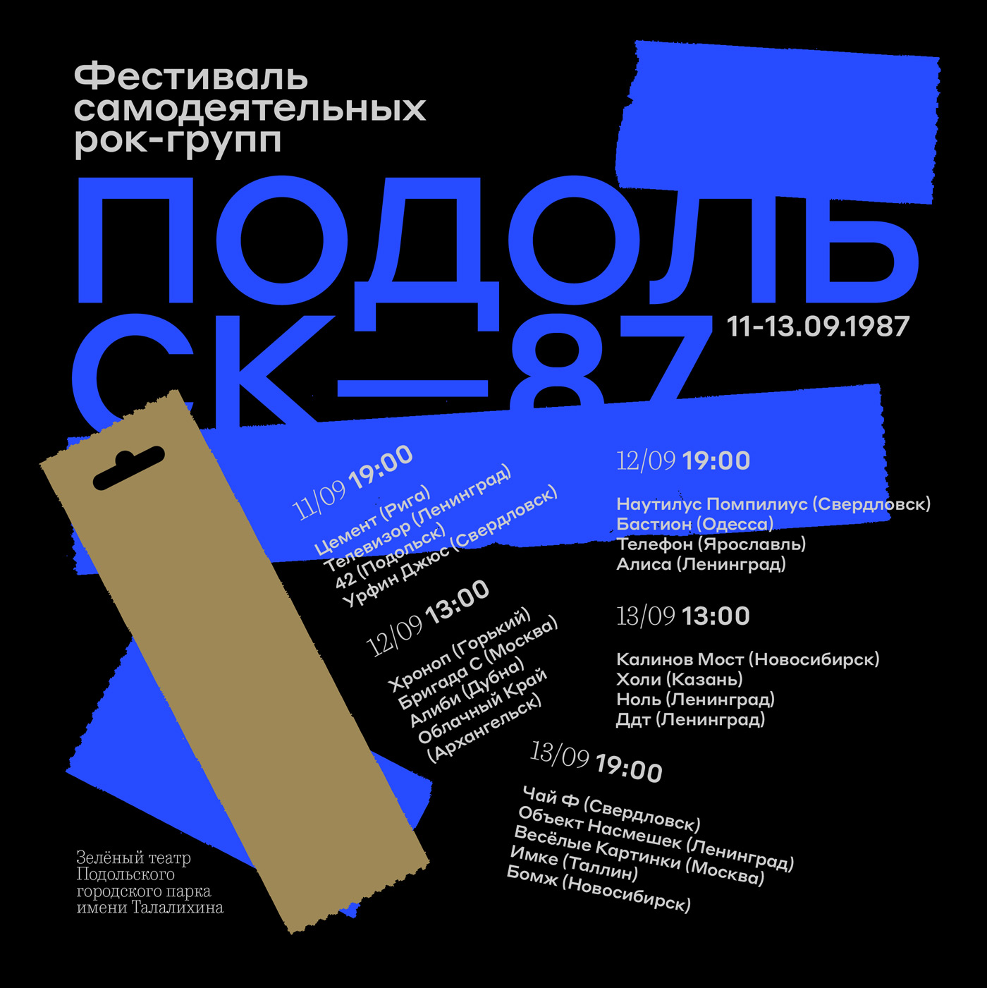
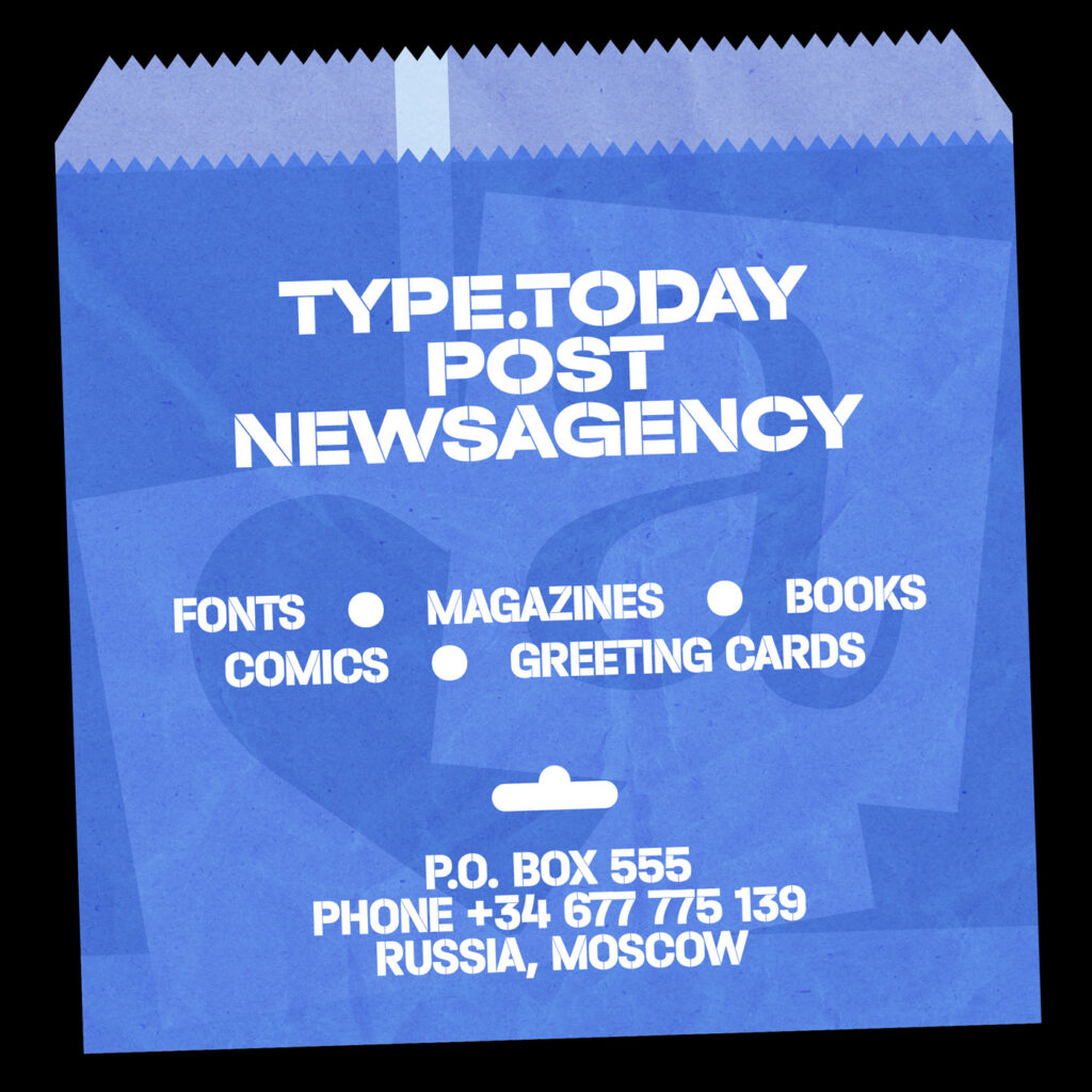
Although it has been quite a challenge for her to stay consistent and deliver some content everyday, the twenty-four artworks definitely impress with their variability. Even if you clearly recognize Karina’s personal style and her practiced eye for typographic details, she still managed to create something new each time without distancing it from her existing work. With their bright and strong colors, energetic and sometimes illustrative shapes, Karina’s artworks seem to be full of dynamic energy, almost begging to be animated.
Apart from her full-time job at the digital design studio ONY, Karina puts a lot of effort into her self-initiated projects. “It is important to me to push my graphic design style forward, so such collaboration projects are the good way to practice and make something for yourself”, she explains. “As working full-time takes a lot of my time and energy, I miss working on personal projects that I constantly made during my studies at university.”Before working in the industry, she first studied Multimedia Design at the Higher School of Economics Design Department. During her studies, she began working on more type-related projects, resulting in the release of her two typefaces, Plastic Love and New Order. “I became interested in typography about four to three years ago when I started researching the work of contemporary graphic designers. It was a time when a lot of crazy fonts and typographical works appeared on the internet”, she tells us, “Then David Rudnik was a great find for me. Inspired by works of other designers I started to learn and experiment with typography.”
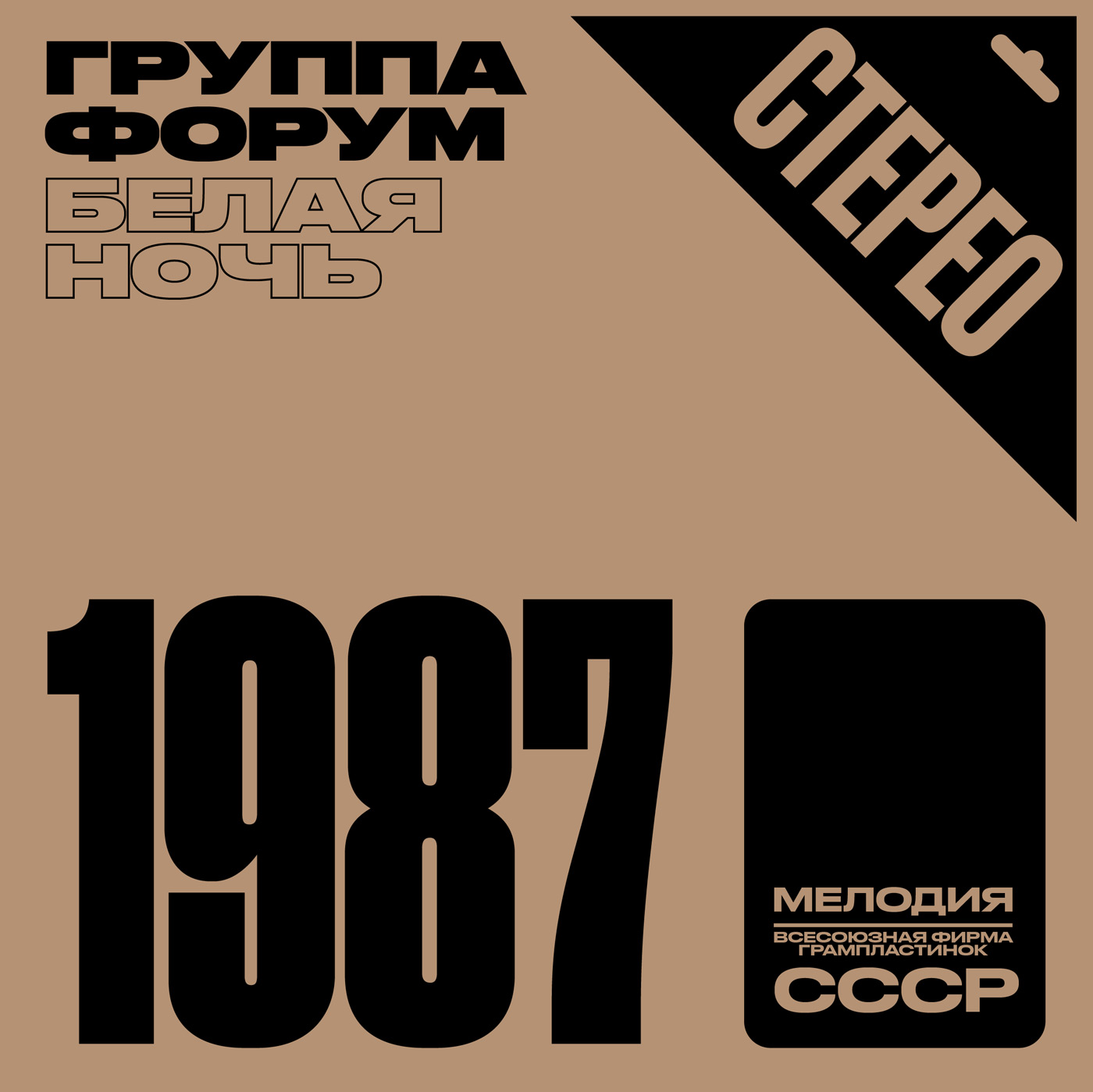
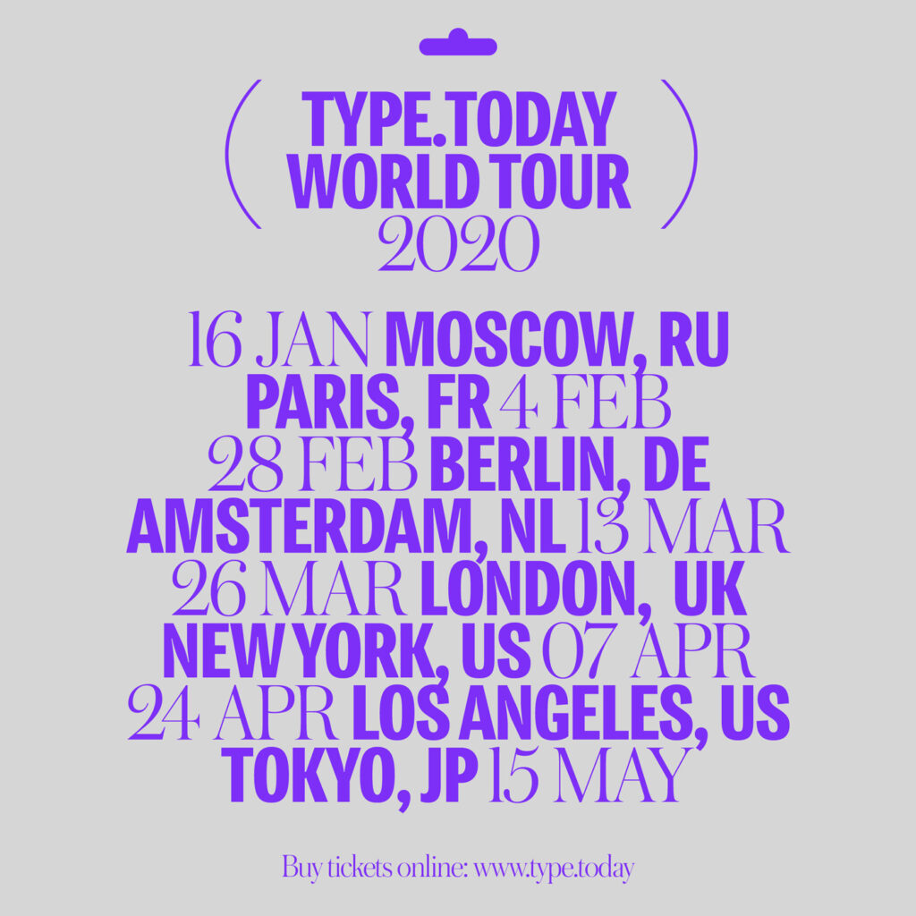

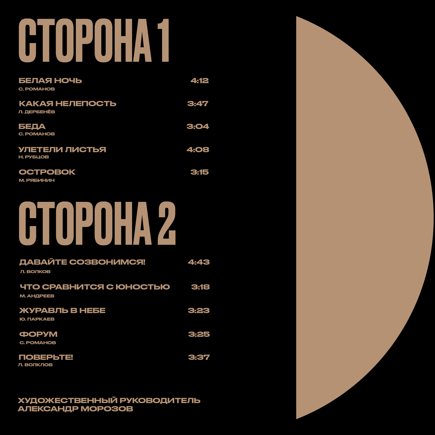
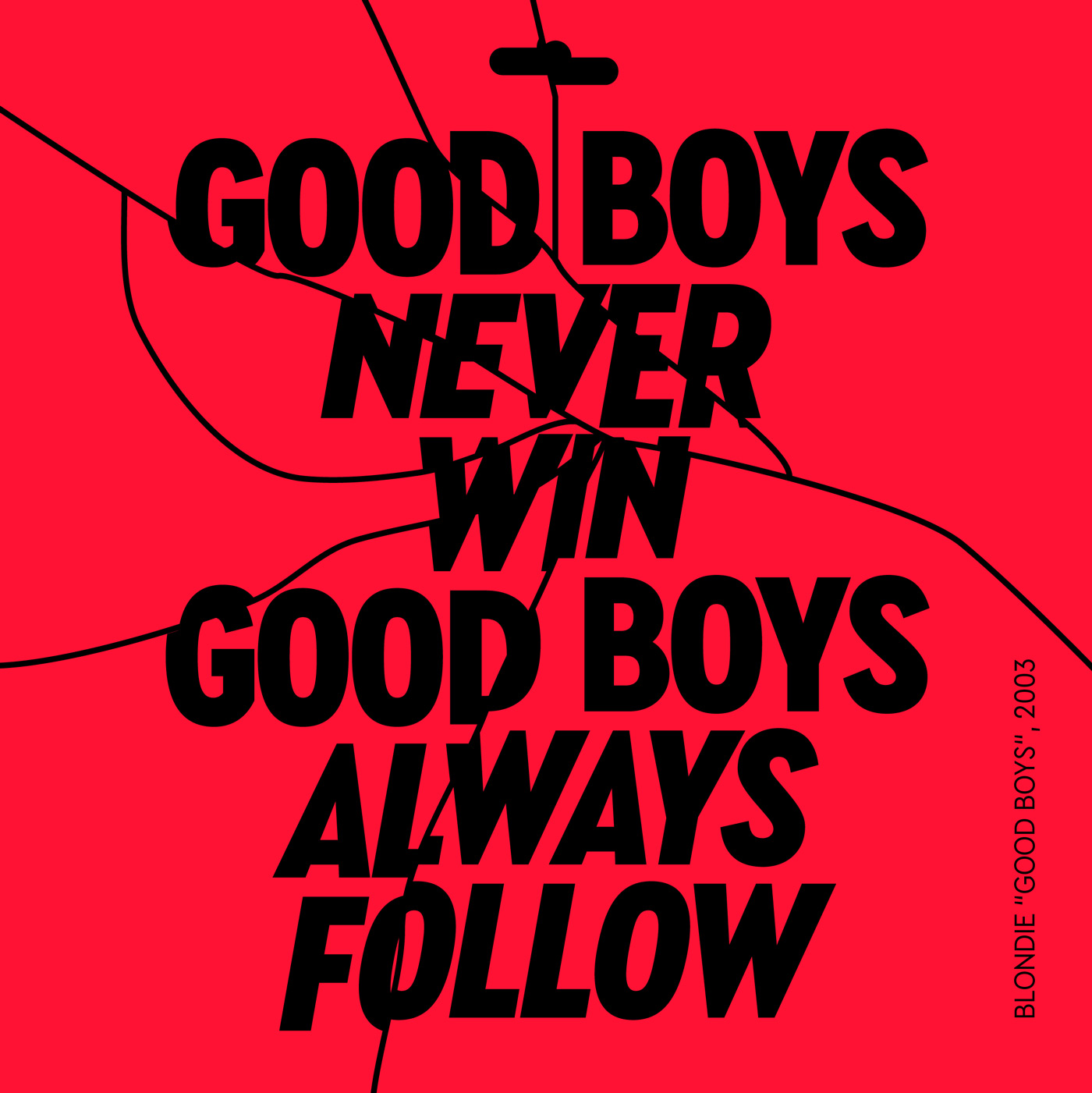
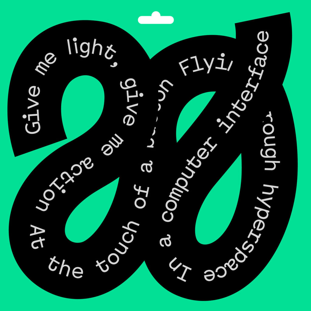
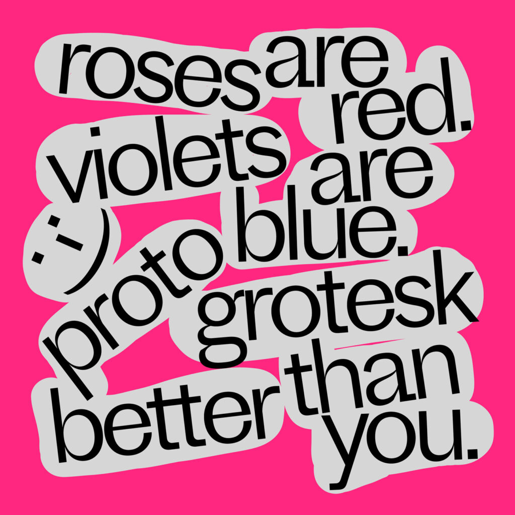
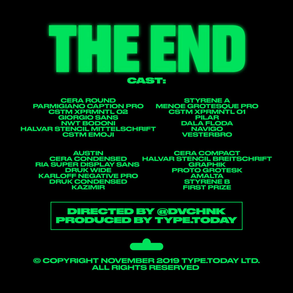
Drawing her inspiration from a lot of different sources, like movies, music and magazines, Karina has grown an interest for the aesthetics of different subcultures and the visual languages of different countries. “It is almost always the case that I turn to the past decades. I love digging the internet, searching for interesting and rare visual content, that I often use as a reference or inspiration in my work”, Karina explains. By drawing on these different resources, she constantly pushes her personal style forward, while still keeping an eye on the past. “Some people called it ‘underground’, sometimes ‘marginal design’, but I think it is just a contemporary graphic design style with some retro vibes.”
Looking into the future, Karina emphasizes the growing importance of typography in the design world, stating that “there are a lot of design works and identities that based on typography only. The role of typography will remain, only the mode will change.”
Karina Yazylyan
Instagram
COLLABORATIONS TO LOOK AT:
Plate Collaboration by Half & Half and Anna Kulachek

