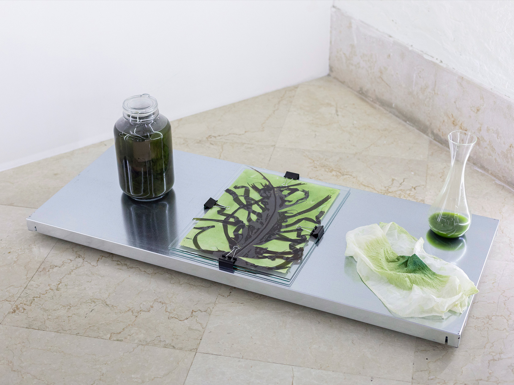
Around 50 years ago, in 1972, the exhibition “Italy: The New Domestic Landscape” was on display at MoMA in New York. It became one of the pivotal moments in the international success of Italian design, bringing together the most radical examples of modern Italian design with Italy’s political context and complex history.
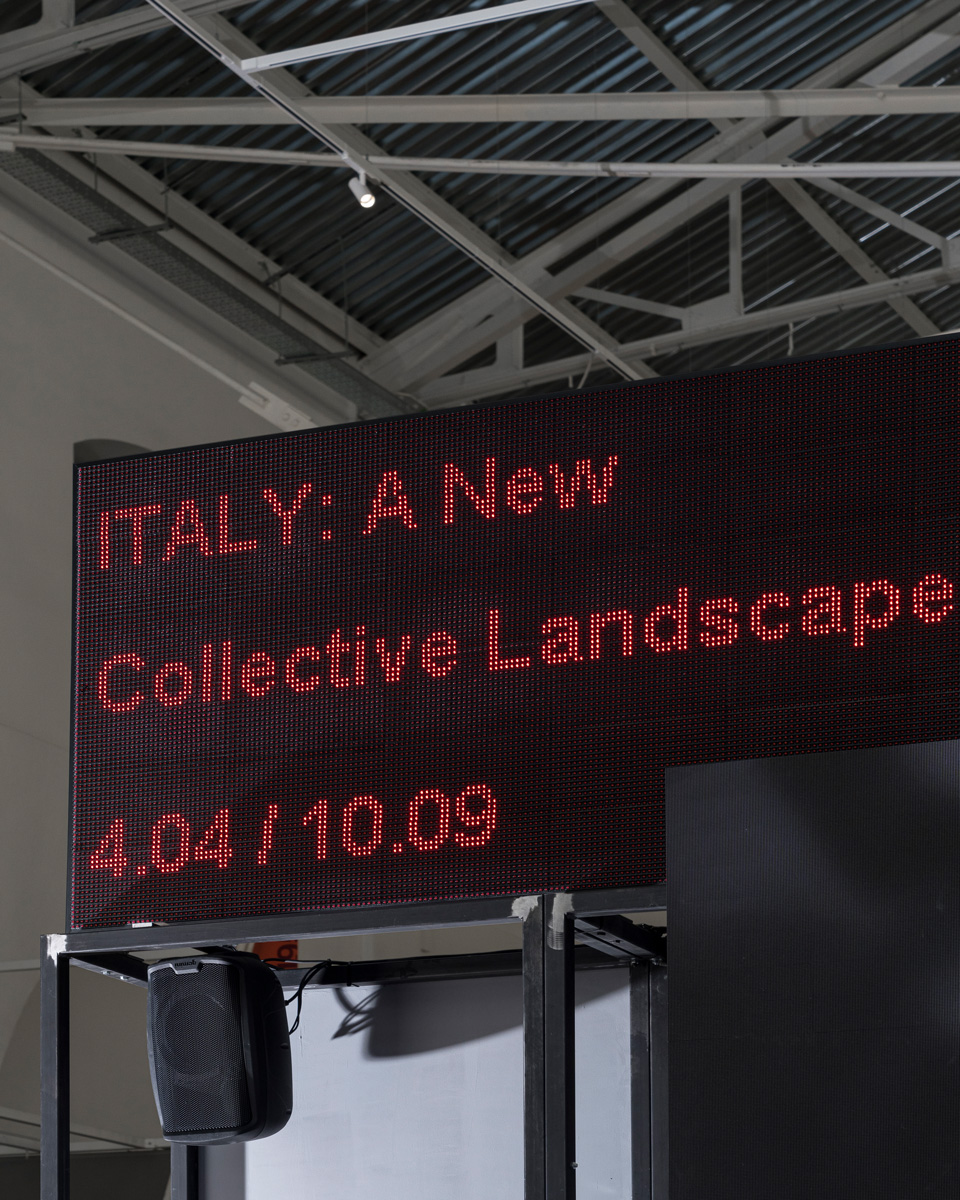
Produced by the Milan-based ADI Design Museum in response to this famous event, the exhibition “ITALY: A New Collective Landscape” invited a group of Italian designers under the age of 35 to reflect on the current global situation and its continuous ecological and social transformations. Curated by Angela Rui with Elisabetta Donati de Conti and Matilde Losi, the exhibition offers a platform to the younger generations by spanning a wide variety of approaches to the discipline. It investigates the languages of contemporary design, its role, and that of its leading characters. In addition to the exhibition that will be on display until September 10, 2023, the public program consists of workshops, readings, screenings, and participatory sessions. The design of the exhibition and its accompanying catalog was created by the designers Paola Bombelli and Alice Zani.
“During the years, I always found it difficult to bond and work with female designers, as there is such little space for us in this industry. When trying to rise, we always find ourselves needing to adapt to a strong, still male-dominated environment. At least, that’s what I have encountered so far in Milan,” Alice tells C24. At the start of her career, Alice went onto work for several studios, such as La Colonia Studio and Studio Vedét, before going freelance. Predominantly working for clients from the cultural sector, the graphic designer and art director gained a wealth of experience while honing her crafts over the years.
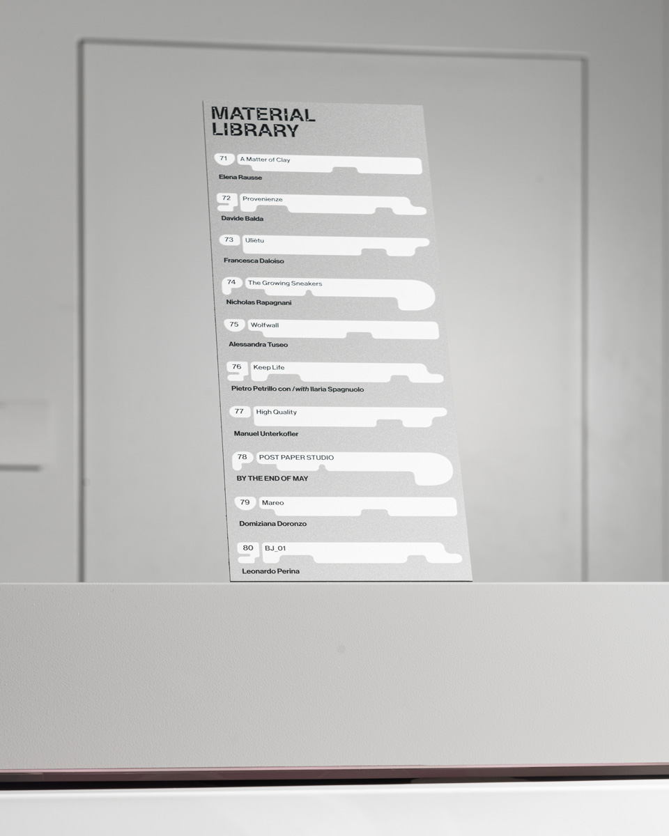
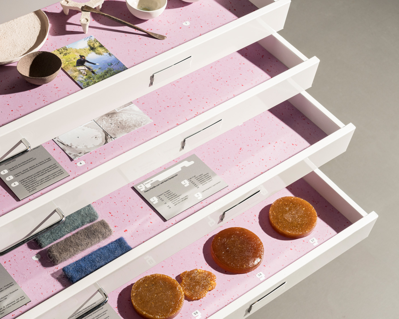
The designer explains that, when approached by Matilde Losi to take over the design of the exhibition, she wanted to collaborate with Paola, who she admired for her authentic work and achievements in the industry. “It is always nice to collaborate with someone that respects your taste and experience. It was fun for both of us to help each other with decision-making, to give feedback, and support each other every step of the way,” Paola reflects.
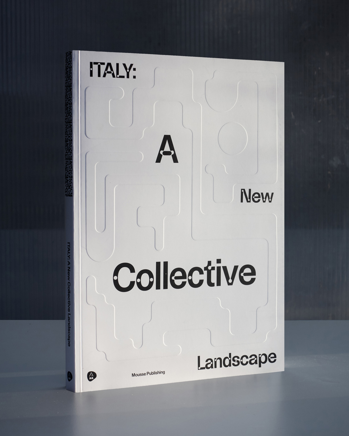

Besides teaching at the New Academy of Fine Arts in Milan, Paola has been busy co-founding a design studio while pursuing her freelance work. Since we last wrote about her book “12—12” in 2020, the designer has worked on a range of exciting projects, including several visual identities for art exhibitions, books, and catalogs.
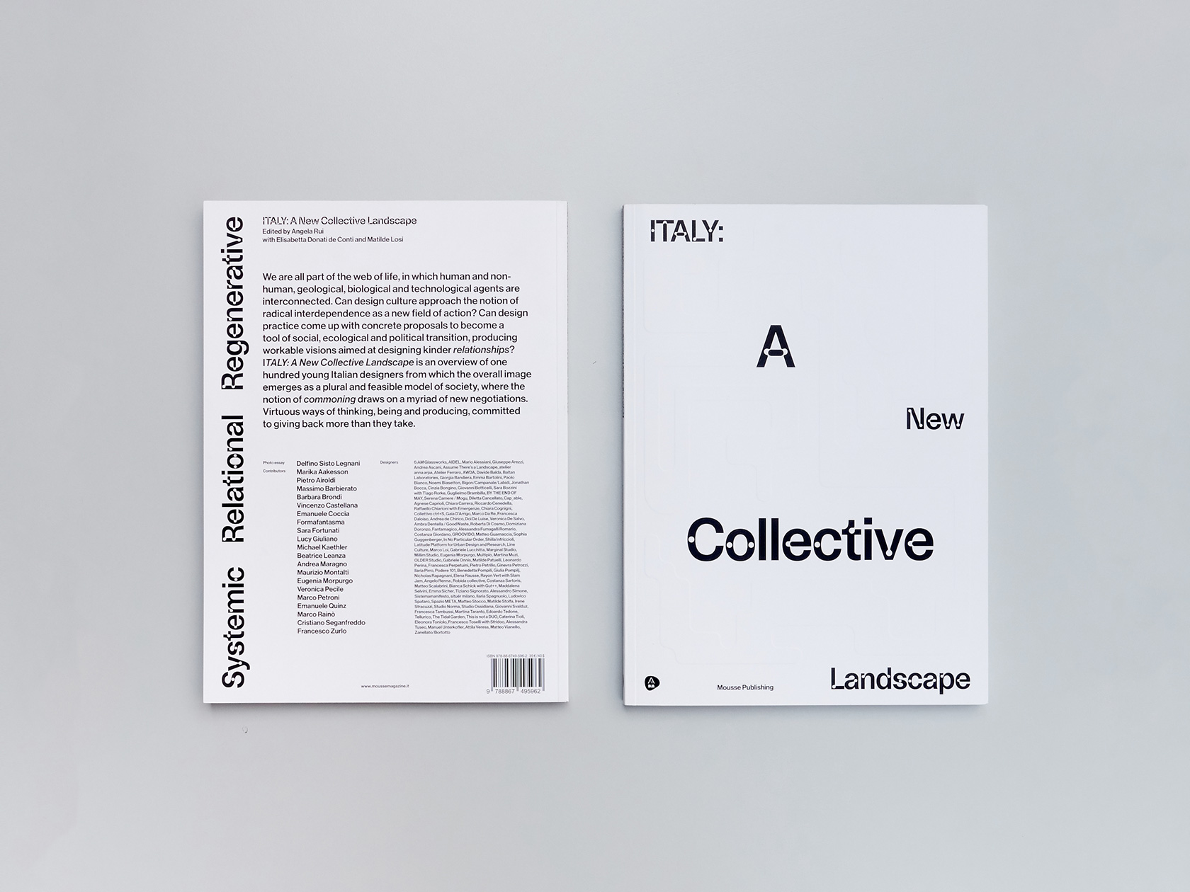
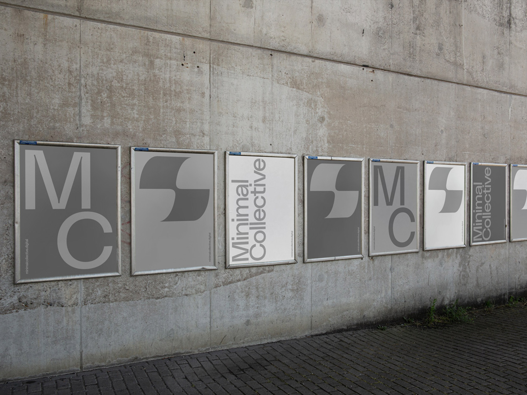
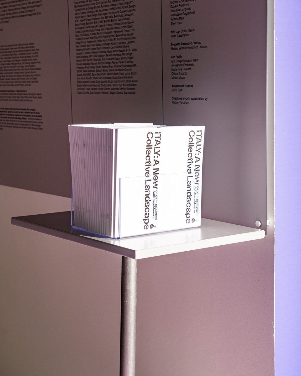
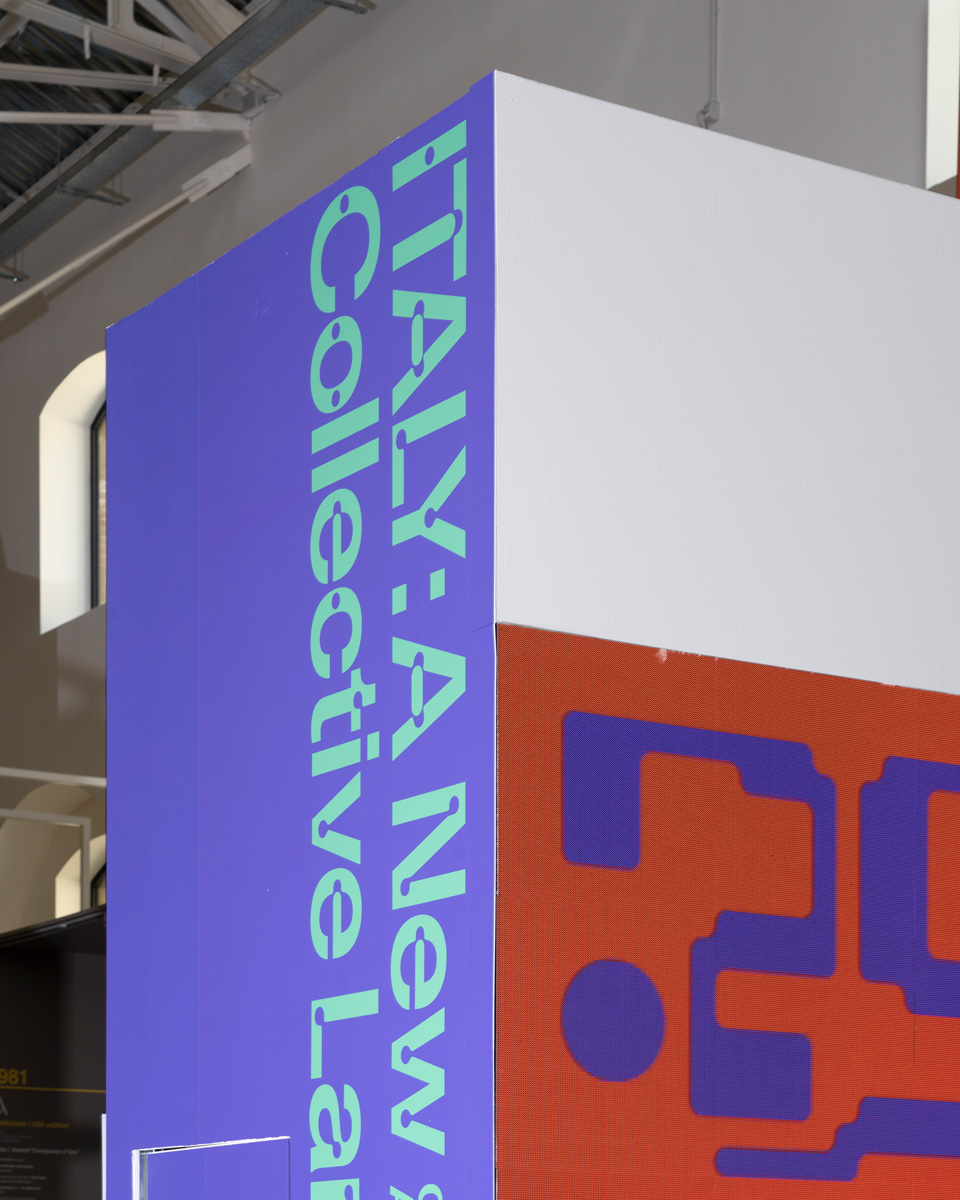
In the same way that the exhibition brings together different perspectives on design, its visual identity consists of a system of abstract shapes that can be repositioned and repeated to fit in a variety of formats and sizes. The typeface “Camera” by Dinamo is used across the visual identity. The reinterpretation of light traps adds an exciting twist to the grotesque. “It was a great choice because of its geometric elements and curves, which resemble our visuals,” Alice explains.
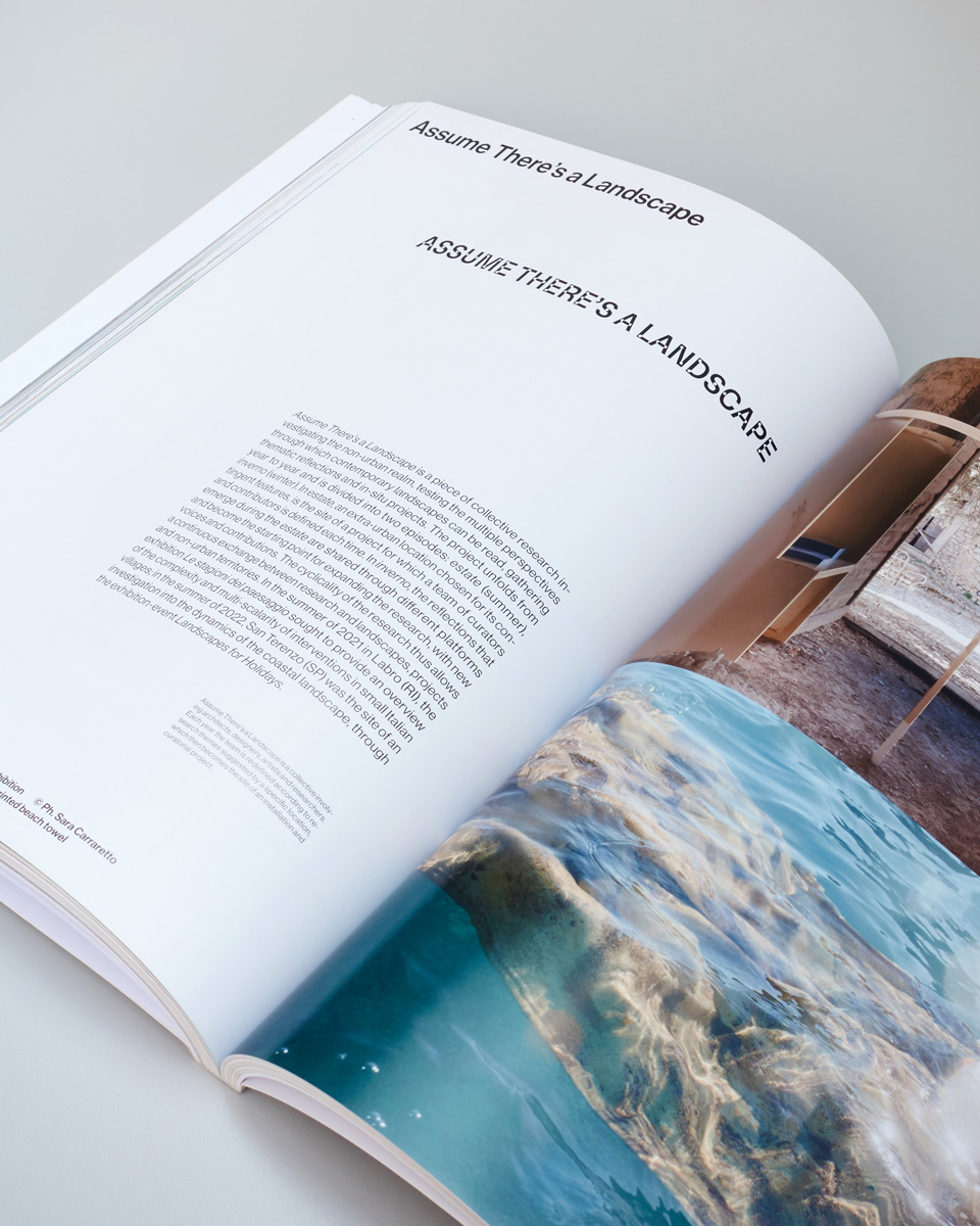
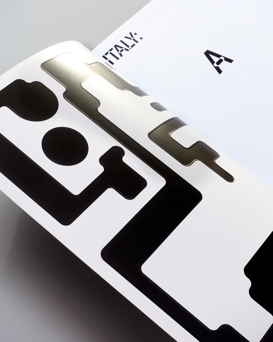
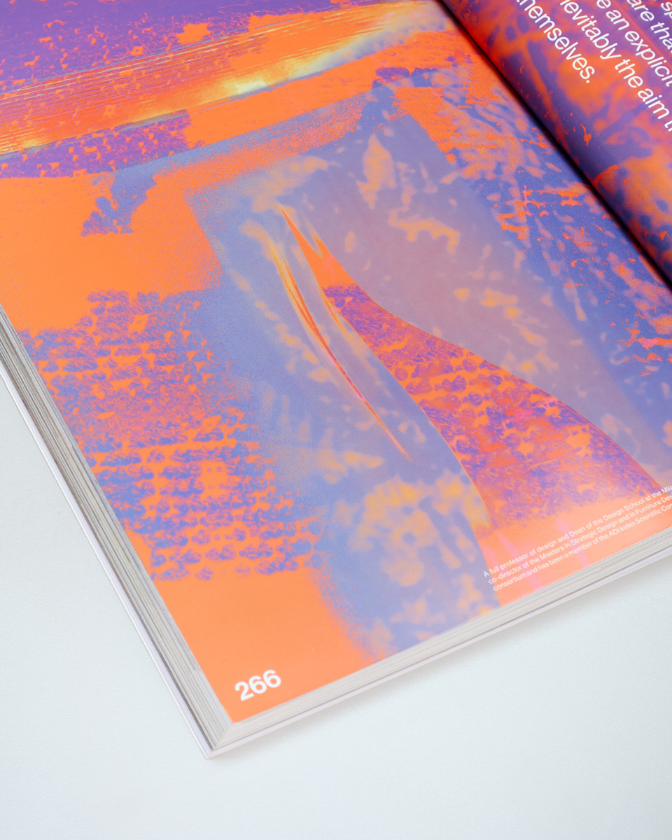
With an irresistible, embossed front cover, the large-format catalog features the works of the designers and collectives from the exhibition, as well as written and photographic contributions. The blind embossing on the cover plays with the interaction of light and shadow, only to reveal the printed shapes once turning the page. The two words “A Collective” from the long title are highlighted and point to the collaborative and social aspect of the exhibition and its attempt to redefine the role of design through its inclusive, traversable, and fluid approach.
COLLABORATIONS TO LOOK AT:
Media ISSUE 2
Hei Agenda

