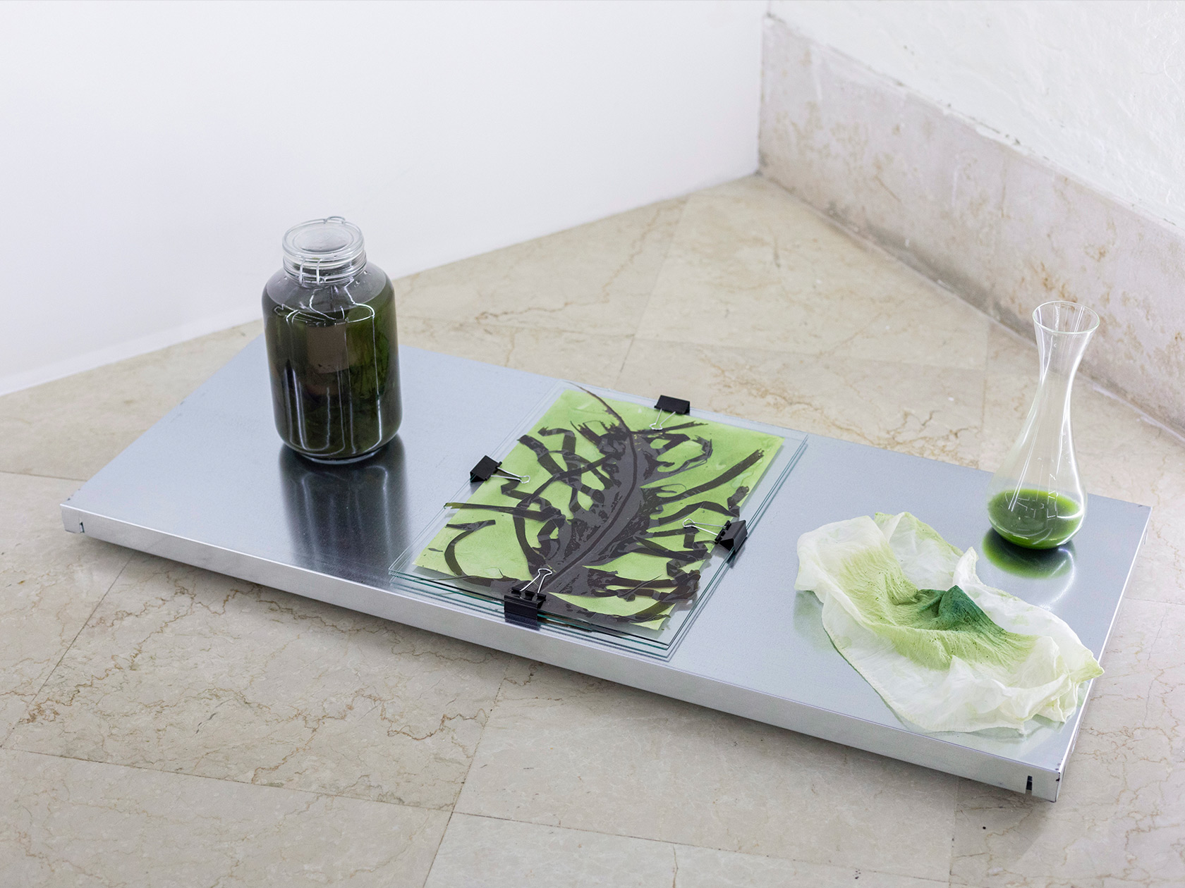
At Paris-based graphic design studio Zoo, every day looks a bit different. Flitting between different disciplines, their portfolio includes editorial projects, digital design, visual identities, and more. Its three founders—Baptiste de l’Espinay, Julie Galand, and Valentine Thébaut—are always searching for the unexpected in their designs, while still maintaining a clear and distinctive visual language. “As a general rule, we listen carefully to our clients and ask them a lot of questions to figure out what they want to say,” they tell C24. “No matter what they create or what they sell, we try to persuade them to turn their uniqueness into a strength to develop a captivating visual language. We believe that singularity leads to the universal: the more unique a visual identity, the more universal it is.”
Baptiste, Julie, and Valentine have met during their studies at Paris, Strasbourg, and Rotterdam, but went separate ways after their graduation to work at different agencies and studios throughout Europe, among them Studio Pierre Bernard in Paris, Base Design in Brussels, and Studio Luc Derycke in Ghent. After all of these enriching experiences, the friends decided to join forces and founded Zoo in 2014 as a space to channel all of their different skills and interests. Later on, they teamed up with Rafael Ribas, who now works full-time at the studio.
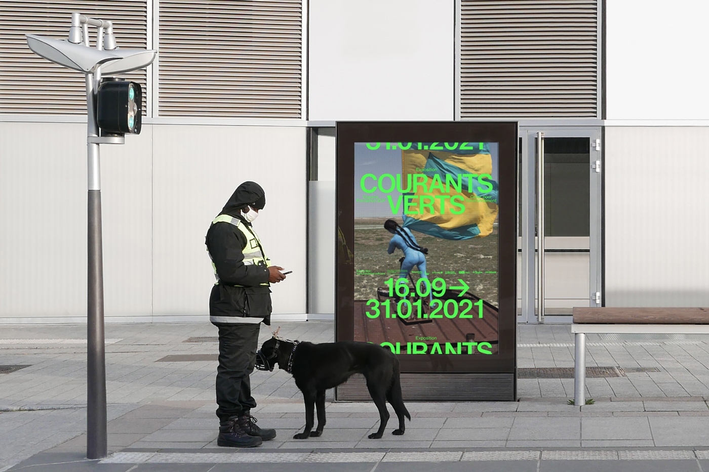
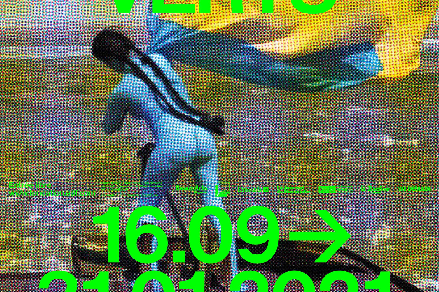
Zoo works predominantly for clients from the cultural sector. Projects, such as the exhibition ‘Courants Verts’ by the Fondation Groupe EDF or the magazine Architectures Crée, give them creative freedom to experiment and refine their personal style. “We love art and culture, that’s why we choose to work in these areas. When it comes to this type of project, the person who runs the institution often knows our work and chooses us to develop the most interesting project possible,” they tell us. “All clients in the cultural field are different, there is no general rule that can be applied to everyone. Teams are always different.”
During the pandemic, the studio has changed quite a bit, forcing them to redefine their structures. “No longer having a physical meeting, no longer meeting the people with whom we collaborate. This is what we missed the most during the health crisis,” they remember. “For seven years, we have worked a lot and got used to working very long hours. Then, the crisis stopped us in our tracks and allowed us to take a step back. Now, we pay more attention and choose the projects we engage in more wisely.”
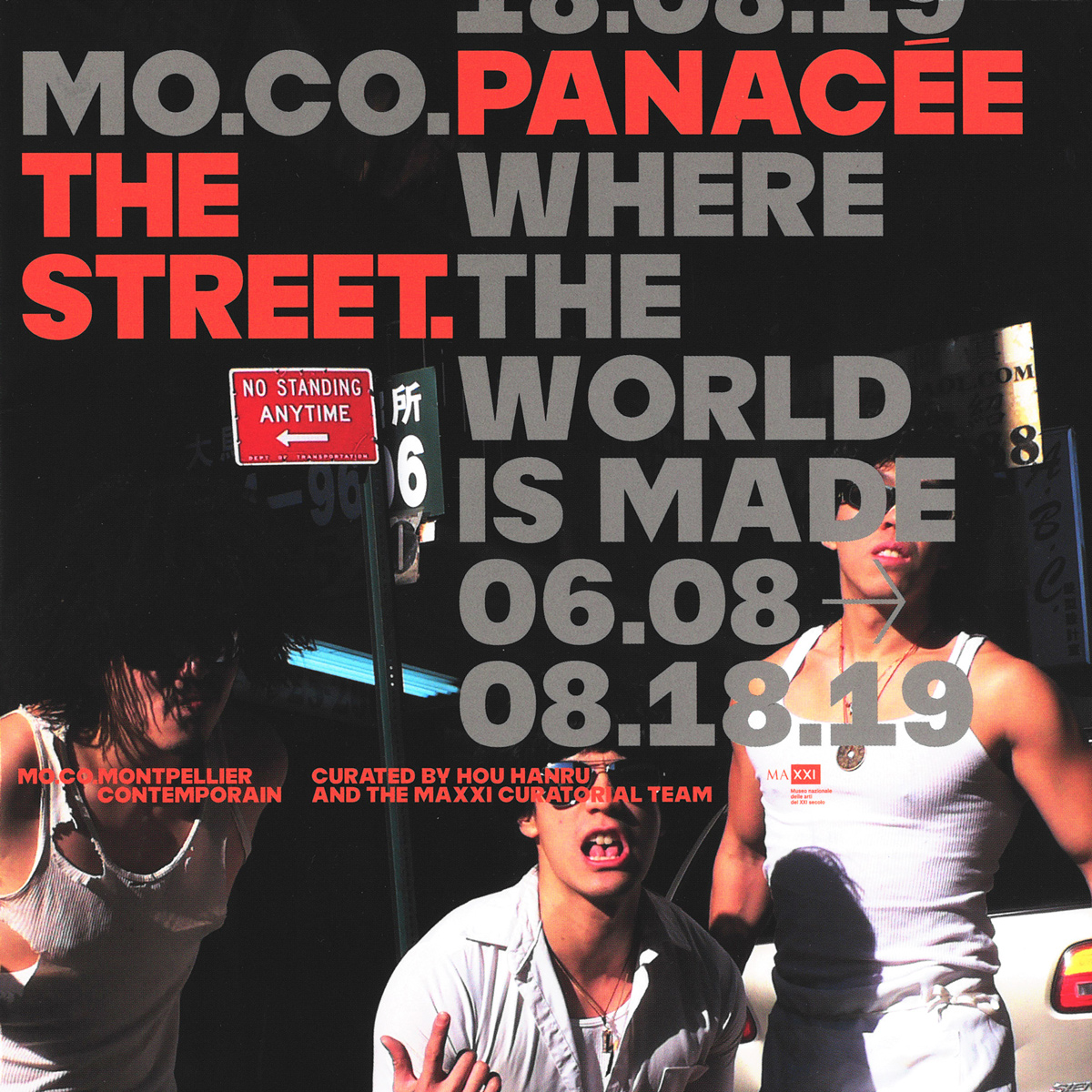
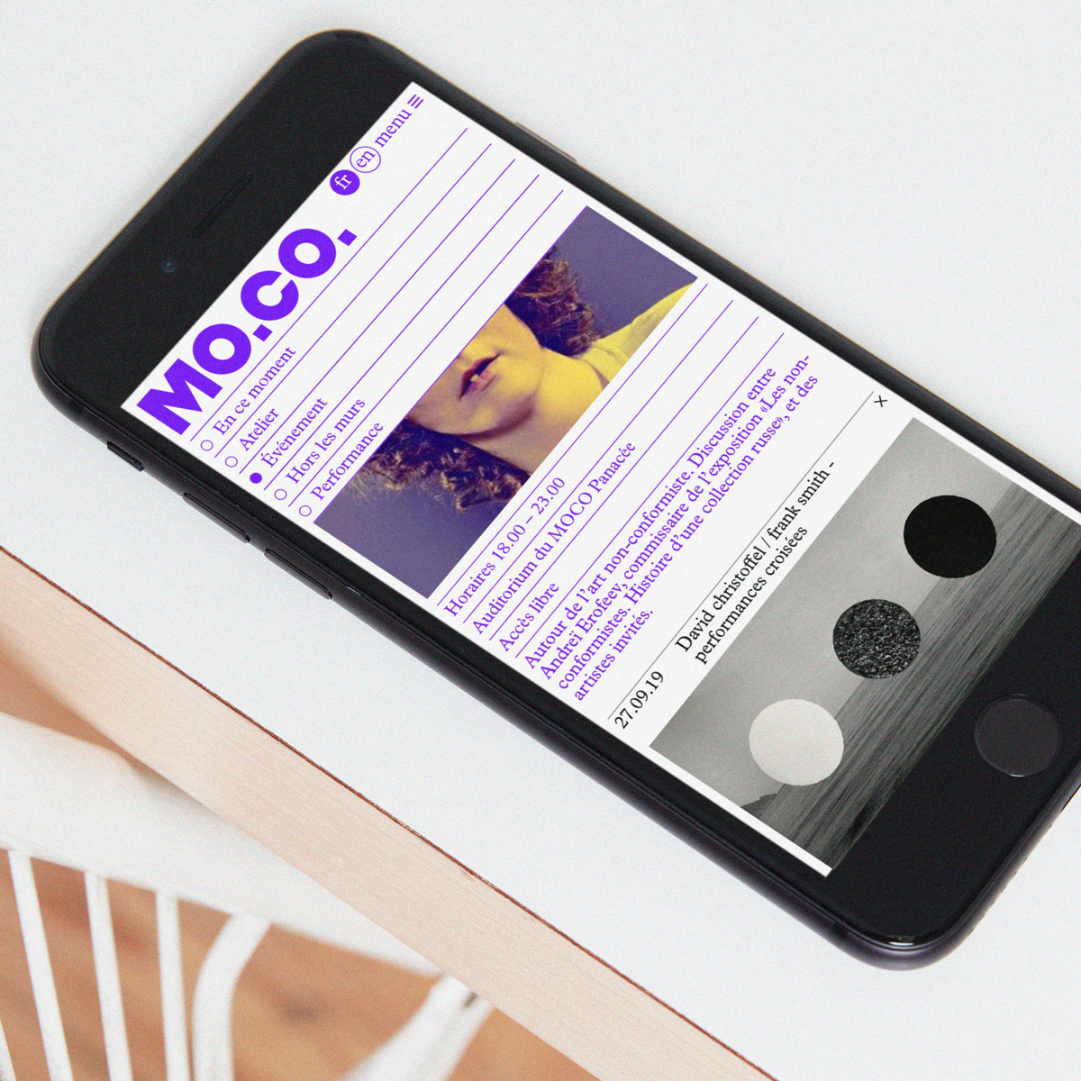
Surprisingly, one of their favorite projects dates back to 2019, when the studio designed the global identity system for MOCO Montpellier Contemporain, a pioneering artistic project led by Nicolas Bourriaud. It serves as an artistic ecosystem, bringing together the School of Fine Arts ‘ESBA MOCO’, the contemporary art center ‘MOCO Panacée’ and the ‘MOCO Hôtel des Collections’. For the launch of this new artistic institution, Zoo developed a flexible system, including a corporate typeface, graphic guidelines, the signage for the three locations, the website, as well as a local and national campaign.
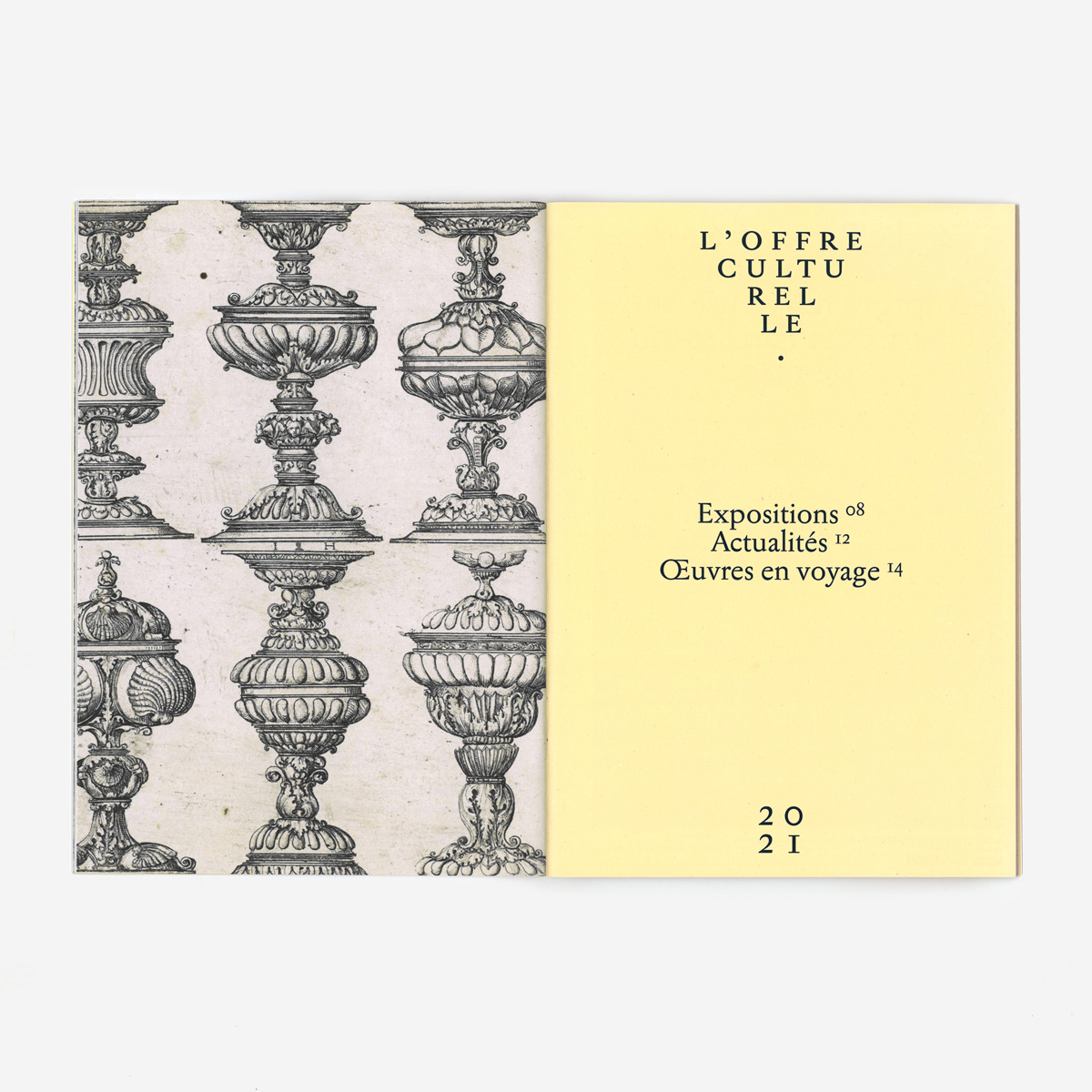
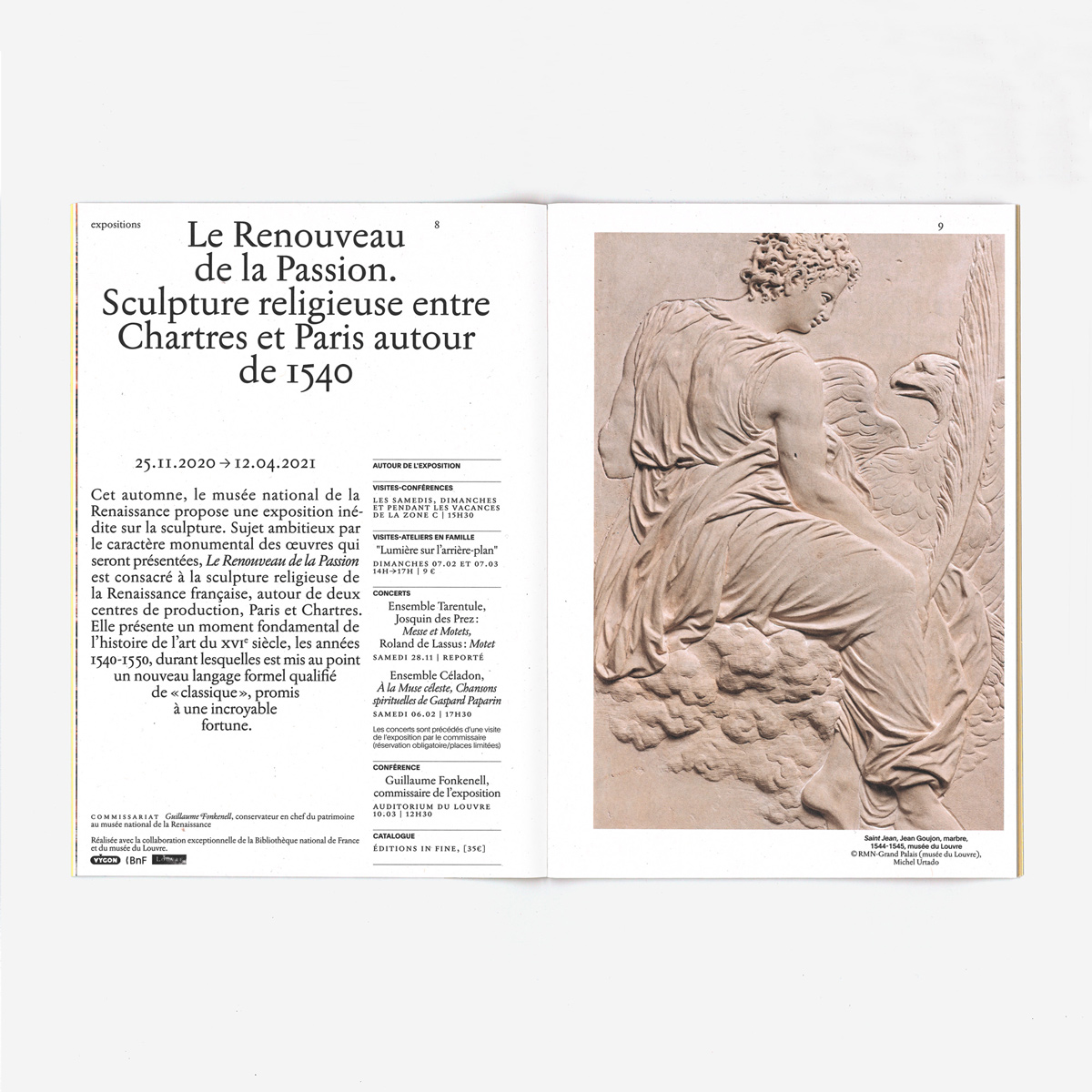
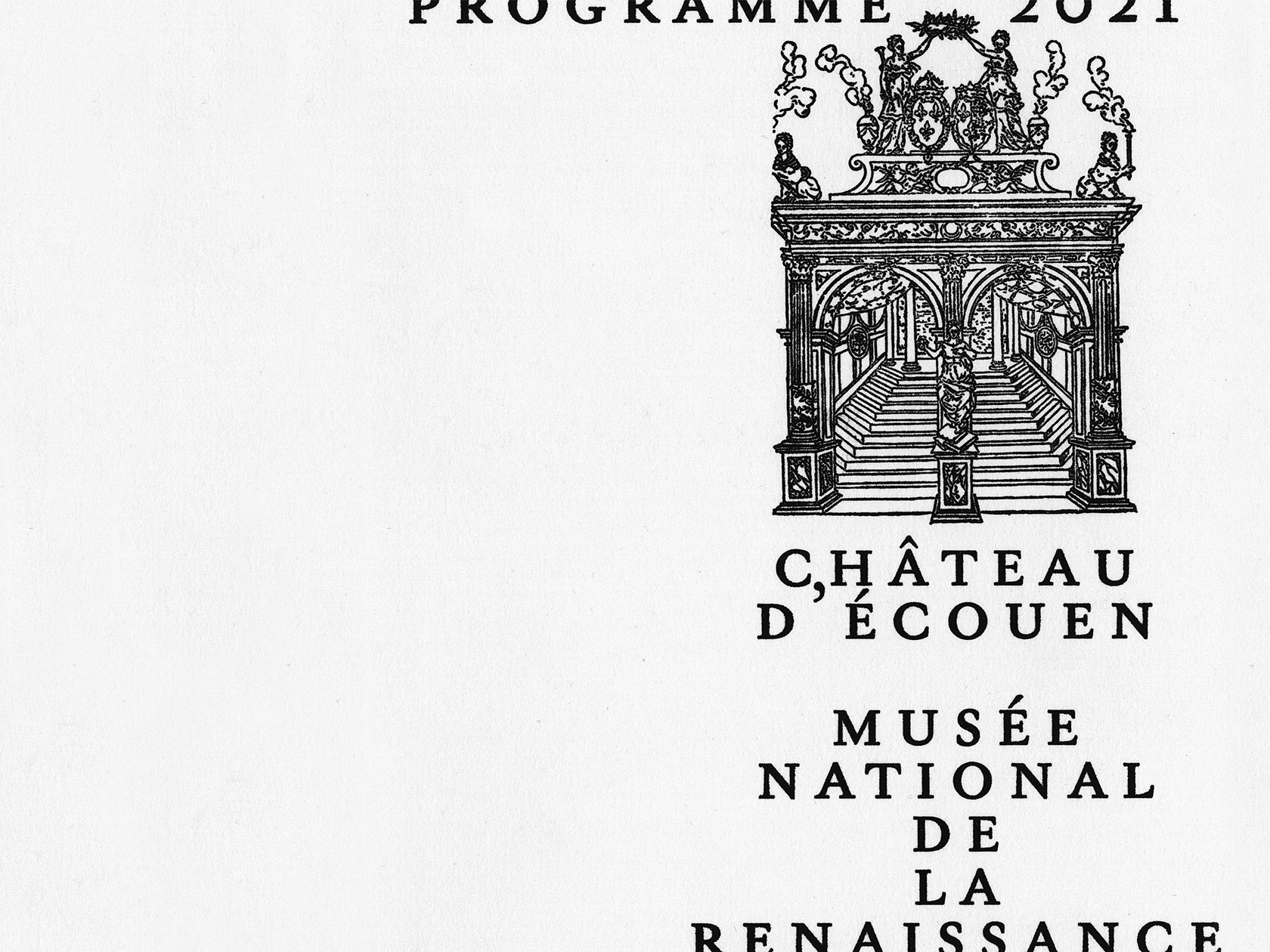
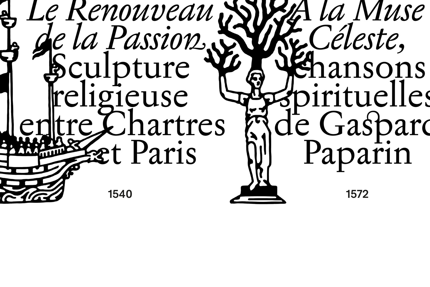
In 2020, the studio took over the visual identity for Château d’Écouen, a historic château in the commune of Écouen, which houses the collections of the Musée national de la Renaissance. It contains a notable collection of paintings, sculptures, ceramics, and other arts of the French Renaissance. Since 2020, Zoo has redefined the overall visual identity system of this unique cultural institution, resulting in a sensitive and didactic look. “We started with defining a visual and typographic universe, playing the combination of contemporary aesthetics and typographic twists inspired by books from the Renaissance,” they elaborate. “It is such an inspiring and rich period of incredibly daring typographic forms!” With the help of the illustrator Arthur Bonifay, they designed a series of pictograms referring to woodcuts from one of the first illustrated books from that time.
This year, the studio created the global redesign of the Amos Sport Business School, which has 12 campuses in Europe as well as a large network of international partnerships. Next to a set of dynamic communication tools and an exhaustive guideline for the visual language, the heart of this graphic identity was an exclusive typeface, Amos Display, inspired by sport and movement. “It was basically the client’s wish to have their own font—and we liked that idea! Our challenge was to create an institutional and dynamic language, that focuses on the international scene and is aware of the major sporting challenges of the world of tomorrow.” With some slanted letters—A, M, W—and a playful set of O’s, the typeface adds a unique twist to the new design system, consisting of a series of logos, a national communication campaign, customized goodies, institutional brochures, stationery, and more.
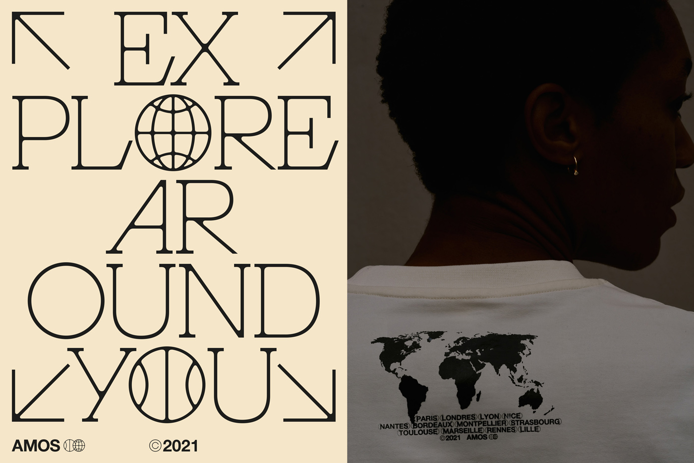
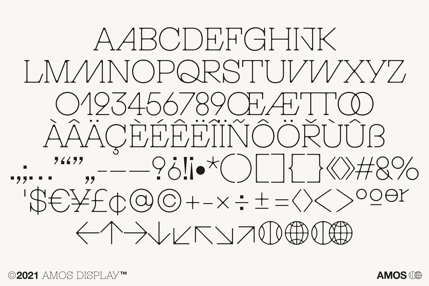
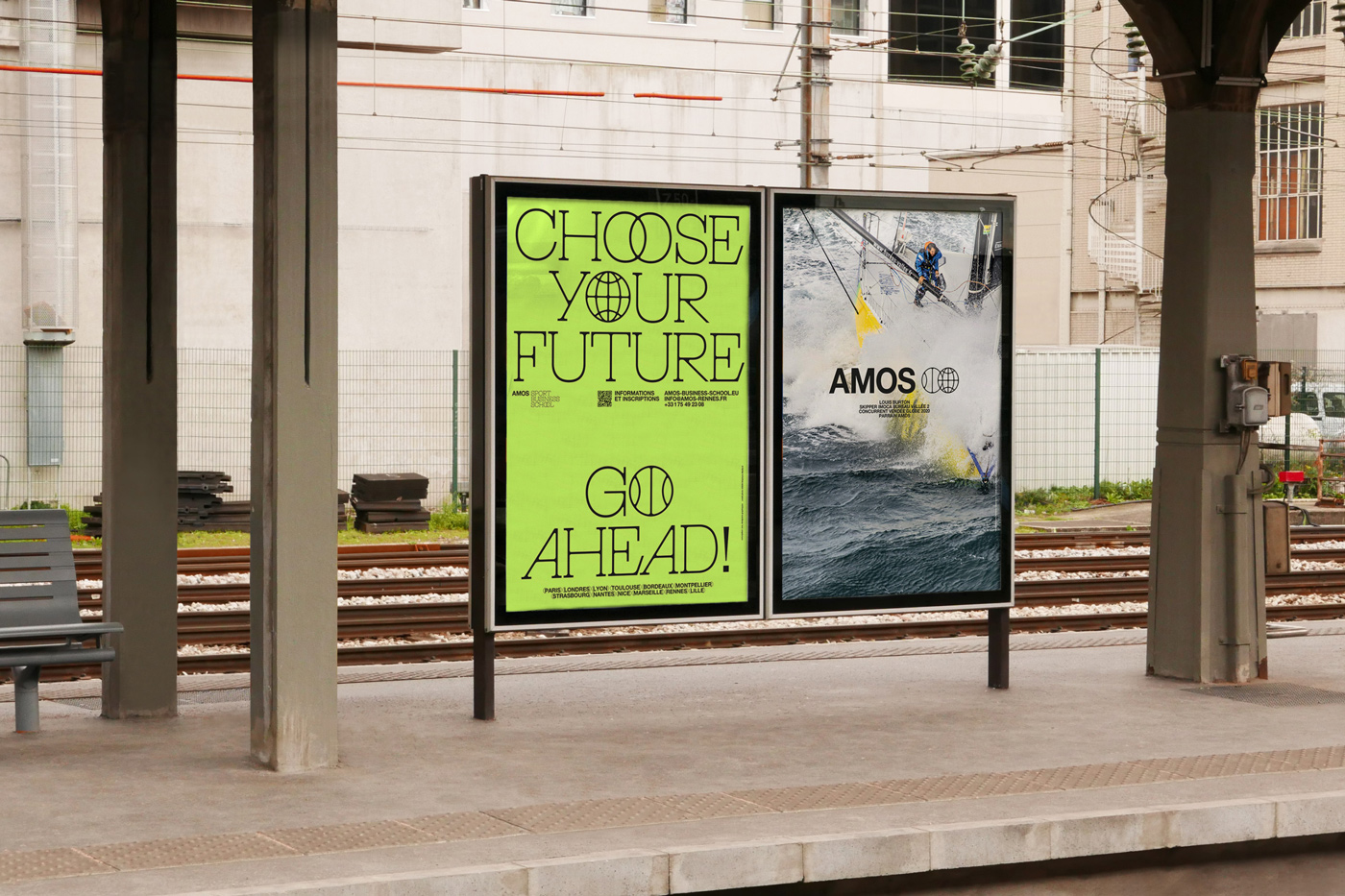
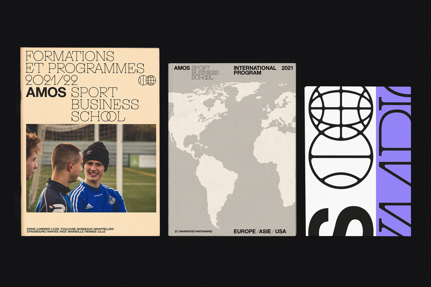
Design for Amos Sport Business School by Zoo
Due to their education, their work is influenced by the functionality and rigor of the Swiss Style, as well as the Dutch school with its more expressive and sensitive aspect. Following their multidisciplinary approach, they work with a range of collaborators from different disciplines, like photography or iconography. “Our job is to create a dialogue between the different visual elements, a dialogue that is at the service of the content. There is no point in defining an ultra-sophisticated typographic system if the iconographic elements are not up to the task! This is also an aspect of design that we teach our clients,” they explain. “It’s downright essential for us to collaborate with other creatives whose work we love. We very regularly call on freelancers for occasional collaborations on specific projects. It allows us to go past the limits in the creative process and to bring in different approaches and visions.”

