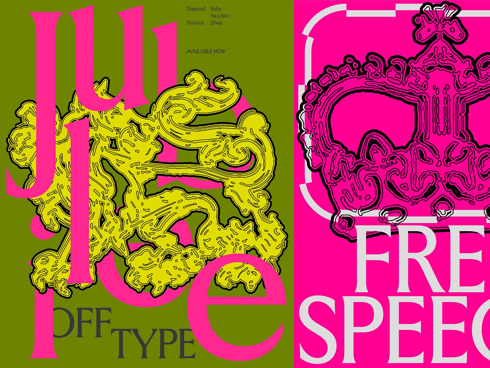
The creative duo Dr4gstor comes from the small town of Shkodër, Albania, and consists of painter-slash-photographer Xhorxho and graphic designer Ledjohny. As many of their posters say, “Dr4gstor is nothing more than imagination that we’re forced to present to you.” Along with graphic design skills, straightforwardness is another powerful tool in their arsenal. They let their subconsciousness (rather its darker side) guide the process, prefer colors and textures over sophisticated concepts, and feel confident developing their fictional digital archeology on the ruins of y2k aesthetics.
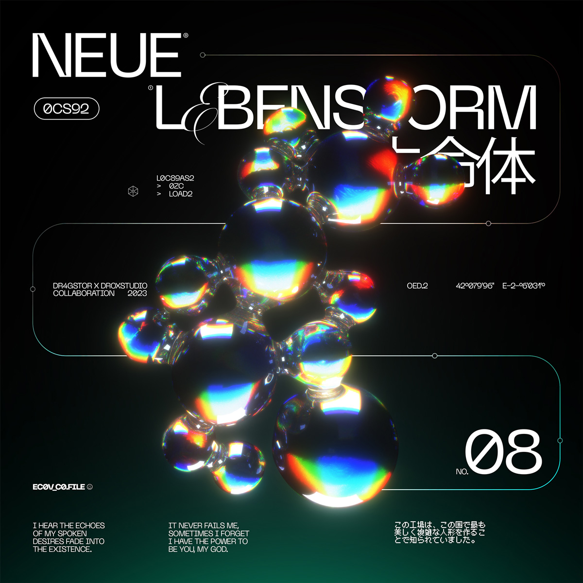
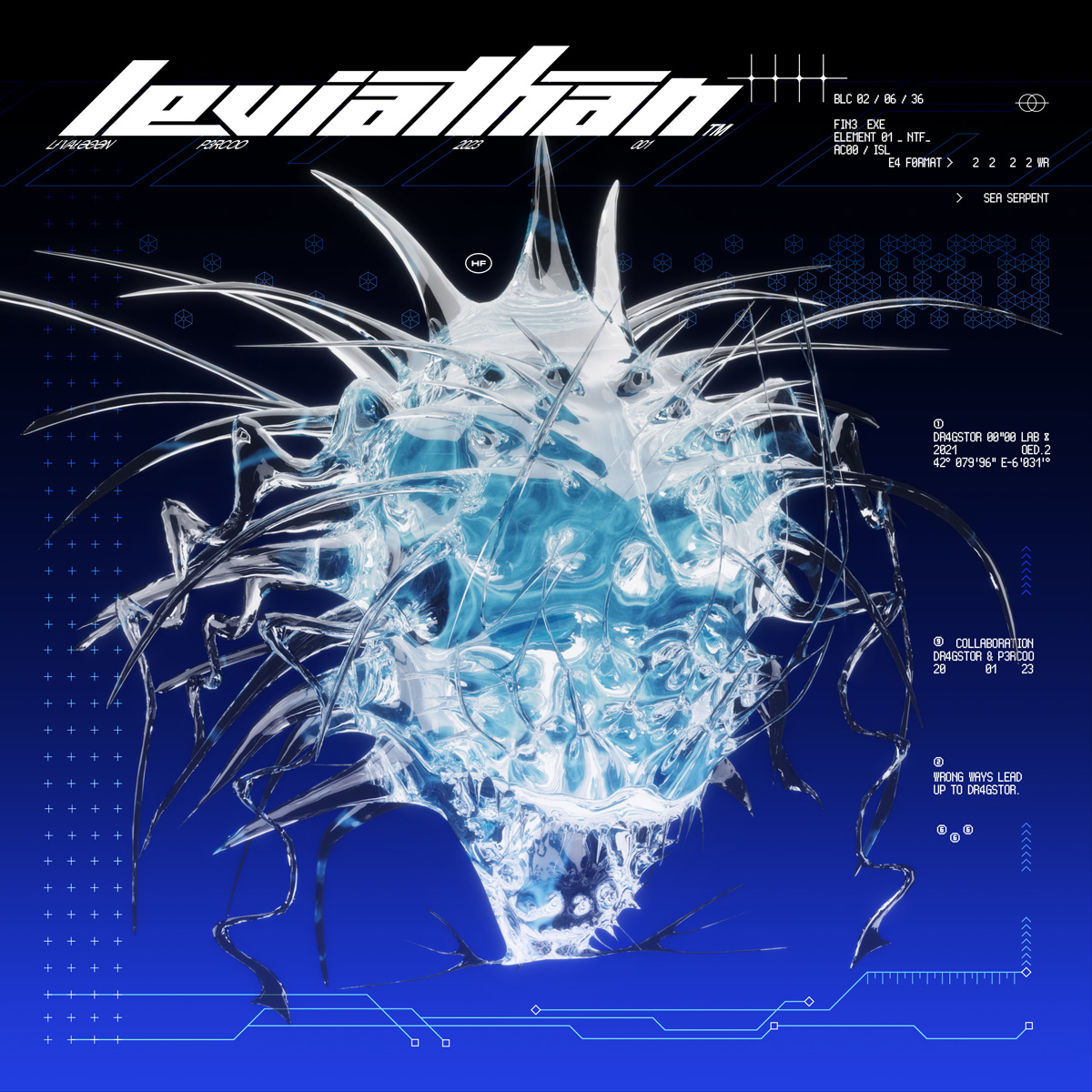
And you can tell Dr4gstor does comprehend the power of collaboration. “How impressive it is that two people can put their skills into one piece and bring something even more powerful together,” Ledjohny says. Following this logic, the more people—the more powerful it gets, as the designers decided to support some of their favorite emerging 3D artists and cooperate on the Collaboration Works series.
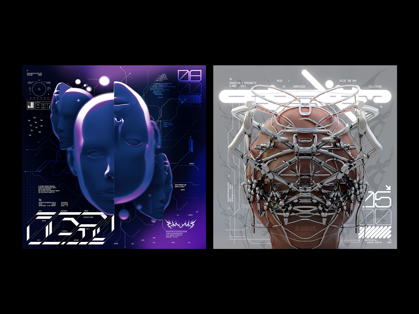
The impulse resulted in eight posters with a strong acid dystopian vibe, sprinkled with allusions to classical anime titles and video games. Two of them—“Cryst4l Flower” and “Warlock”—are made entirely by the designer duo, giving us hints on the basic ingredients of the Dr4gstor style and vision.
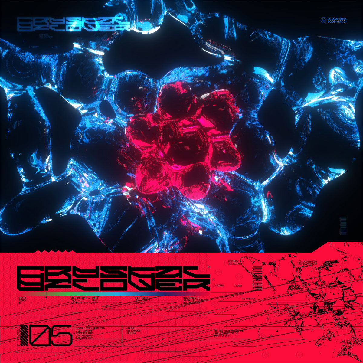
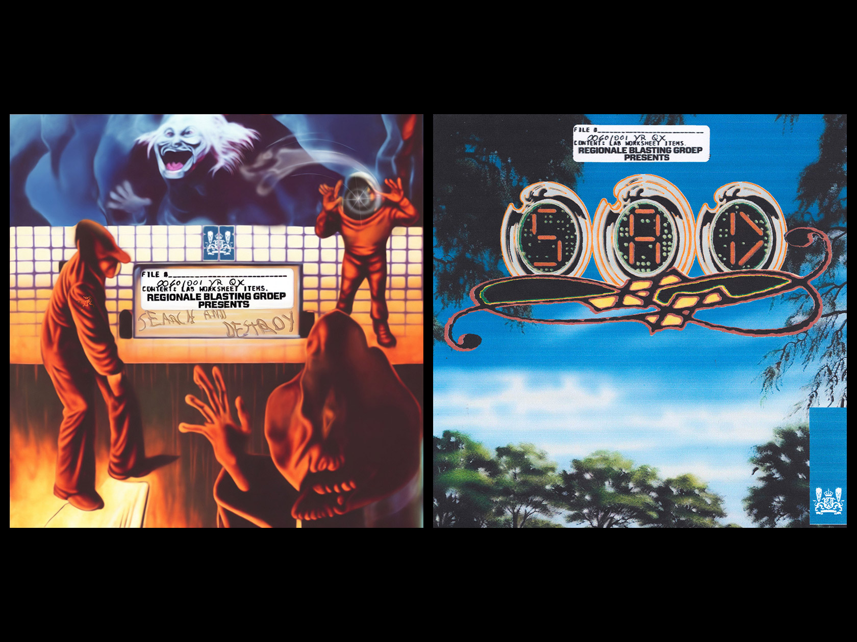
In some non-apparent manner, “Cryst4l Flower” carries more Easter eggs than you would think it could. A bijoux-ish crystal structure turns out to be a piece of different dimension flora. As Xhorxho explains, “a sunflower in crystal form would represent the opposite of a real flower, that, in our opinion, represents calmness and comfort. So, the purpose is to bring a vicious and dangerous feeling to it.” The color-blocking palette of red and blue, which is said to be the starting point of the poster and appears in many other Dr4gstor projects, may trace back to their local environment. This pair of colors is widely presented in Albanian applied arts. Moreover, if you have ever wondered what the crest of Shkodër looks like, it’s basically different combinations of red and blue. Finally, the hieroglyph-imitative font reveals the realm of Asian culture appropriation, which, having played a big part in the whole ’00s lifestyle, is hence prominent in the works of the duo. Puppet Factory by plohodsgn emphasizes the issue, with regional attributes reduced to their decorative forms and stereotypes.
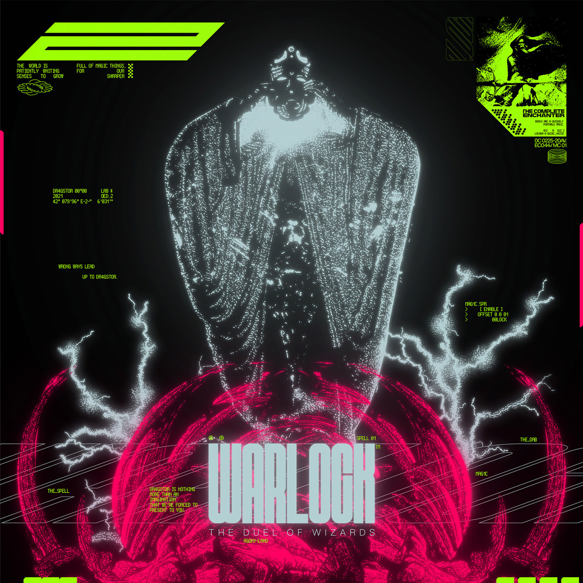
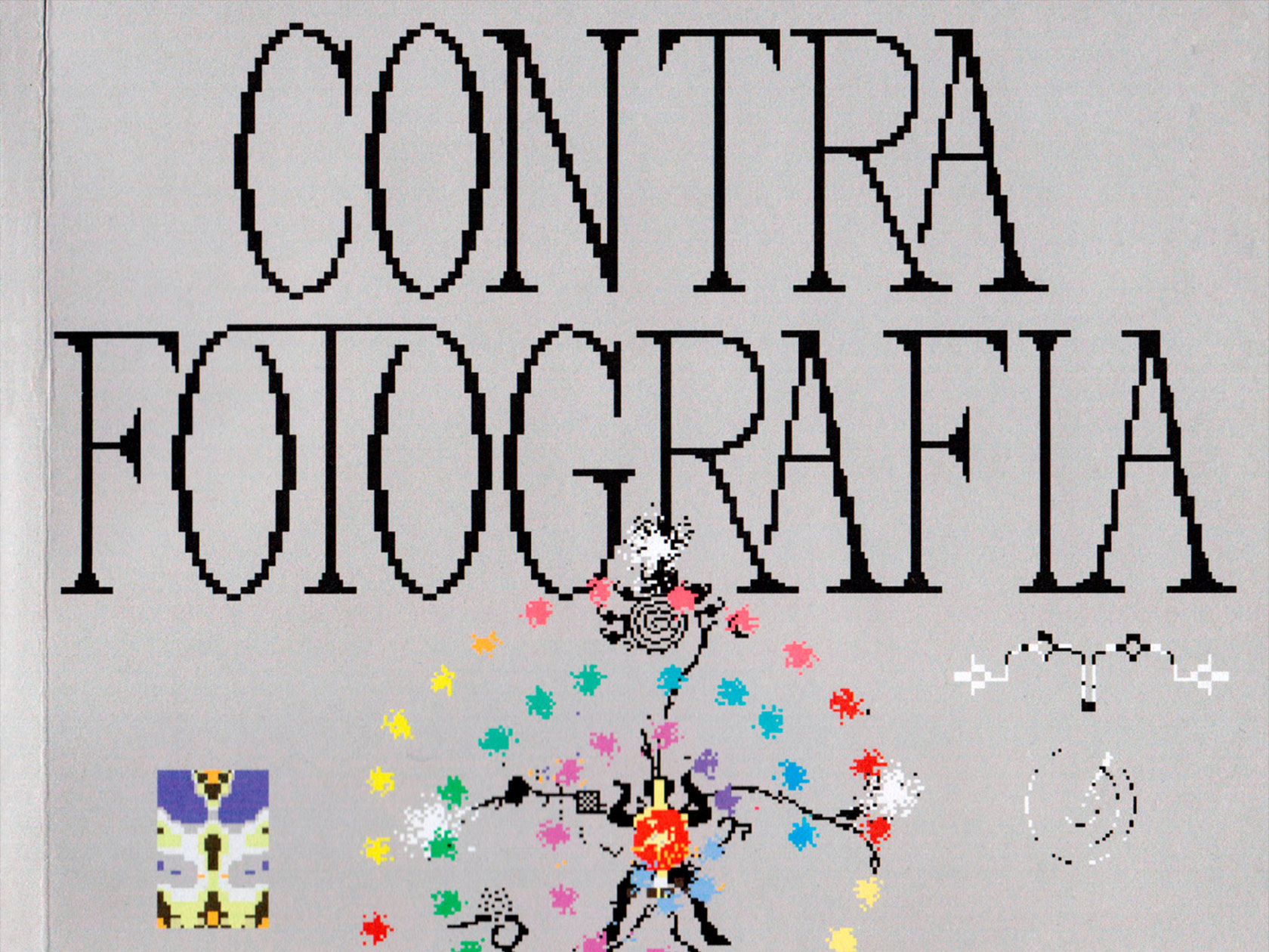
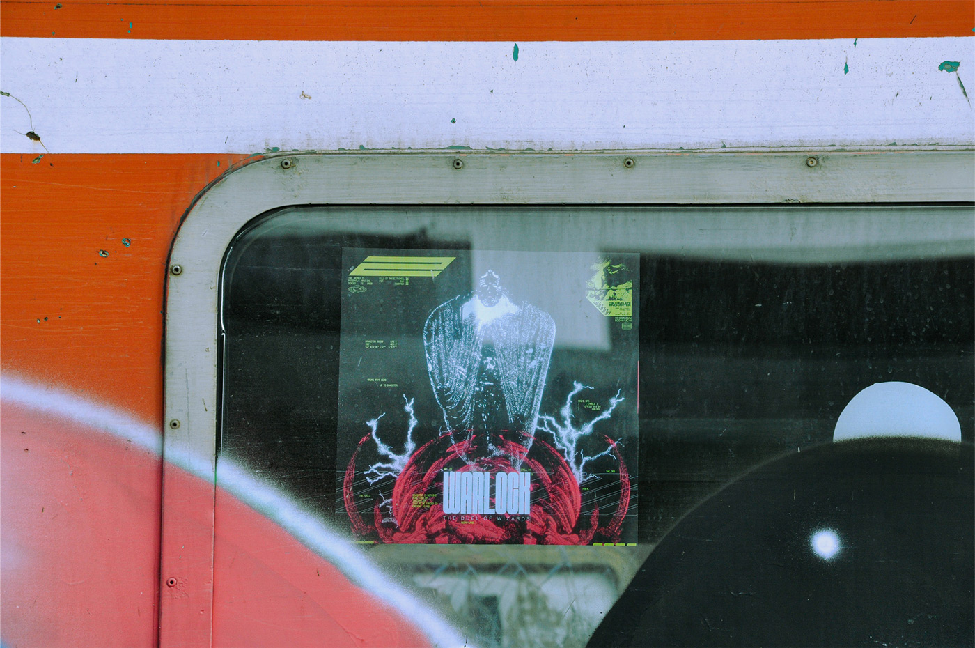
The “Warlock” poster adds doom metal taste and an iconic anime atmosphere to the overall picture. If Tolkien’s plots and characters were transposed into a “Ghost in the Shell” setting, that would be it. The wordings gain weight here (only metaphorically—in fact, the fonts get even thinner): those who are blessed with a sharp vision get access to some beautiful maxims, like “The world is full of magic things, patiently waiting for our senses to grow sharper.” Or: “Wrong ways lead up to Dr4gstor”. An image of a badass wizard suits both creators pretty well.
When it comes to the collaborative process, the algorithm is quite transparent. The “assembly line” implies two steps. First, artists provide an original 3D render, and second, designers add a graphic layer to the original work. The hardest part is to get into the artist’s mind and adopt their perspective to come up with a cohesive design for the poster (repeat x5). As Ledjohny puts it, “designing in many different styles would always extend and improve your creative field and way of thinking.” In other words, it is a perfect exercise for the designer muscles.
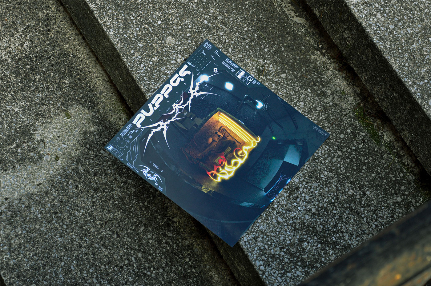
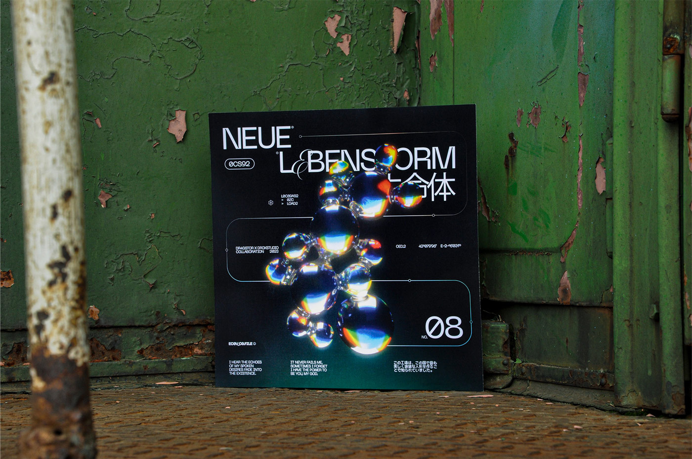
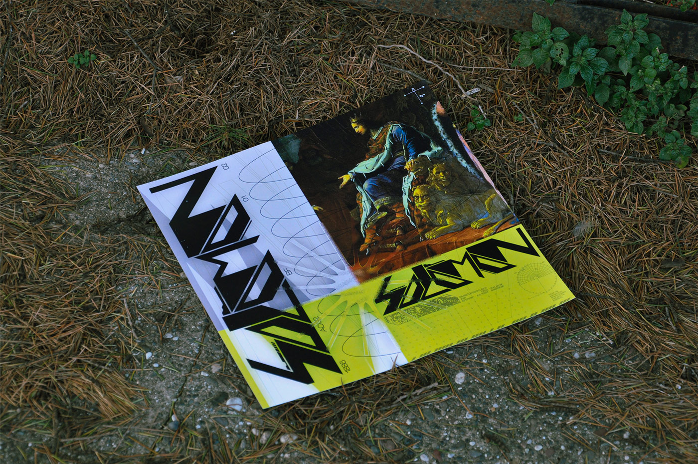
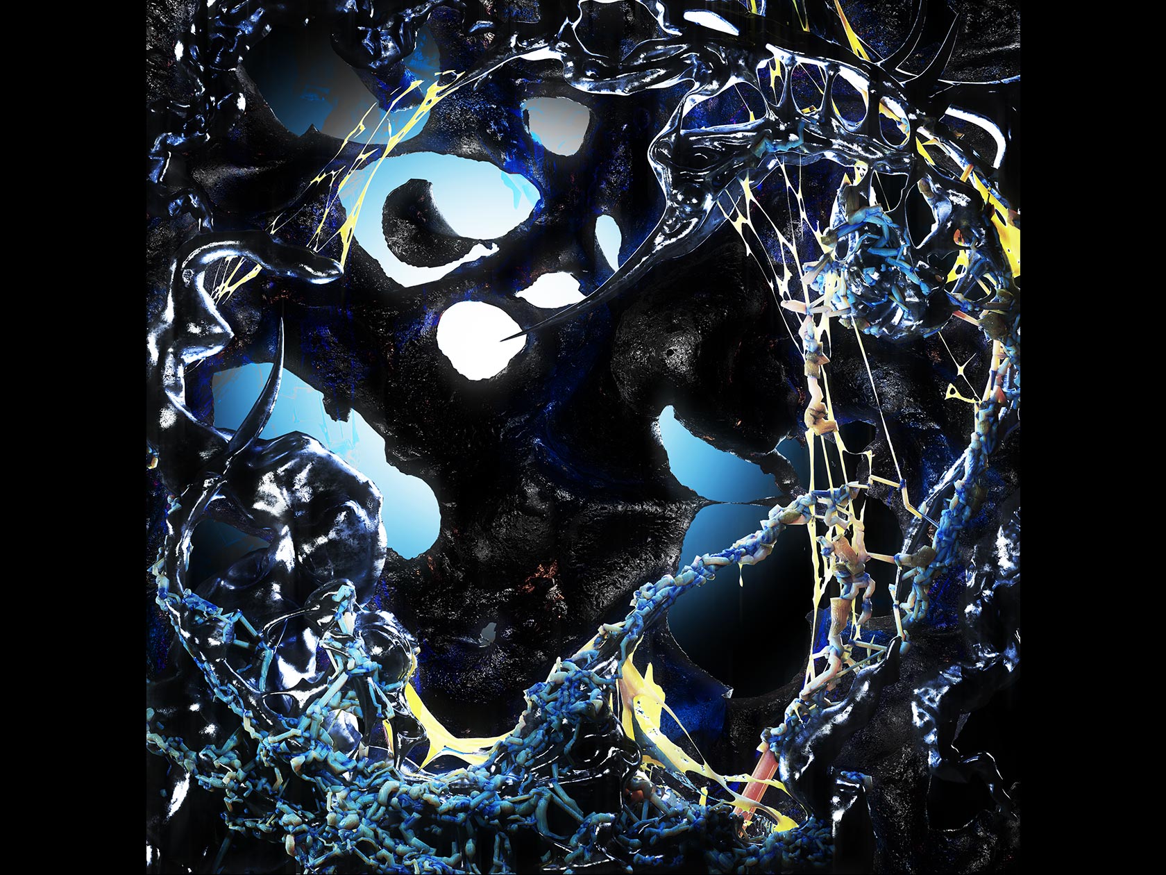
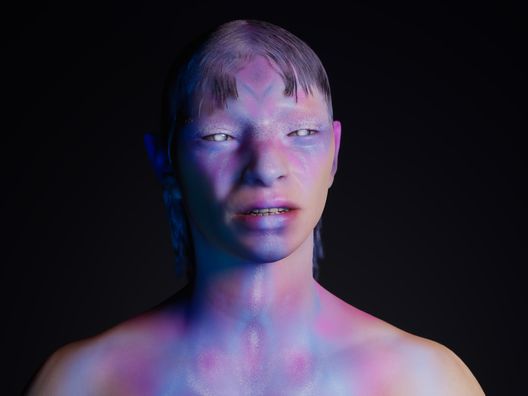
Aside from the above-mentioned plohodsgn, “Collaboration Works” features such artists as babyfire.bf, Droxstudio, FINT Design Studio, p3rcoo, and Persancte Studio. Their works are permeated with cyberpunk, biblical and tribal motives that mix well into a pertinent digital fusion. These designs could easily pass for the default collection of CDs on the shelf of one’s elder party-monster sibling in the middle of the ’00s but ended up in a slightly bigger format, resembling more of a vinyl cover. The conceptual transition of the 3D art to the 2D medium is in Dr4gstor’s habit. “We always print and store our pieces in a big dossier”, Xhorxho clarifies.
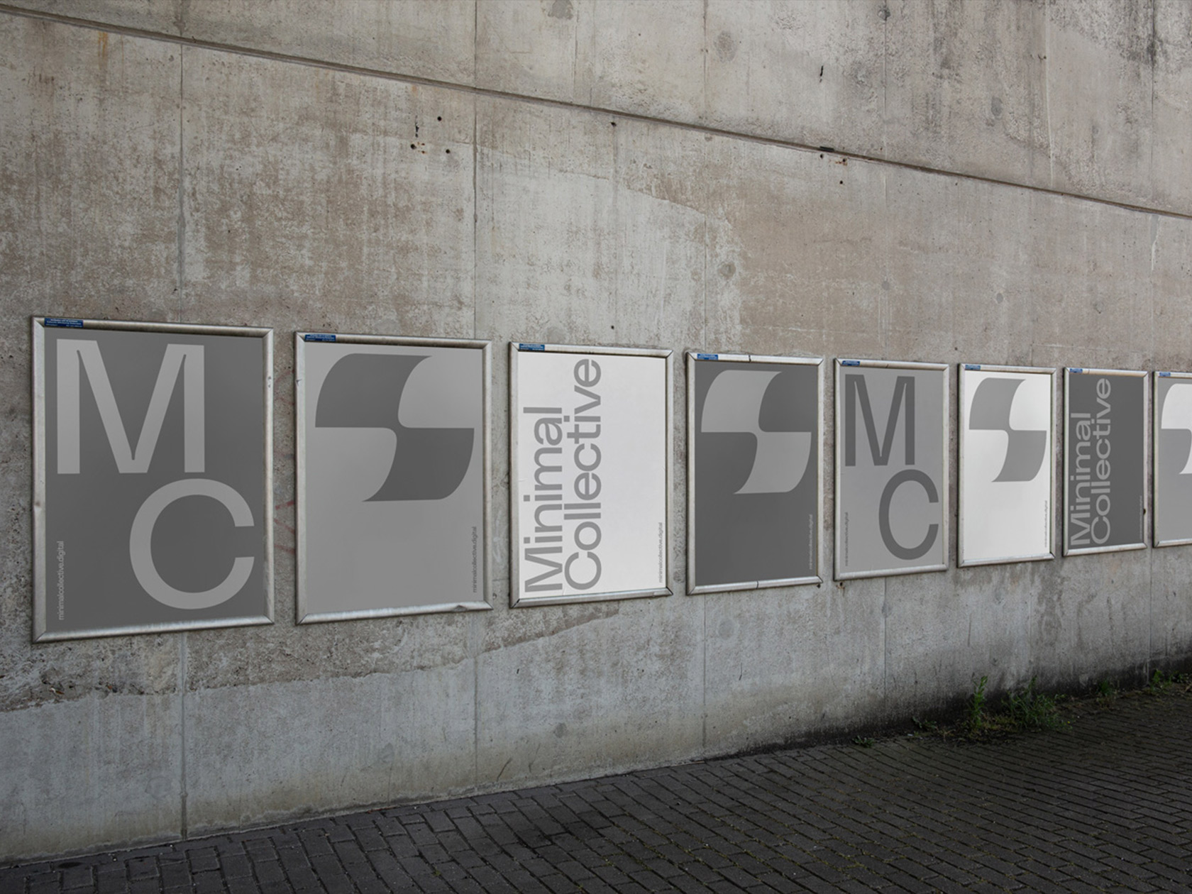
The final destination of the digital project turned out to be the local train station, where the posters merged with the environment with a grace of a bull in a China shop—but that only added more bulge to the series. Therefore, collaboration worked.

