Before founding Due Collective, the two designers Massimiliano Vitti and Alessio Pompadura met by coincidence. Working at the same agency, Studiogusto in Perugia, they noticed that both of them share the same vision and soon started designing and experimenting together, resulting in their first typeface “Nodo” – a geometric and modular type. “Due Collective was born spontaneously, with no premeditation. Today, it is the space we use as a statement to express our take on design”, the duo tell us, “There are no precise and distinct roles in Due Collective. We both do everything. We think together, draw together and then correct ourselves together. Each of us has his own strengths and visions, but then, we put all of them into a single output. Perhaps this is the strength of Due Collective and the sense of its aesthetics. Our name is a bit the synthesis of our manifesto, 2.”
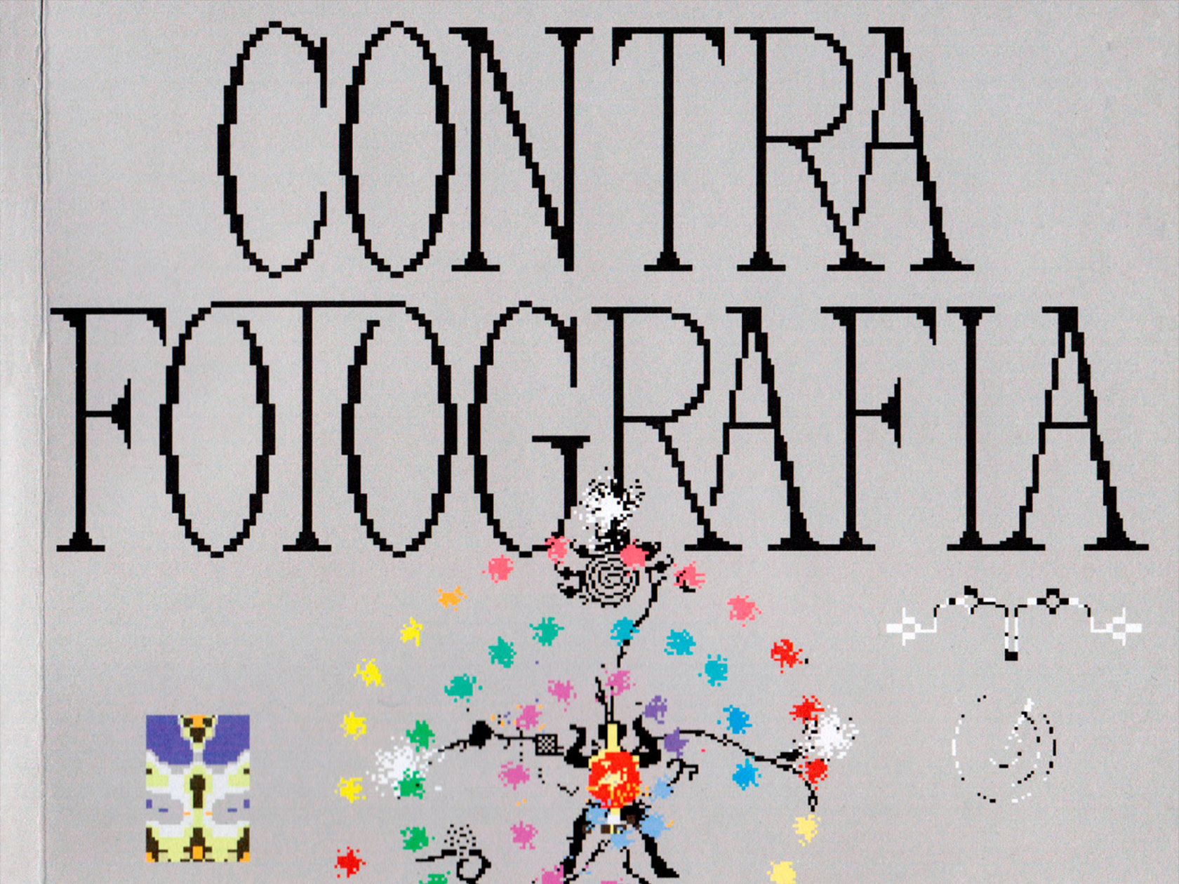
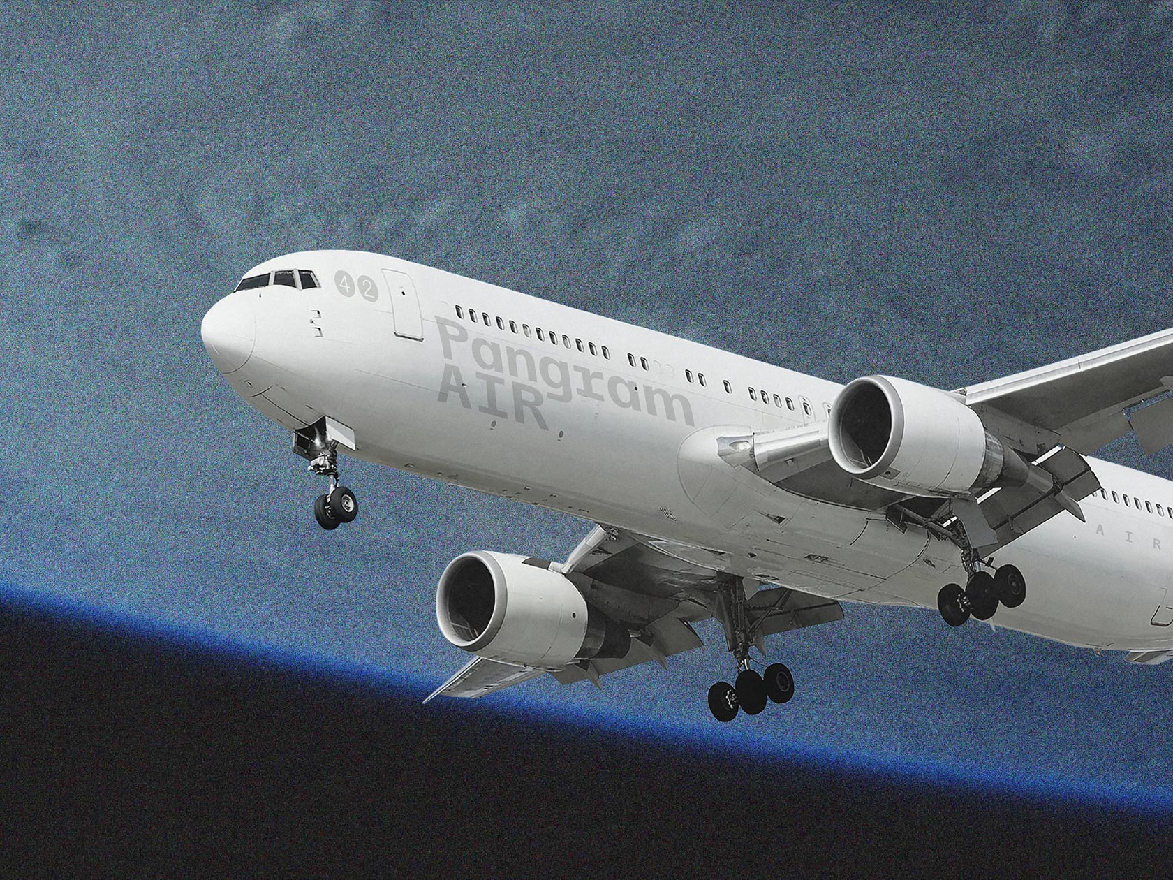
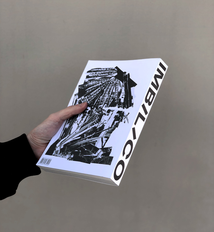
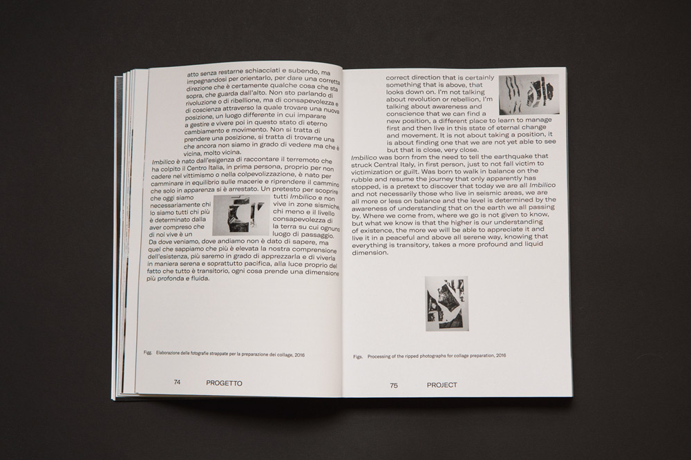
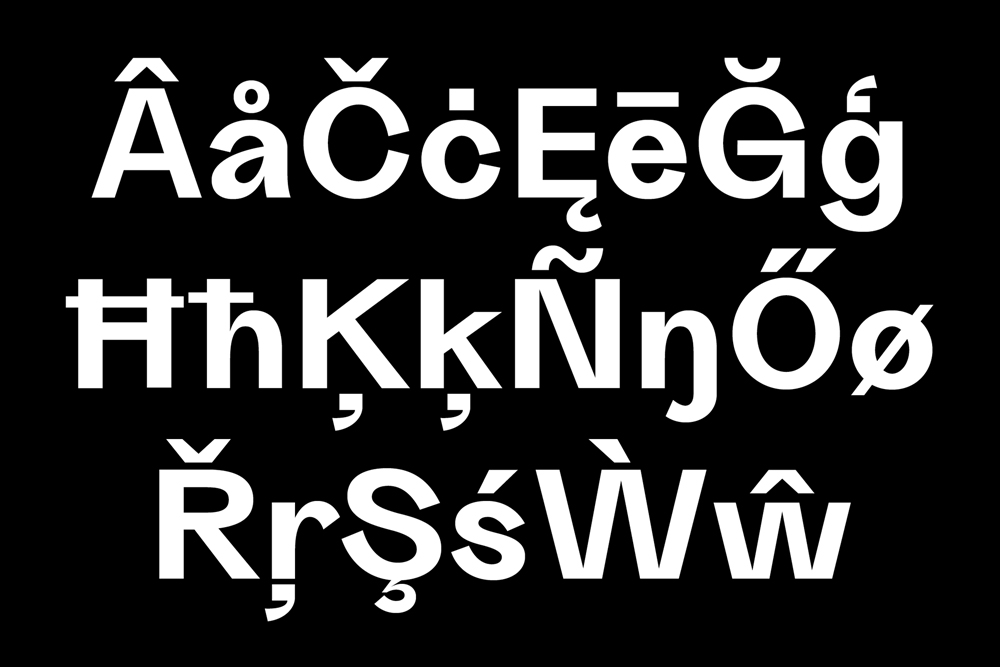
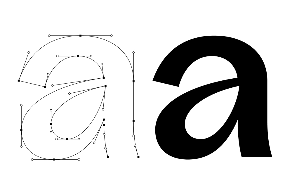
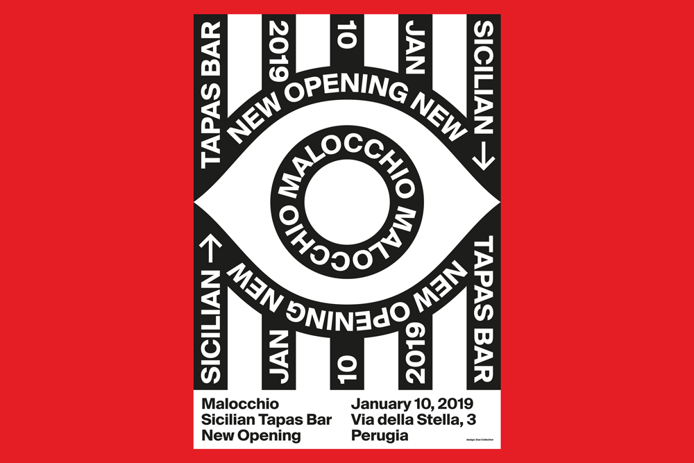
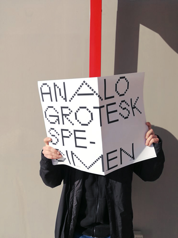
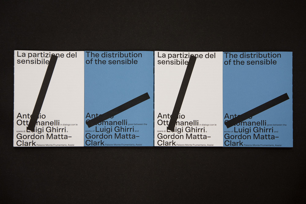
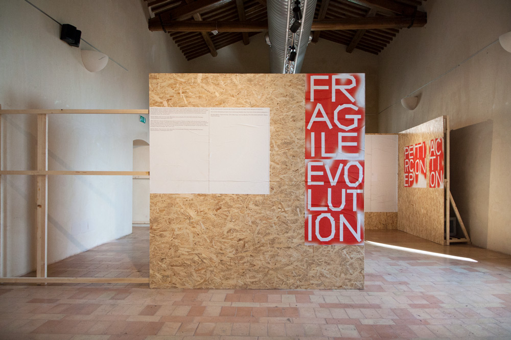
United by a strong focus on typography, the work of Due Collective is energetic and experimental, without ever losing sight of the functionality: “We like to deform, to stretch, to exaggerate. We do it with a certain irony, but without forgetting what we are creating and for whom. We love strong contrasts and experiments. We know the rules, and sometimes we play by them.” In the last couple of months, they have not only released several typefaces, like “Analo Grotesk” and “Grotta”, but have also worked on many culturally-rooted projects, like the visuality for the event “Sundaze”, the design of the latest edition of the book “Imbilico”, and the identity for ‘The distribution of the sensible’, an exhibition by Antonio Ottomanelli.
Always being interested in books, graphic design and typography, Massimiliano studied Editorial Design at ISIA, Urbino. While the visuality of his design work is shaped by his rational nature and functional approach, he tends to experiment more in other disciplines, like painting or illustrating. Just as Massimiliano, the roots of Alessio’s interest in graphic design can be traced back to his early childhood. After studying Advertising Techniques at the Università per Stranieri di Perugia, he started focusing on editorial design and typography. The duo draws a lot of their inspiration from their masters from specific fields, naming Nicklaus Troxler’s jazz posters, the experiments of geometry and color by the Dutch Karel Martens or the joints of fluid and primordial figures by Keith Haring, among others. “We think we can draw inspiration potentially from everything that has a color, a shape and occupies a space in a given context”, they explain.
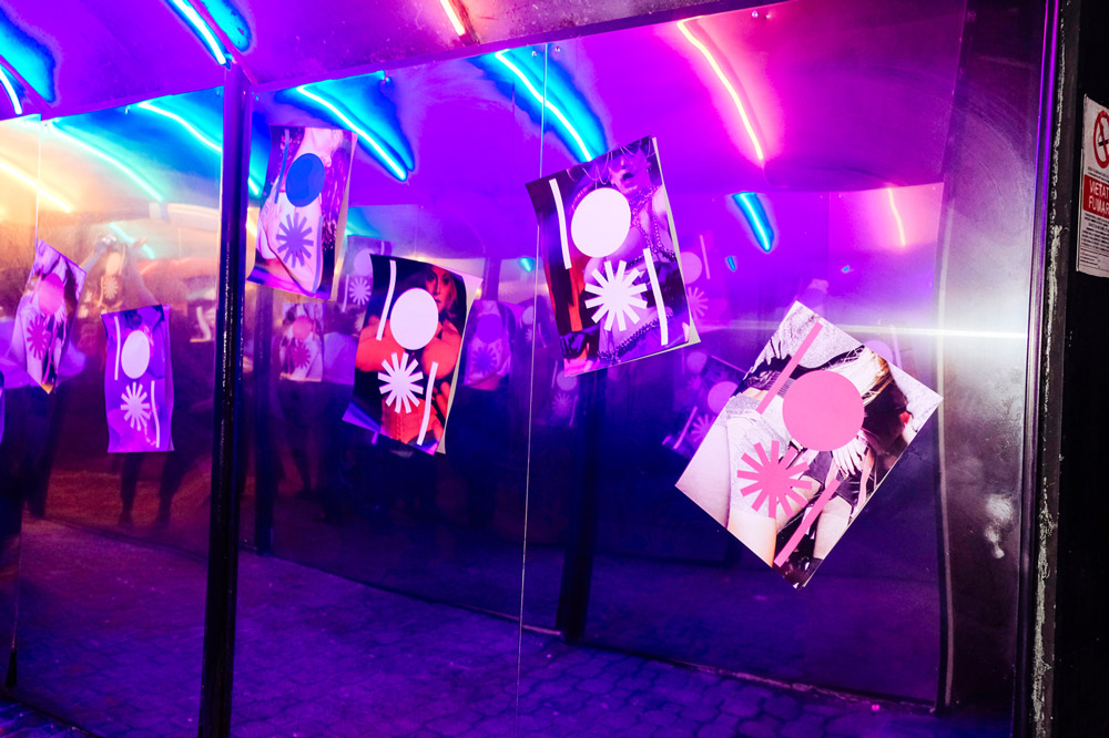
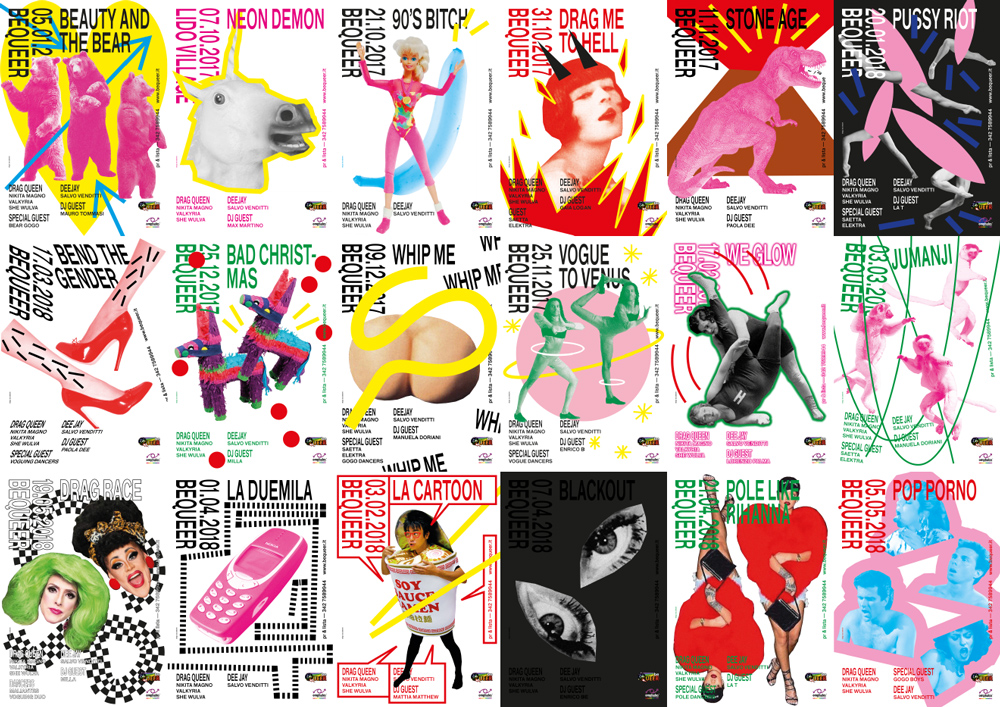
For their most recent project, the duo was faced with the challenge of creating an identity for “BeQueer”, a LGBTQIA+ party series in Perugia. Besides offering a place to dance, have fun and socialize, the event serves as a safe space for the LGBTQIA+ community and raises awareness for its concerns. Last year, the party series decided to undergo a deep change and entrusted Due Collective with creating a new visuality. “We had to come up with a solution to keep our style, revolutionize BeQueer’s identity, and to create something that was not too discordant with the visual habits of the audience”, the duo tell us about the challenging project.
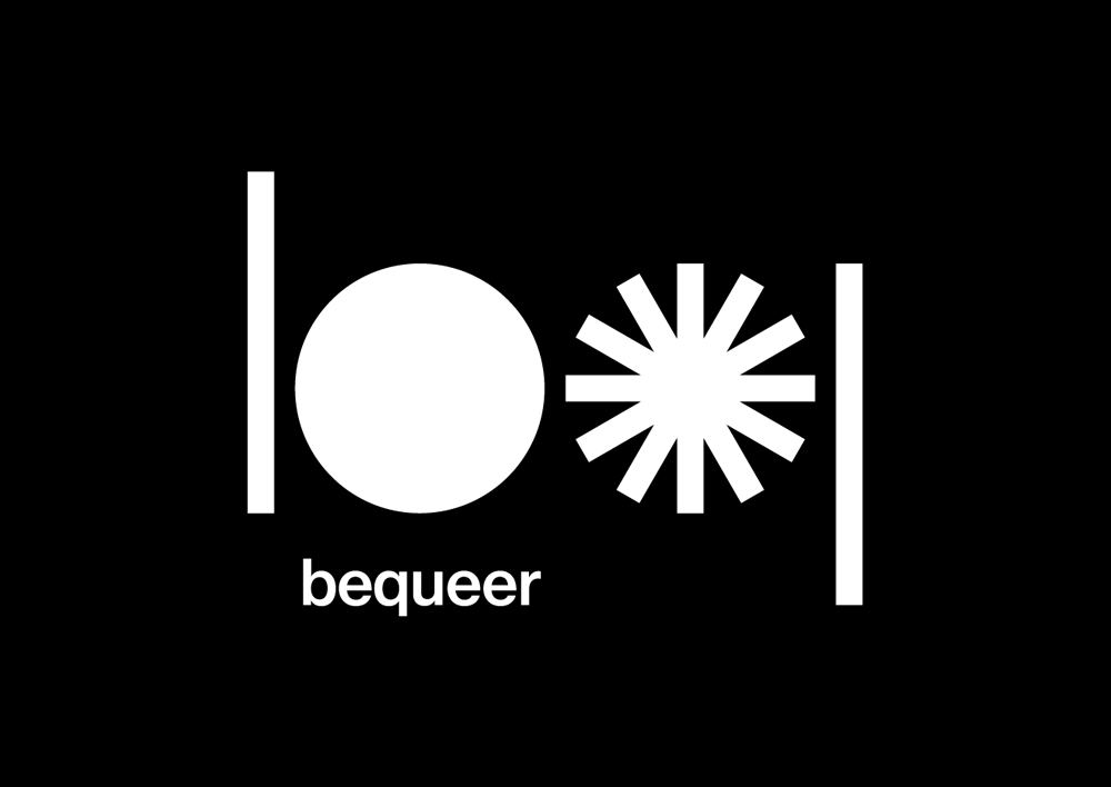
Soon after designing a poster series for the events, they were asked to take care of the next important step: the logo. Reducing it to the two letters b and q and combining it with the asterisk – an icon for gender non-conforming identities and intersectionality, the new logo incorporates the history and expressive needs of BeQueer. “After the briefing, we understood that BeQueer and the LGBTQIA+ community in general have a strong symbolism that cannot be separated from the identity”, the duo explains the concept behind their work, “So, though we usually like to concentrate on the lettering in the creation of a logotype, we felt the need to include an iconic meaning to those letters, transforming the bq into a disco ball and an asterisk. The disco ball stands for the safe place that BeQueer is and the norms-breaking queer fun that is a political statement itself. The asterisk is an Italian symbol used for non-binary, non-conforming identities, also to be put at the end of the words to make our gendered language an inclusive and non-gendered one.”
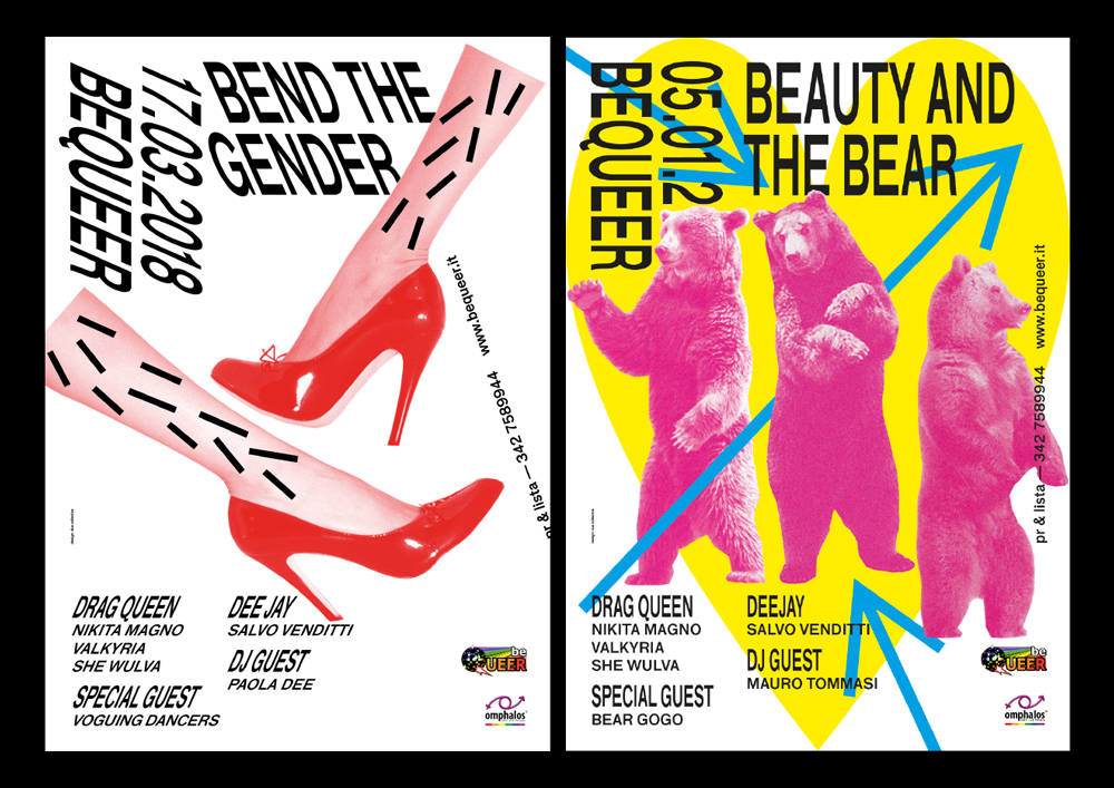
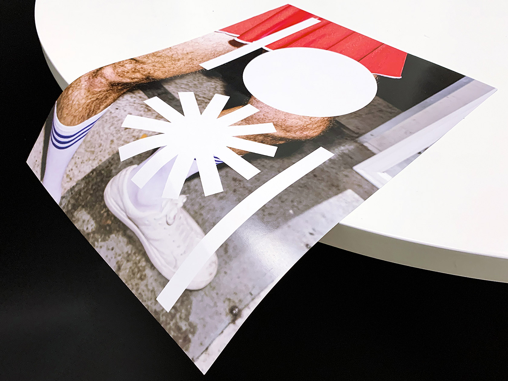
In order to capture identity of the community, the duo had to “escape the straight-cis male privileged gaze” and to put a lot of time and effort into the research and understanding of “a very diverse community fighting against an oppressive heterocisnormative society”. By focusing on important aspects of queer activism, like the subversion to the to the patriarchal norms and moralistic values, they came up with a “clean, colorful, provocative, sometimes odd, and always very queer” identity: “We decided to go for a mix of collage and graphic elements. We liked to play a lot with the themes, so simple lines became whips, or lianes for wild dancing sifakas, or taboo-breaking vaginas.”
During the whole process, they worked closely together with the Art Director, the activists and the staff of BeQueer. “The collaboration was always on: we really liked bonding and discussing things, not only for a better work, but also for a kind of growth and acknowledgement that only happens when you decide to be open to break your own narratives. We took all of the power of those conversations and found our personal way to express them”, the duo tell us, “It was the key to create something not only visually appealing, but always including political statements like freedom of expression, sexual and body liberation, intersectionality, and gender non-conforming issues.”
As non-profit organizations often lack the required resources to invest into their communication and visuality, Massimiliano and Alessio wanted to make a difference in this case. “We are very happy we nailed a proper identity revolution. We had real fun in the process and discovered something new while making every element we thought for BeQueer,” the two designers tell us proudly, “Convincing them and achieving such a great feedback from the organization, from the staff, and from the audience, was the proof to them that a change in communication can also lead to a better understanding of political issues, and obviously more fun.”
Giving us a little sneakpeak into their upcoming projects, Massimiliano and Alessio announce their very own, “little revolution”: “We have many interesting projects underway, both commercial (coming soon!) and personal ones. We are working on two very personal serif typefaces (Decay and Slack) that will see the light of day in the next months. And our website will soon consist of two sections, one presenting our design projects and another one dedicated to our typefaces collection that will be made available for purchase.”
due collective
@due_collective

