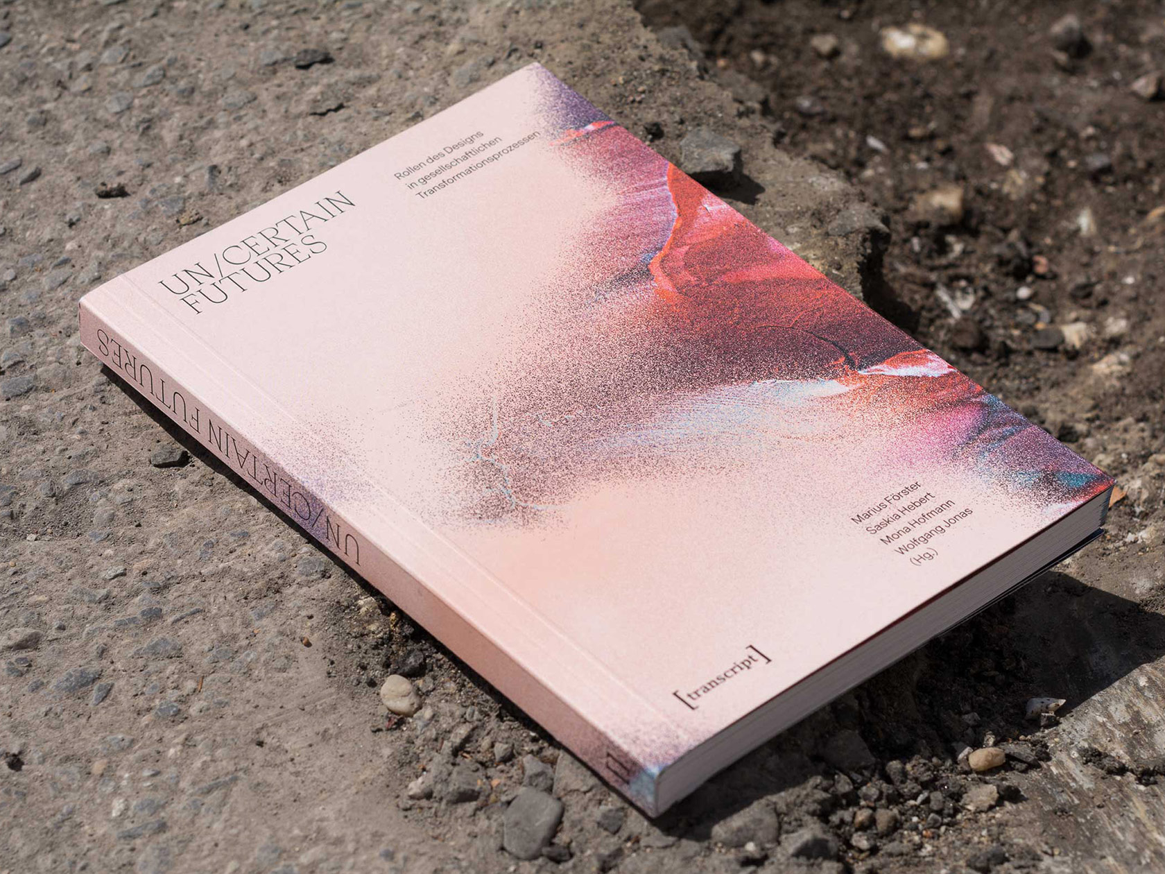
Their design not reflecting the position of their studio, but always the specific context of a project, operative.space understands graphic design as a political practice of mediation. Founded by Marius Förster, Robert Preusse und Stefanie Rau in 2017, the Berlin and Cologne based design studio offers design services for printed, digital and spatial communications, seeing anything from visual identities to editorial, exhibitions, websites and books. The grund_schule der künste in Berlin, Institute for Contemporary Art (ICA) in London or EPFL ArtLab in Lausanne are just a few of the many national and international project partners the studio has worked with. The studio’s approach is always context-specific and highly collaborative. “We work as equal partners and always involve each other for advice and feedback. For each project one person takes the lead and the responsibility”, the three designers explain. “We try to complement and learn from each others’ perspectives with each project. For us the creative process is a continuous process of learning.” In the following interview, the trio talks about the story behind their studio, their recent collaboration with grund_schule der künste Berlin and the reasons why they had to leave graphic design behind in order to return with a new perspective.
First of all, can you tell our readers a bit about yourselves and your backgrounds? How did you come to be as a design studio?
We all started out studying Visual Communication together in Berlin, but already during our time at the Berlin University of Arts, theory and the reflection about our practice became important and changed the way we approached design.
In our Master degrees we each followed our personal interests: Marius first went to the ZHdK in Zürich interested in transdisciplinary methods and then changed to the HBK Braunschweig to study Transformation Design, where he focused on the roles of design in social transformation processes. Robert studied at the Center for Research Architecture at Goldsmiths University in London where he developed his research-based practice into technologies of perception. Stefanie studied at the Sandberg Institute in Amsterdam within the Critical Studies department where she began writing and worked with formats such as lecture performances or essay films, thus developing a text-based artistic practice.
This process of expanding our practices was very important to our individual growth, to leave graphic design behind in order to return with a new perspective. With this experience and after many years of informal collaborations, we decided in 2017 to bring our practices together and form a design studio. It becomes only slowly visible how important these detours and transformations are to the way we work now.
What or who were your early passions and influences?
Understanding graphic design as an always already political practice of mediation we often found our interest outside of the field. Over time these concerns have changed, but they might be in activist questions, artistic endeavors, educational formats, social transformations and so on, but every time in a very specific and particular way.
How did you come up with the name of your studio, “operative.space”?
It took us very long to find and agree on a name. At some point we just needed to produce a credit for an imprint and “operative” was one of the terms on our list that we all liked. The complementing domain ending “.space” of the name was mostly a practical decision of being searchable, but at the same time the name gives elusive endeavors between theory and practice a tangible voice.
In the beginning, when we started without an office space, the name was also a reference to the virtuality of the studio that since has materialized.
How does your dynamic work as a studio?
We work as equal partners and always involve each other for advice and feedback. For each project one person takes the lead and the responsibility. When all three of us are involved, we divide our tasks and then exchange them. Especially in the concept phase of a project, the discussions between us are extremely important. We often hand over drafts to each other, this helps us to build on and develop ideas and create a common language of what “operative.space” is. We try to complement and learn from each others’ perspectives with each project. For us the creative process is a continuous process of learning.
How would you describe the aesthetic of your work in general?
On the surface, we might not have one rigid aesthetic practice, but we engage every project in its specific context. This means that the first step is always to listen and to understand what and who we are working and collaborating with. Their expertise is intrinsic, because often we have a lot to learn from them. The resulting aesthetic does therefore not reflect some position or idea of the studio, but our approach of a design that is context-specific.
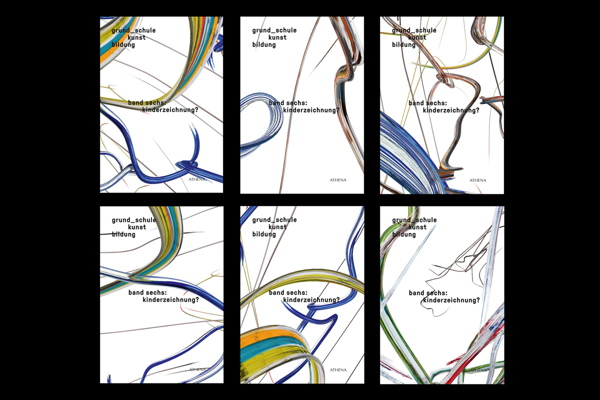
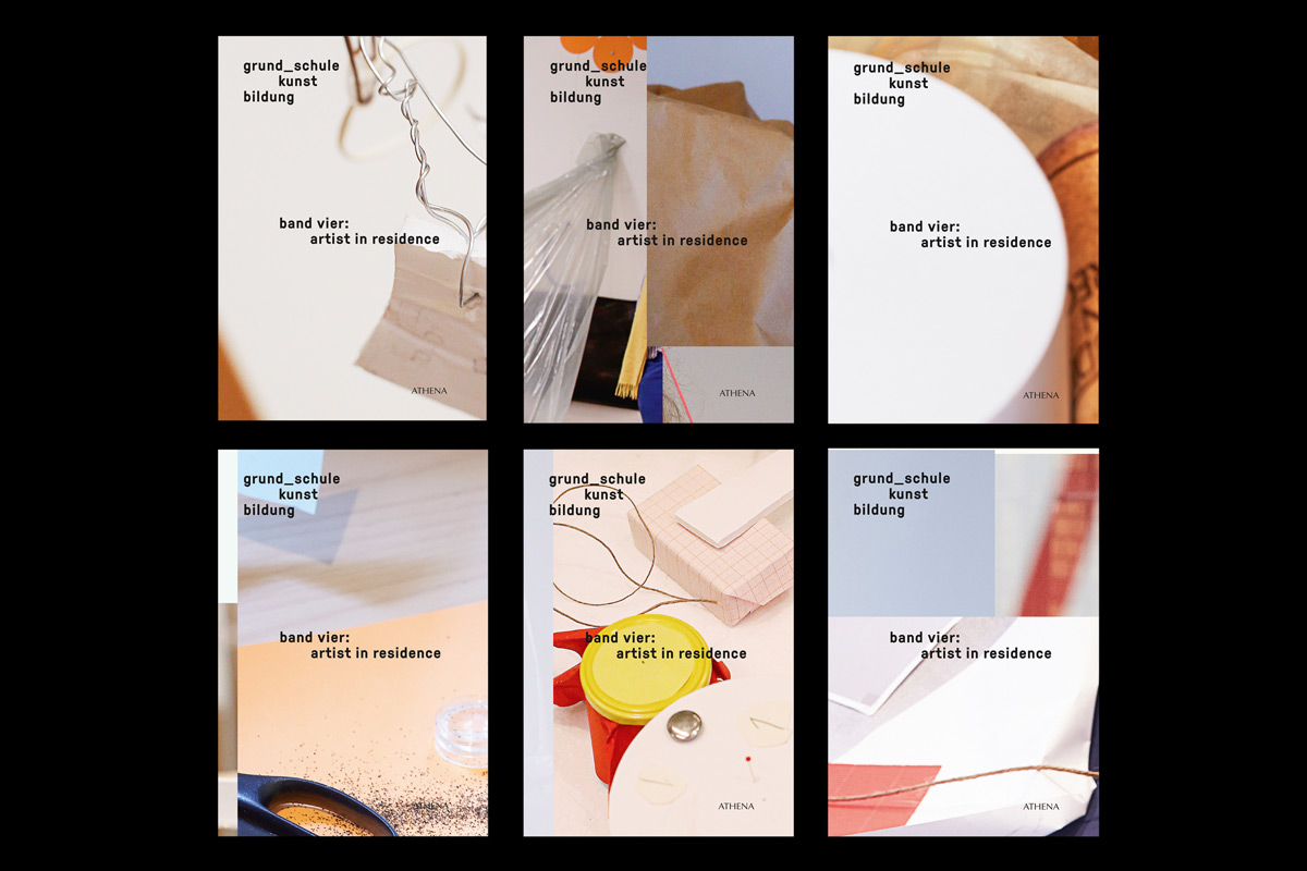
Can you tell us more about the collaboration with grund_schule der künste? What is the concept behind the editions of „grund_schule kunst bildung“?
grund_schule kunst bildung is a department at the Berlin University of the Arts (UdK) for which we started working when we were still in our studies. It is one of these long running projects with which we were able to grow. The department understands arts education not as an affair of the ivory tower but values school children as equals that express themselves artistically. It invites them into the spaces of the university and helps art students enter into schools. One of the formats where they reflect on their practice is the yearly publication. We proposed to print a unique cover for every single book of the edition as a way to communicate their artistic and pedagogic stance.
How closely did you work together with the school during the collaboration?
Especially in the beginning our collaboration was very close. We needed to understand many aspects of the department and become sensitive to how specific aesthetics are read within this environment. After seven volumes the process works smoothly, but every volume begins with a meeting where we engage and try to understand the material that we are working with. It is an interesting process of back and forth in understanding each others concepts until the cover idea grows into many gigabytes of print material.
How does the visuality of the books incorporate the philosophy of the department?
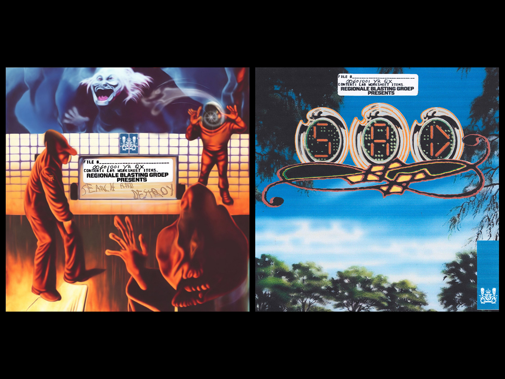
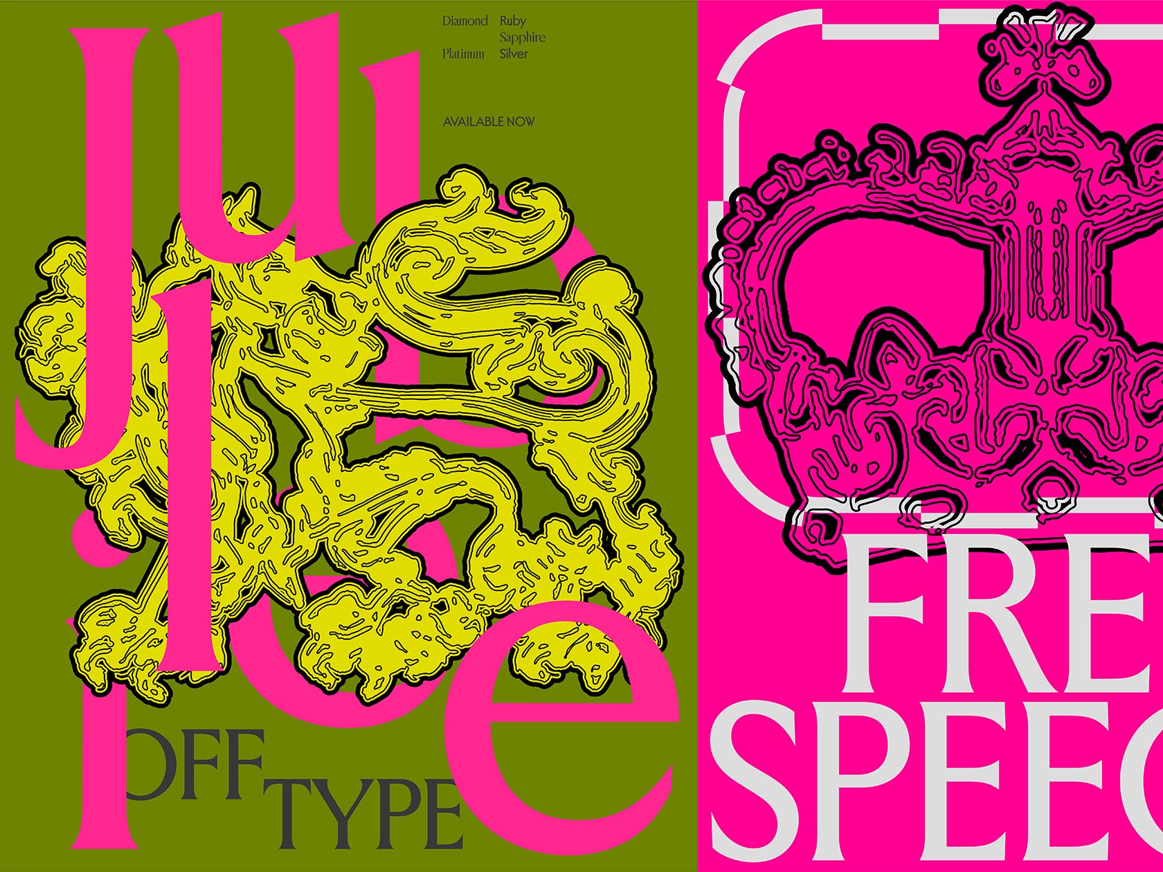
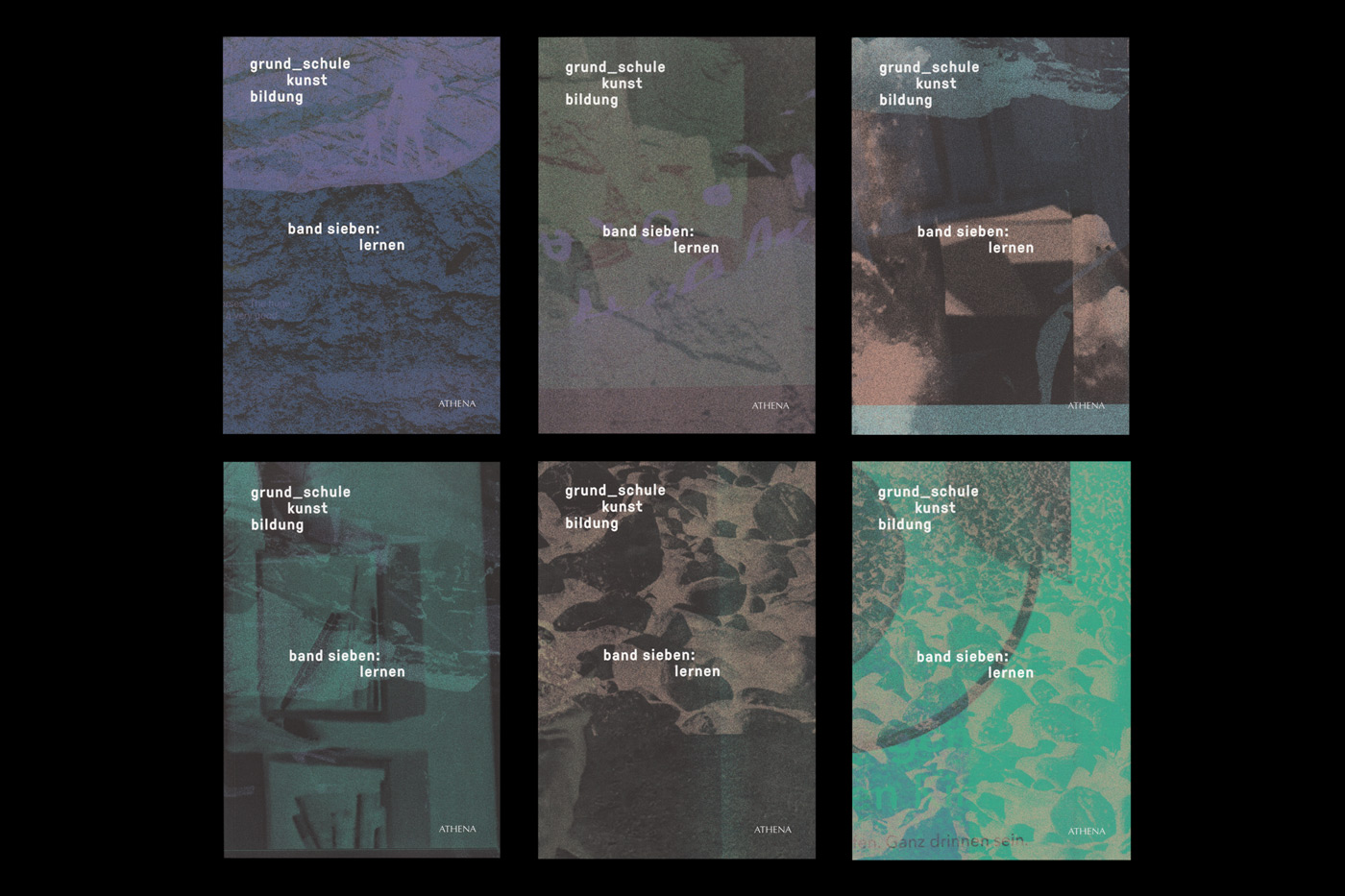
The aesthetics change and develop, but the principle remains: every single edition is different. We provoke playful accidents, set up structures to generate variations, show multitudes and render visible their differences and similarities next to each other. This does not encompass the philosophy of the department, but points toward a position.
For the 7th edition you generated 500 unique covers. How did you come up with the idea of having so many different covers?
For every volume we set up some kind of program with which we generate many hundred mutations. After fine-tuning the process to our happiness we select our favorites. This process is an experiment in computational variation and a chance for us to learn and develop new design tools.
Can you give us some insight into the process of creating those covers? What kind of material and programs did you use?
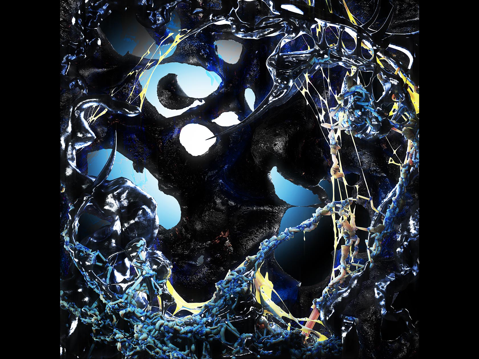
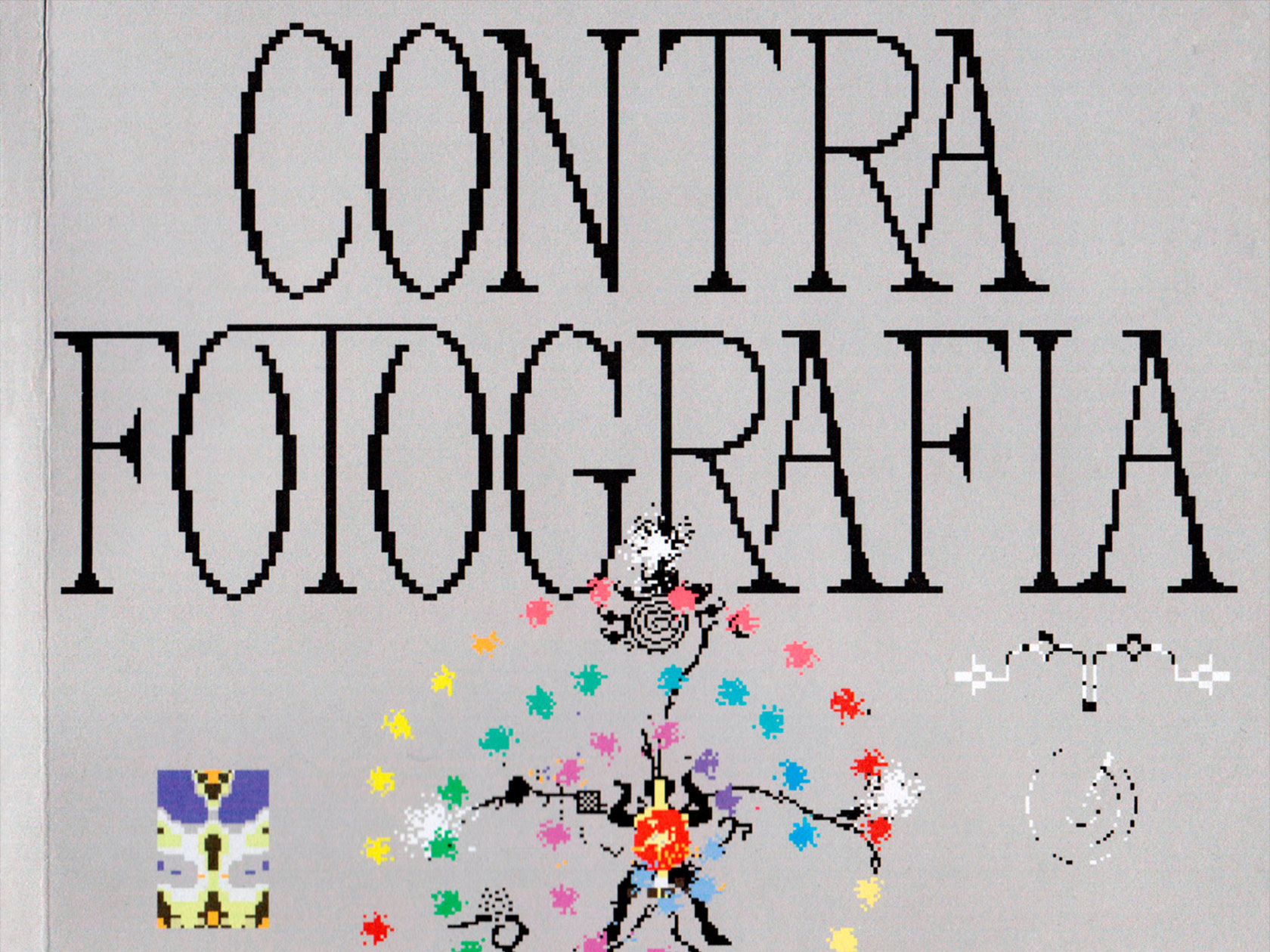
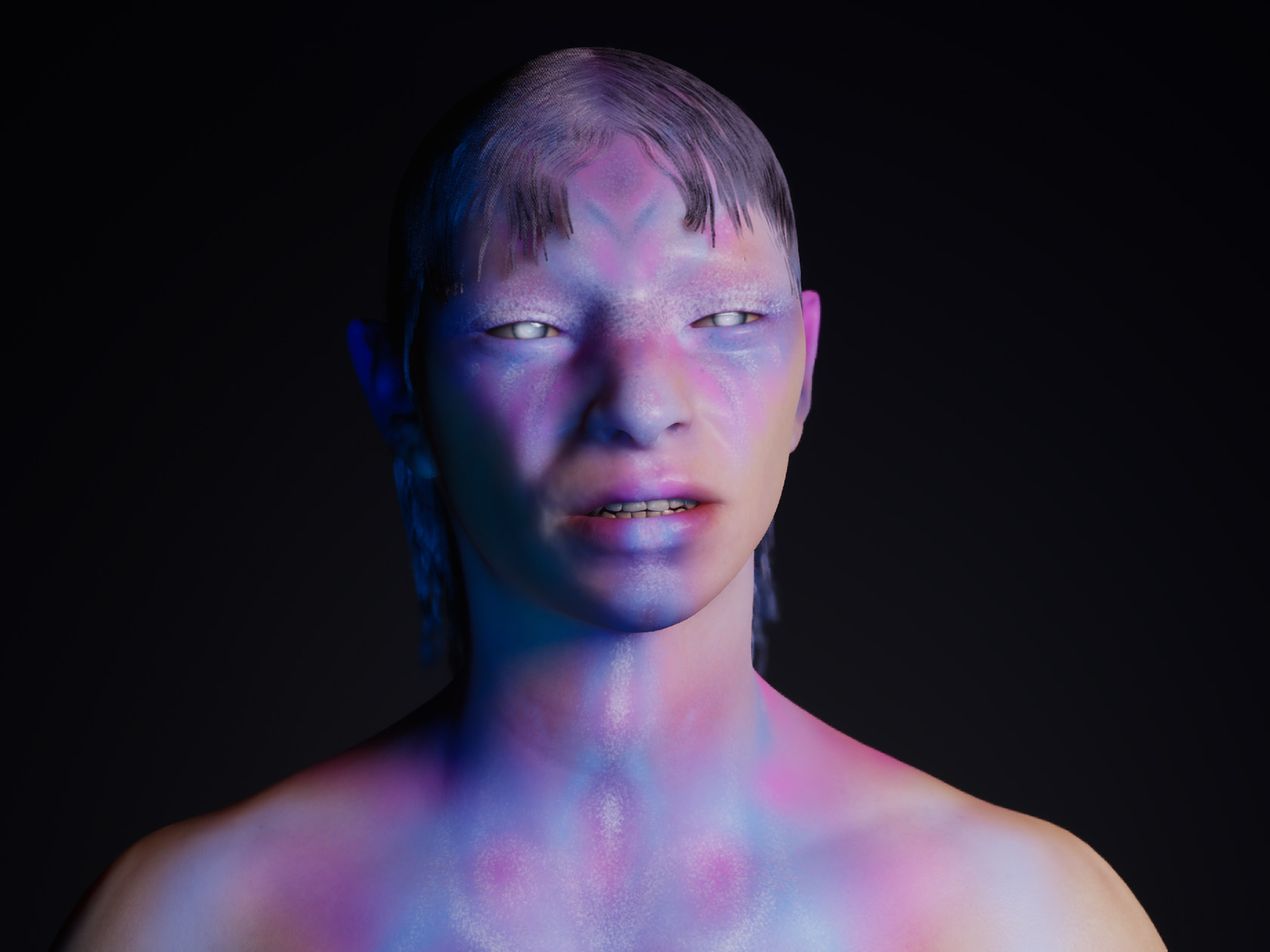
We either produce our very own interpretation of the theme or we use material from the publication itself. This can be scans from drawings, photographs, 3D models or something completely different. Technically we criss-cross various tools stacking material that we then either compile using the “scripting tool” module in InDesign or we generate frames from a 3D animation.
What were the different steps of the working process?
That is very tedious and a bit boring. We essentially play scripts or automations to produce an aesthetic that relates to the given topic. After that it is mostly an exercise in optimizing the process, avoiding mistakes, selecting and finally making the 500 variations print ready in InDesign resulting in a huge PDF that the printer can never download.
What is important to you during a collaboration?
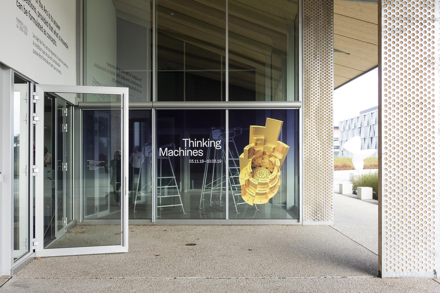
Almost all of our work has a collaborative character. The way in which, for example, a joint briefing is prepared or the framework conditions are defined is an important foundation of every project. In the creative process we include our clients very early in the form of a “Schulterblick” or short insight into our very first sketches and ideas. This is important to reflect our and the clients own reading of the brief. To take each other seriously and to be precise in the analysis and first ideas often leads us to the final results.
Do you have any collaborative projects in mind which you find inspiring?
An important collaborative project for us has been Parallel School – a workshop format that Robert and Stefanie got involved in between 2013 and 2015, organizing workshops in Berlin and as part of the Off Programme of the International Biennial of Graphic Design in Brno. The idea behind Parallel School is simply to create a space in which every participant is at the same time teacher and student. This means that everybody who takes part contributes something into the space, something that can be shared with the group, an activity, an exercise, a discussion, etc. It’s about learning from each other, getting to know each other instead of focusing on the outcome or a result. This created a special energy and an atmosphere that we rarely experienced in regular educational settings. Through this involvement, friendships have formed that have changed our trajectories and that are very dear to us today. This project taught us how little it takes to initiate exchange.
What can we expect to see from you in the next months?Any projects in the pipeline?
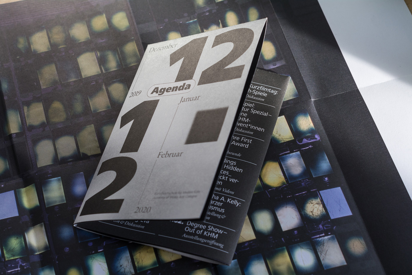
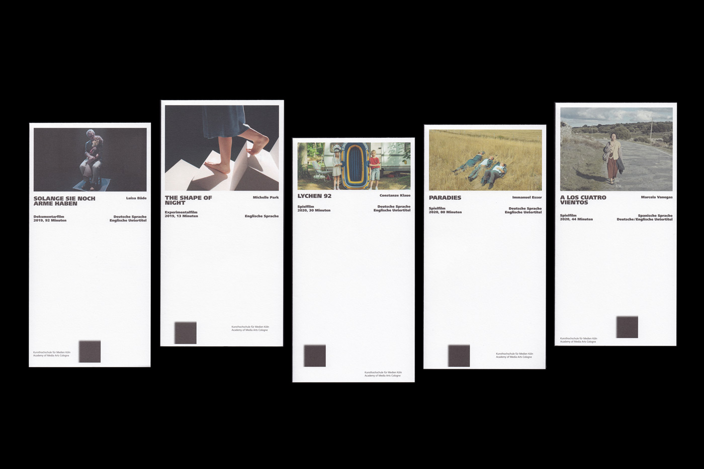
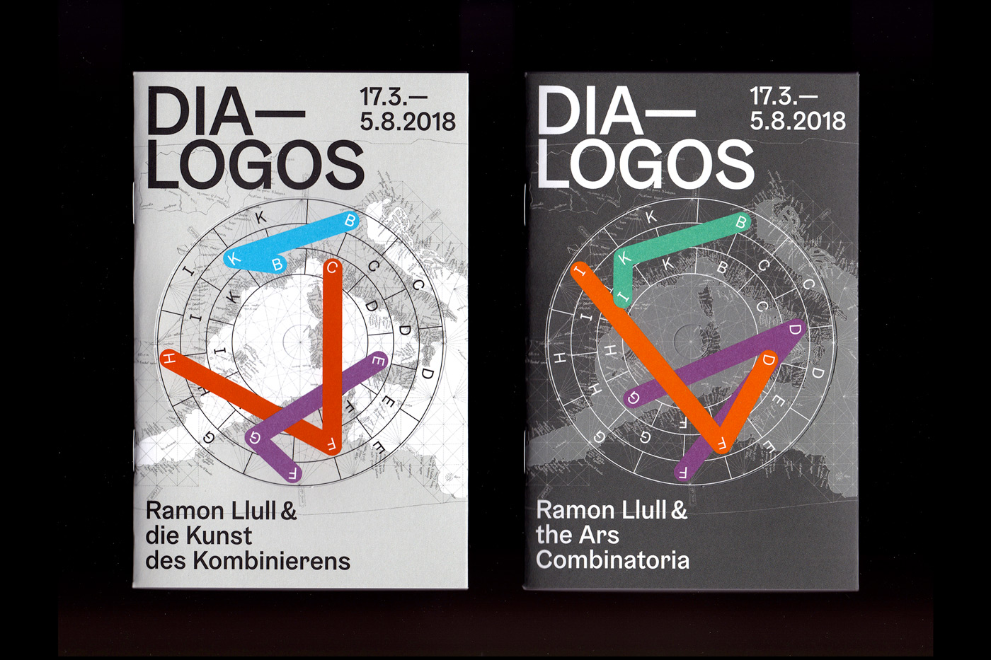
Currently we are working on the visual appearance of an exhibition project at ZKM Center for Art and Media Karlsruhe, which we have been involved in for almost two years. Furthermore, we are busy with the redesign of the graphic appearance of the Academy of Media Arts in Cologne. This cooperation is designed as a long-term process and we are very happy to be involved in redesigning such a great institution. This includes the signage system, the annual exhibition and many smaller graphic formats.

