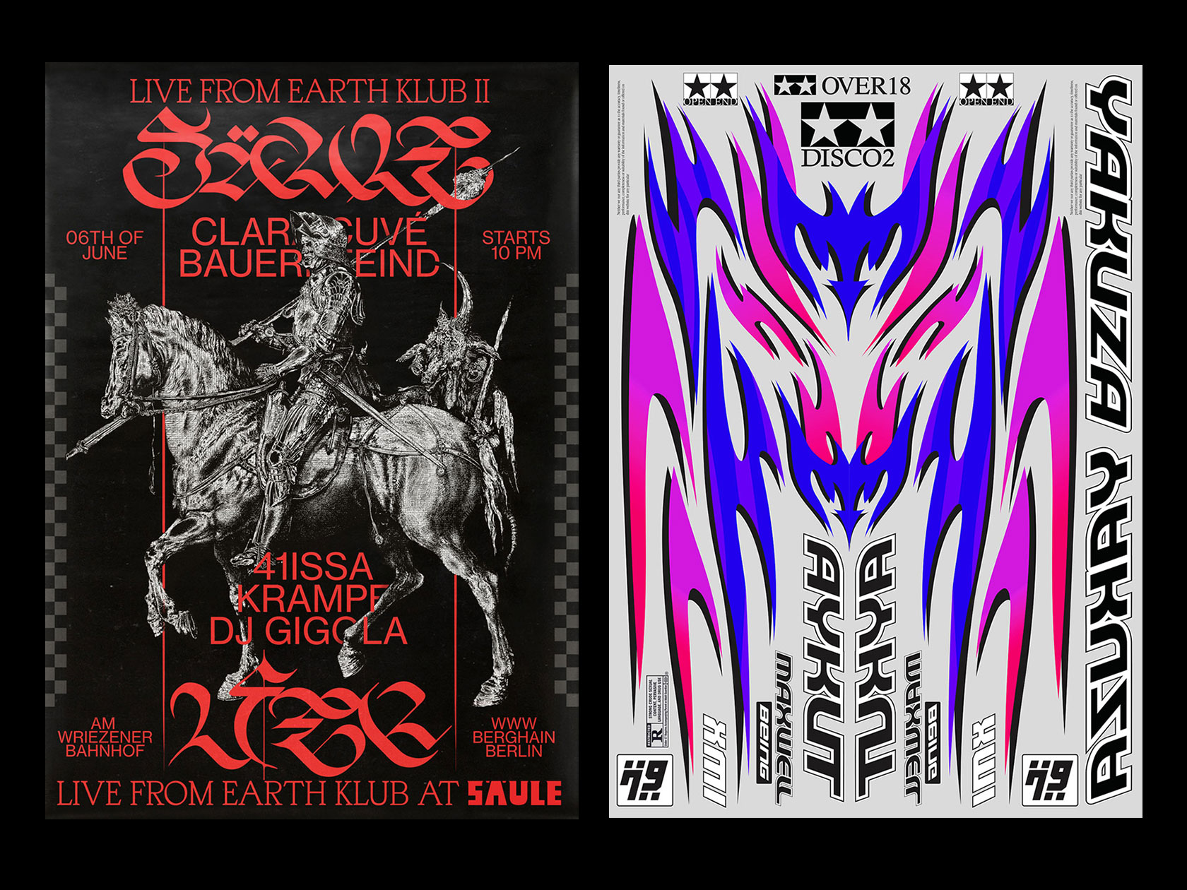
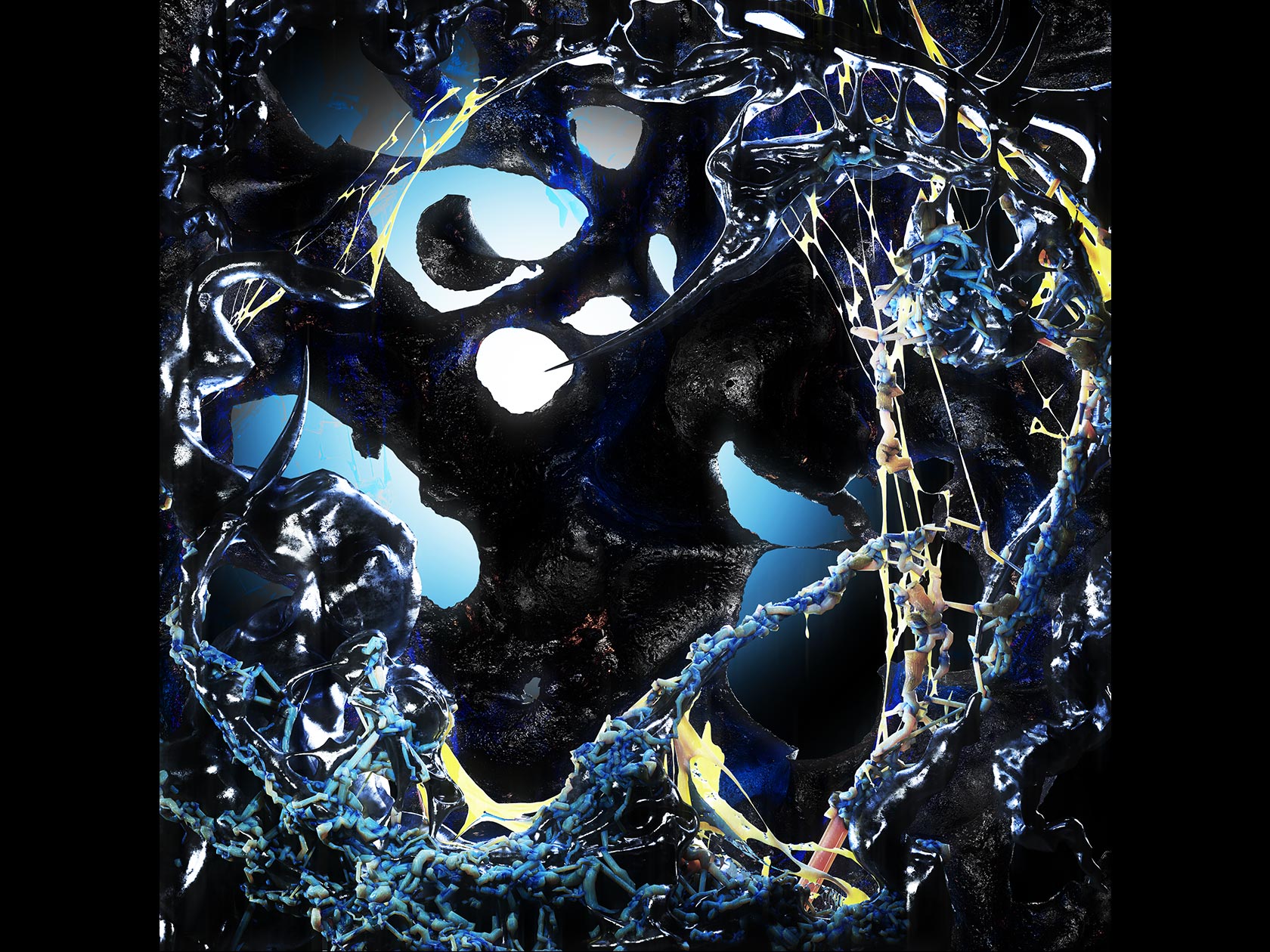
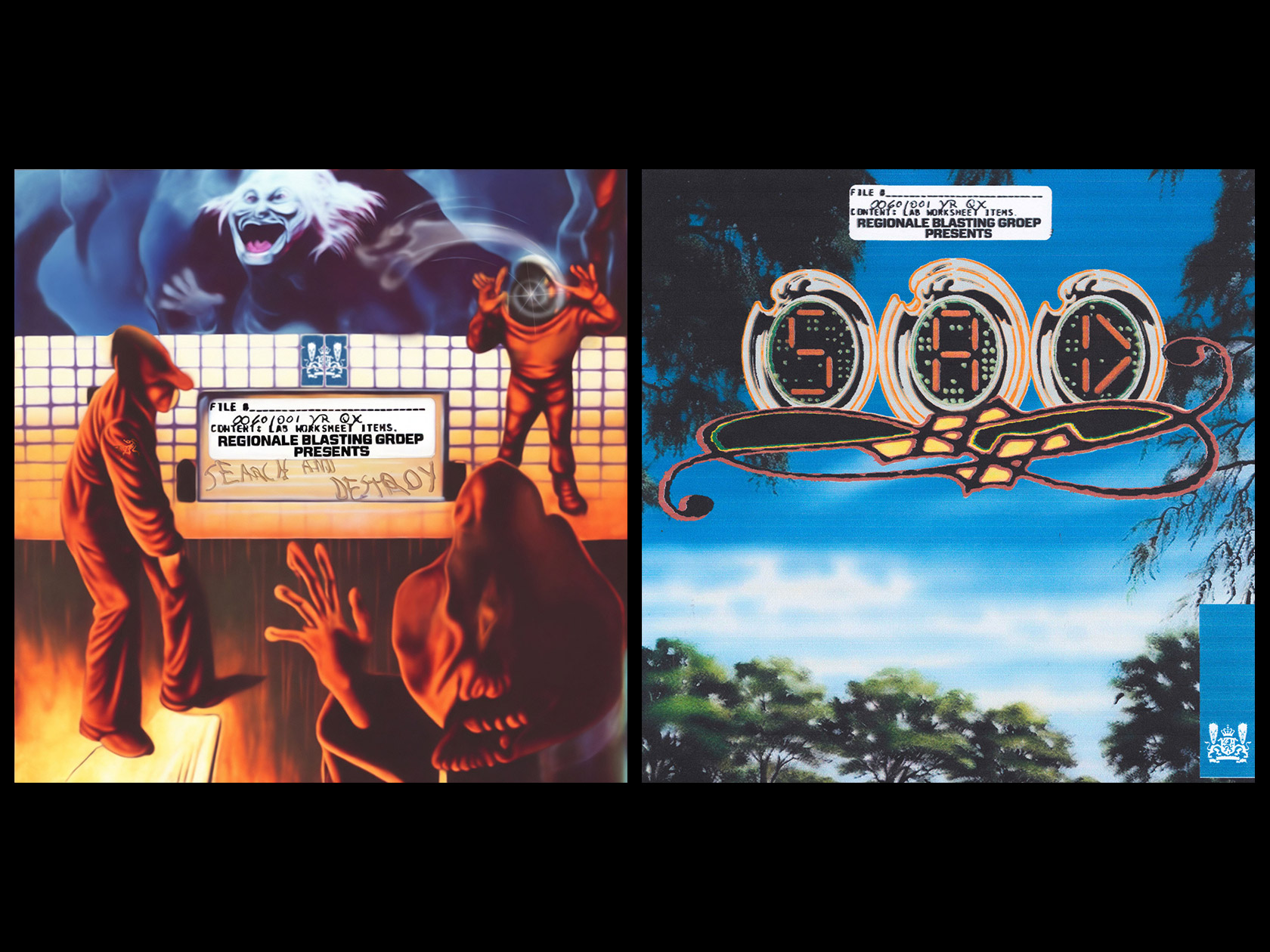
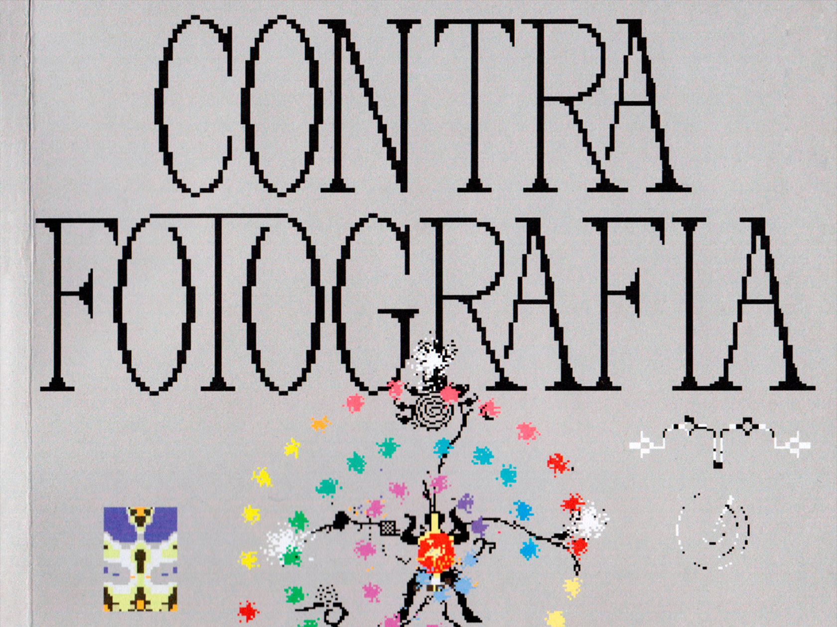
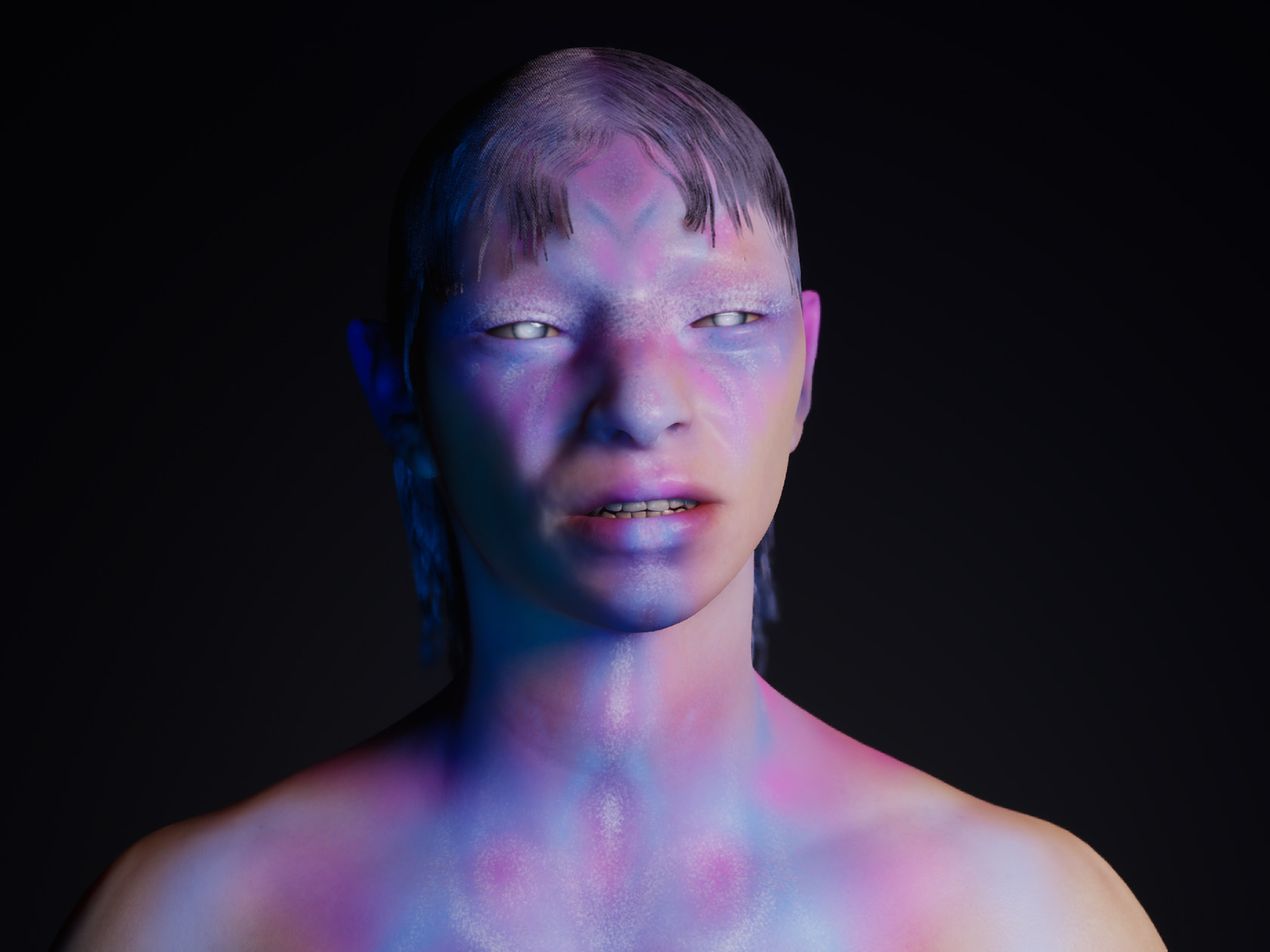
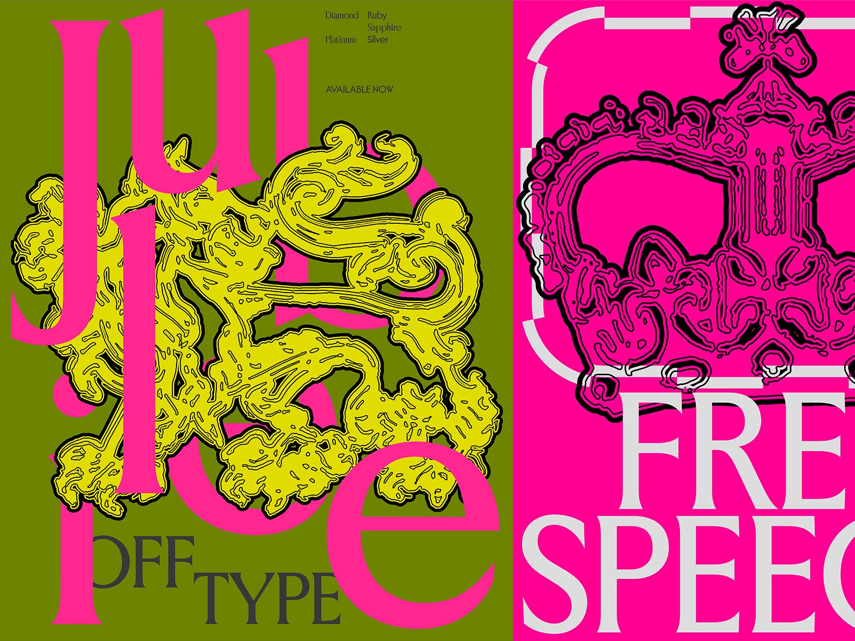
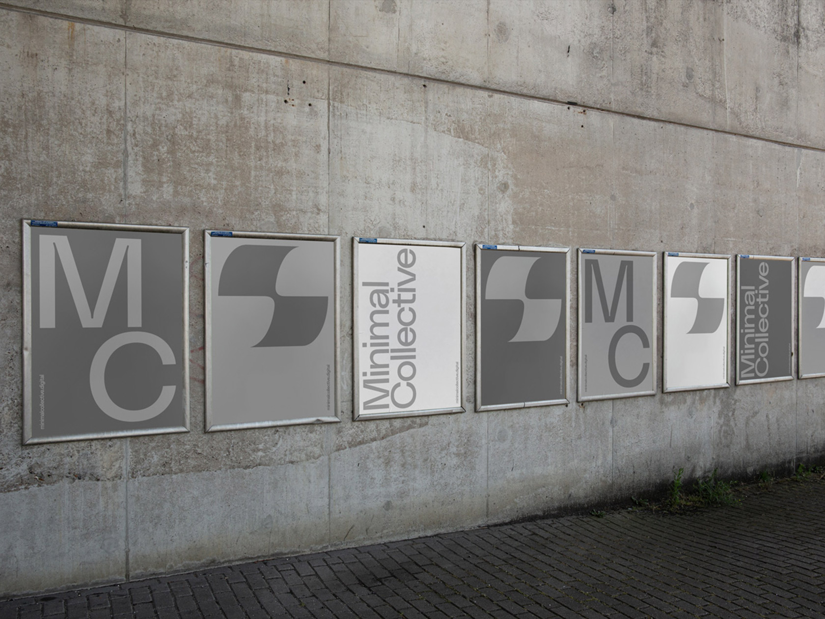
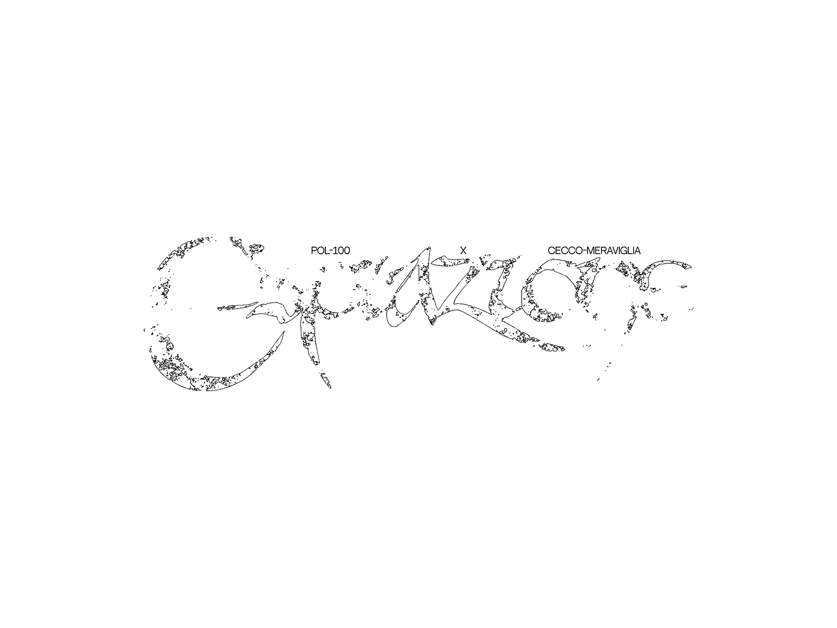
If you are interested in contemporary graphic design, you will surely stumble upon the name of Tim Lindacher at some point. With an excellent eye for details and an unbelievably good sense for upcoming movements in the scene, his work always seems to be one step ahead. His portfolio consists of various projects for musicians and cultural constitutions, ranging from the 1220 Magazine for Yung Hurn to the self initiated poster series “Decal Sheet”, which was part of 100 Beste Plakate 2019. If he would have to describe his own style, Tim would describe it as a good mixture: “I really love to use the whole format given. I preferably work with typography and try to combine different aspects of graphic design. Working closely with friends is always inspiring to me.”
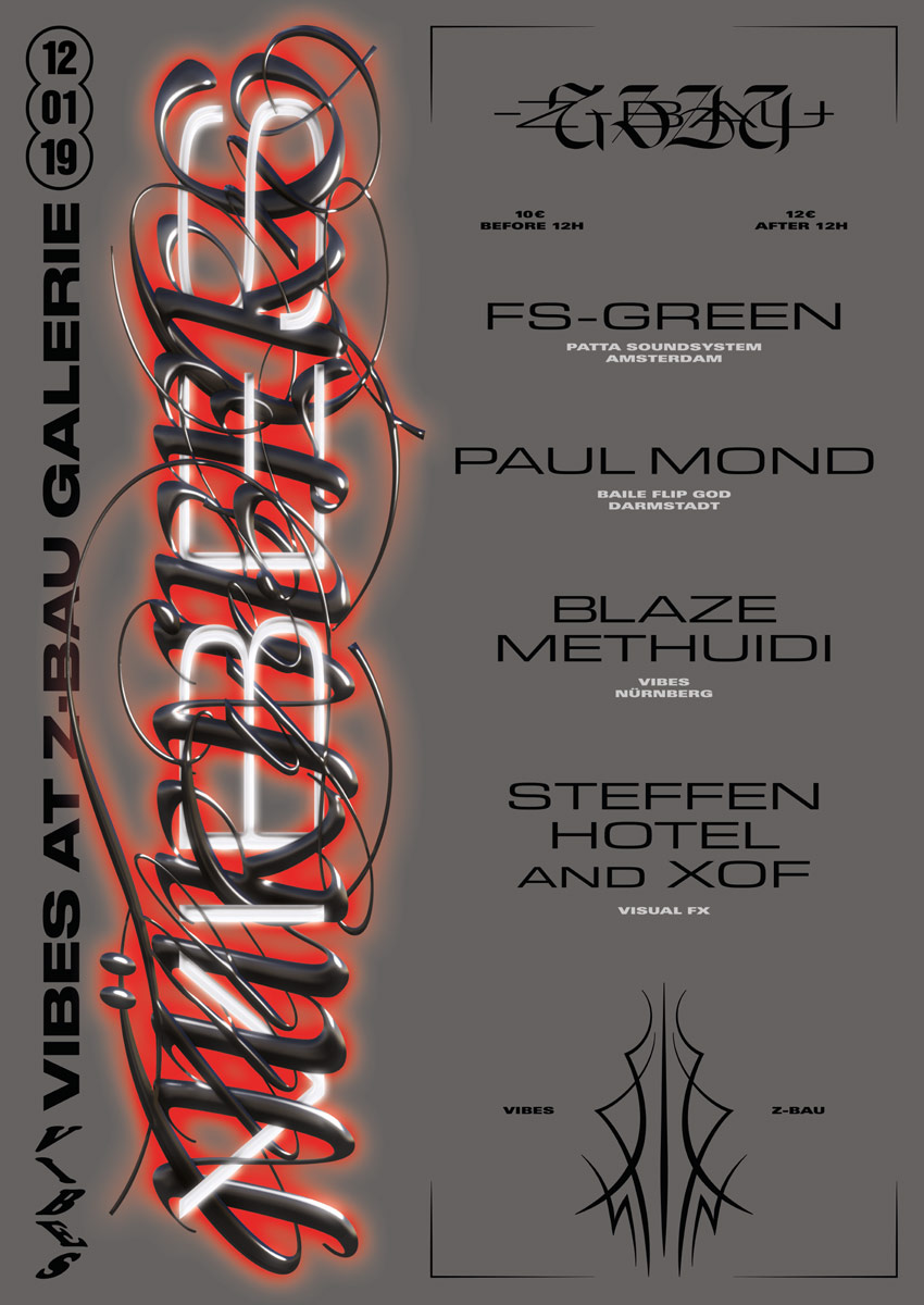
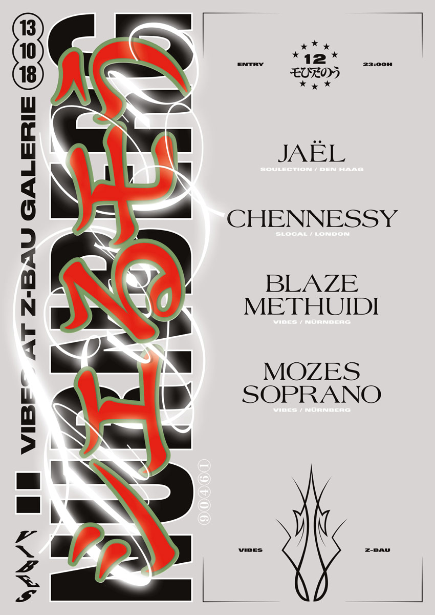
Collaborating with friends has always been an important aspect of Tim’s design career. Sharing a flat with “extremely talented graphic designers and even bigger friends” over several years during his studies in Mannheim, has given him the fortune to be daily surrounded by not only good company, but also fresh input and inspiration. “It was an amazing time that will never be forgotten. The whole vibe around it was super important for all of us.”
Where do you get your inspiration from?
Mostly friends. Talking to each other is super inspiring for me.
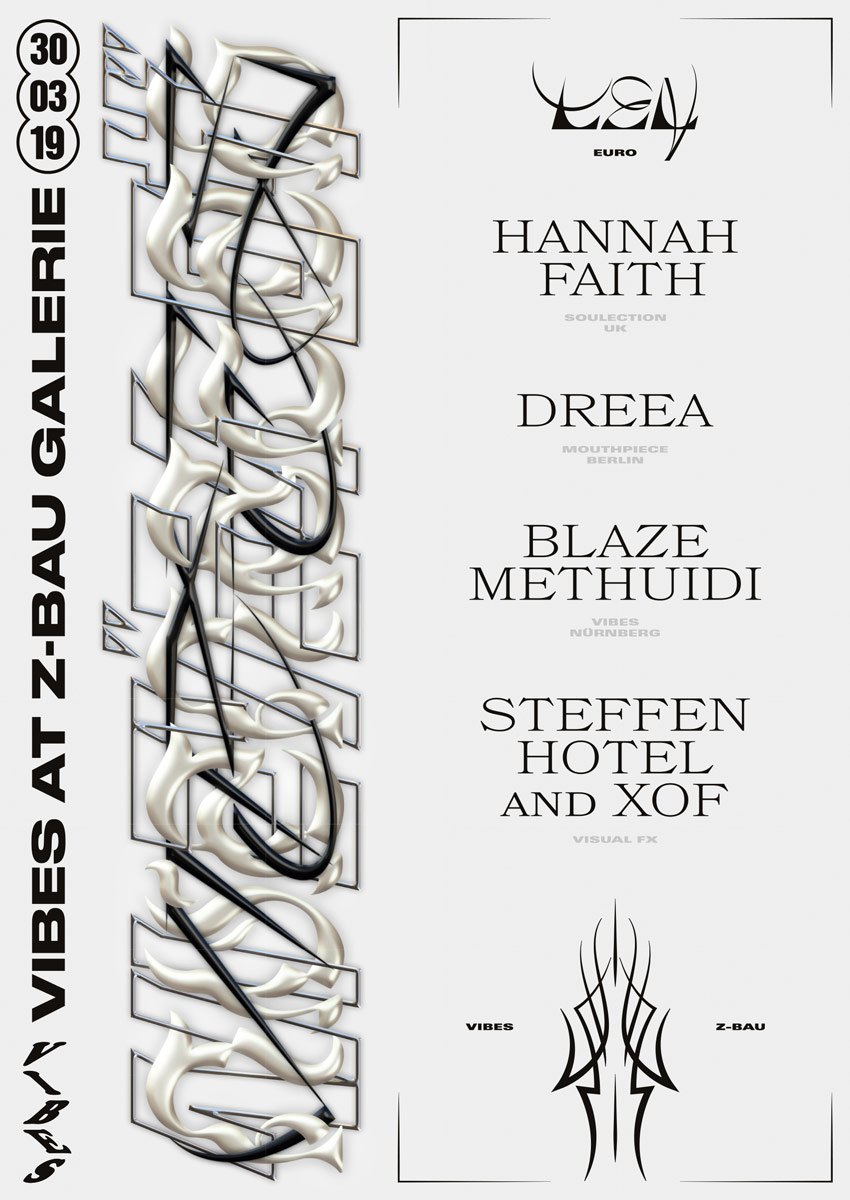
Many of the friendships built at that time have lead to collaborative projects and in fact to long-lasting working relationships. “In my opinion collaborations are always a win-win situation for everyone involved. If you don’t know each other yet (what i would recommend), they may begin with working together, but it has proven to me that most of the time they end with a friendship as long as everyone is in the same sense of feelings”, Tim says, “As Sebastian Zimmerhackl once said: ‚1+1=11‘.”
How do you resolve conflicts that might occur during collaborations?
As long as you treat each other respectfully it should be all fine. Don’t take arguments personally, try to keep an eye on the bigger picture.
Especially working on the 1220 Mag together with Yung Hurn, Steffen Hotel, Simone Cihlar and Josie Doser felt like a “breaktrough” to Tim: “It was a crazy experience. This all started out of an idea Steffen had back in the days. We had a collaboration going on called »A Mag A Month« were we chose a theme every month, searching for content that we both found interesting and then designed a Magazine that fitted the theme. Steffen showed this project to Yung Hurn during his internship at Selam X. That’s when he became aware of us.” The Magazine itself has been a special add-on release in an album bundle for Yung Hurn’s record “1220”. Its design aesthetic seems to follow no rules or certain structures, but feels more like a colorful, popping sequence of spontaneous snapshots and rough scraps of conversations – fitting perfectly to the impulsive and Dada-like music of Yung Hurn.
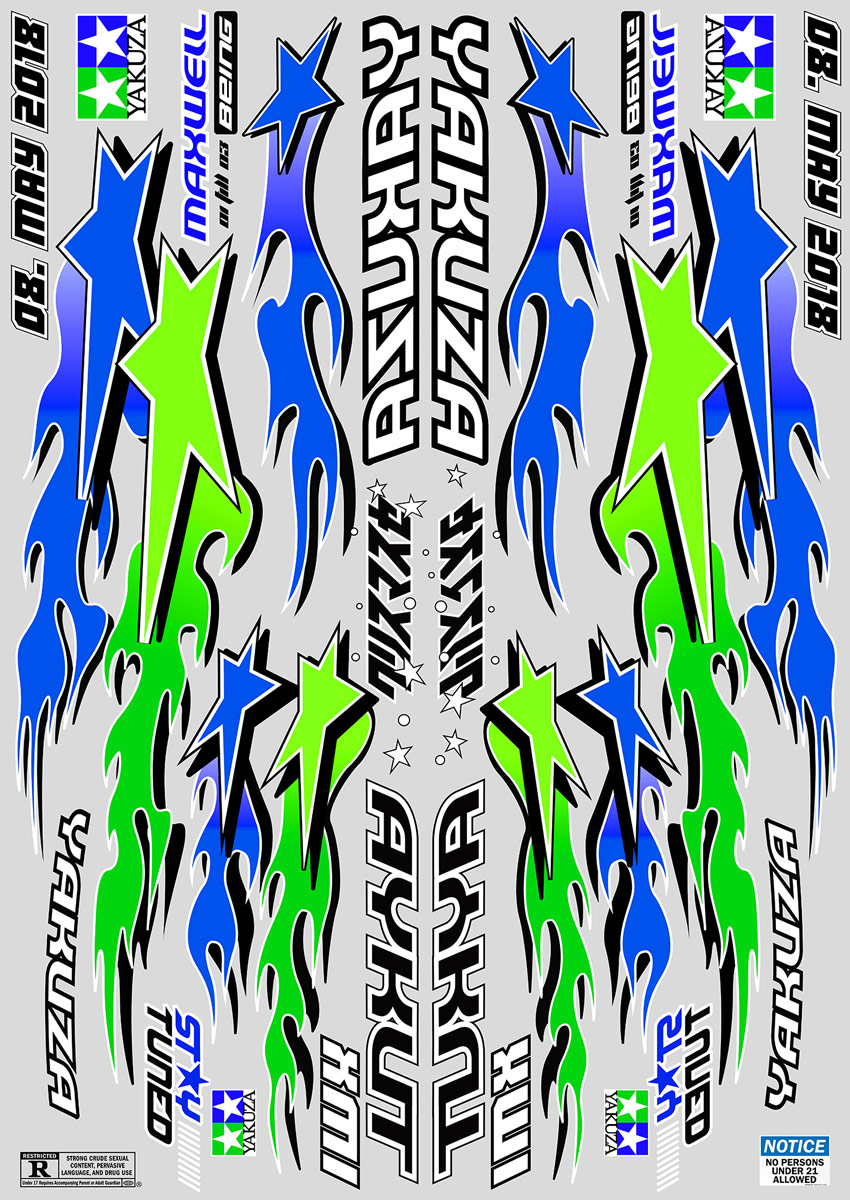
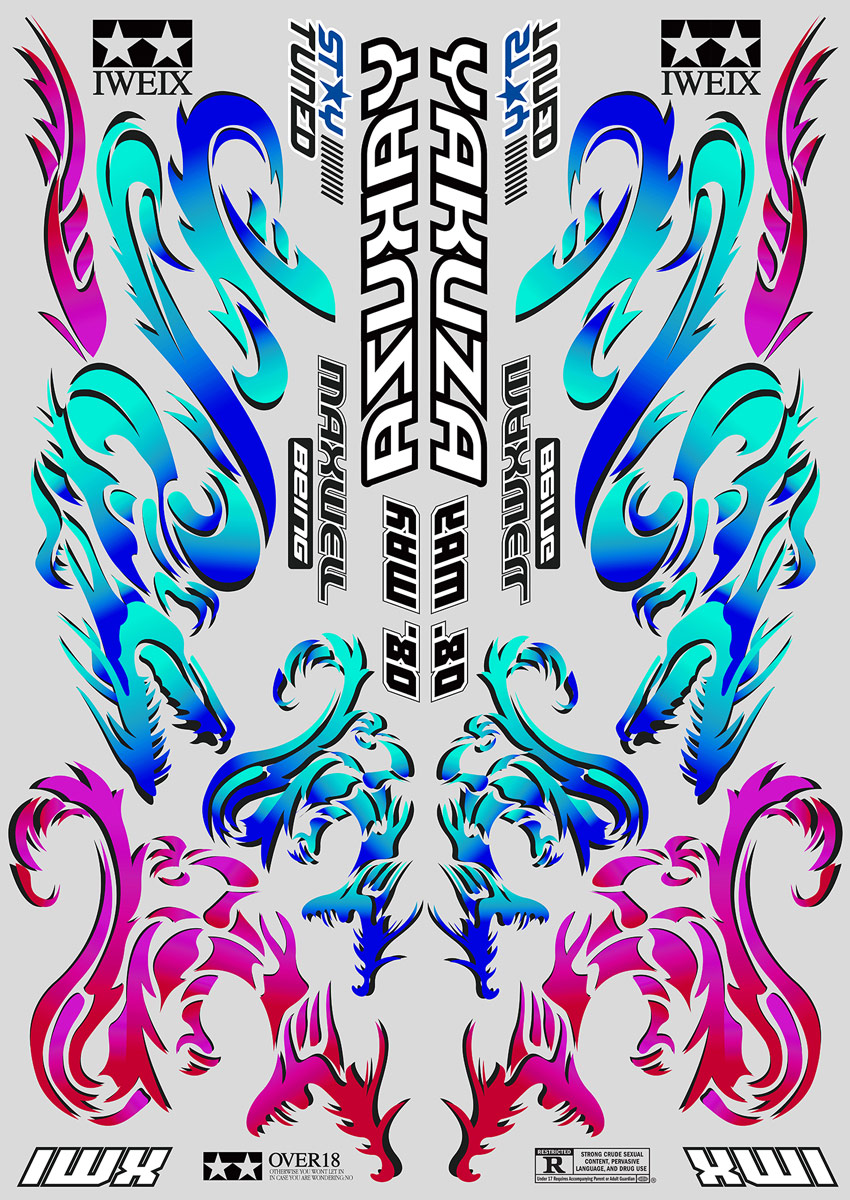
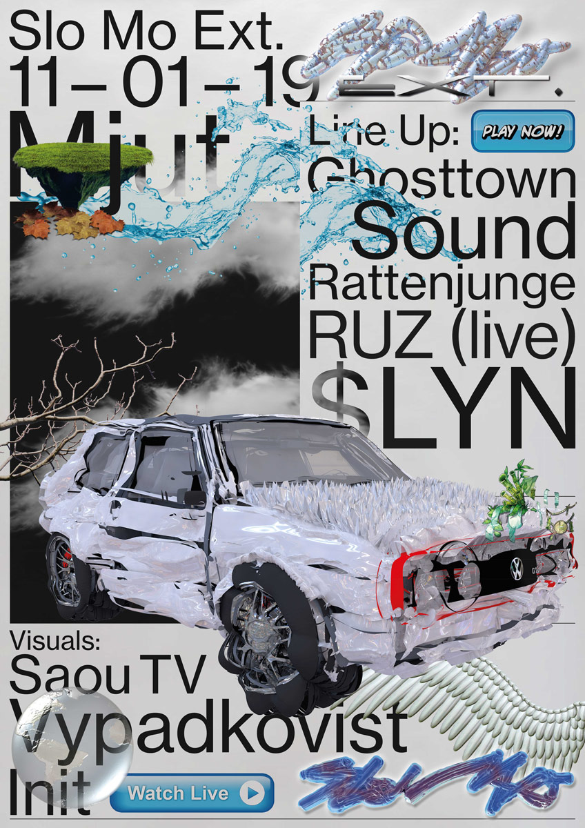
Other collaborations, like the poster series “Decal Sheet” which Tim designed together with Mannheim based graphic designer Josie Doser, show their ability to adapt graphical influences from other scenes and transform them into something new. The posters were inspired by 90s decal sheets known from racing cars and the motocross industry.
Do you have any collaborative projects in mind which you find inspiring?
Yes! I really love the works of Kevin Bray and Braulio Amado. When they announced there collaboration I was hyped as fuck and they did not disappoint!
As far as future collaborations, Tim is “open for nearly anything”. At the moment, he will be working more closely with graphic designer and illustrator Simone Cihlar who is known for her abstract and surreal artworks for musician Anderson Paak and with whom Tim would like to start an own studio at someday. So, whatever Tim’s future may hold for him, we are sure he will make it look pretty damn good.
Tim Lindacher in 5 years? Professor or leading a studio?
I would definitely prefer being a Professor but who knows?
I am open for anything.

