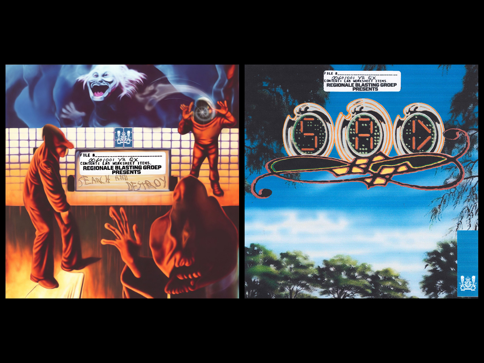
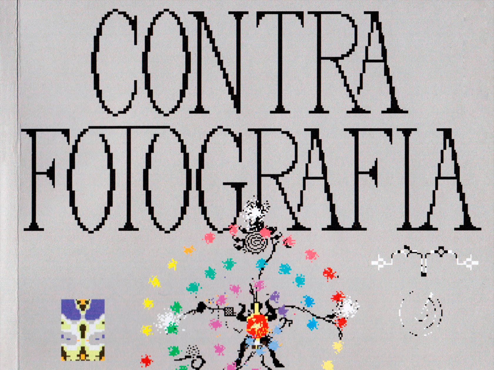
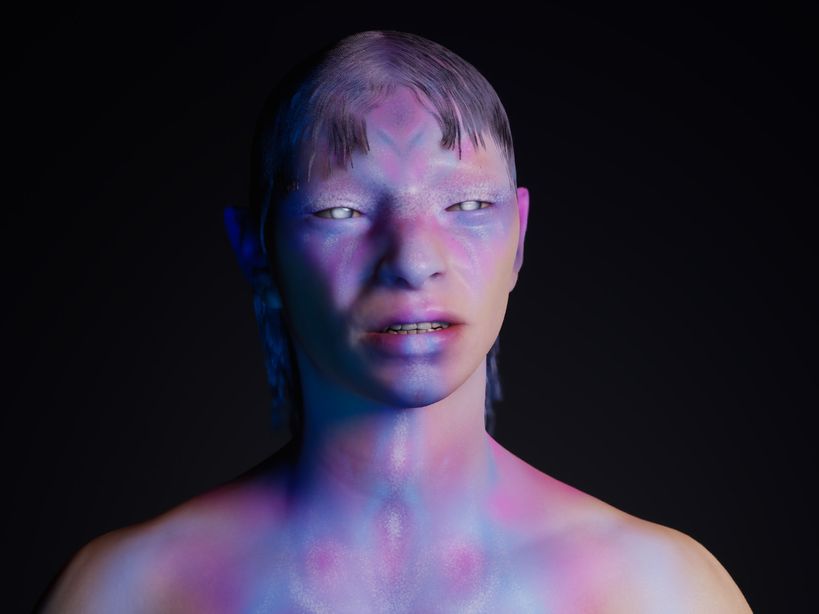
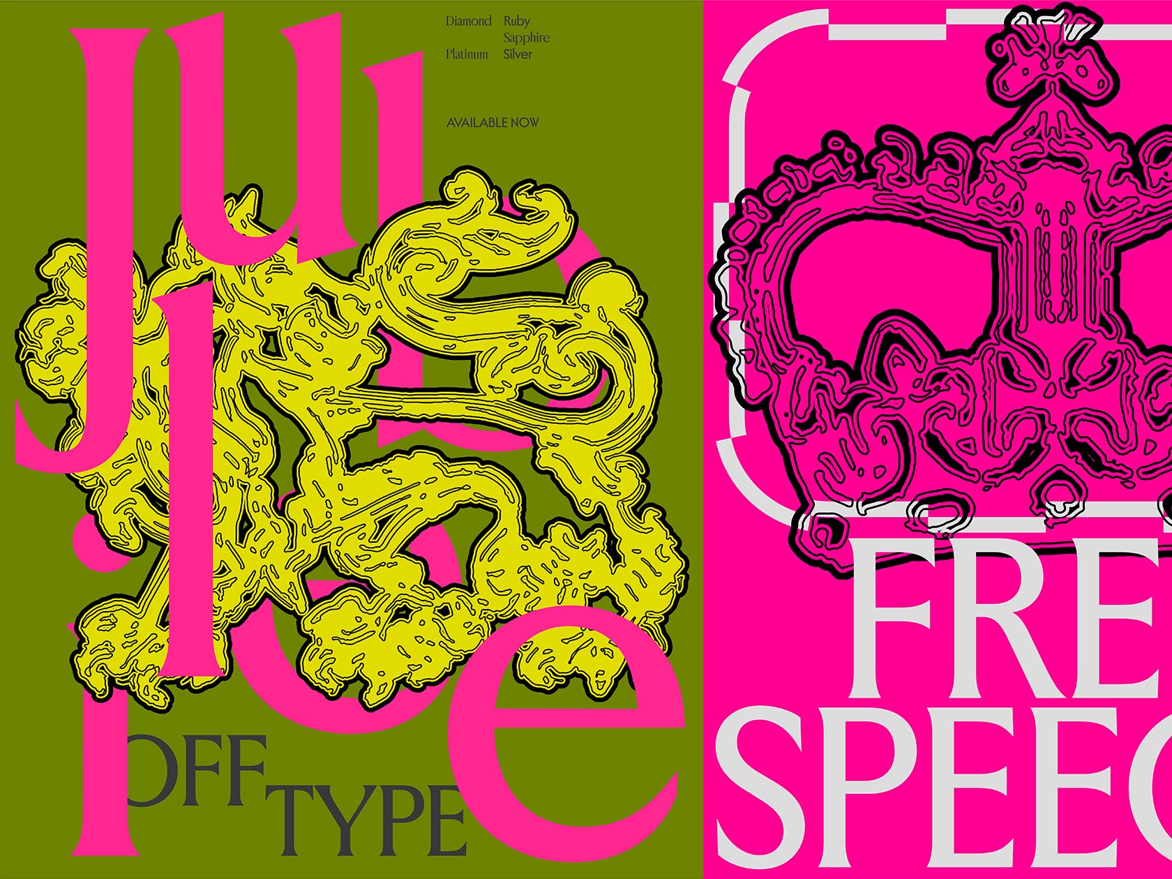
Barcelona based studio Léon Romero was born out of the ambition to take a different approach on art direction and graphic design. Conceiving each project as a challenge – regardless of its scope – the two duo behind the studio, Jorge Léon and Mikel Romero, have tried and tested the ways of working that best suit them. Immersing themselves in experimentation and exploring the unfamiliar, the duo describes themselves as being “in constant evolution”. The studio aims at building a collaborative network with like-minded creatives from various disciplines in order to address all kind of design briefs. In the last few months since their formation, Léon Romero have worked with a range of exciting clients, among them fashion label Lavina Peswani, The Visual Arts Festival of Lanzarote Veintinueve Trece, CCCB, Levi’s and many more. With their focus on typographic details, the studio’s practice feels playful and experimental, yet functional and highly considered at the same time.
Since being introduced by a mutual friend, Jorge and Mikel have built a strong friendship over the last years. After working for various local agencies for quite some time, they both decided that it was time for a change – and founded their studio Léon Romero soon after. When it comes to work, the duo usually jumps between different projects as not to get stuck in the same way of working. “We both have similar profiles and we approach every task in a very similar way, always questioning our own decisions to make the best of each practice”, Jorge and Mikel tell Collide24, “This often leads us to a continuous round of critics, explanations, tests, argumentations and decisions. The whole process is really enriching to us.” By adapting their process to the needs of every project, the duo invests a lot of time in finding the right concept and strategy before focusing on the visual exploration. “We have not a particular methodology as we approach every process differently, depending on the client’s needs, assignments, the budget or deadline”, they add.
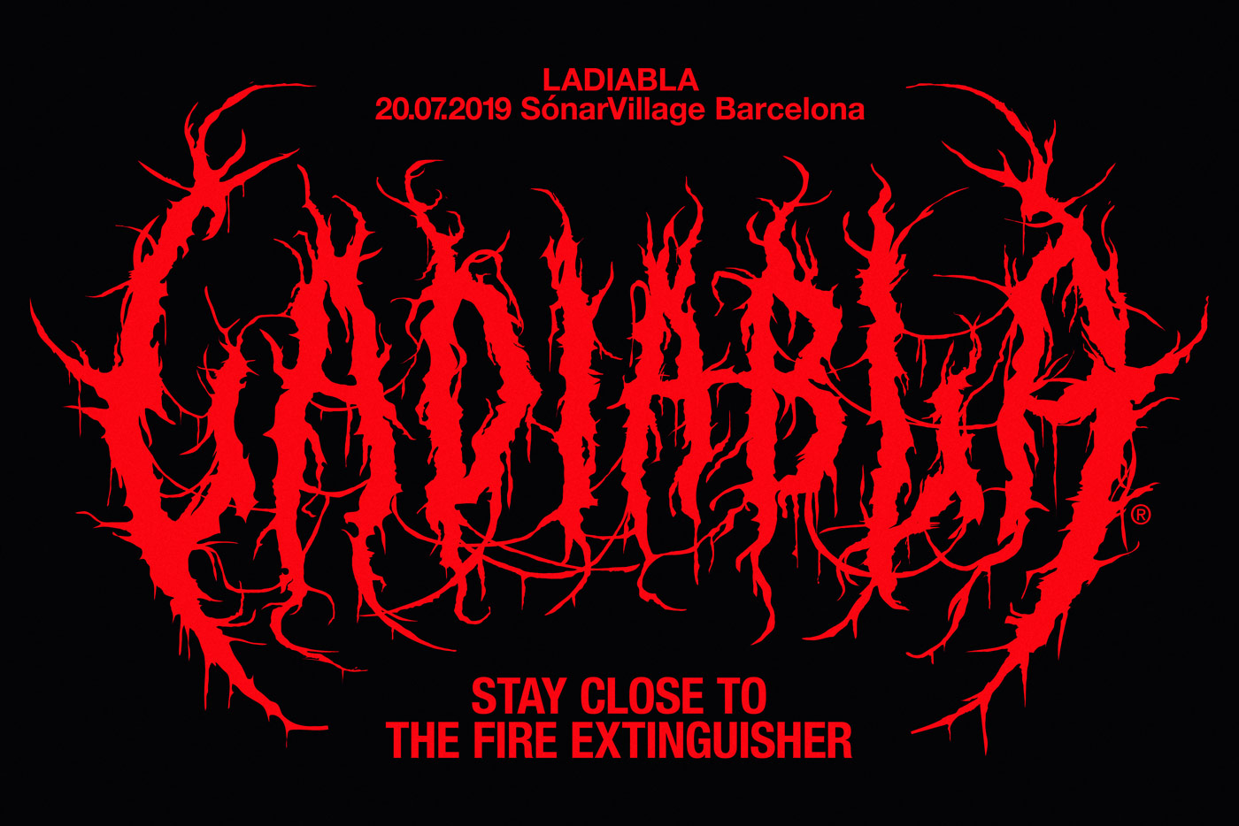
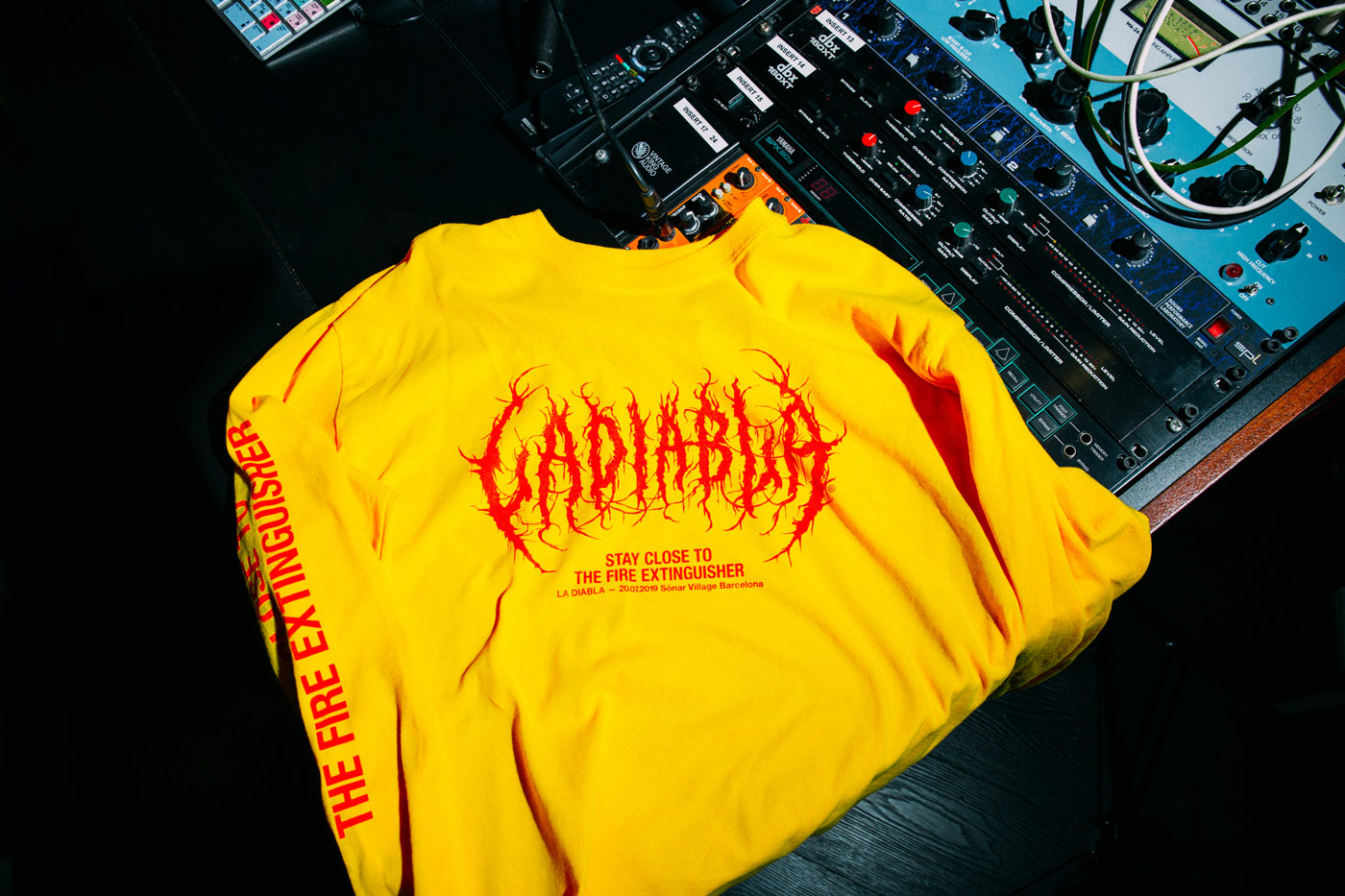
With collaboration at the heart of the studio’s ethos, Léon Romero worked together with various artists in the past, slowly but steadily building up their creative network. “As creatives, we have some kind of responsibility or duty in generating culture. That is why we have collaborated with so many friends over this year”, Jorge and Mikel explain, “This allow us to meet interesting people, trying new ways of doing things and open ourselves to new cultures. In some way we also think collaborating helps us to positioning the studio as an open structure lead by us.”
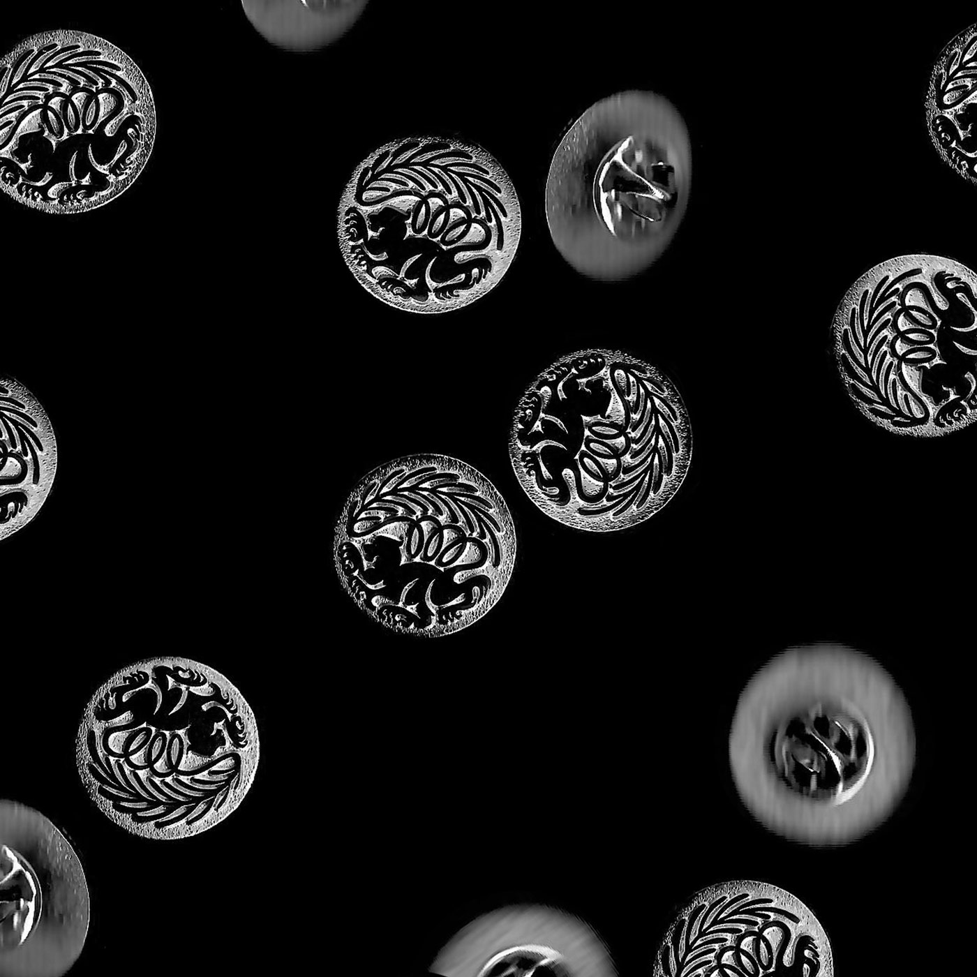
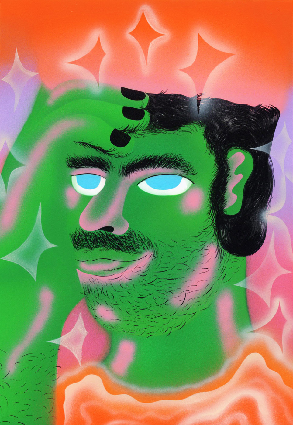
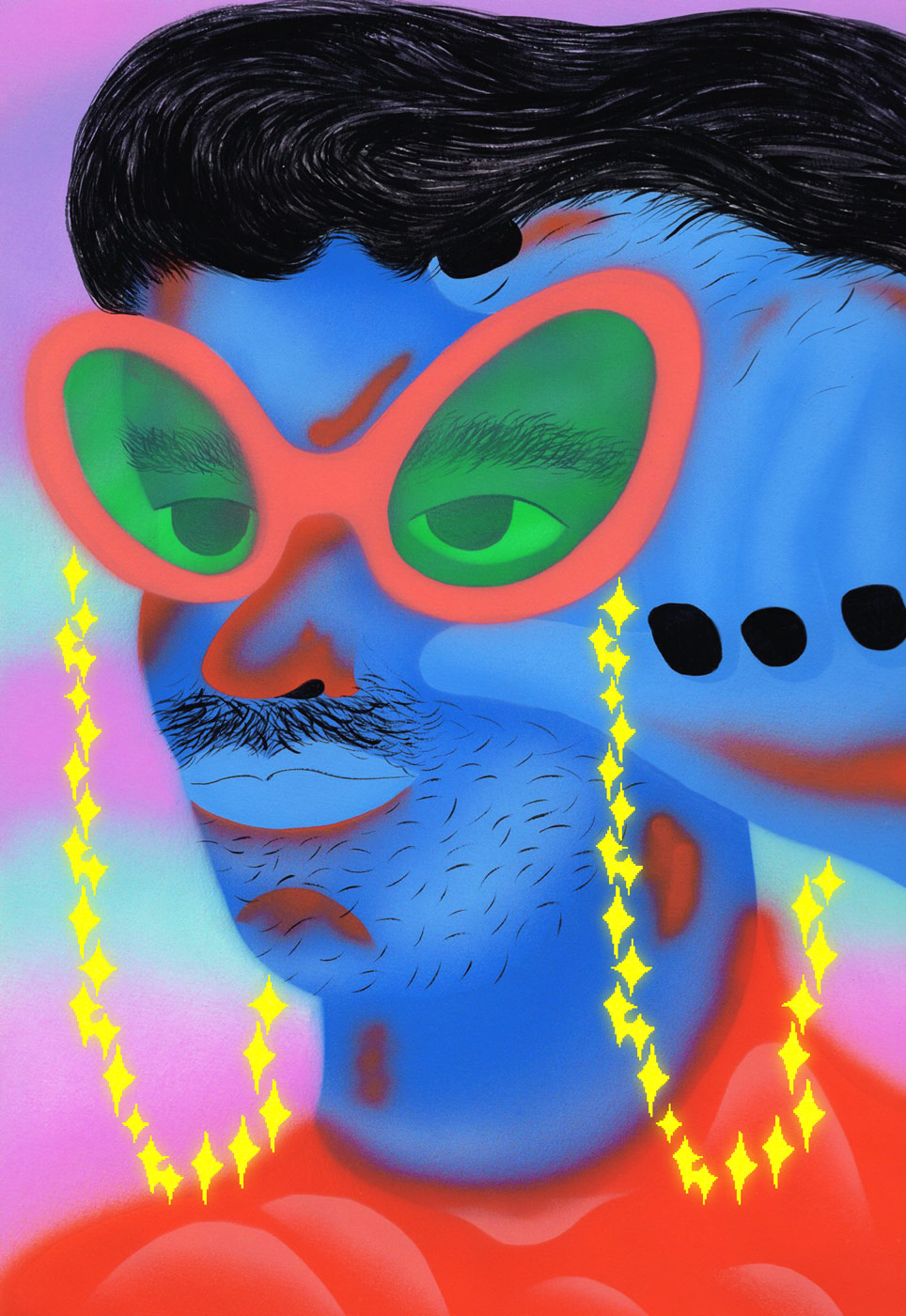
Apart of some hand-painted portraits with illustrator Li Ya Wen, they have currently developed their very own studio badge as part of their visual identity in close collaboration with Studio Mark Bohle. “Since the very beginning, the studio was conceived as something more than just a professional structure. We are conscious of our own responsibilities, especially regarding our profession – which also involves our families in some way”, Jorge and Mikel tell us about the idea behind the badge, “The symbol embodies the union of a lion and rosemary branch – and therefore our surnames, as in merging both families. The outcome is a one-off heraldic emblem that represents this idea.”
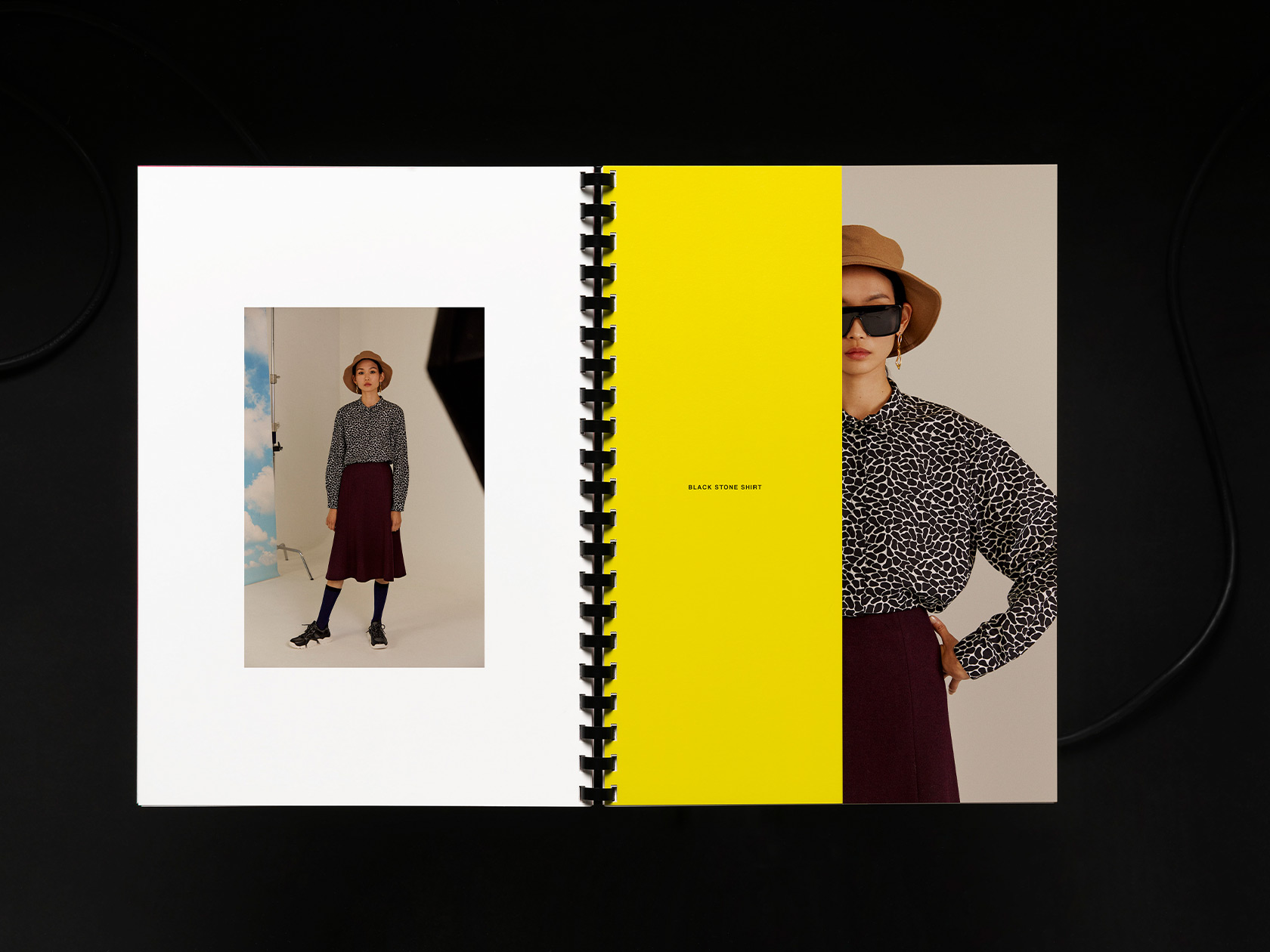
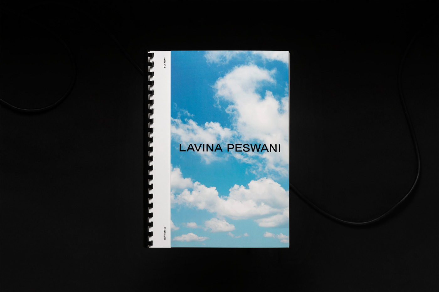
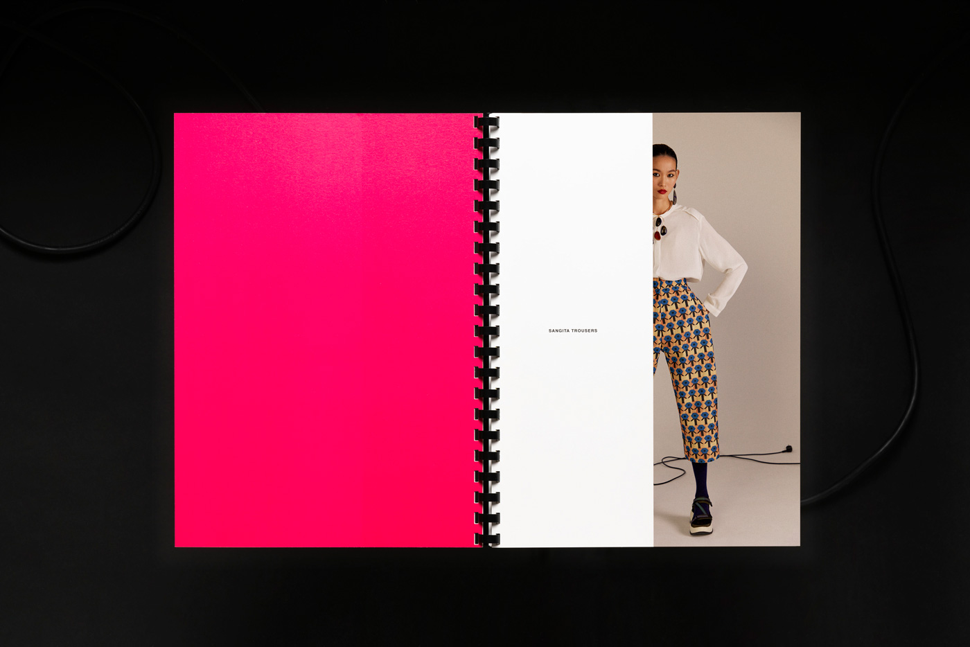
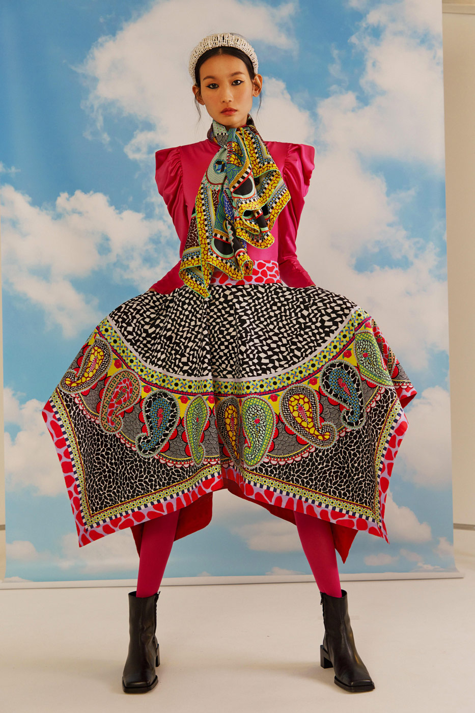
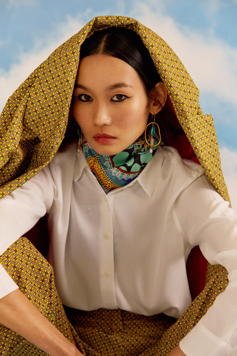
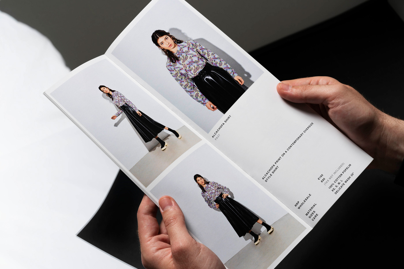
Since forming the studio about a year ago, Jorge and Mikel have worked for big brands, like Nike SB and Levi’s, but also for cultural institutions and brands, like CCCB and LTPeriòdica. “No matter its format, size or outcome, we always find fun and happiness in every project. The Variety and diversity of projects is what keeps us active”, the two designers state. One of their ongoing projects is the art direction for the fashion label Lavina Peswani and its identity, consisting of several print and digital media. The collections of the progressive label are driven not by seasons or trends, but by an exploration of concepts, emotions and powerful stories. As her past work, her newest collection “Fly Away” aims at giving a voice to women and emphasize their power and strength. “Under the concept of dream versus reality, we tried to picture the moment where the protagonist is dreaming about flying in a non-literal way, interacting with a background of a sky and the main studio set as a representation of freedom”, Jorge and Mikel explain. In contrast to her colorful textures and extraordinary printed textiles, the catalogue and line sheet are purely functional, prioritizing the communication of the campaign to the potential clients.
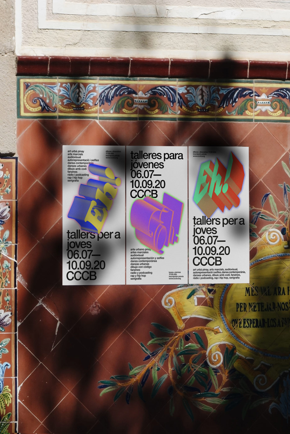
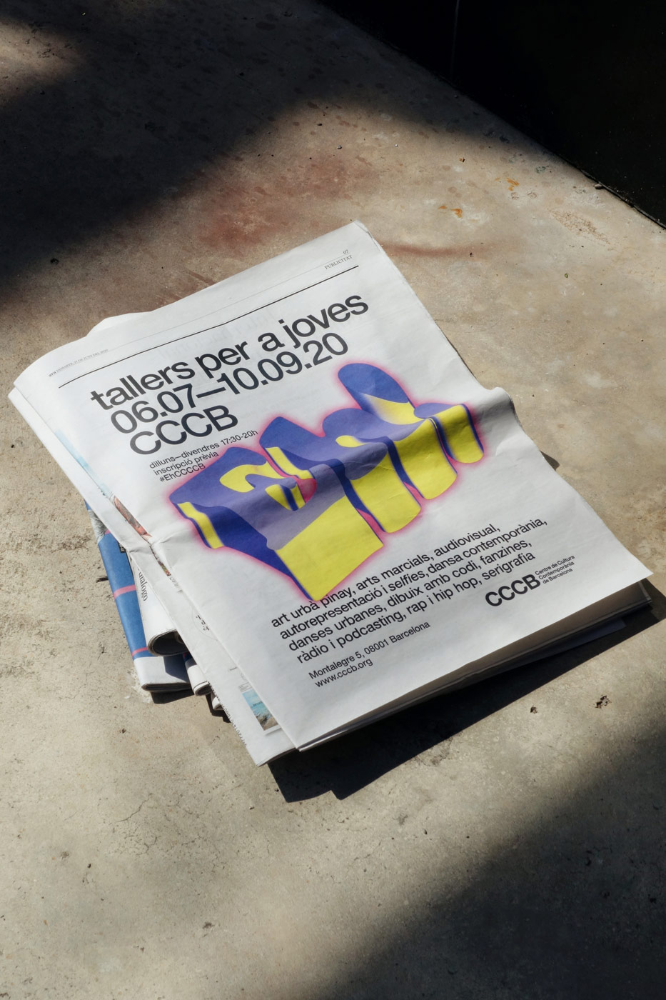
Due to the current situation under Covid-19, CCCB commissioned studio Léon Romero with a digital native campaign to attract a younger audience. The multidisciplinary cultural center offers an extensive programme, excluding major thematic exhibitions, series of conferences and literary meetups, film screenings and festivals. “We wanted to focus on an easy, direct and eye catchy campaign that mix the classic institutional/corporate language of CCCB’s identity with a bunch of social-media-inspired-stickers in order to impact the audience. We created some ‘Eh!’ letterings that add dynamic to the media and also fit perfectly to the informative content of the campaign”, Jorge and Mikel explain. The dynamic energy of the campaign also manifest itself in the animations that they developed in collaboration with the Barcelona based motion design studio Gimmewings.
Apart from a few upcoming projects, including a website for an architecture studio, the visual identity for an electronic music festival in Melbourne and the design for a jewelry store, studio Léon Romero has exciting plans for the future: “We will be defining our own approach as a design studio as well as improving our flexible structure. The two of us will be the core team, leading the studio, but always under the idea of collaboration”, Jorge and Mikel explain, sharing their vision with us, “As mentioned, we are always keen for new ways of doing things – from new partnerships to new kind of briefs. For us, this is the best way to work with certain kind of clients or projects without replicating obsolete structures.”
