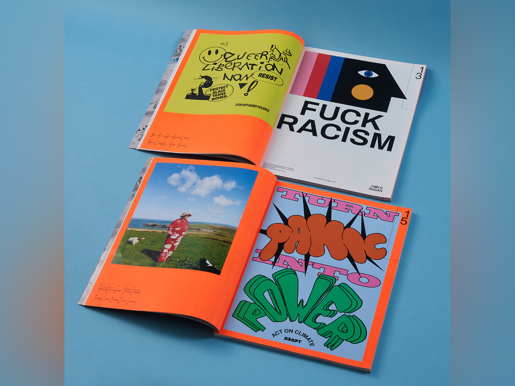
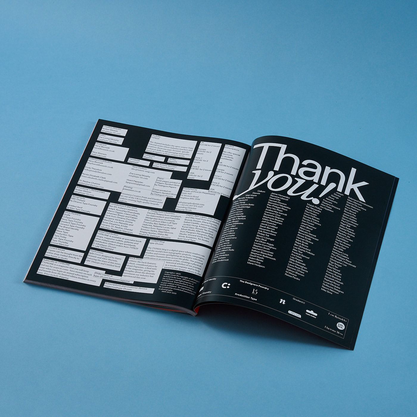
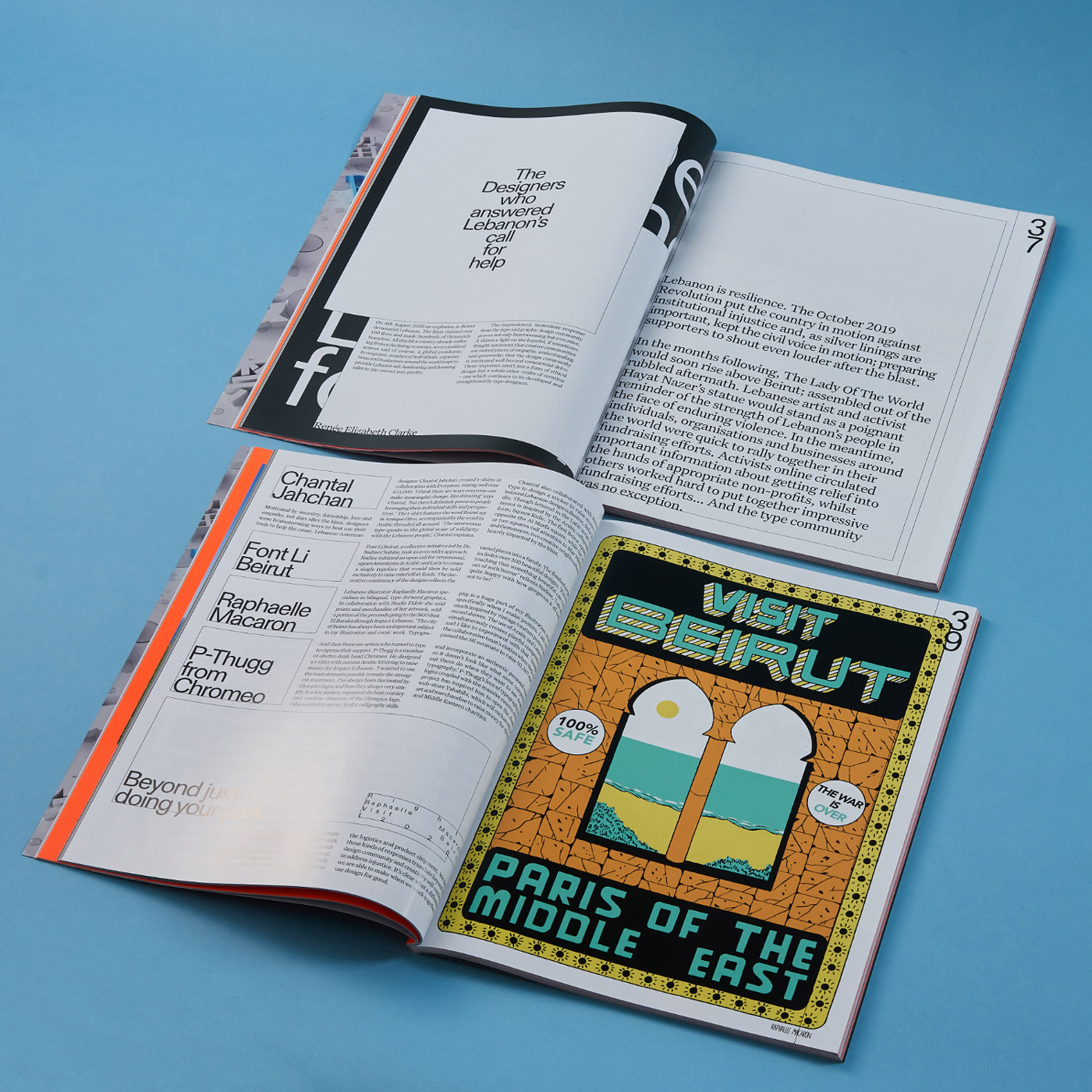
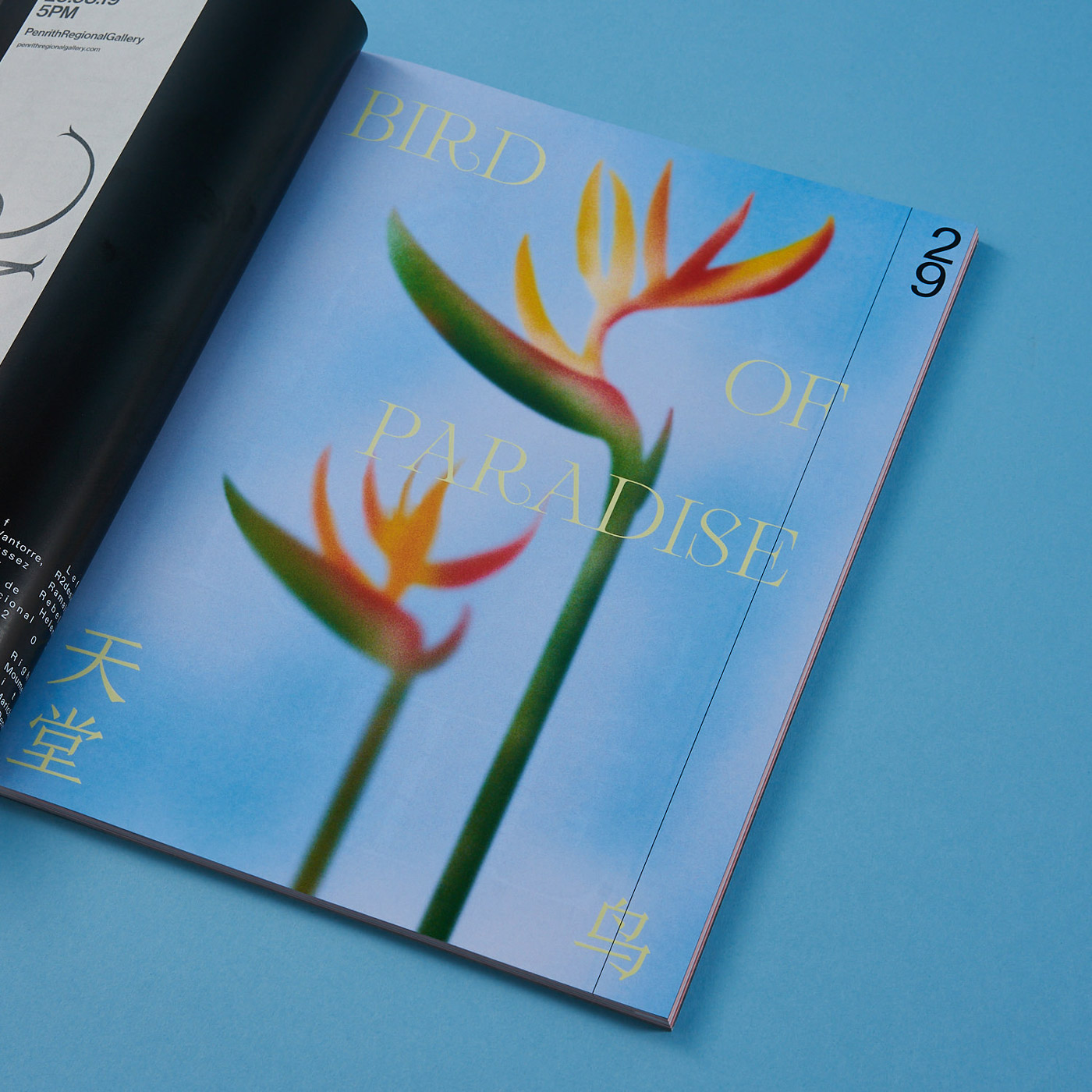
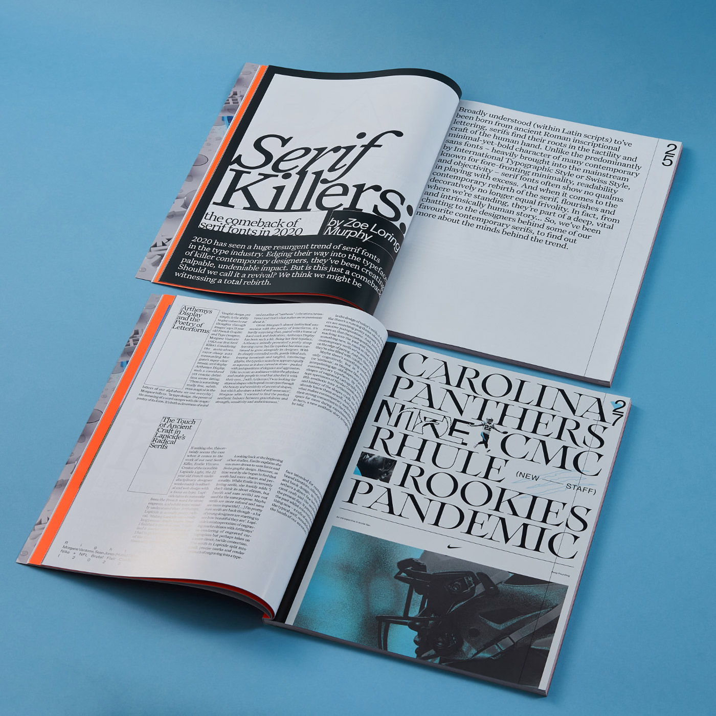
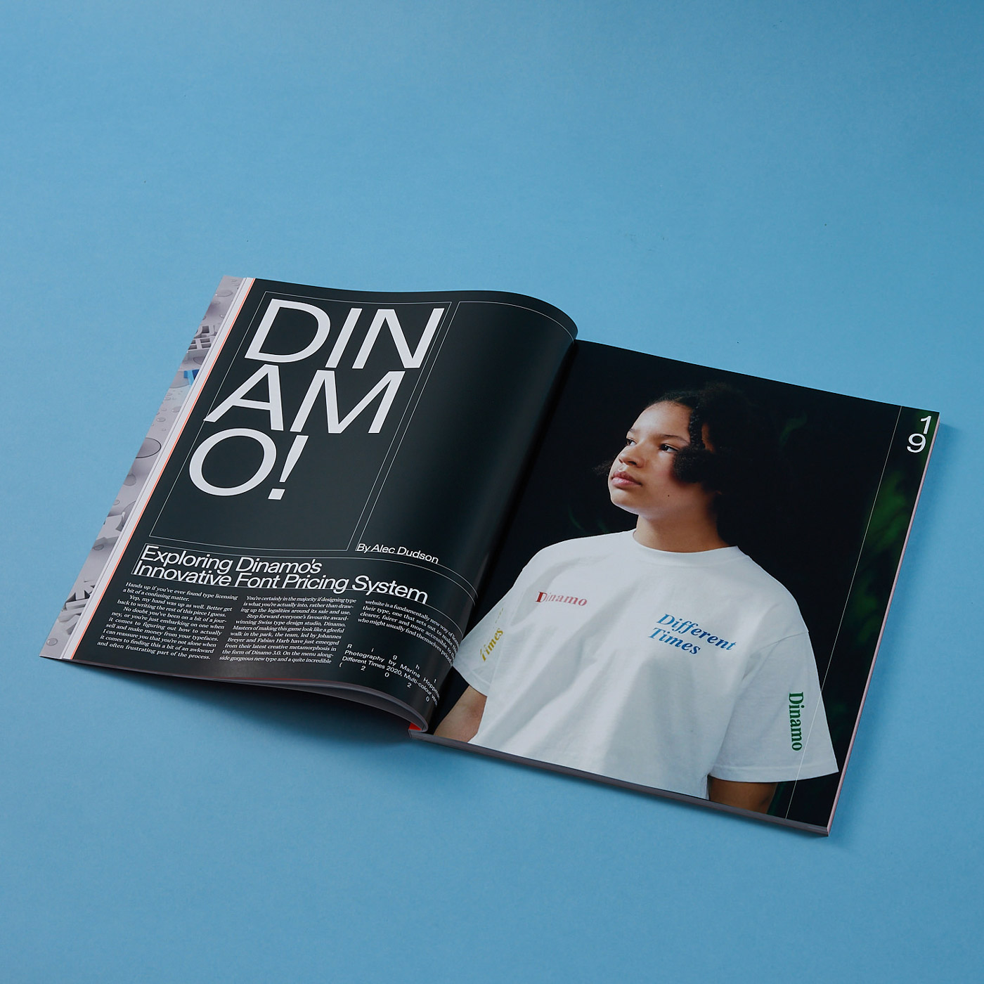
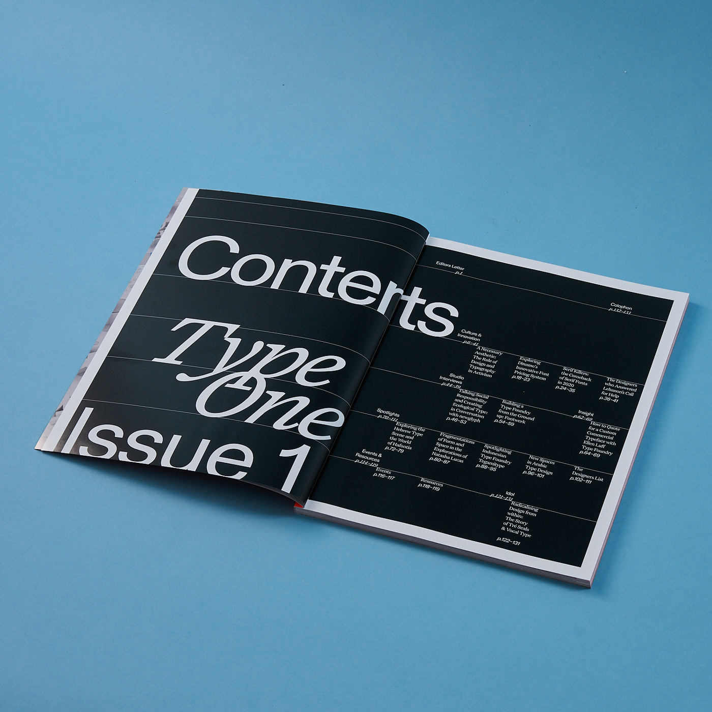
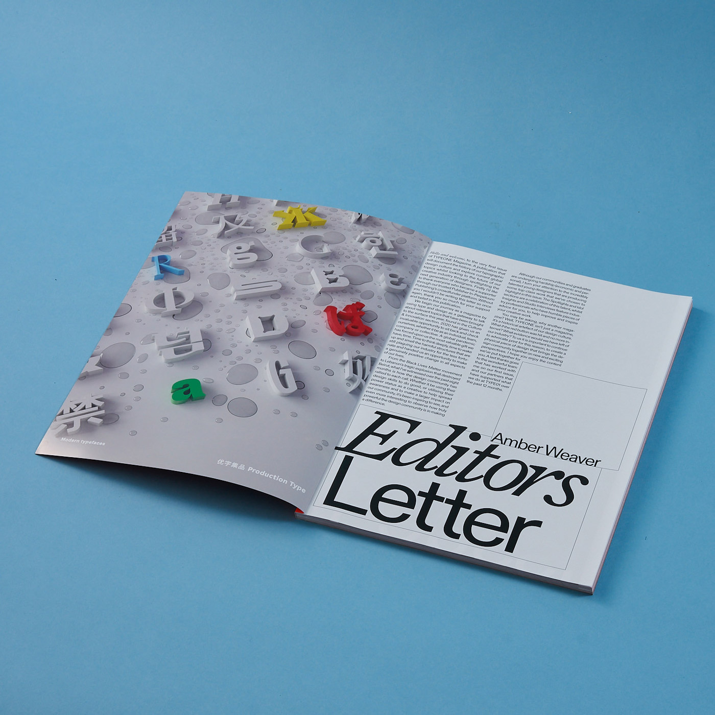
Founded in 2019, Type01 has become one of the leading platforms to champion and support the creative craft of type and design. Covering a wide variety of topics, the platform uses type as a gateway to open up important conversations and connect creatives from all over the world. Right before 2020 came to an end, Type01 has released the first issue of their bi-annual print magazine TYPEONE, designed by Alice Sherwin and Harry Bennett under the art direction of the platform’s founder, Amber Weaver. “She was the most amazing client to work for, she was very receptive to our ideas and considerate of our decision making. We feel very proud and thankful to be a part of executing her vision!”, Alice and Harry tell C24, “It was definitely a case of right place, right time. Harry was commissioned to write an article for the magazine and we asked whether they needed help with the design. It just so happened they did and the rest is history!” Sometimes, best things happen by chance and the two designers took over creating the entirety of the identity and editorial system. The result of this collaboration is an impressive and vivid magazine, showing an overwhelming amount of attention to detail.
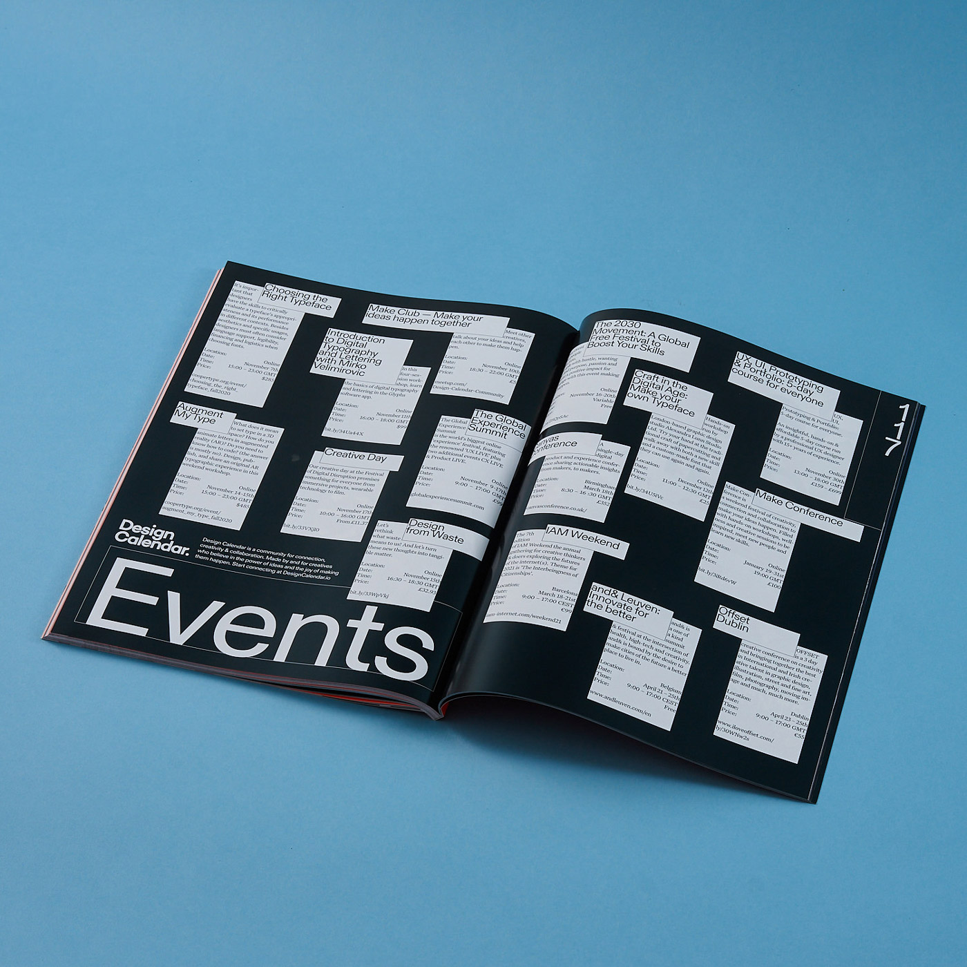
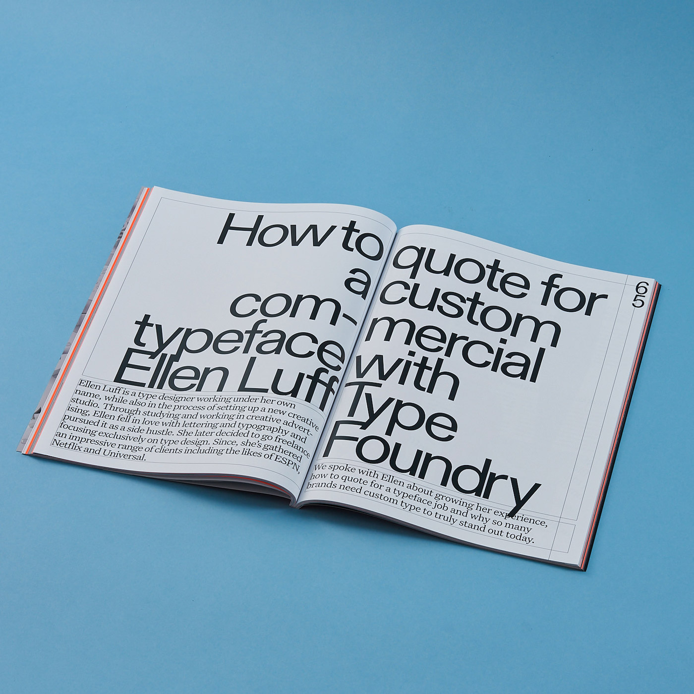
The debuting issue of TYPEONE centers around type design fused with the important global issues that 2020 has served up this year, exploring what role type and design have played in communicating messages and changing the world for the better. “I think we both have a general feeling that lots of design is purely based on aesthetics, and whilst that definitely has its place, we are both most interested in design or other cross-disciplinary practices that have a heavy grounding in research and that are genuinely useful, if even in a small way”, Alice and Harry state. This sentiment seems to be at the core of their practice and person, leading to thoughtful and research-driven projects. “I don’t think either of us believes in the grandiose idea that ‘design can save the world’ but it was brilliant to work on something that highlights a really quite international range of people and practices – and people at different stages of their careers. We love the idea of design as something supportive and love when writing intersects with design.”
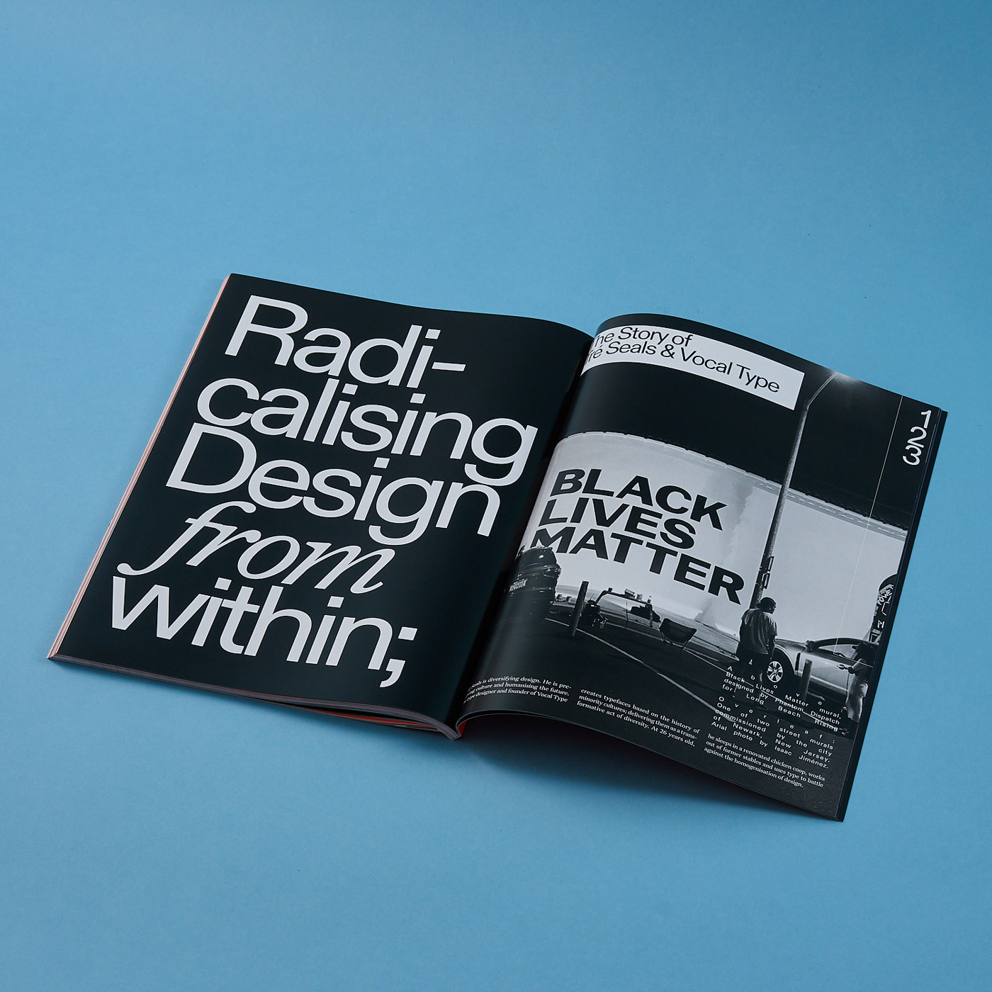
The magazine fuses creative type mediums with topics such as culture, business, technology, innovation, global issues and design, discussing global-led initiatives, projects, campaigns and the people behind them. “If you’re even a bit interested in typefaces and type design, you’ll at least find one thing for you in this – it covers everything from commercial facing studios to more niche practices, using type design as a gateway to topics that are incredibly relevant to our current social and political climate”, Alice and Harry tell us, while giving us an insight into the first issue, “The article Harry wrote for example concerns the role of typography and design in activism, TYPEONE speaks to Tre Seals from Vocal Type about his typefaces based on the history of minority cultures and NewGlyph Studio are interviewed about taking social responsibility and creating ecological type.”
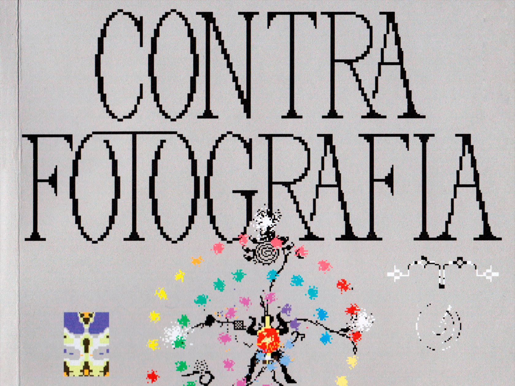
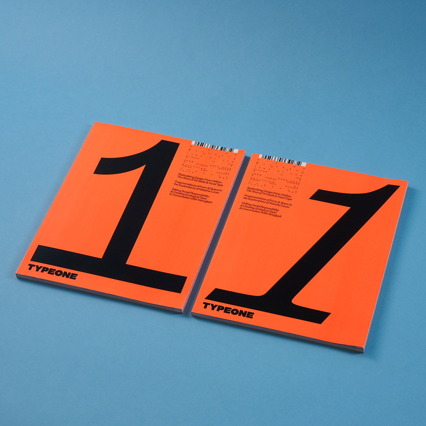
The identity of the magazine came from making a feature of process, based on the building blocks that make up editorial design and publishing. “We were also very aware that we were designing for a contemporary magazine about contemporary typography”, Alice and Harry explain. “We wanted the magazine to always feel fresh, without feeling too ‘trendy,’ so the system we’ve put in place is for the elements of the identity to alter from issue to issue – with a lot of this coming down to a change in the sans and serif typefaces we use in each issue.” Changing the typeface every issue allows the magazine to showcase the work of different type designers. “This concept was further encapsulated by the cover design, where we intend the large issue number on the front to visually morph and reflect the topics covered in each issue, as well as highlighting the sequential feel of the owning multiple issues of the magazine.”
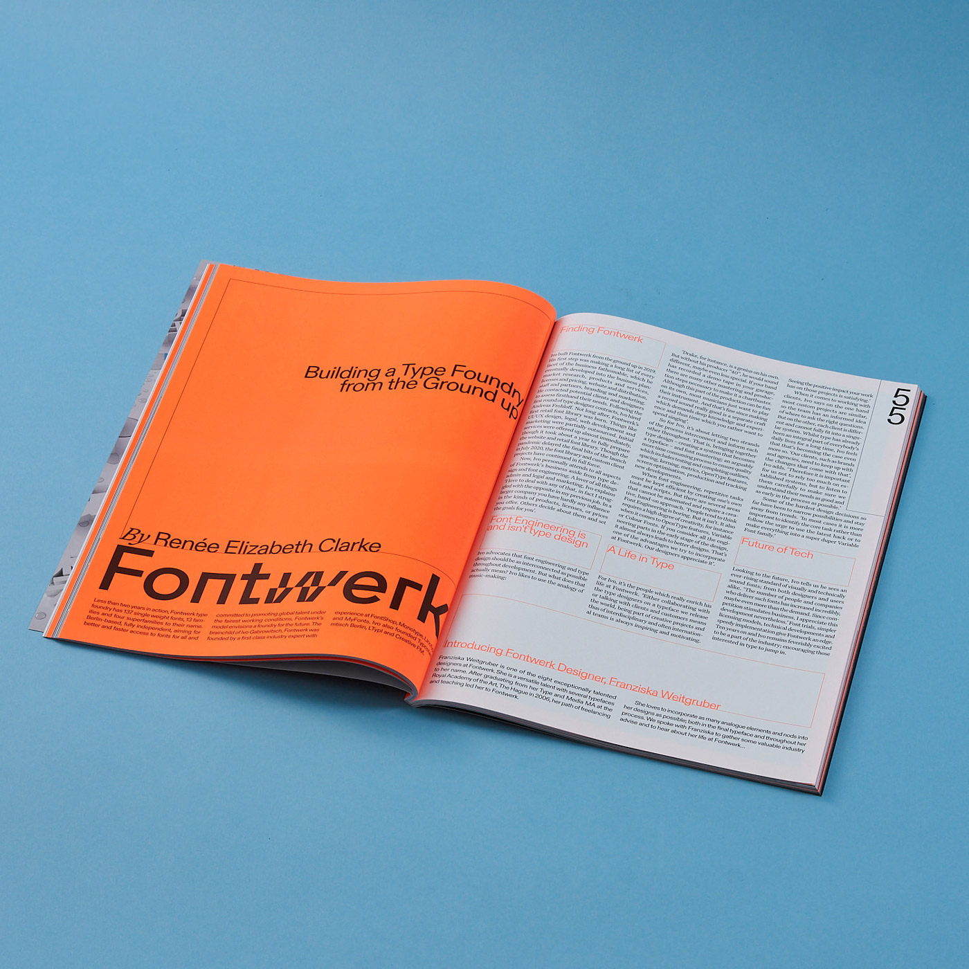
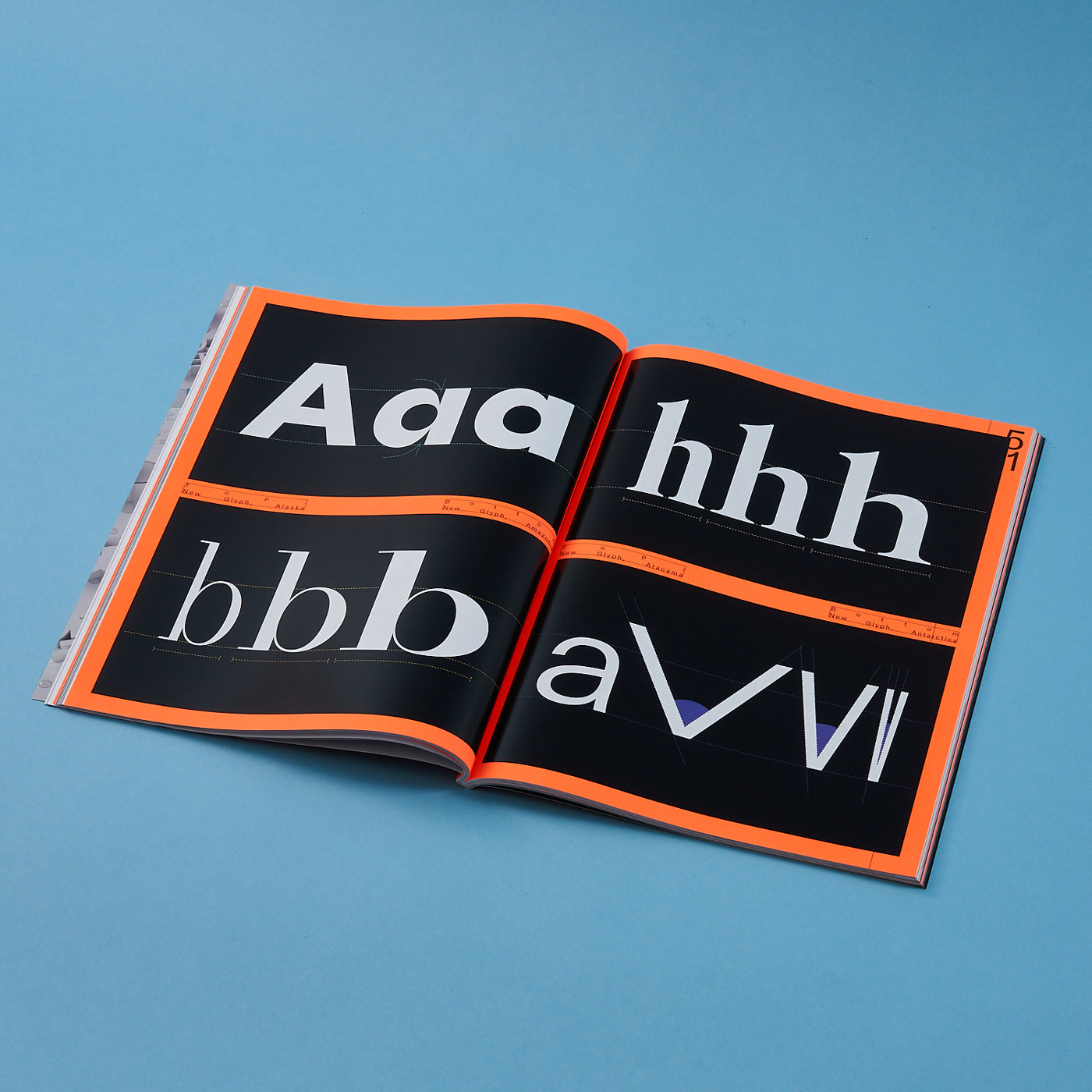
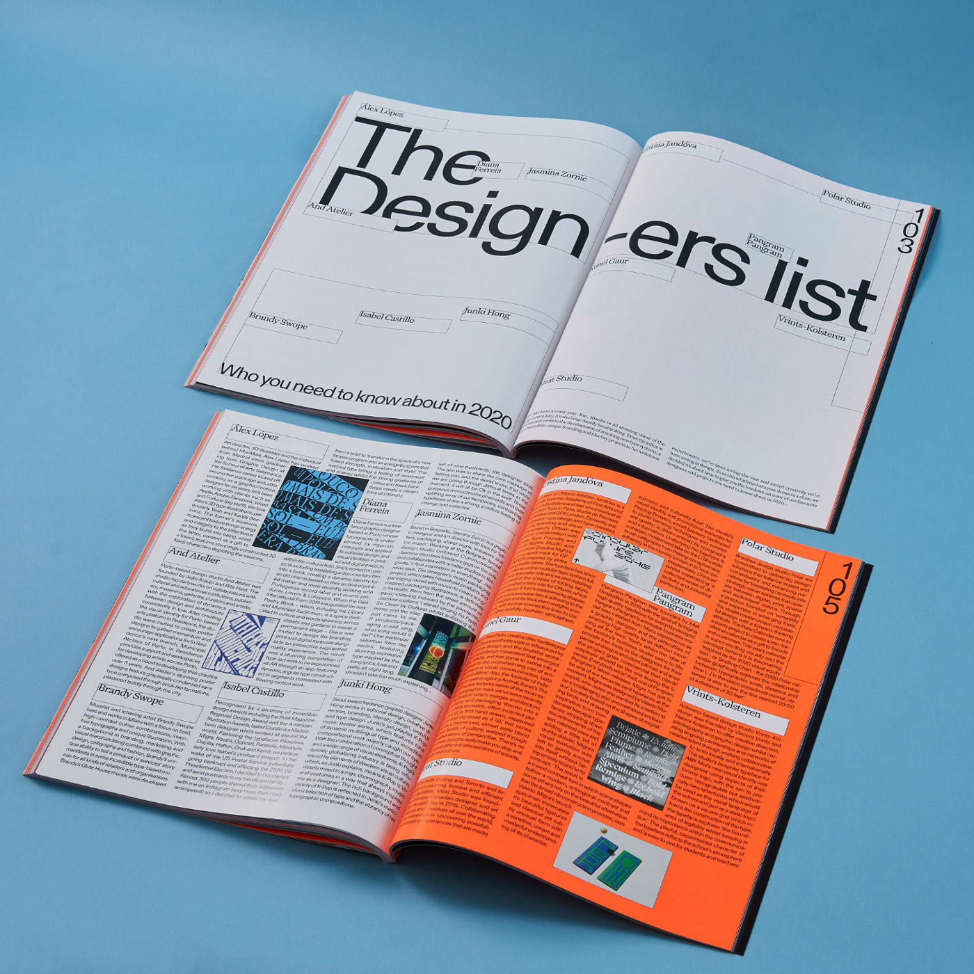
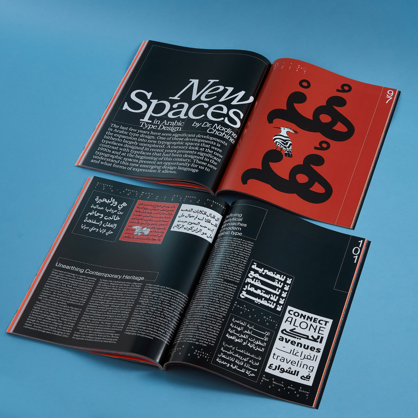
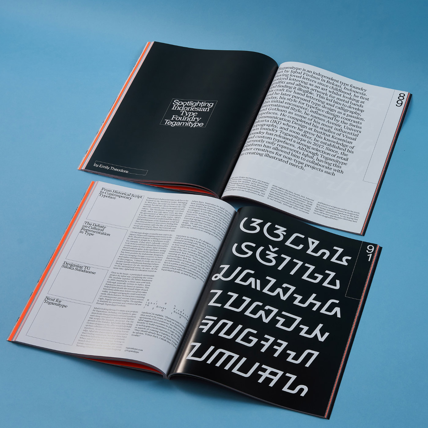
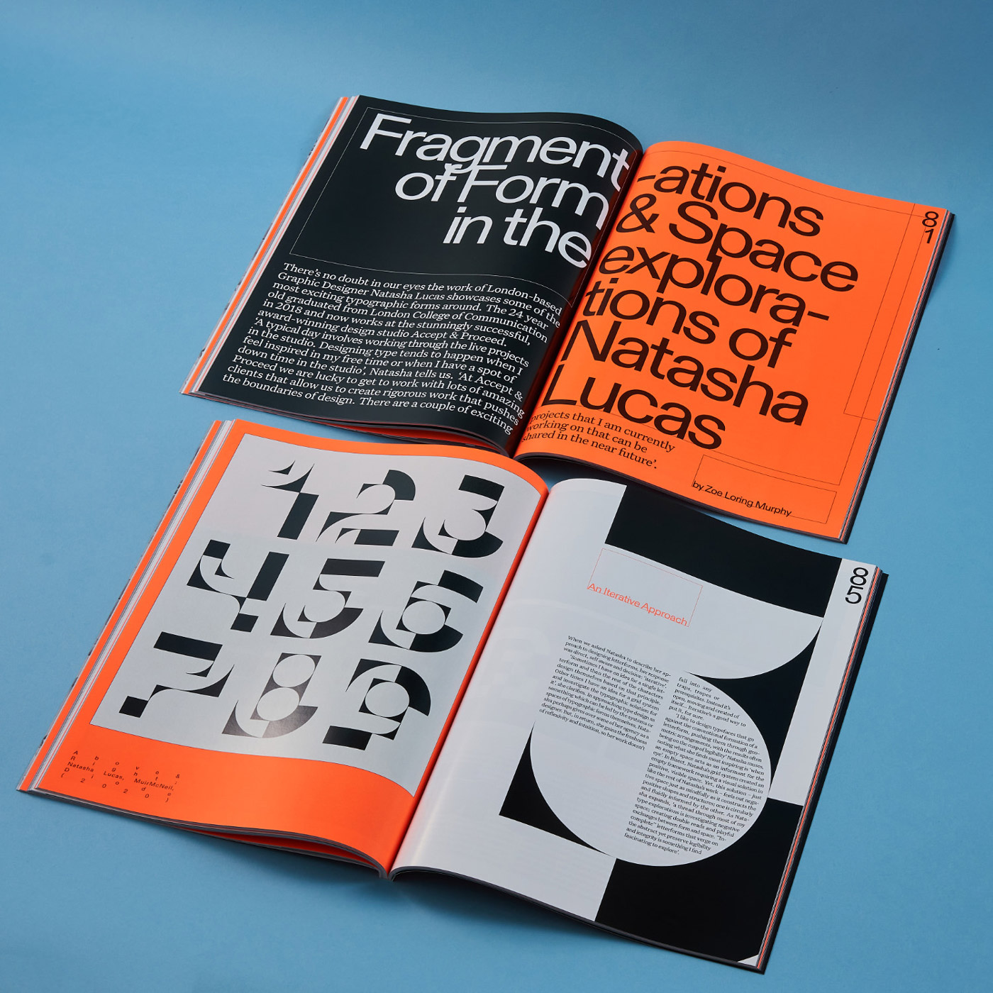
Looking back, Alice and Harry describe their working process as “riding a tandem bicycle” which demands a high level of coordination between the two partners. “Working from home we sat side by side and when one of us got stuck or incredibly fed up with designing a section, we’d simply swap what we were doing”, the two designers talk us through their process, “We were fairly brutal with each other, if we thought something was shit or amazing we made a pact to say it up front – which massively sped up the process…no tiptoeing around.” The duo started with pitching the identity design and developing concepts for typefaces, colors and layout. After the first content started to roll in, they scheduled a weekly meeting with Amber to collect feedback. “We were mostly left to our own devices; it was great to work with someone who had so much trust in our design process and vision.”
As it has been an extra project that the two designers took on top of their already fairly hectic schedule, Alice and Harry were faced with quite a challenge to meet the tight deadline. ”Time-wise, it was probably a project we should’ve turned down. Our design schedule for a month was a case of finishing our 9–6ish design/writing jobs, taking a 20 minute break and then getting on with Type One”, the duo reflects, “We were both, and still are, really excited by this project, which definitely kept us trekking through all the long weekends and nights but that’s not to say it wasn’t difficult at times.”
Despite all the difficulties, Alice and Harry managed to balance their heavy workload and learned a lot from this situation. “The biggest lesson was that sometimes it’s good to feel like you don’t have enough time to complete something”, they state, “It forced us to make quick and decisive decisions, a lot less ‘let’s try 20 iterations’ and more ‘what do you think?’ followed by the other one of us saying ‘yes, great’ or ‘no that’s shit’ — it definitely made us much more brutal with less time to faff and endlessly shuffle things around a page.”
As a result of their collaboration on TYPEONE, Alice and Harry fulfilled their dream to launch their own studio, called Studio Ground Floor. “It’s a practice focusing exactly on the sort of stuff we want to design, such as TYPEONE”, they tell us. Apart from the second issue of the magazine, the fairly new studio is currently working on a book called Shape of Words in collaboration with friend and fellow designer Emma Judd, resulting in an exciting collation of writing and visual work from over 30 creatives from the contemporary art and design scene.
The duo first met each other at Winchester School of Art, where they both studied Graphic Arts with a focus on Graphic Design. During their third year at university, they built a close friendship and started working together soon after. “This forged the beginnings of our design working relationship, putting in 12 hour days in the studio space we were lucky enough to have, making lots of books, playing a lot of pool in the uni cafe, procrastinating a lot, and eating a lot of tesco meal deals”, they tell us, “We now live together in Hackney (and are together too). We both started out with jobs as graphic designers straight from uni, but at a certain point, Harry semi-fell-out-of-love with the more commercial element of design.”
At that point, Harry was offered the opportunity to write for It’s Nice That. Having always written for himself and being drawn to the more academic side of the design discipline, this seemed like the right opportunity to pursue this new and exciting path. Now, he splits his time between writing and design and decided to go freelance this year. “I was somewhat forced into freelancing due to Covid-19 and I really really never intended to do it this soon, but it turned out to be the best decision in my career so far”, he explains, “It really suits my brain well; I get to (not quite literally at the minute) meet lots of interesting people, talk about lots of talented artists and work with so many wonderful individuals. Again, the collaborative and social nature within the niche of this industry that I’ve managed to somehow fall into is the most rewarding and exciting thing to be involved in.”
Both having a strong grounding in research and the more academic side of design, Alice currently works as a graphic designer in the fields of web, editorial and identity design. “I am now way more certain, enthused and excited about the possibilities within design and the wider creative world than I’ve ever been”, she tell us, “Having said that, I do think that when I was a little intern during my second year summer at uni, meeting Dan Viveiros, now my creative director, definitely set me on a path to where I am now. Having a mentor that hyped me up when I was just dipping my toes into design made the world of difference and has definitely made me more aware of how important it is to help out other designers who are just starting out.”
For both designers, collaboration is an essential part of their practice. “It increases the speed of decisions, makes you more accountable and gives you fresh perspectives. Ideas become way more interesting and you are designing less in a vacuum”, Alice and Harry state, “We’re lucky to be friends with lots of different creative people, working in lots of different fields — it’s so refreshing to learn from people who have amazing creative practices but don’t care as much as we do about leading or kerning! It stops you going down the rabbit hole of designing purely for other designers and forces you to confront other approaches. It is fundamental for our enjoyment in our practice to work with others as much as we can, and both our mental well-being and professional practices are all the better for it.”

