Looking for someone to help him out with upcoming projects as a part-time job, Maximilian Mauracher describes it as “love at first sight” when scrolling through David Rindlisbacher’s portfolio. “In his portfolio, there were a couple of projects that made me think ‘I’d love to have had that idea’”, Maximilian tells Collide24 about their first encounter. Since then, the duo has worked on a bundle of projects together, including the beautiful and well-conceived publication about the Beijing based artist Tong Kunniao. As his solo exhibition in Berlin got postponed, the young and emerging art gallery XC.HuA decided to present his work in a booklet instead and introduce him to potential collectors. The gallery has reached out to Maximilian beforehand, asking him to take care of different media and material for upcoming exhibitions.
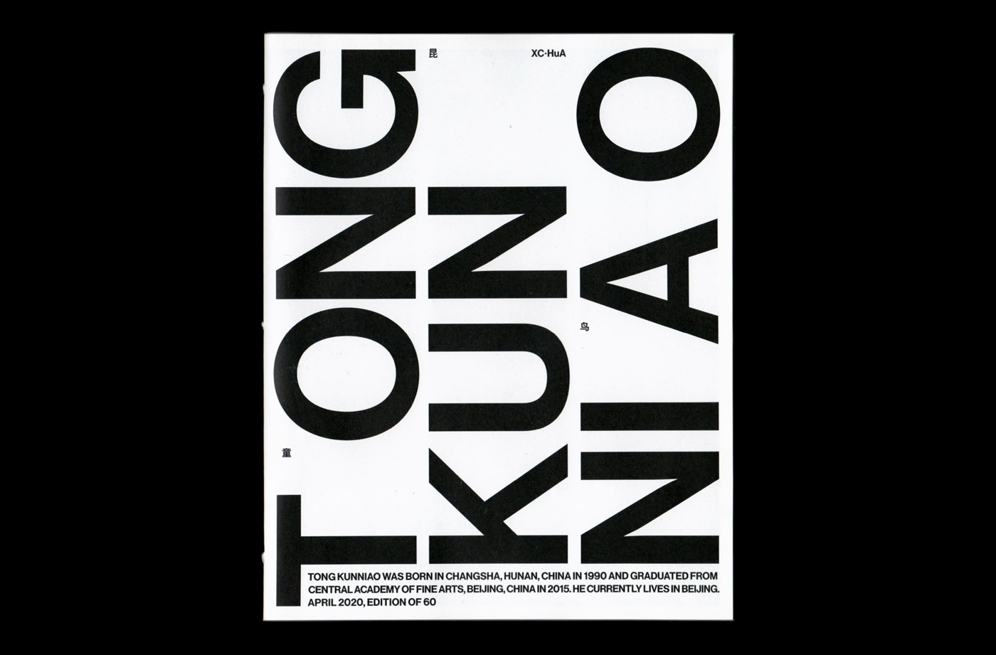
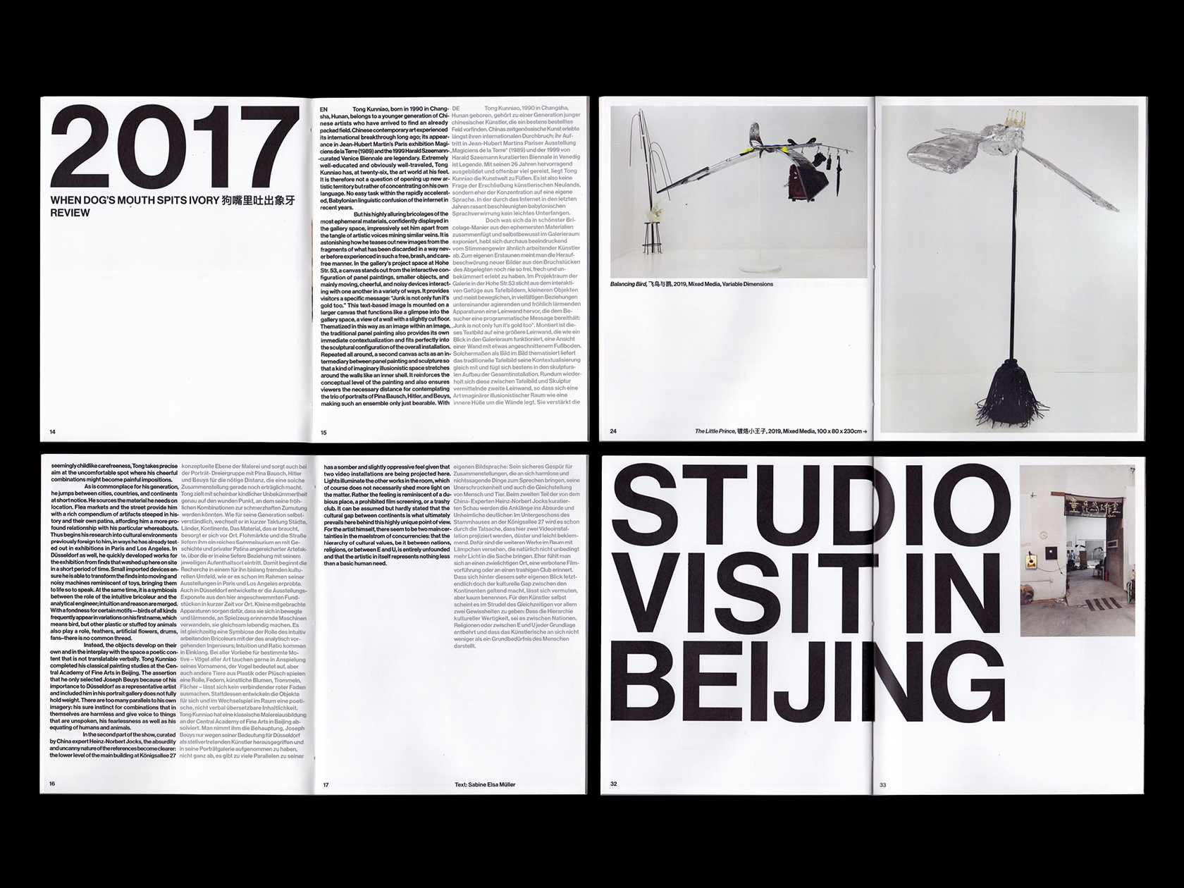
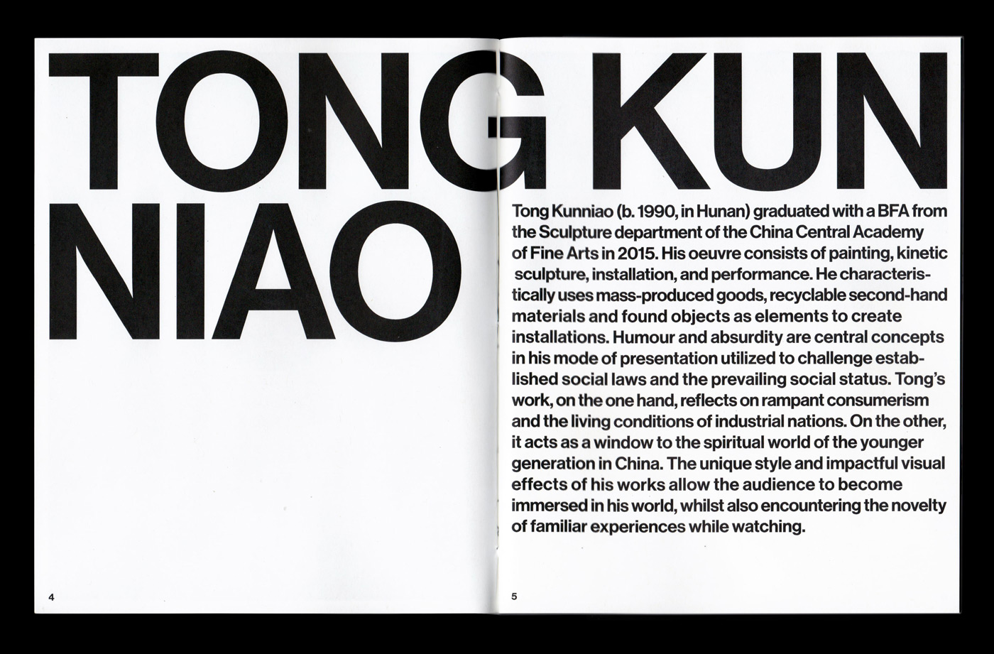
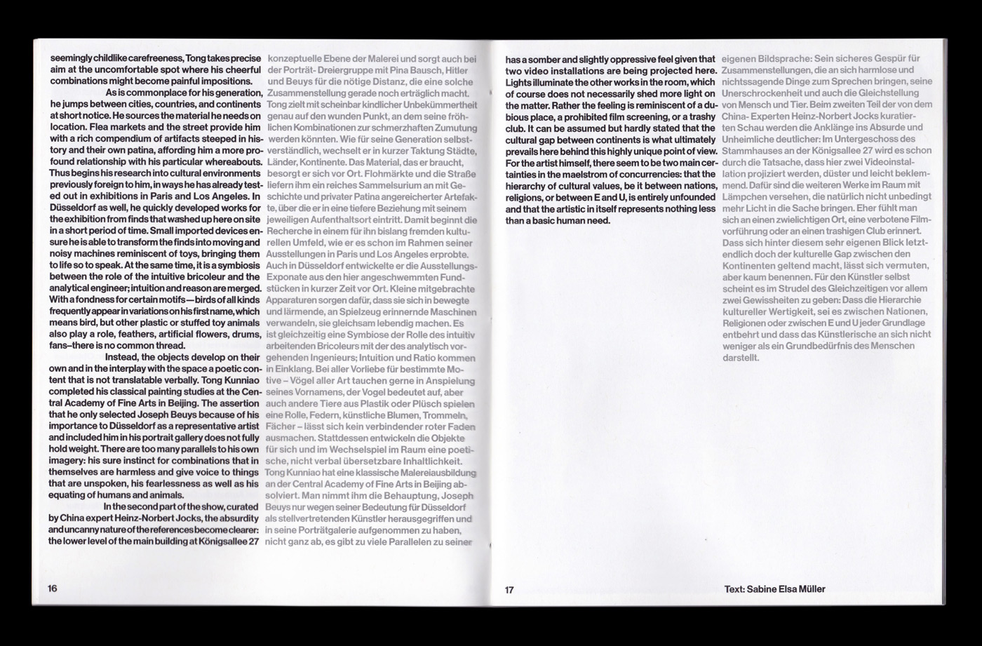
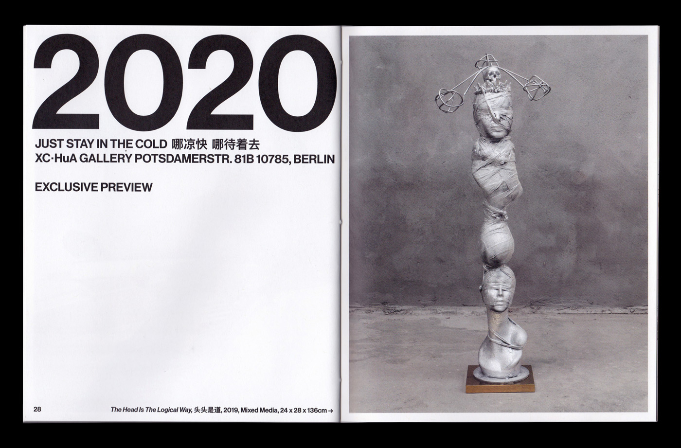
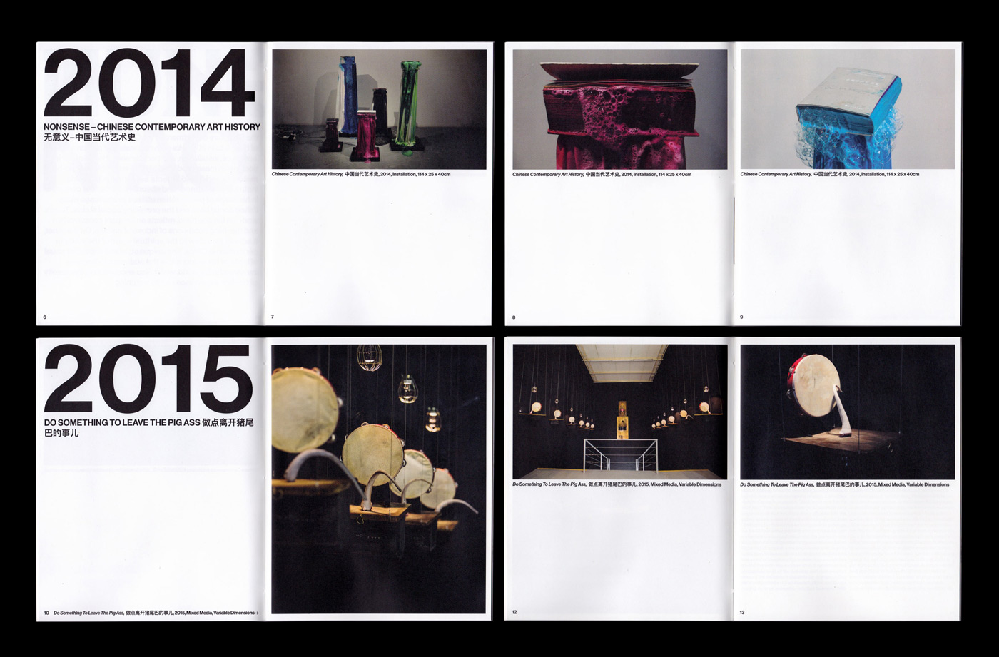
Since the gallery provided them with an overall structure and even a first draft for the publication, it felt more like “a redesign of an existing booklet”, David and Maximilian state. As Kunniao’s work is considered to be bold, unconventional and provocative, breaking the boundaries between sculpture and performance, the duo came up with the idea of using big, stacked typography – a performative element – on the cover to attract attention. In contrast to the bold typography which has been used as a main headline format throughout the booklet, the images of Kunniao’s work and the overall layout of the publication are presented in a very structured way. “For his sculptures, Tong uses objects found on flea markets and breathes back life into them. This fact has certainly influenced our choice of paper and binding in the end”, Maximilian concludes, “We had quite a clear idea from the very beginning given the fact that the artworks had a strong influence on our design.”
Because of the international nature of the gallery, the publication has been translated into two languages, English and German, as well as including the Chinese titles of the works and exhibitions. “We visualized the different languages in the text by setting the English text in black and left-justified, and the German text in grey and flush left”, David explains.
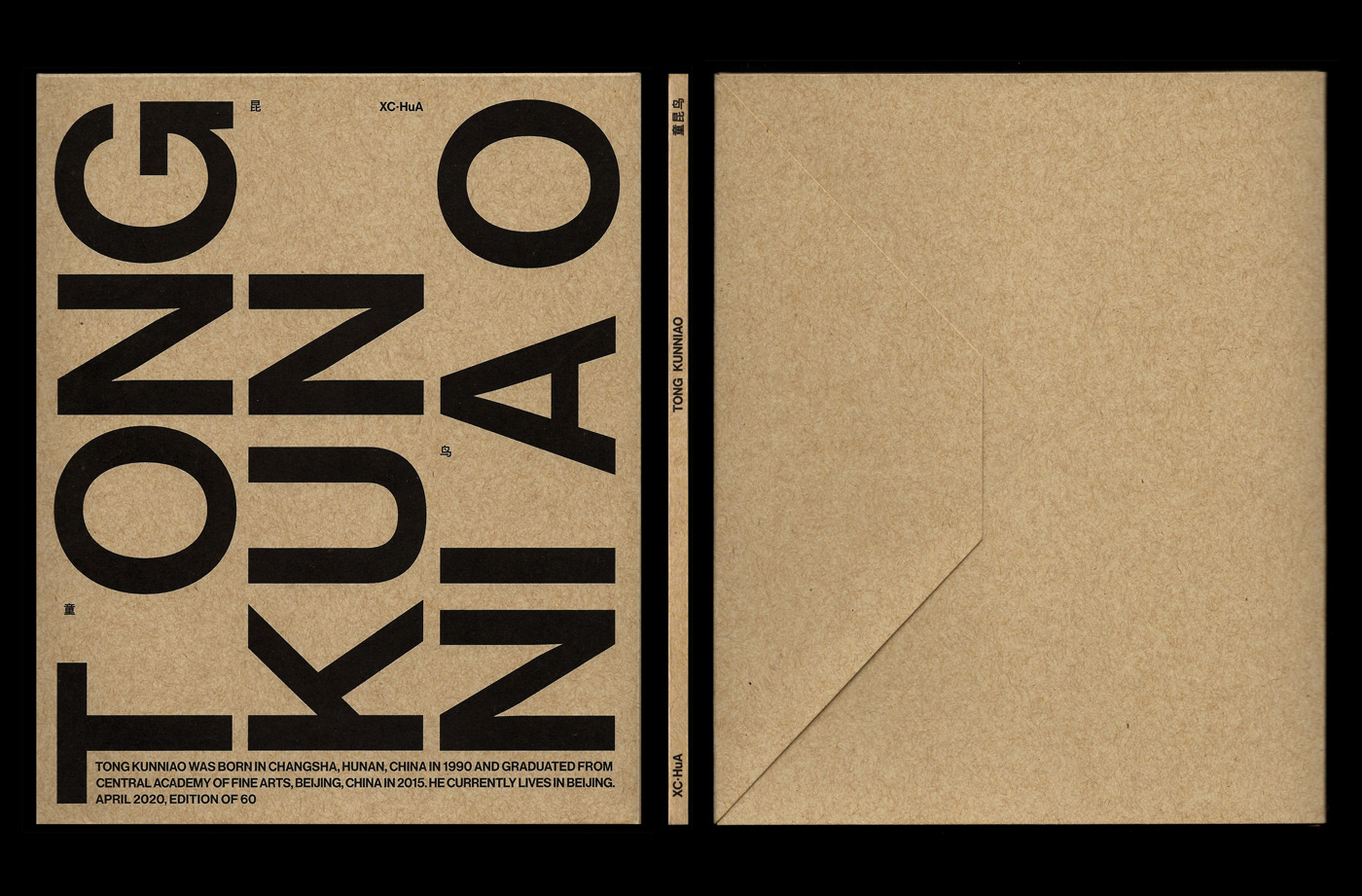
Another highlight of the publication is definitely the packaging. The publication’s smooth recycled paper and 3-hole pamphlet stitch binding embrace the roughness of Kunniao’s works which are often made of discarded and found objects. The custom-made and screen printed kraft envelope adds to this upcycling aesthetic and can actually be used as a mailing bag for the publication. “We knew we wanted to design some sort of custom packaging for the booklet to give the collectors a special experience unwrapping it. So I came up with a concept for an envelope, duplicating the publication’s cover on the outside”, David tells us. By adding Kunniao’s name and biography on the envelope, the packaging serves as a promotional tool, instead of just being a protective wrapping.
As he has worked in the industry for several years at various studios and agencies after his studies in Vienna, Maximilian has quite a wealth of experience. Seven years ago, he decided to go freelance, predominantly working in editorial design for the cultural sector. “I started with design at the age of 16 and what has always been a hobby is now a profession”, the Berlin based designer reflects, “I like to discover new sides of being a designer, always slightly changing and evolving. Production, writing, … pieces and elements I first wasn’t aware of but which are a big part of being a freelance designer or having your own clients and side projects. It’s selling ideas or stories in the end – probably something I learned during my studies – although I nowadays prefer less commercial projects in the arts and culture. I’m usually looking for an idea to base everything visually on; to find that one element that can be used across any medium or format which ties everything together.” Apart from modernists like Herb Lubalin, Willy Fleckhaus and Dieter Rams, Maximilian emphasizes the strong influence Muriel Cooper had on his work. “Hardly anybody knows her, unfortunately design schools still teach a man-made history of graphic design. Coopers work across branding, editorial and software interface design is outstanding. She was the first design director of the MIT Press, breaking two-dimensional planes in design and exploring 3D visions of cyberspace although the web was still in its infancy.”
Being raised by a Swiss mother and a Portuguese father, David has always been interested in different cultures. After finishing high school, he has left his hometown Lisbon to study design and has lived in several different cities overseas since then. “These include Berlin, where I did an internship, Bern where I did most of my visual communication degree and The Hague, where I was for an exchange semester. I finished my degree at the Bern University of the Arts last summer and now I am back home in Lisbon”, he tells us. During his studies, he stumbled across the book “The Graphic Designer and His Design Problems” by Josef Müller-Brockmann and was introduced to the theoretical side of the traditional Swiss Design. “It motivated me to do more research on my own, reading books like ‘Grid Systems’ also by Müller-Brockmann, ‘My Way to Typography’ by Wolfgang Weingart or ‘Design as Art’ by Bruno Munari. These books were not only a source of inspiration for me, but also gave me the knowledge to become a more confident designer”, David states. In his work, the designer explores how he can intertwine the structural and typographical approach of traditional Swiss design with contemporary and experimental elements, like type design, lettering, 3D-renderings, creative coding and augmented reality.
As both designers follow a “quite conceptual” approach, often designing based on systems and reducing the content to its necessity, the duo clearly works together as a good team. “Sharing a similar mindset when it comes to design and aesthetics, we’re rarely not on the same page when we work together”, David concludes, “Collaboration is the foundation of everything we work on together.” During their working process, the duo usually takes on different tasks, with Maximilian concentrating on management and art direction, and David focusing on the design and visual implementation.
“I would describe our collaboration as a designer-art director dynamic, where at the beginning of a project I get to design a number of layouts based on a concept or a mood defined by Max. After that we narrow down each proposal until we have the final one that’s shown to the client”, David explains, and Maximilian adds: “I’m in touch with the client, try to figure out what they want (and what we want) and give David some initial thoughts or ideas, references and relevant background information. From there on I let go of the design part and keep my eyes on the bigger picture, adding some ideas and details to David’s drafts to push the strong parts even further. Regarding client feedback I try to keep as much as possible away from David and once we’re almost done, we think about finishing options and production, which I usually take care of. We’re hardly ever designing in the same document as I fully trust David on what he’s doing and enjoy taking the backseat in the projects we’re collaborating on.”

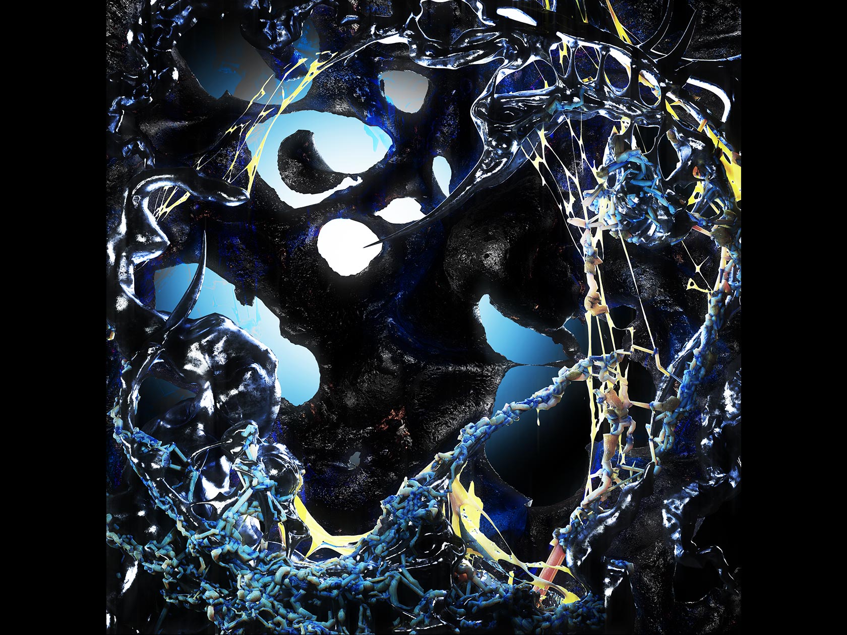
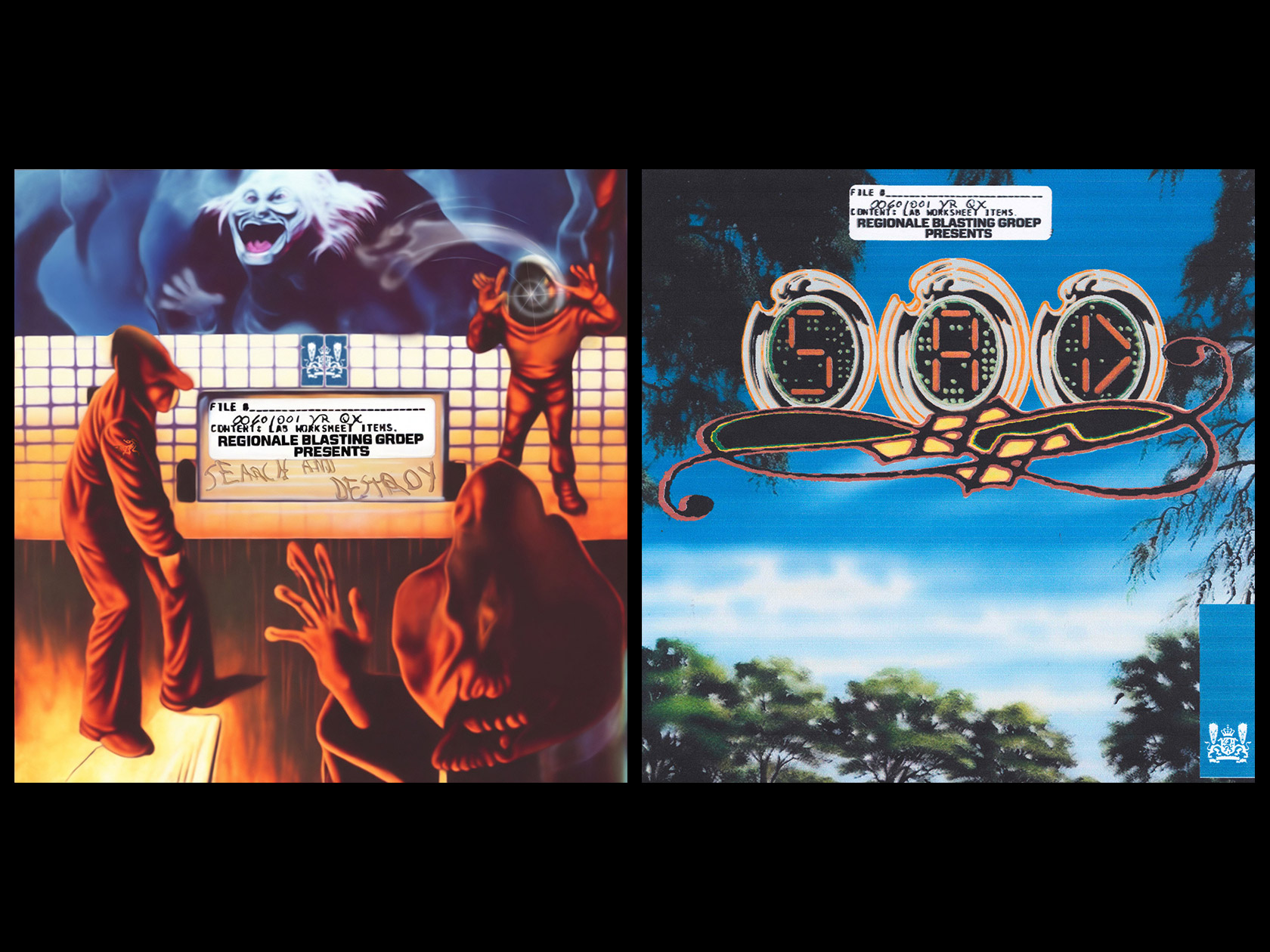
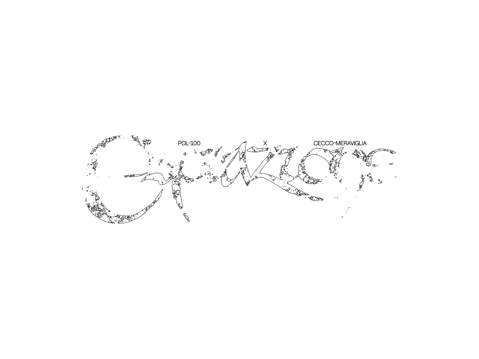
In the following months, David and Maximilian have quite a few projects in the pipeline, including a publication about Leipzig-based photographer Philotheus Nisch and a music related project with 3D artist Herwig Scherabon. Apart from that, the two designers recently launched their online radio and digital platform for sound art, called /100, an erratic radio show for sound as artistic expression. Looking into the future, the duo will definitely continue to work together, even giving us some hints about an upcoming release of a “big surprise, which hopefully leads to many more collaborations”. We can’t wait to lift this secret.
Maximilian Mauracher
Website
Instagram
David Rindlisbacher
Website
Instagram
COLLABORATIONS TO LOOK AT:
Offshore Studio
Double Denim Look 2001 by Britney Spears and Justin Timberlake

