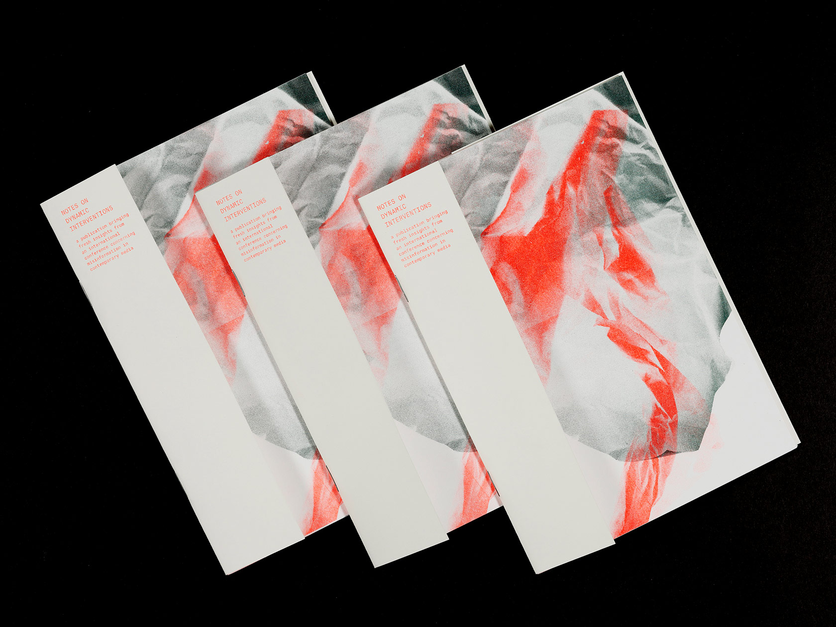
Today’s landscape of communication is getting more and more complex: The channels through which information is consumed have all changed drastically and digital technologies have brought the printing press to the masses. Supported by the LCC Graduate School Fund, the publication “Notes on Dynamic interventions” by London based graphic designers Laura Dirzyte and Bruna Osthoff questions whether we as designers, writers, artists, developers and publishers can intervene in the public debate and counter misinformation in a relevant manner. After attending the Urgent Publishing Conference in Amsterdam and Arnhem in 2019, the duo decided to create this publication based on the discussions and talks during the event in order to share their insights with their fellow students. “The ideas explored at the conference tapped not only into our personal research but also touched a number of projects we saw our peers investigating at the London College of Communication”, Laura tells us, “So we felt it was important to bring this international conversation back to the university. The publication became a point of reference from which our fellow postgraduates at LCC went on to discuss contemporary communication strategies and the ways we could use digital media to socialize academic projects.” The two designers who met during their MA Graphic Media Design Course at the London College of Communication, have both an emphasis on research-driven projects. In the following interview, Bruna and Laura talked to us about their collaborative process, the accountability of publishers and about finding a voice in times of information crisis.
First of all, can you tell our readers a bit about yourselves and your backgrounds?
BO: I’m Brazilian born, London based graphic designer. I did my bachelor at P.U.C. in Rio de Janeiro and after interning at a few places decided to pursue a Master degree at LCC, I’ve recently graduated from their MA in Graphic and Media Design where I had the chance to explore editorial design and develop my interest in challenging narratives and exploring the designer position as a storyteller.
LD: I’m a graphic designer mostly working with editorial, brand and typography focused projects. I was born and raised in Vilnius, Lithuania, but moved to the UK almost seven years ago to study architecture. After graduation I realized that I’m much more invested in graphic design projects that have been my side hustle since high-school. So I focused on this career path and a couple years later applied to the MA Graphic Media Design course at LCC. My aim was to explore how graphic design can be used as a critical tool to investigate the complexities of contemporary society. And that’s where me and Bruna met!
How would you describe the aesthetic of your work in general?
BO: I feel like each work brings different challenges that allows me to keep exploring my graphic design language. Right now I’m more interested in how to solve a problem then tying my aesthetic down to one thing. In general I really enjoy an aesthetic that allows the content to shine through.
LD: It’s quite difficult to define my aesthetic as it continues to develop together with every new project. I like to experiment with type and editorial composition if I seek to make an expressive piece of design. But for client projects I usually try to pare down the visuals to the essential elements that communicate the core idea.
Where does your fascination for typography come from?
BO: My love for editorial design drove me to it. When you’re learning something you start looking at the basic parts and type was just something that really fascinated me, how within this set of limited formats that we recognize as letters we can have such a wild variation that carries different impacts and messages. It’s something that drives me a little crazy (the level of detail) but I can’t help being drawn to it.
LD: When I decided to leave the architectural career path behind and focus on graphic design, typography was a design tool that I didn’t have a strong foundation in. As a result, I took a short course on typography at Central Saint Martins which was computer-free and that made it a wonderful experience. We learned about type by dissecting letterforms, analyzing compositions and producing collages to see how shapes of letters can communicate an emotion on their own. These relatively simple exercises really opened my eyes to see how much meaning type can carry. Since then typography became one of the most exciting parts of my graphic design practice.
Where do you get your inspiration from?
BO: My peers and colleagues are the best sources, I have numerous notes on my phone with books, sites and exhibitions that I try to organize and catch up once a week.
LD: A lot of my inspiration comes from conversations with people, listening to podcasts and reading various types of literature. I enjoy taking time to explore new topics and am curious about different points of view.
How did the two of you start working together? Do you remember your first encounter?
LD: Our very first collaborative project was a day long event exploring examples of professional practice which we organized for our course mates. It was called “In Search Of… Interactive Storytelling” and we were curious what methods can be used to encourage audiences to become participants rather than just spectators of a story. We got to know each other much better during the planning process and realized we have a good work dynamic as well as mutual interest in contemporary publishing.
In the publication “Notes on Dynamic interventions”, you explored the question how designers, writers, artists, developers and publishers can intervene in the public debate and counter misinformation in a relevant manner. Did you find an answer on this question?
LD: There is probably no one right answer to this question, but it does create space for critical reflections to be shared. As part of the project we organized a round table conversation where the postgraduates students of LCC were invited to share their responses to this prompt. One of the key points of discussion was the language used in academic papers, which can make the content inaccessible to an everyday person. So even if the important research was made public, the tone of voice can be a barrier in accessing relevant facts. As creatives positioned in between academia and commercial communication practice, we are in a unique position to help translate such complex information into something accessible. Also, as designers we have opportunities to work with people and projects from diverse range of subjects. We have the potential to bring professionals and information from different contexts into one space – the space of publication. During the round table discussion we realized that some of the most engaging and thought provoking content we come across today is formed by bringing together different realms of experience.
Why is the subject of the publication important to you personally?
BO: The significance of publication shifted for me when I started seeing myself as part of it, as someone who intended to publish. Tackling current subjects, being relevant, being ethical, finding your own voice, it can be quite overwhelming in the information crisis we are living right now. It has been important to know how to position myself in a way that I feel I’m not just adding more noise to the already confusing landscape.
LD: I resonate with Matthew Stadler’s and Paul Soulellis’ definitions of publishing as the act of making a public – gathering communities around a discourse. Following this thread of thought, I see publication as a space where different opinions can meet and be shared in a considered manner. At this time of 24/7 breaking news (which sometimes seem more like broken news) and impulsive commenting online, I find myself relying on publications that have high journalistic standards and hold themselves accountable for the content they publish.
How did you come up with the visuality of the publication?
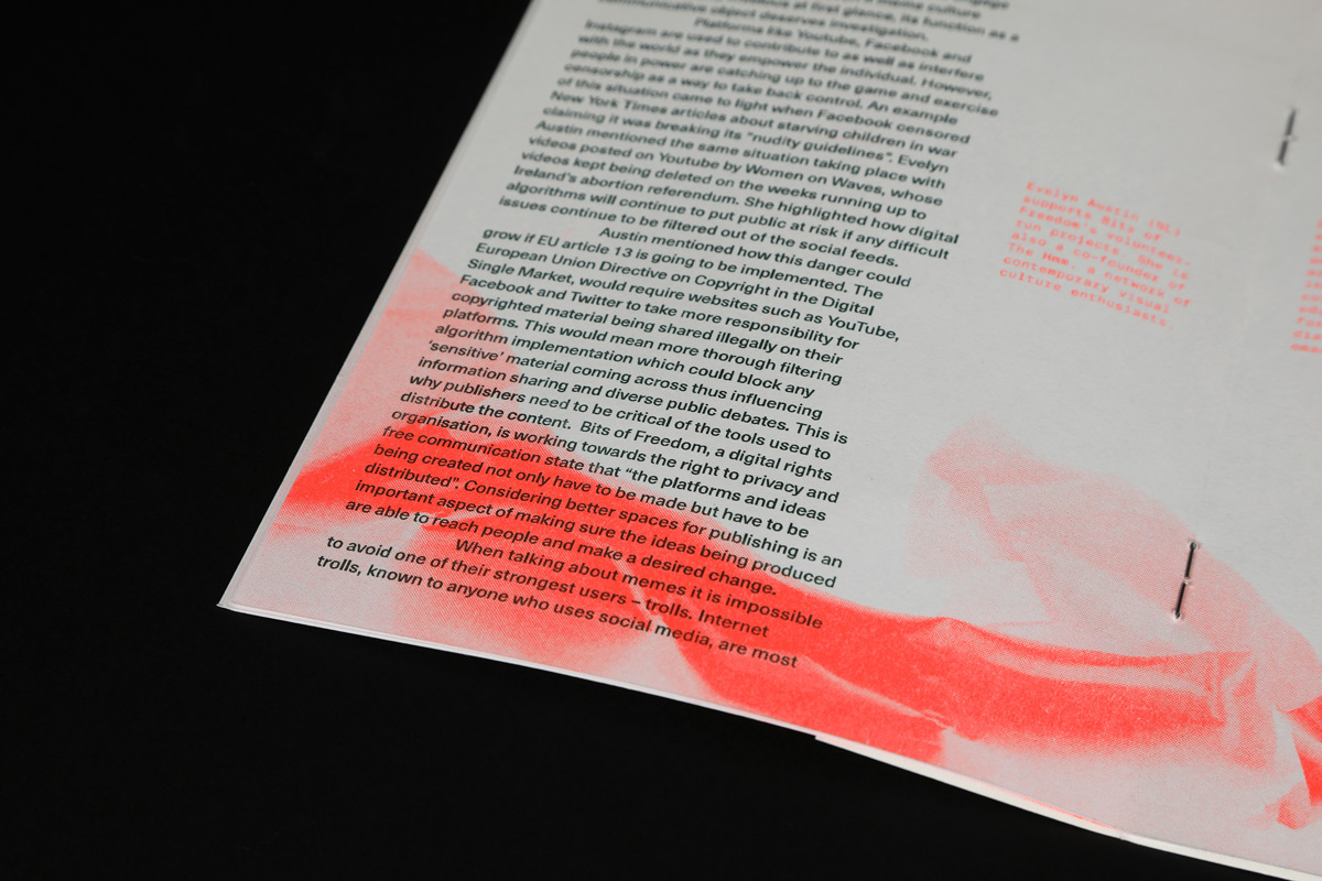
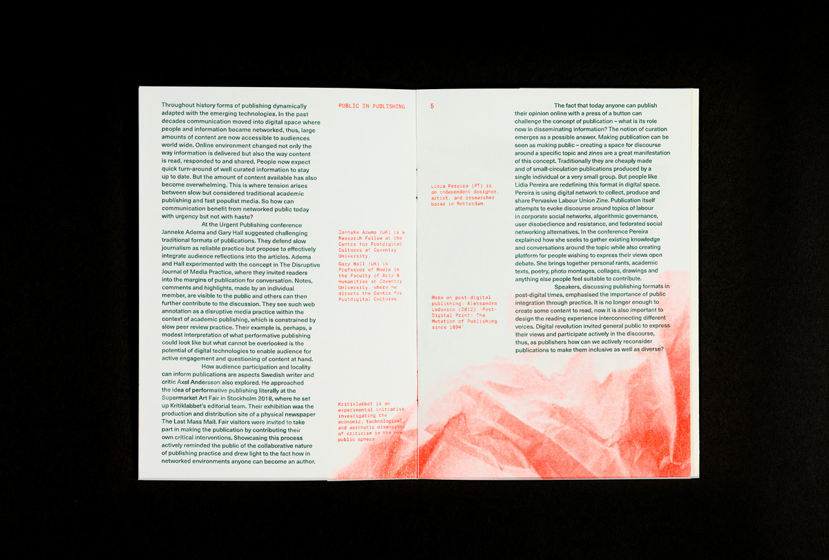
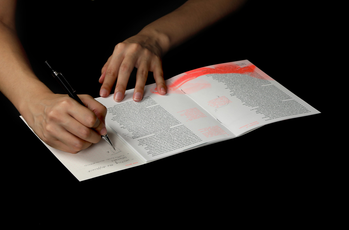
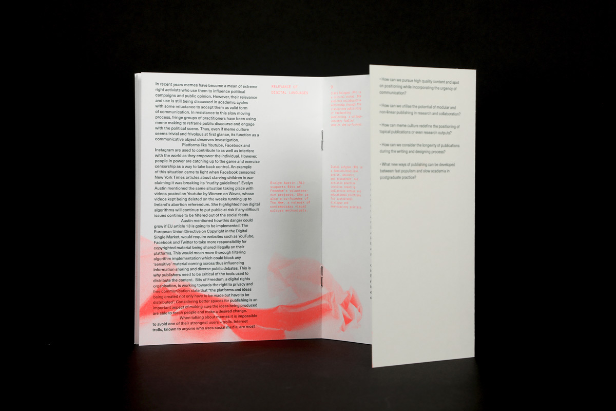
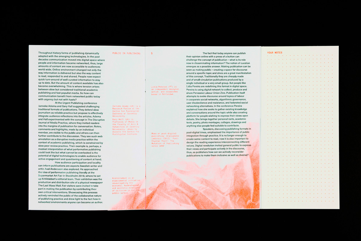
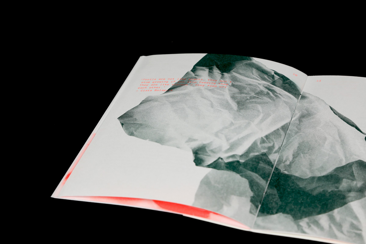
BO: Participation was vital for our project, we wanted to have a publication that invited people to interact with the content. Following this concept we chose paper and designed the booklet format that would encourage readers to build upon our work. The back cover folds out offering readers a generous space for their personal reflections – an extension to the content written by us. At the same time we were inspired by the idea of people writing on the margins, so we used our margin space as the front cover format.
In terms of type, we chose Suisse Mono and Neue Haas Unica combination. Suisse Mono felt like a good choice as the font has structured feel and good legibility. But we set the type in a bright riso colour which helped to avoid font looking rigid in our work.
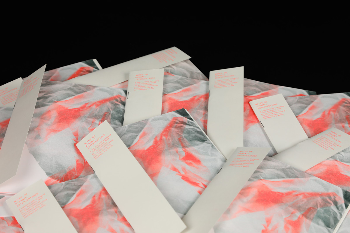
For the illustration part we knew that we wanted flexible fluid forms to translate the concept of adaptability that we felt permeated much of the strategies presented at the conference talks. We experimented with a scanner and how it translated different 3d forms into 2d images. The results from the twisting paper were our favorites and the ones we chose to incorporate in the publication.
Can you tell us more about the working process and guide us through the individual steps?
BO: As postgraduates we would often get emails about various conferences taking place in the UK and Europe, but the Urgent Publishing conference stood out as it seemed to overlap with the topics we were exploring within the course. We also knew the college sometimes funds conference visits and projects that can bring back value to the university. So knowing we work well together and are interested in the questions raised by the conference speakers, we sat down to brainstorm how we could bring the information from this conference back to our college and the proposal for Notes on Dynamic Interventions was born. We then went to the staff at LCC Graduate School to discuss the project proposal and after encouraging conversations we were granted the financial support.
Before going to the Netherlands we also presented the project to our coursemates and asked them to send us questions we could address while at the Urgent Publishing conference. During the talks in Amsterdam and Anaheim, we took extensive notes of the talks and once back divided the topics between ourselves to write reflective pieces for the publication.
Laura then focused on developing publication format and concept for layout while I started working on the illustrations. Initially they were going to be modeled using Blender software but we didn’t like how the tests were looking. So we explored other alternatives and arrived at the experiments using a scanner. Finally we joined everything together: edited each other’s writing, worked on editorial layout options and discussed paper and color choices for the final publication. The printing took about two days but with the help of a couple friends we managed to cut and bind all publication copies in one more day.
Once the publications were done, we got in touch with the other MA courses at LCC and visited a couple of classes to talk about the project, distribute the publication and invite students to our round table conversation. We had to hold the event a few months later to work around the college hand-in dates, but the discussion proved to be thought-provoking and offered further insights into the ideas brought from the conference. After completing the project we wrote a piece about this project for the UAL Postgraduate blog as well as MA Graphic Media Design publication “A Line Which Forms a Volume 3”.
Was there a reason why you decided to print with a riso-printer?
LD: We felt the idea of urgent publishing connected perfectly with risograph. These kind of printers are very speedy and have been famously used by artists and activists who wanted to spread their message quickly in large numbers. It also felt apt that riso ink doesn’t get fully absorbed by paper, so even if you rub the page with your fingers some days later, the ink will smudge and leave an impression of fresh print and urgency. The fact our course had its own riso printer with a good selection of vibrant colors enabled us to explore a number of color combinations, have the ownership over the print outcome and a quick turnaround as well as keep the production costs within our modest budget.
How important is collaboration to you as a design practice?
BO: It’s absolutely essential. I believe that my best projects are the ones that come out of collaboration. There is just an edge that emerges from challenging each other and sharing experiences.
LD: It’s really important to me as well. I find that I’m the most creative and productive when I work with people who are as interested and excited about the work as I am. Also the projects benefit from productive discussions – design decisions can then be informed by a range of perspectives.
What is important to you during a collaboration in general?
BO: Flexibility. It’s important to be in tune with the person you’re working with, sometimes it is just a matter of giving an issue some time instead of keeping on pushing it. People have different processes, it’s part of the fun to work together to create a new creative process with the other person instead of expecting them to work at your pace and way.
LD: Being willing to really hear one another and be open to take a different point of view, different way of doing something. I also learned that it’s important to give myself and others time to process conflicting ideas. In collaboration with Bruna it was easy to do so as we both are calm-natured, so we didn’t have hasty ego driven arguments.
Do you have any collaborative projects in mind which you find inspiring?
BO: I’ve been reading a lot about Patti Smith and her partnership with Robert Mapplethorpe which is something very interesting. I find it fascinating how they could see things in each other’s art before they themselves could notice it and how their own individual process would bleed into the other. I’ve been thinking a lot lately about how creating together doesn’t always mean working on the same thing.
LD: I think Christo and Jeanne Claude’s projects are some of the most extraordinary collaborations. They respond to political or social issues through art in such an interesting manner. The idea to hide something in order for it to stand out can initially sound like quite a subtle intervention, however the scale of their work is definitely not subtle.
What can we expect to see from you in the next months? Any projects in the pipeline?
BO: Right now I’m working on expanding my MA final outcome that tackles our social knowledge of disease epidemics, I’m exploring how design can help in the process of discussing frightening topics with the goal of helping us avoid prejudice actions during moments of crisis. The current situation with the corona virus and the rash actions against asians that we have seen made me feel the need to continue my research process.
LD: I’m currently designing a website to share my MA major project research with a wider audience. The project questions how literature can evolve from a book to a reading experience in post-digital publishing. I’m also excited about the 36 Days of Type Instagram challenge in which I’m participating for the third year in a row.
In the critical times we find ourselves, the question behind Laura and Bruna’s work “Notes on Dynamic interventions” seems more important than ever. As creatives, designers, writers or publishers, we should be aware of our own accountability and try to find our own authentic voice in the wild and scary landscape of over-information.

