“Graphic design enables me to convey a message and tell a story without really spelling it out. The need for me to express myself and create something that can be seen by other people plays a big role in my life.”, Zurich based Samara Keller tells us about her working approach, “As visuals play a great role in us as humans I find it important that we try to create meaningful pictures, make our world aesthetically pleasing and convey the right messages.” After starting an apprenticeship in an agency for a year and growing more and more interested in typography and language, the designer decided to pursue her passion and study visual communication at the Zurich University of the Arts in 2018. After creating her first typeface, she “just couldn’t stop” and soon started to practice type design on a regular basis. As a result, the idea for her typeface “Neustadt” was born, which is part of the Gadji Collection on the platform typelab.fr by Floriane Rousselot (Read more about it here!). “Starting studying again gave me the freedom to focus more on my work and crystalize what I really appreciate about design: The importance of typography, the exchange of views and the collaborations between designers you respect and admire”, Samara explains.
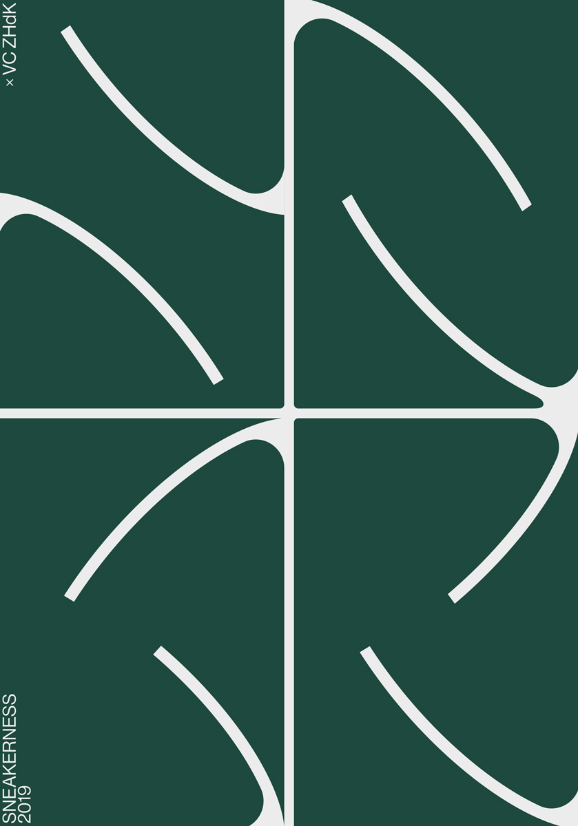
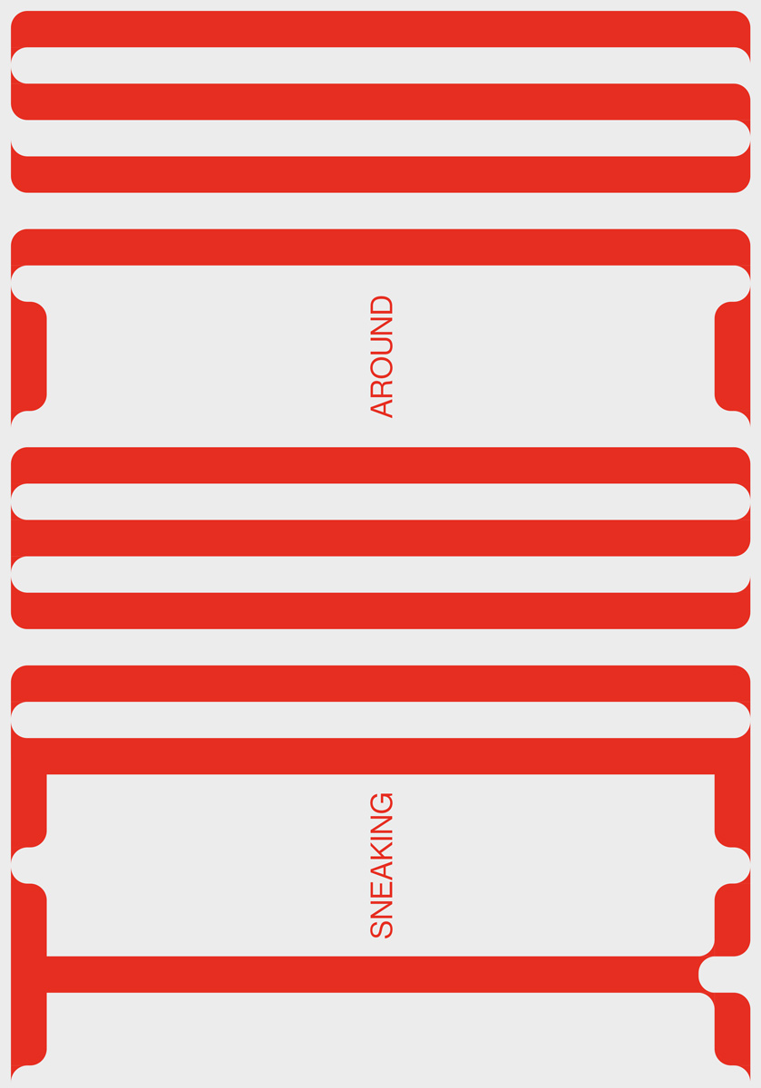
Seeing collaborating as a way to develop her skills and gaining new perspectives, there are many collaborations to spot in her portfolio, among them the posters for this years edition of Sneakerness – Europe‘s leading Sneaker and Lifestyle Convention taking place in Zurich, Amsterdam, London, Paris, Milan, Cologne and Rotterdam. In corporation with Zurich University of the arts, Sneakerness announced a design competition which invited to analyze the training shoe by its shape, purpose and its history in form of a poster. Together with Bastien Egger and Viltė Jurgutytė, Samara contributed a poster series, which was exhibited during these events all over the world. “The inspiration for the red poster comes from the main element of a sneaker – the laces – and from the lines from a basketball field. We wanted to bring forward the different methods of lace tying by putting the word ‘sneak’ in a shoelace form”, she tells us about the concept behind the posters, “The same goes for the green poster where the abbreviation SNKR is written in the same style as the lines from a basketball field. In order to imitate a sports shoe, the poster series is made up of two contrasting colors.”
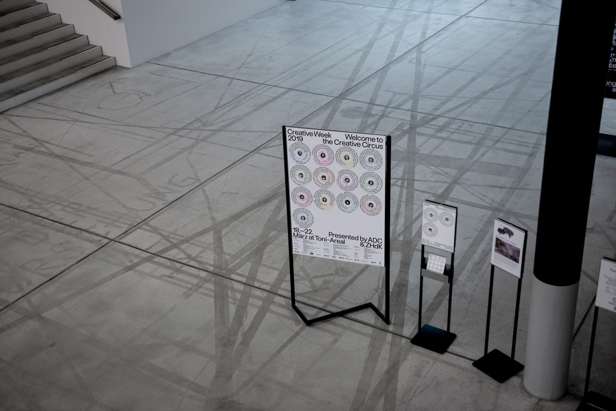
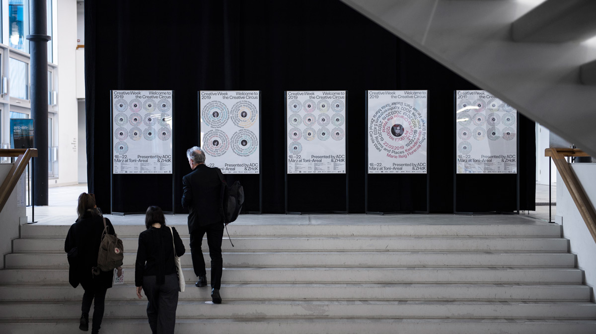
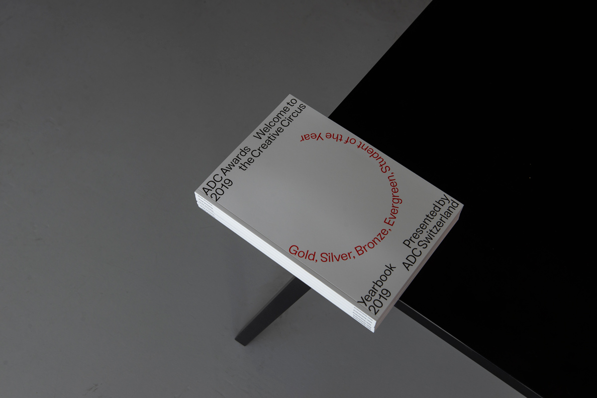
In collaboration with Christian Knöpfel, Stefan Hürlemann und Viltė Jurgutytė, Samara has currently released another poster series for the creative week 2019 presented by ADC Switzerland.
Each year the ADC Creative Week aims to bring together creatives from all over the world under one motto to share their unique views, philosophy and vision. The motto of 2019 was “Welcome to the Creative Circus” referring to the craziness of the creative industry. “After a long sketching phase, we decided to bring together the arena of the circus, the etymology of the word ‘circus’ and the movement of the artists in one concept: the turning point. Creating a system from this concept, we created different posters, animations and digital communications for the event. The colors are based on the carriages of ancient chariot races, red, green, blue and white, which represented the four elements”, Samara tells us about the collaboration, “I really enjoyed my work on the ADC Creative week. It took a lot of time and work but I really enjoy the outcome and the work with my group.”
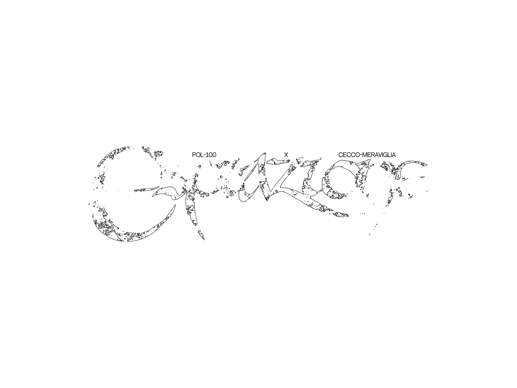
While technically not being a collaboration, but having the subject of collaboration at its core, Samara was invited by the Red Bull Music Academy Daily to create a custom logotype for their collaboration week in June this year. The online platform creates themed educational modules about a certain topic in music and highlights different aspects of each one of these. To incorporate the spirit of collaboration, Samara designed the logotype with a couple of ornamentations overlapping each other. “Paired with the modern and technological construction of the letters I added delicate elements that give the logotype it‘s distinctive appearance”, she explains.
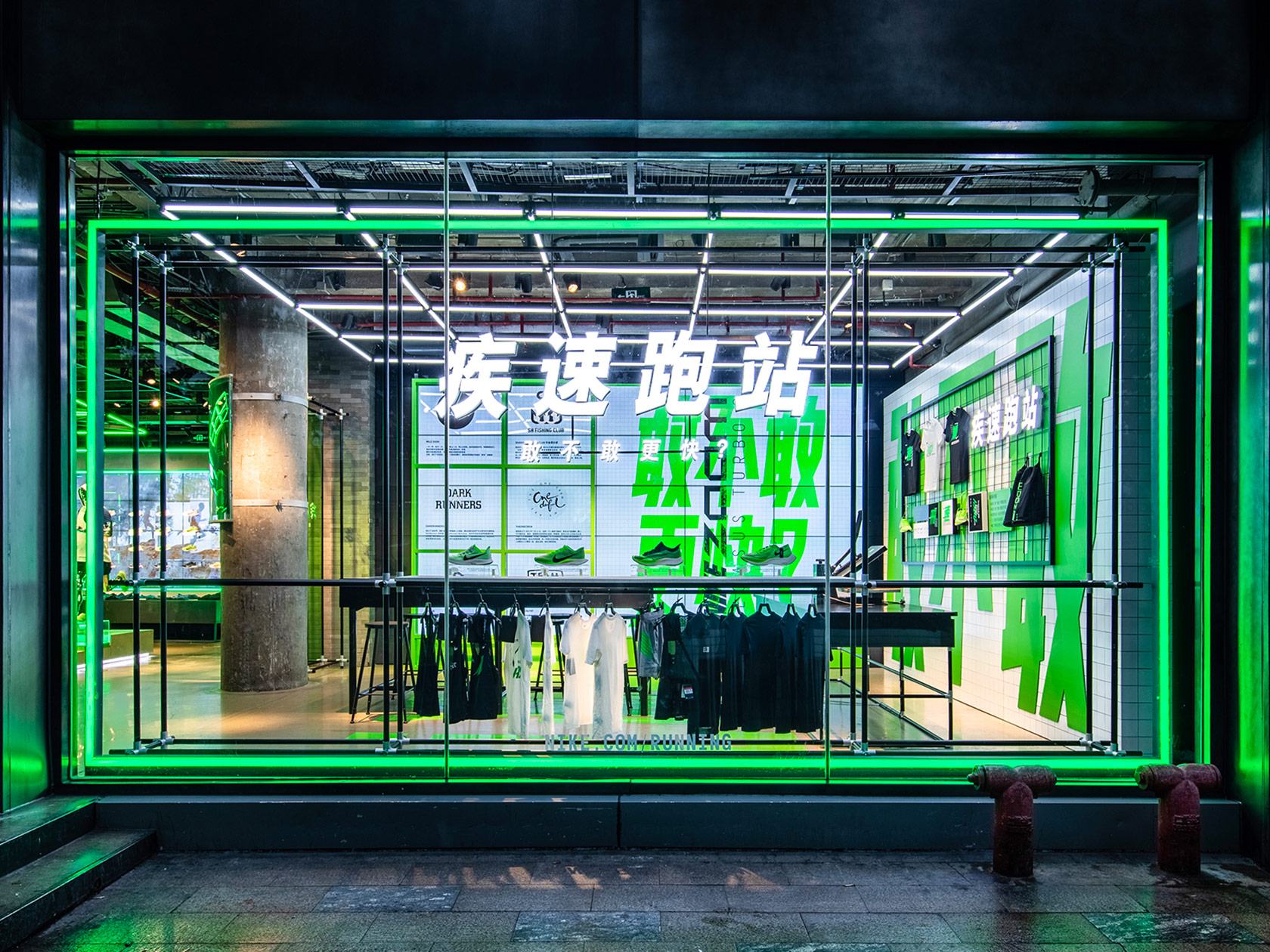
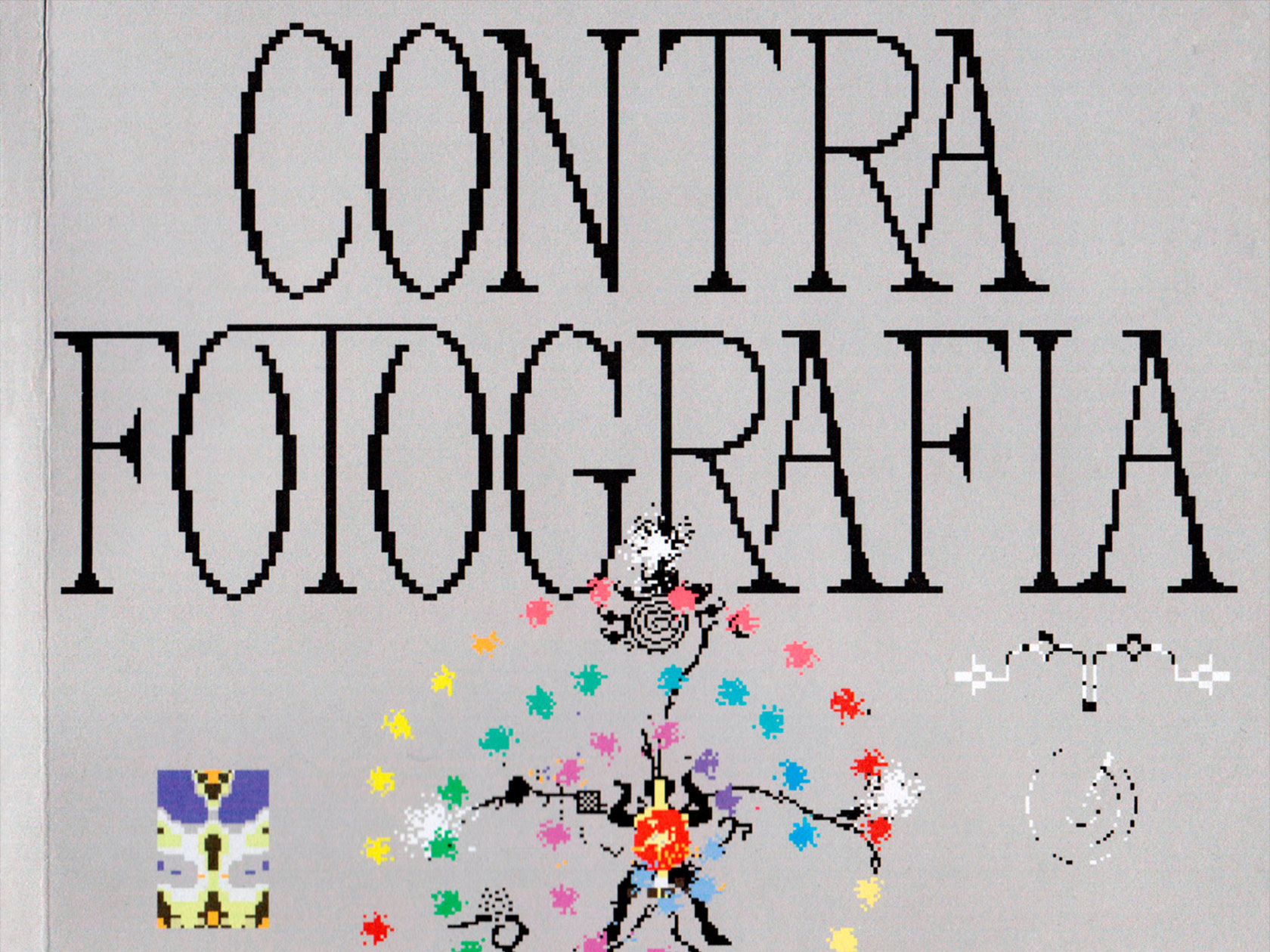
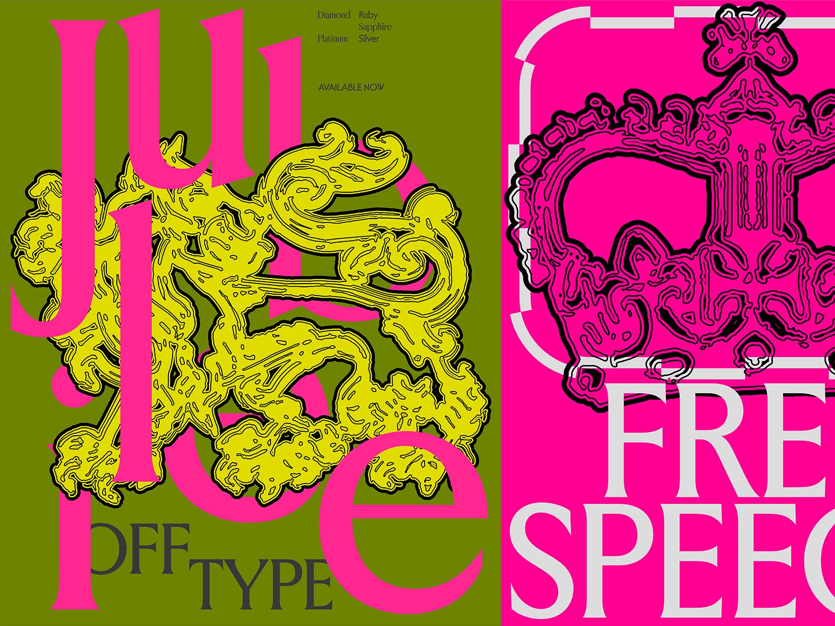
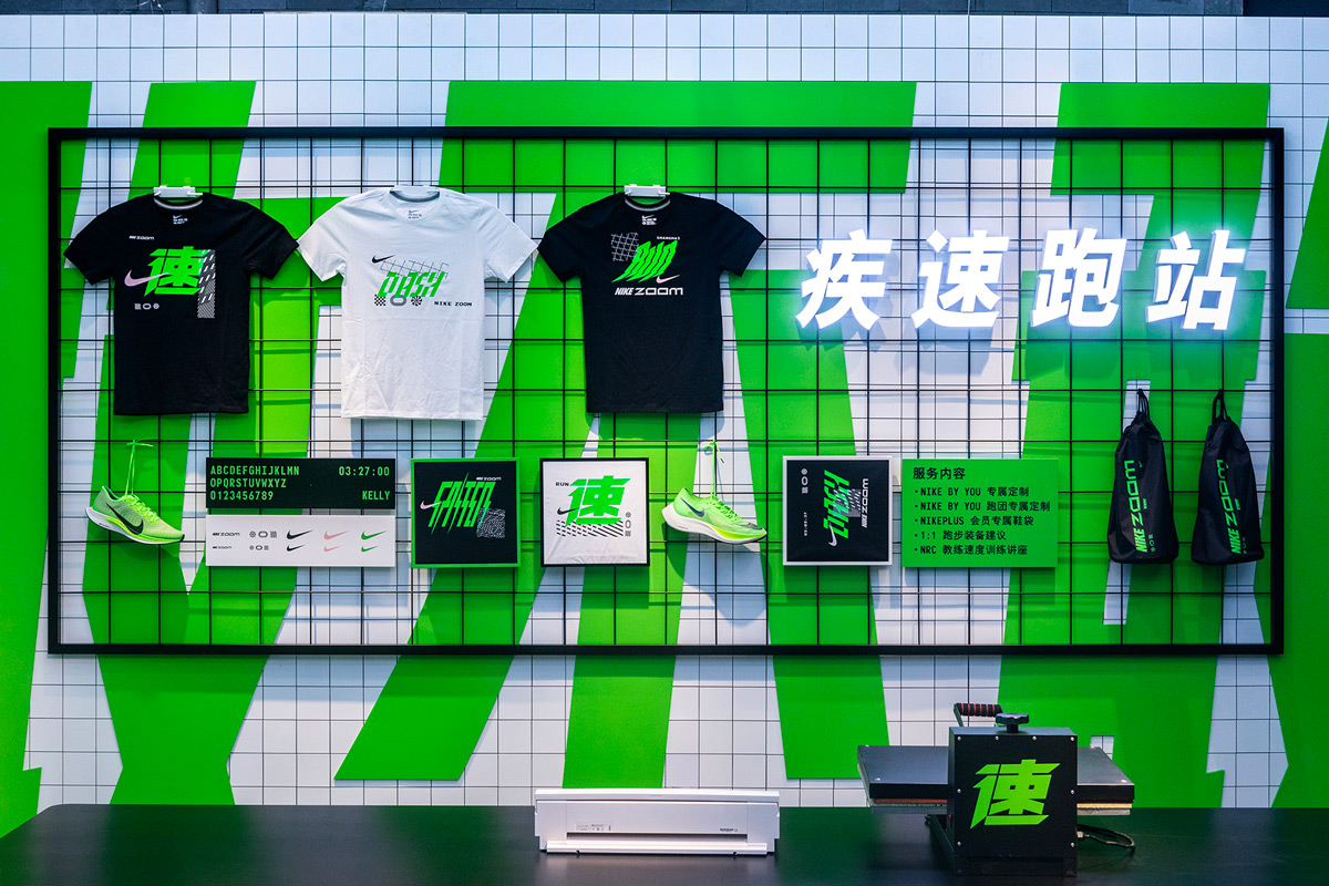
As her work mainly consists of “typographic solutions”, creating custom type plays an important part in her projects in order to give them an individual, personal touch. In several of her projects, like the sketches for Nike China and the Shanghai-based studio Royal Club which she designed together with Stefan Hürlemann, the custom typefaces are the main focus of the whole visuality and are not meant to be functional, but pictorial instead. “I think typography plays a big role in design in general. We read all the time how essential it is that the type conveys the right message. In custom type, you can especially fit the type to the related project and control the message and aesthetic behind the typography”, Samara explains, “For me designing type it’s much more a detail-oriented process than designing usually is. Based on the nature of type design, it’s also easier for me to stay focused on one specific set of letters and all the glyphs that are necessary to create a whole letter. One aspect that I find quite inspiring is the limit given by the letters to the designer. As the form of the letters is already defined, you as the designer can just to work around it and give the glyphs it’s right ‚costume’.”
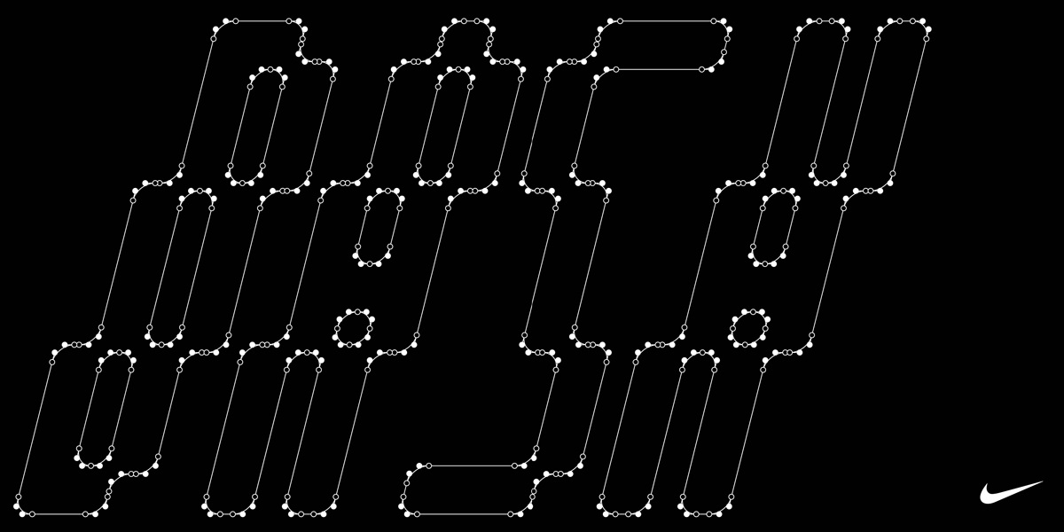
Besides working on the release of her new typeface “Tempos”, a monospace typeface inspired by the good old Times, Samara is currently doing a research about the history of a typeface that was really popular during the 50s. “I first saw this typeface on an old Swiss railway and fell in love with the elongated and constructed look. It’s unfortunately quite difficult to dedicate this style of type to a certain designer as they didn’t name their work. So I’m trying to find out where this typeface comes from and who cultivated this style”, Samara tell us about this upcoming project and adds: “Also, I want to focus more on my type-related work. I want to focus more on my typefaces and my type-based research.”
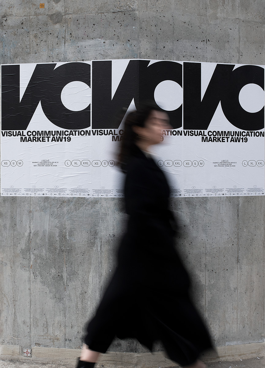
Trying to find visual references in everyday life, Samara usually does not start with a clear vision of the final result in her mind. “For me, a project generally develops over time. When an idea comes to my mind, I start doing quick drafts and try to crystallize a concrete aesthetic”, she explains, “Usually, I try a lot of different ideas and hop between different approaches, angles and views. Choosing the right idea is difficult for me so I have to be sure that the idea is the right one.” During collaborations, she appreciates the exchange between different people. “As we grow up in different circumstances, everybody has a different outlook on life and I think you can learn from everybody and take a piece of inspiration for your own life and work. It is important to me that all opinions are listened to and taken into consideration. I think everybody has a valuable perspective and can therefore contribute to the design”, she tells us, “The biggest difficulty is always the communication – in everyday life as well as in collaborations. Good communication is key. That’s why it is so important to accept each others’ views and opinions.”
Collaborations to look at:
Francesco Griffo x Aldus Manutius, creating the first italics

