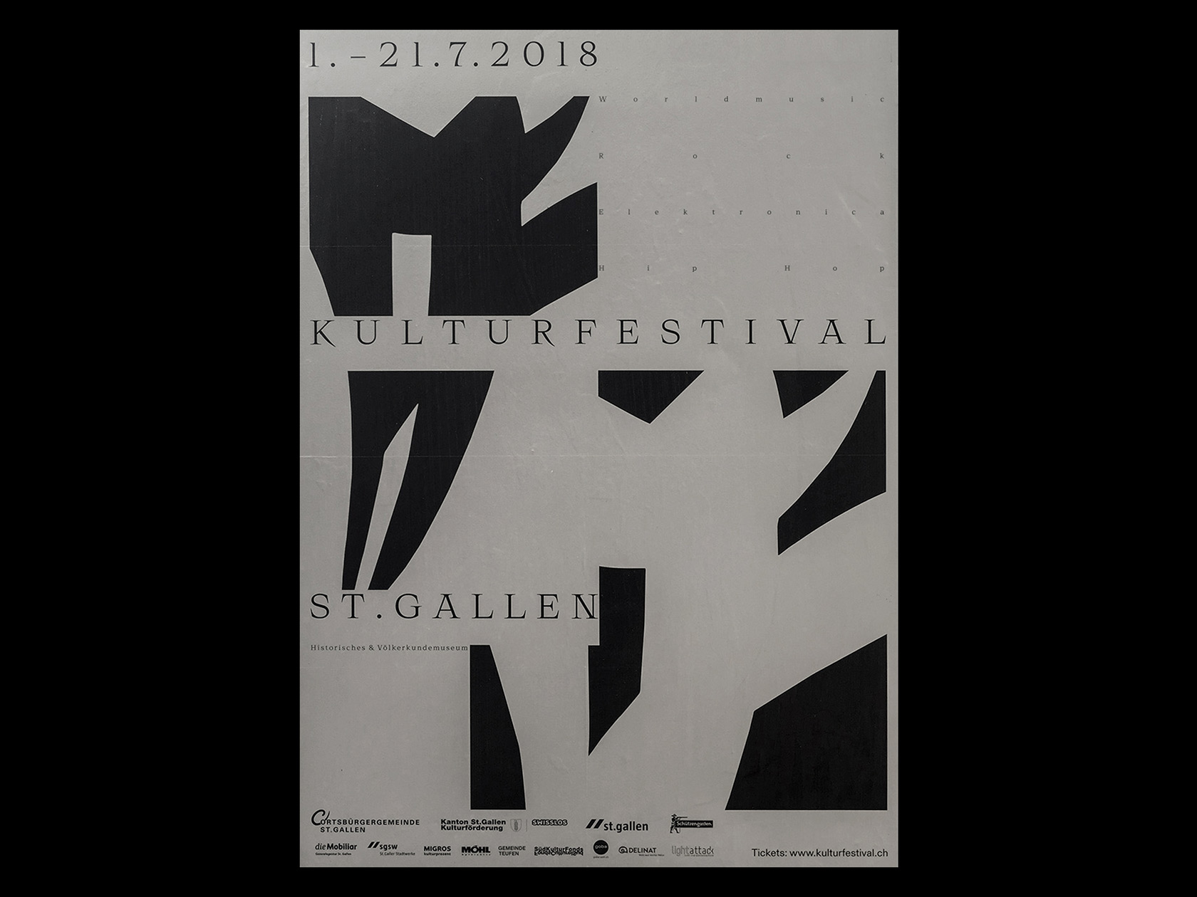
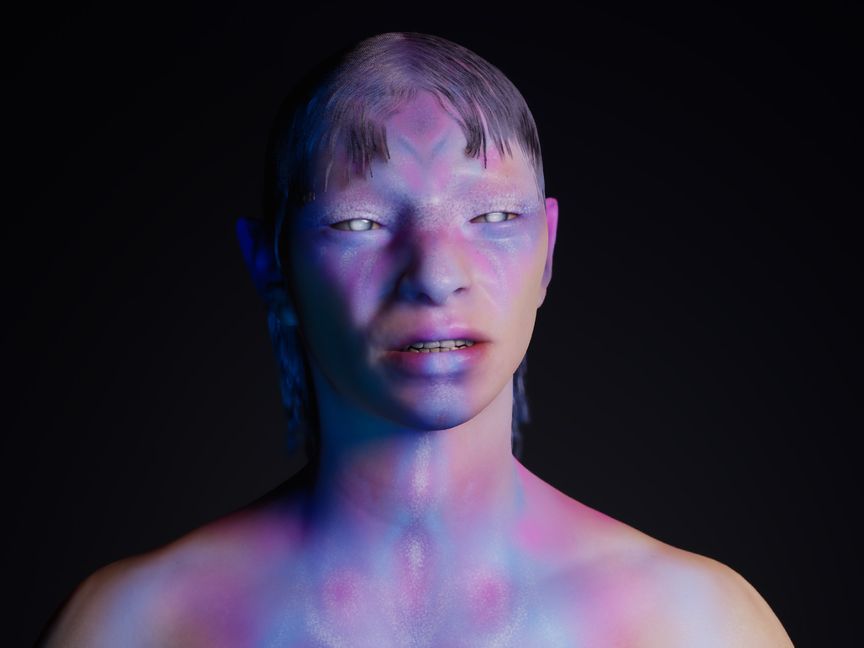
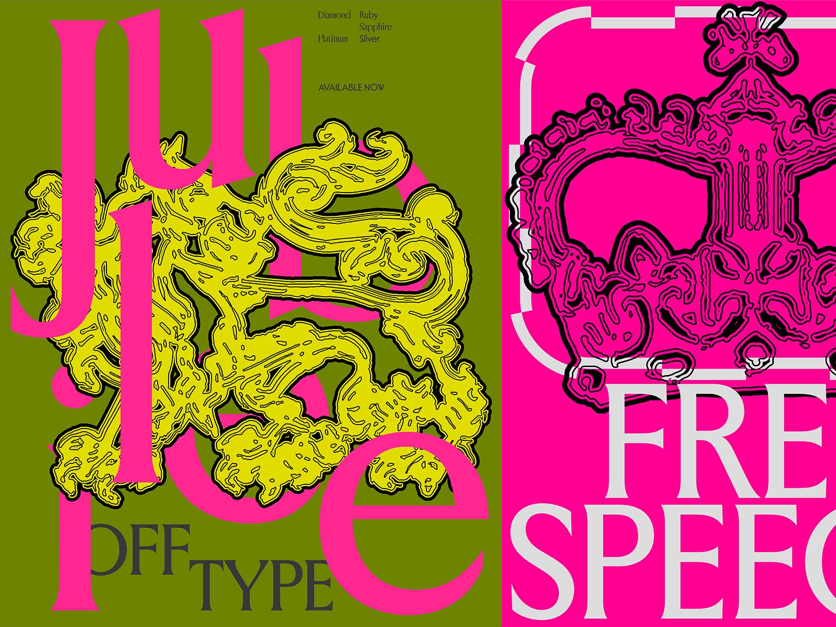
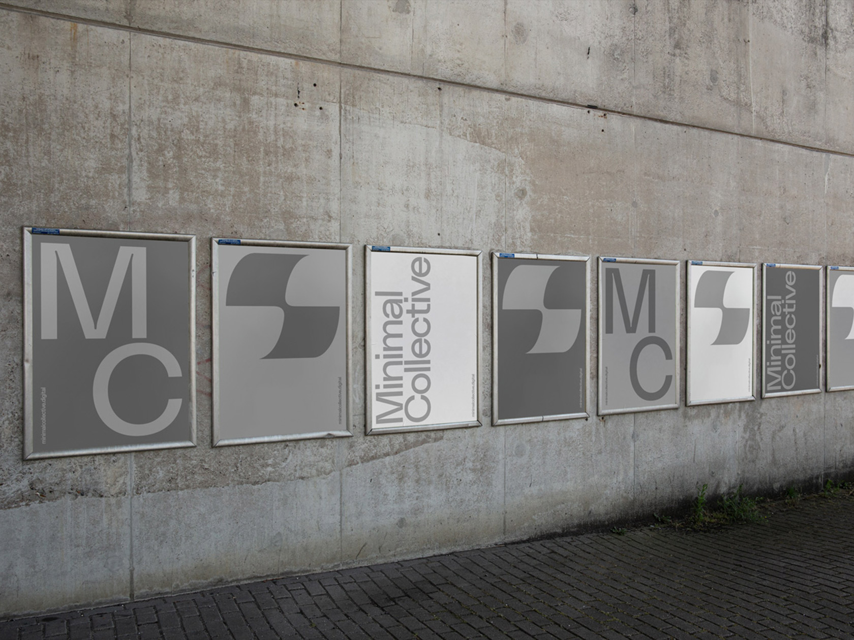
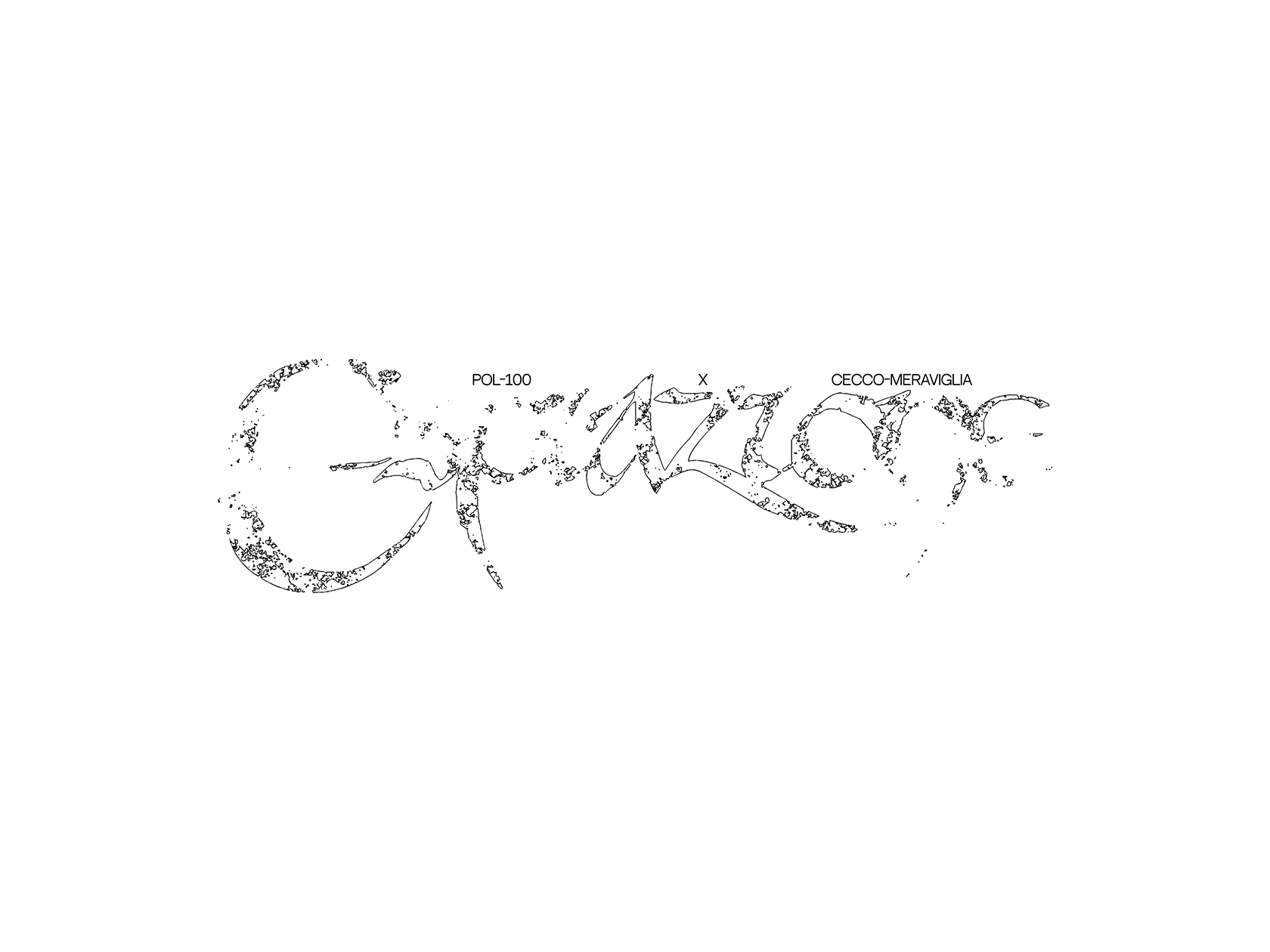
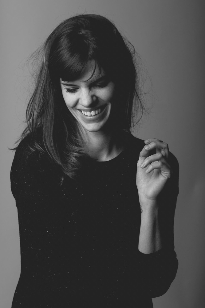
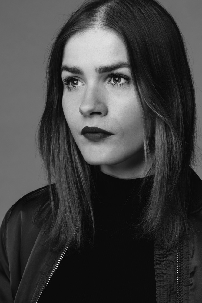
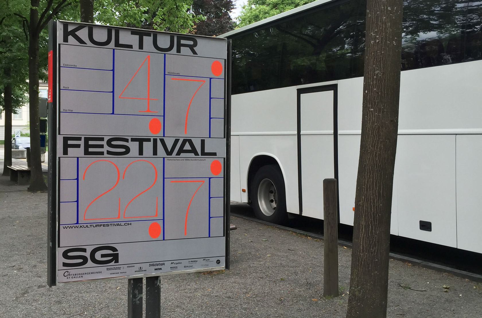
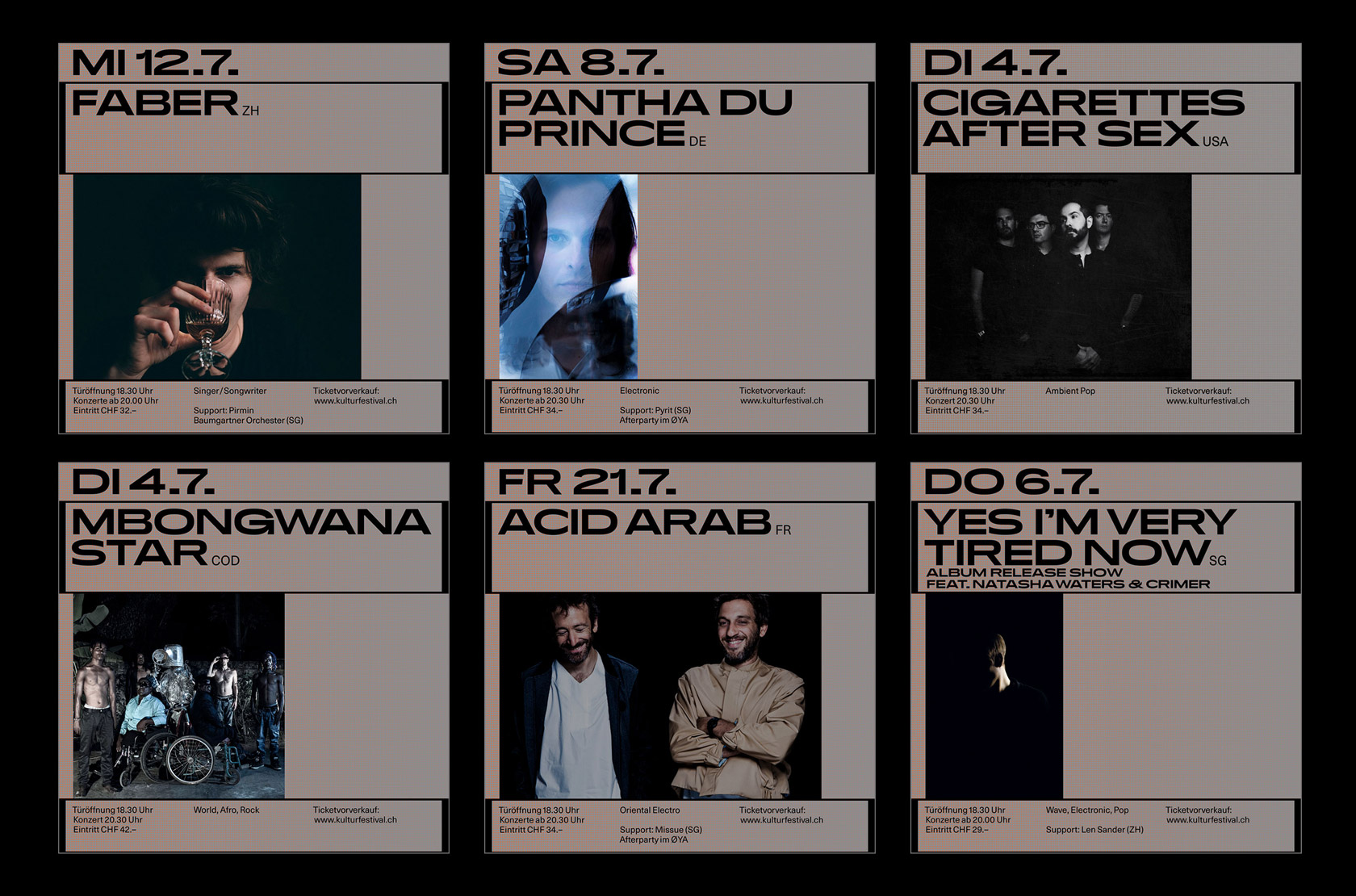
“Life is pure inspiration! We consider it important to be ready for new ideas, to stay open and to have a watchful eye in order to receive new impulses and to break conventions”, says the design duo Laura Prim and Aurelia Peter, both based in Switzerland. For visual identity of the Kulturfestival St. Gallen in 2017, they managed to combine modern, bold typography with graphical associations from the world of music. The wide vertical lines and oval dots were reminiscent of note lines, varying typefaces and different weights showed the diversity of musical genres at the festival. In year 2018 they were back with an even more contemporary, unique look, consisting of abstract forms and a clear, but playful handling with typography.
The wide program of the Kulturfestival which takes place in the courtyard of the Museum of History and Ethnology in St. Gallen, varies from electronic music to indie music to hip hop. The lineup consists of international stars and artists from the region – a colorful mixture of different cultures and genres.
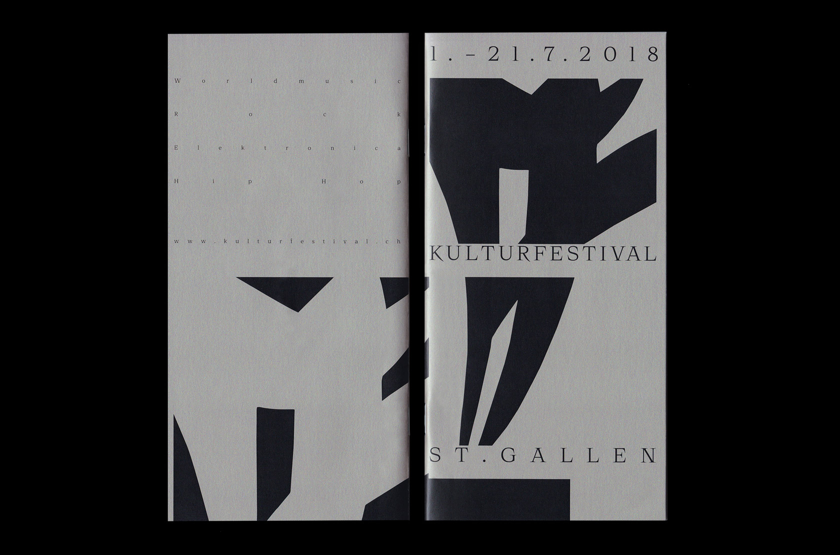
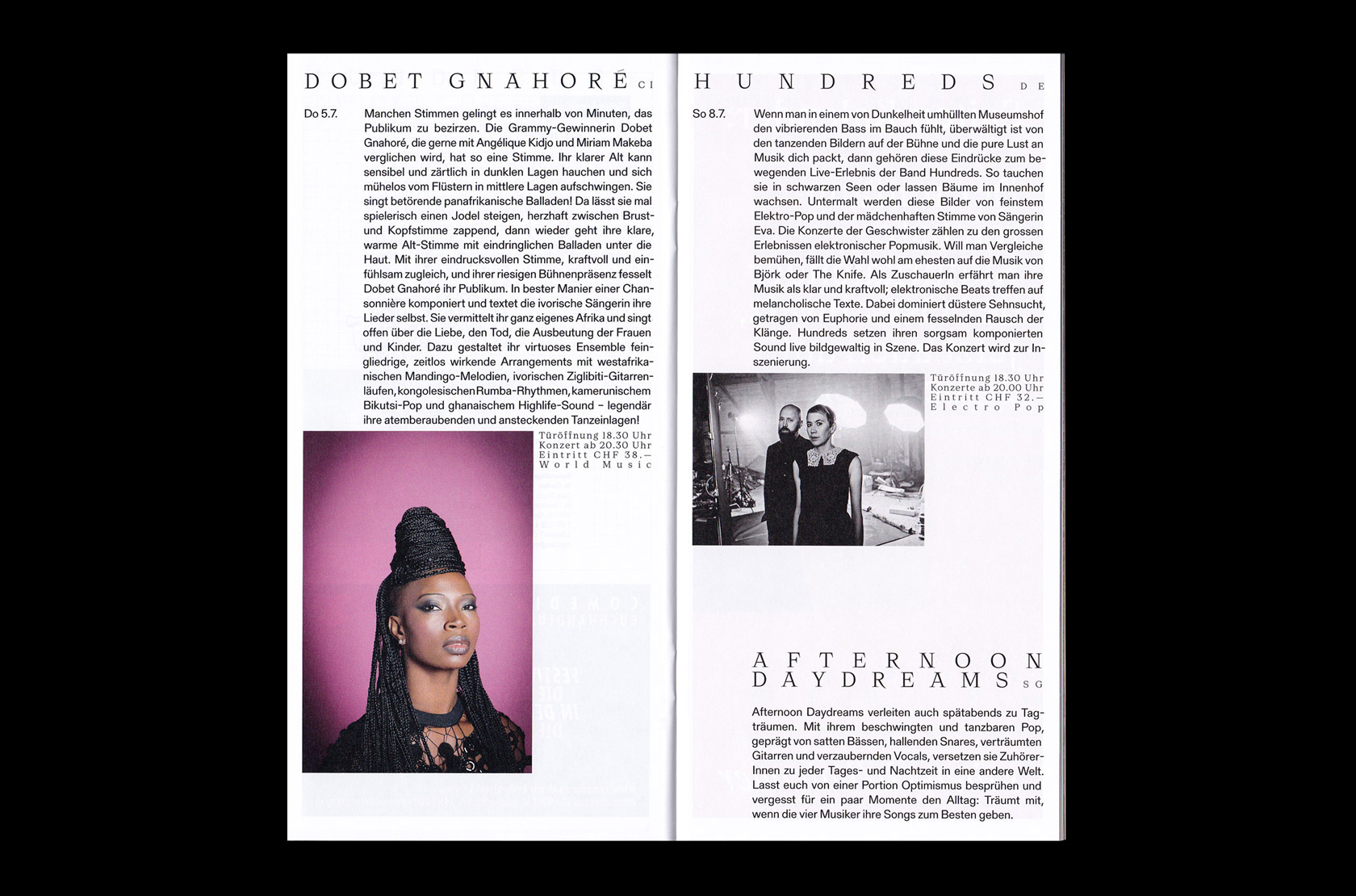
Besides being the location of the Kulturfestival, St. Gallen is also the place where Aurelia and Laura absolved the first part of their graphic design education. “The city is small, but it has produced some well-known graphic designers. From earlier times as well as contemporary names. The claim is great to do justice to this heritage”, they say. From the Z ETT Magazine, the university magazine of the Zurich University of Arts (Aurelia) to the identity of the Rosenberg Kollektiv (Laura): many of their projects are based on cultural background, having their roots in the music or art scene. Aurelia now lives and works in Zurich, Laura has her own studio in St. Gallen.
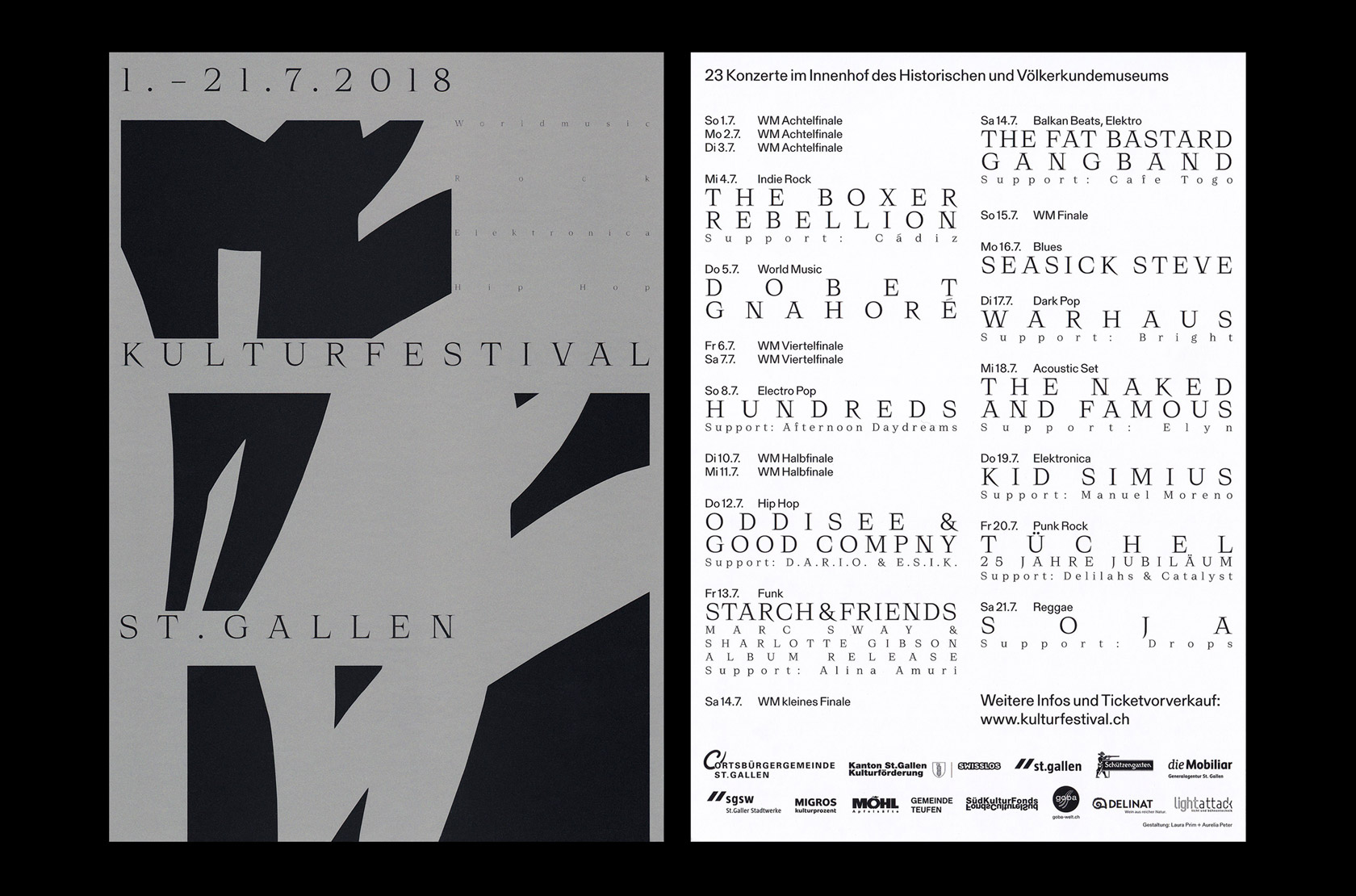
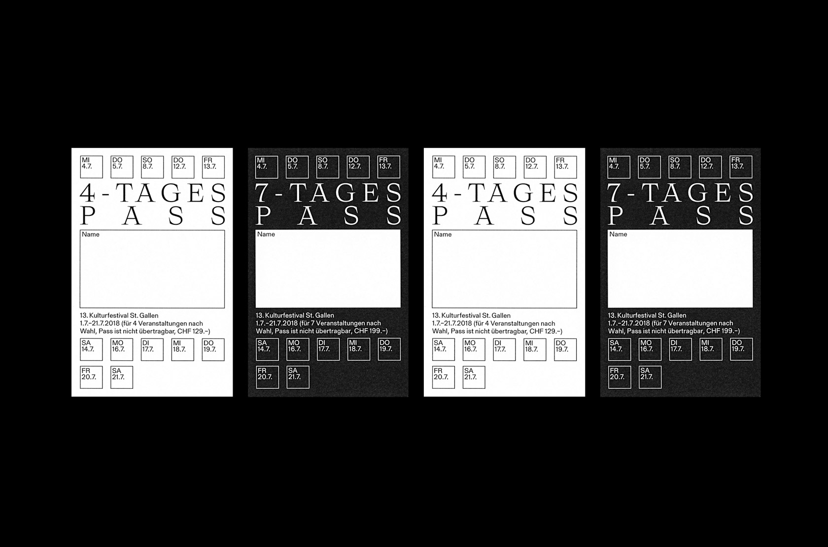
While each of them works independently on their own projects, they gladly take a given opportunity to work together. “For us, collaborations means working together with the aim of creating an independent and unique work together. It begins at the latest with the development of the design concept. Such an exchange is always enriching, also personally. We appreciate the opportunity to exchange views and ideas and enrich our work together on projects.” Both of them share not only a “similar style and working rhythm”, but also “similar design ideas and respect for each other”. Alternating between contemporary graphic design and clear swiss typography, maybe the deep respect for each other is also the reason why their work always seems to be in balance – just like their working process is: “It’s very balanced. We are both responsible for every task. We even alternate consciously. For example, if someone is working on a design and can’t get any further, the other person goes on. Usually, it is exactly at this time, during stagnation, that an exciting new way emerges. Perhaps none of us would have come to this result alone. If there is a division of tasks, it is in communication with the customer or the printer.”
Speaking of their collaborations together and their mutual working process, they state: “There are many great designers. But a lot of things have to be right for successful cooperation – at various levels. We are glad that we have found each other.”

